Guided by Ken’s expertise, Seng Kiat and Mallory transformed their executive apartment into a versatile home for both adults and children.
Talk about “limited edition” public housing and jumbo flats and maisonettes immediately come to mind. But equally elusive are the executive apartments, which have been phased out by HDB in the early 2000s. For those unfamiliar, these are expansive, single-floor HDB flats boasting more space than the typical 5-room flat. Their layouts often feature a study room and balcony, making them an ideal family home for young parents like Seng Kiat and Mallory.
 “An executive apartment definitely fits what we were looking for,” said Seng Kiat. As the father of two daughters, he highlighted that the spaciousness was perfect for his family of four.
“It doesn’t come with a bomb shelter and we like the fact that every area, while segregated, still blends well into the main living room area.”
Compared to their previous home, this new space offered vast possibilities for interior design. Seng Kiat envisioned a sanctuary where he could indulge in his hobbies—playing games, gardening, and music. But first, the couple had to overcome a delightful dilemma: choosing a theme for their new home.
“Initially, we were lost in the world of potential themes. Based on our research on the internet, we started out with the mid-century theme in mind but eventually went for a more minimalist, wabi sabi theme after discussion with our ID.”
Extra space
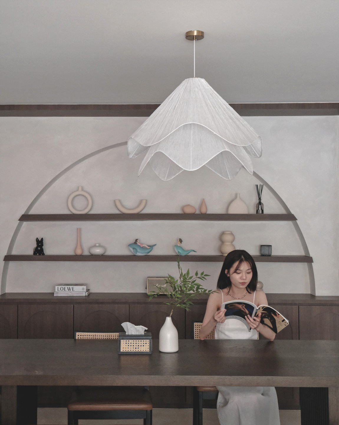
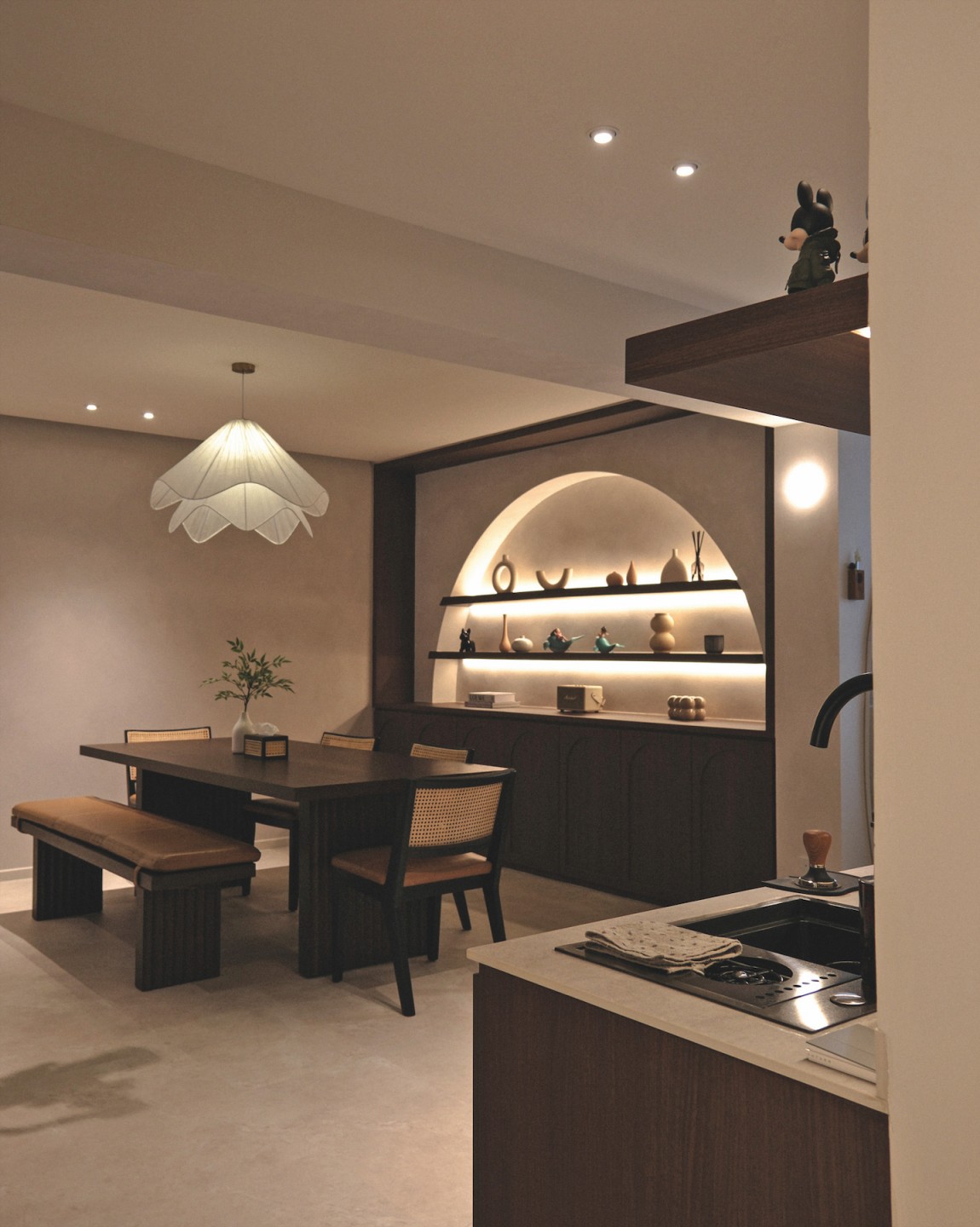
This theme is immediately evident upon entering the apartment, whose size is accentuated by seamless, textured walls and flooring. The dining area’s feature wall, one of the couple’s favourite spots for group photos with family and friends, draws the eye.
“The curvature of the arch softens the space, allowing the owners to place their decorative items, while the lower cabinets provide ample storage space, maintaining a clean and uncluttered look,” said Ken.
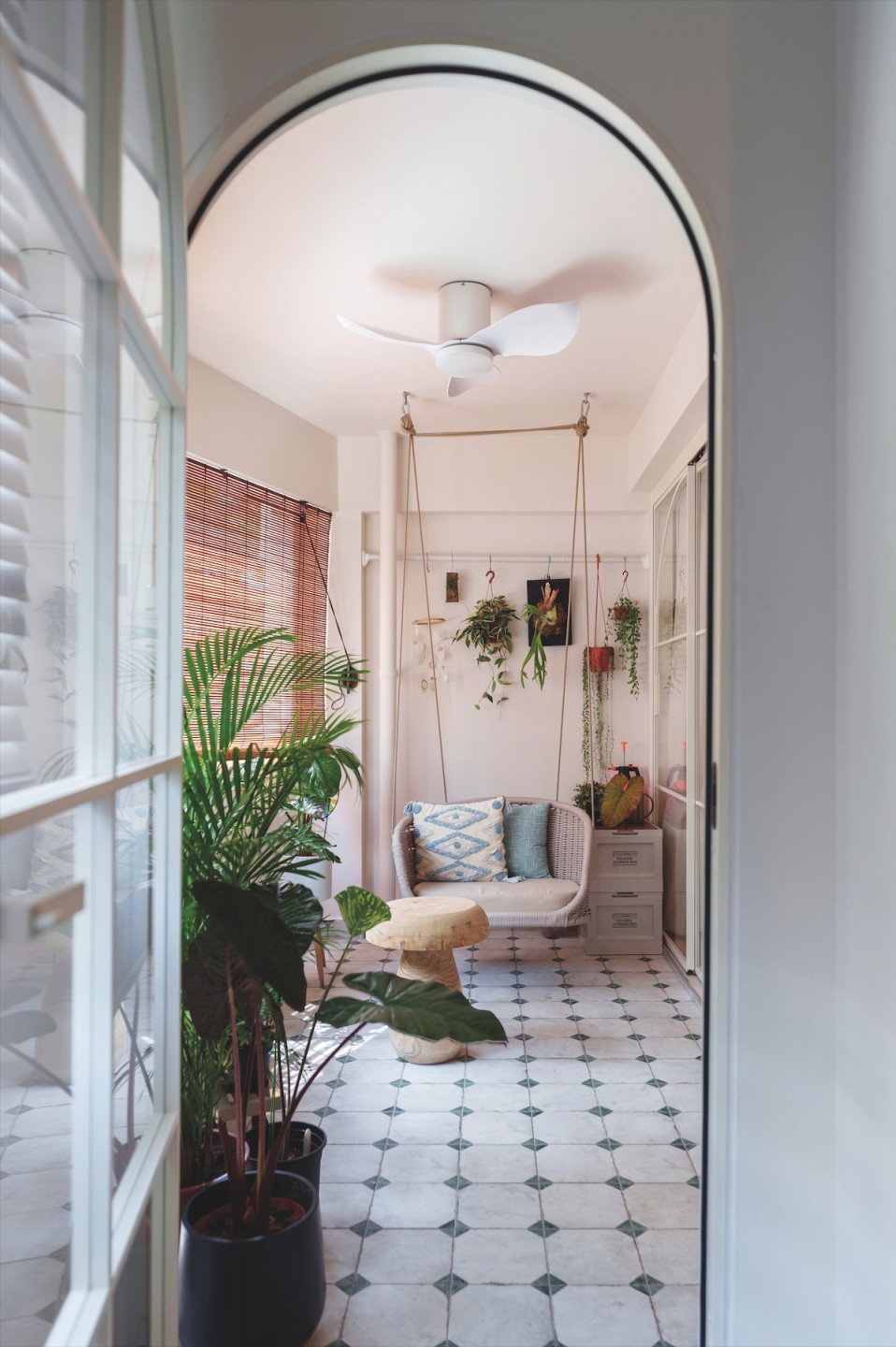
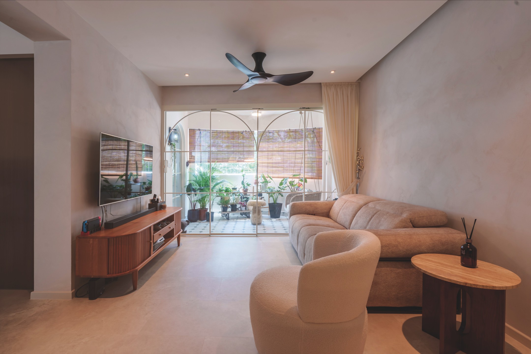
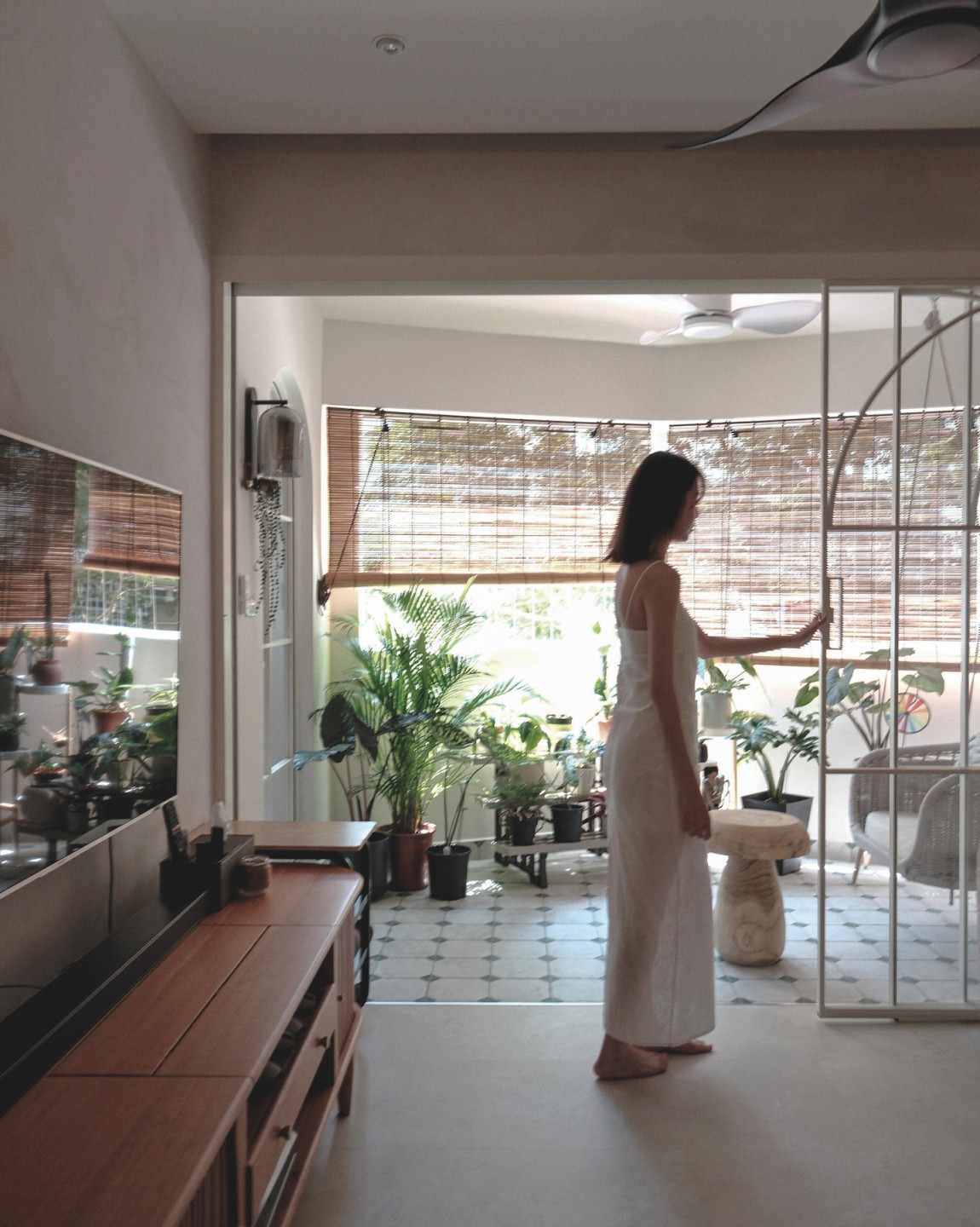
The dining room flows effortlessly into the living room and its adjoining balcony, distinguished by patterned tiles that lend the outdoor garden a quaint charm. Sliding doors with sheer curtains invite daylight into the communal areas, creating a bright and airy atmosphere in the living room.
The balcony also leads to the study room, where Ken’s expertise provided solutions the couple had not considered.
“When we decided on an enclosed study room to minimise disturbance from the living room, Ken suggested a sliding door with a fluted design with LED strips. Thanks to that, we could keep the study conducive and connected to the hall,” Seng Kiat said.
Little delights
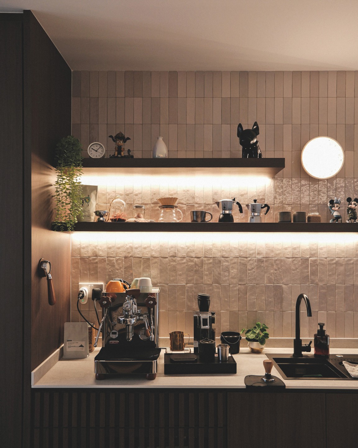
To fulfil the couple’s dream of a home cafe, Ken designed a compact dry kitchen. Textured and glossy subway tiles on the backsplash add visual interest and reflect light, brightening the workspace.
In contrast, the wet kitchen features a modest touch of walnut for warmth, paired with a neutral palette for the worktop, backsplash, and top-hung cabinets, ensuring the enclosed space feels open.
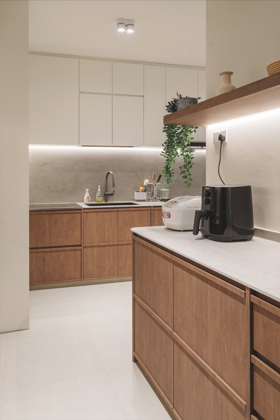
“We especially like that the wet kitchen and service yard are separated, as this allows us to cook without having smoke enter the laundry area,” Seng Kiat said.
The fluted glass sliding door not only allows light into the kitchen but also simplifies maintenance compared to clear glass, which would reveal any mess in the service yard.
Moving down the room corridor, kid-friendly elements begin to appear, starting with the common bathroom. Designed for their daughters, it is cloaked in terrazzo floor tiles and curved subway tiles that emit a pink hue under warm light. This whimsical quality is mirrored in the children’s bedroom, featuring a wardrobe with Mickey-shaped wooden knobs and a curved edge for safety.
While the master bathroom also showcases soft, neutral tones, the standout feature is the large format, plant-themed tiles, creating a resort- like ambiance. The master bedroom maintains a minimalist theme with microcement laminate used for the floor, wardrobe, and vanity.
“The vanity features built-in shelves, offering ample space for cosmetics and personal items and keeping the countertop clutter-free,” Ken explained. “It’s designed to be both functional and stylish, integrating seamlessly with the overall bedroom decor.”
Ken’s attention to detail and ability to combine practicality and aesthetics have not gone unnoticed by those who have seen the space.
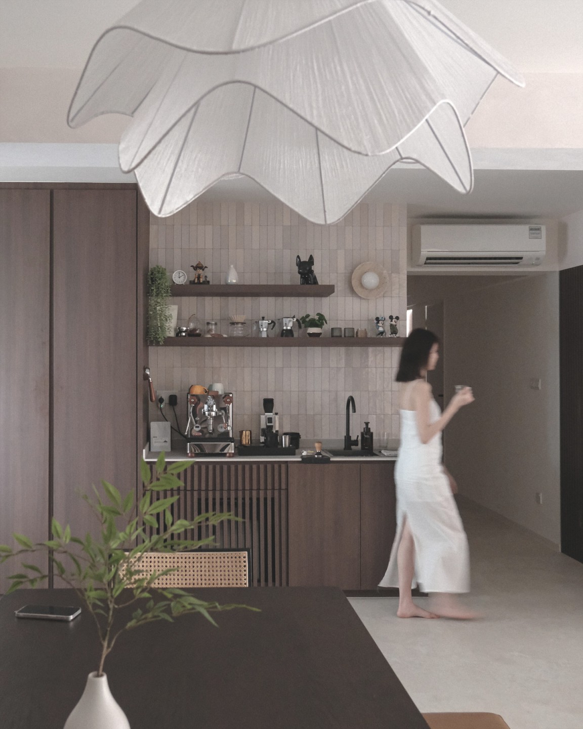
“Our friends and family love how big the space is, and said that our house is very well-designed. They appreciated that while we have allocated spaces in the house dedicated to design, it remains fully functional with lots of storage.”


