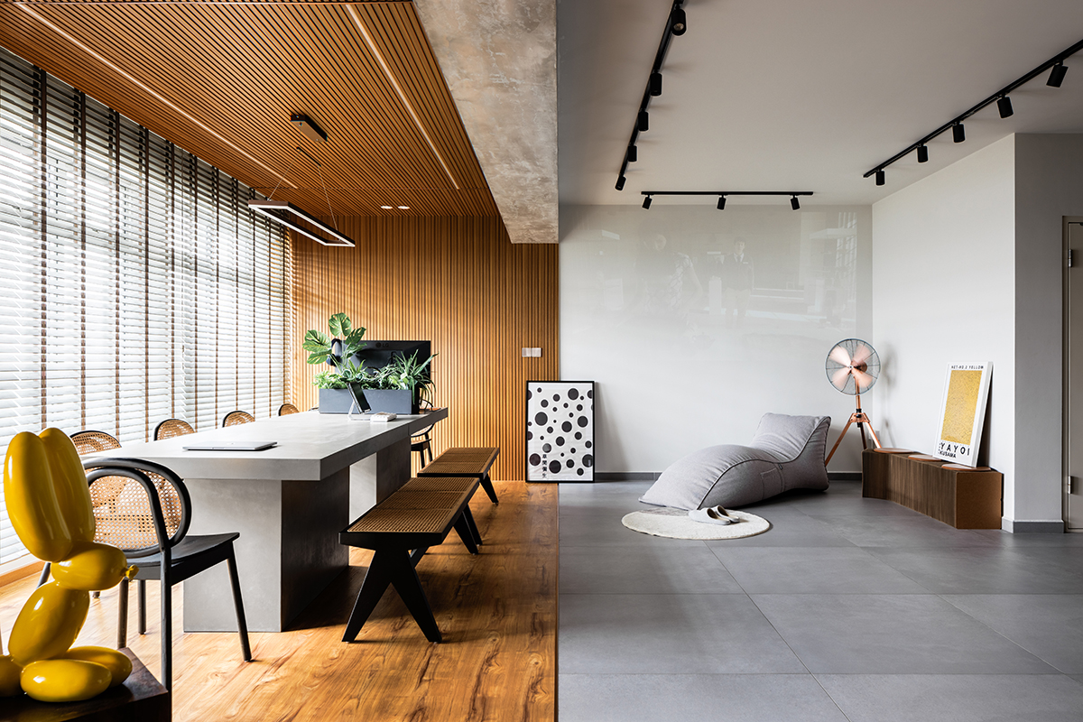
Distinct visual languages demarcate the different zones of this apartment in Punggol.
As far as BTO flats go, one could say that owners Javin and Crys have hit the jackpot. Besides its spacious 1,200sq ft size, their new apartment, which is on a lofty 18th storey, also has an unobstructed seafront view of the Johor Strait. As luck would have it, the couple are professional creatives—Javin and Crys being creative and art directors respectively—so to have the apartment’s interiors match up to its impressive attributes was hardly a question.
The couple engaged Joey Ong of Salt Studio for his interior design expertise and project management. It is worth pointing out that Javin is architecturally trained, so the design was much influenced by his ideas, which Joey then fine-tuned for execution.
In terms of the brief, the couple wanted a balance of function and aesthetics: interiors that would wow yet withstand the test of time. They conveyed their desire for a contemporary take on industrial ruggedness and a need to incorporate a workspace and studio as they planned to do photoshoots at home.
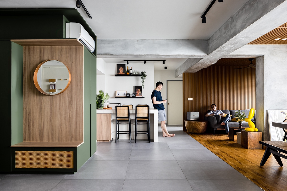
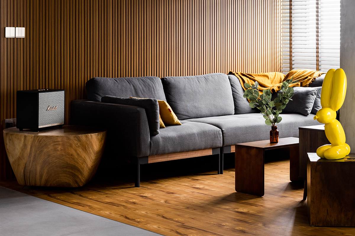
From the communal area, one can perceive the visual divide that cuts the apartment into two along its length. The functional areas of the living and dining space are bathed in warm, inviting wood-tones to signpost that these are hubs of activity and to draw people towards these zones. The other half, which are mostly transitional zones for movement, is finished in a cooler palette of white walls, grey tiles, and pine green accents.
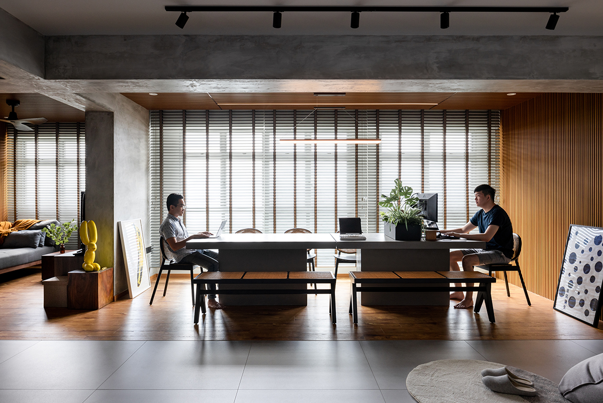
The large 10-seater dining table is easily the focal point of the apartment. It is the centrepiece of the dining space, originally the apartment’s living room, which Joey converted into the dining cum workspace. A new living room was created from an adjacent bedroom after hacking away its walls.
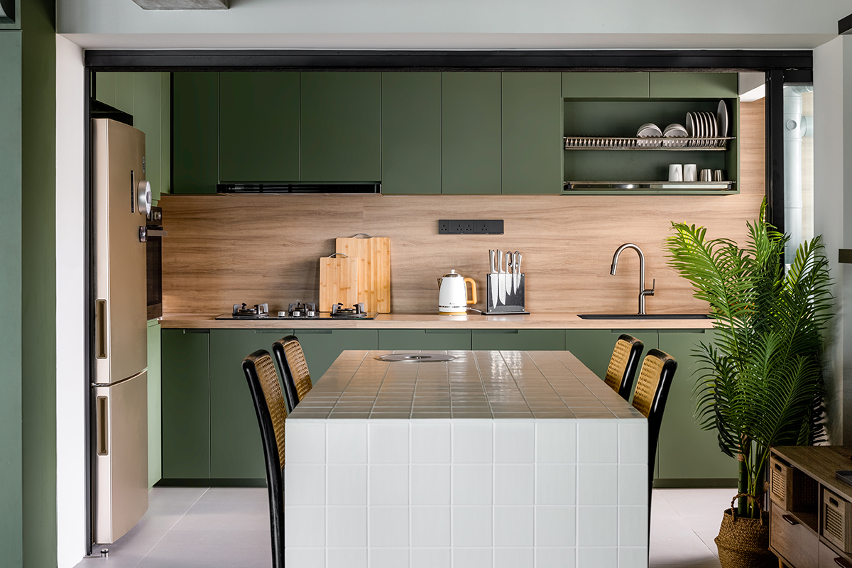
For the kitchen, the decision was made to remove the service yard to elongate the space. As the rectangular layout of the expanded kitchen is too narrow, an island was created right outside the threshold. The feature is a versatile workhorse that provides extra countertop space for cooking, casual dining and even working.
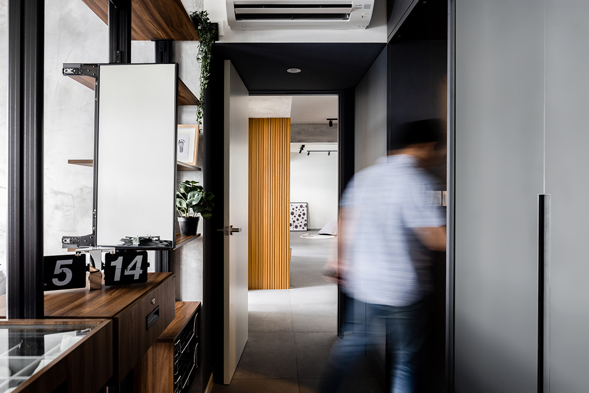
After converting one of the common bedrooms into the new living area, the remaining common bedroom was kept for the couple’s new-born son. The footprint of this bedroom has been reduced to expand the adjacent master bedroom, creating more space by the entrance to accommodate an extra wardrobe.
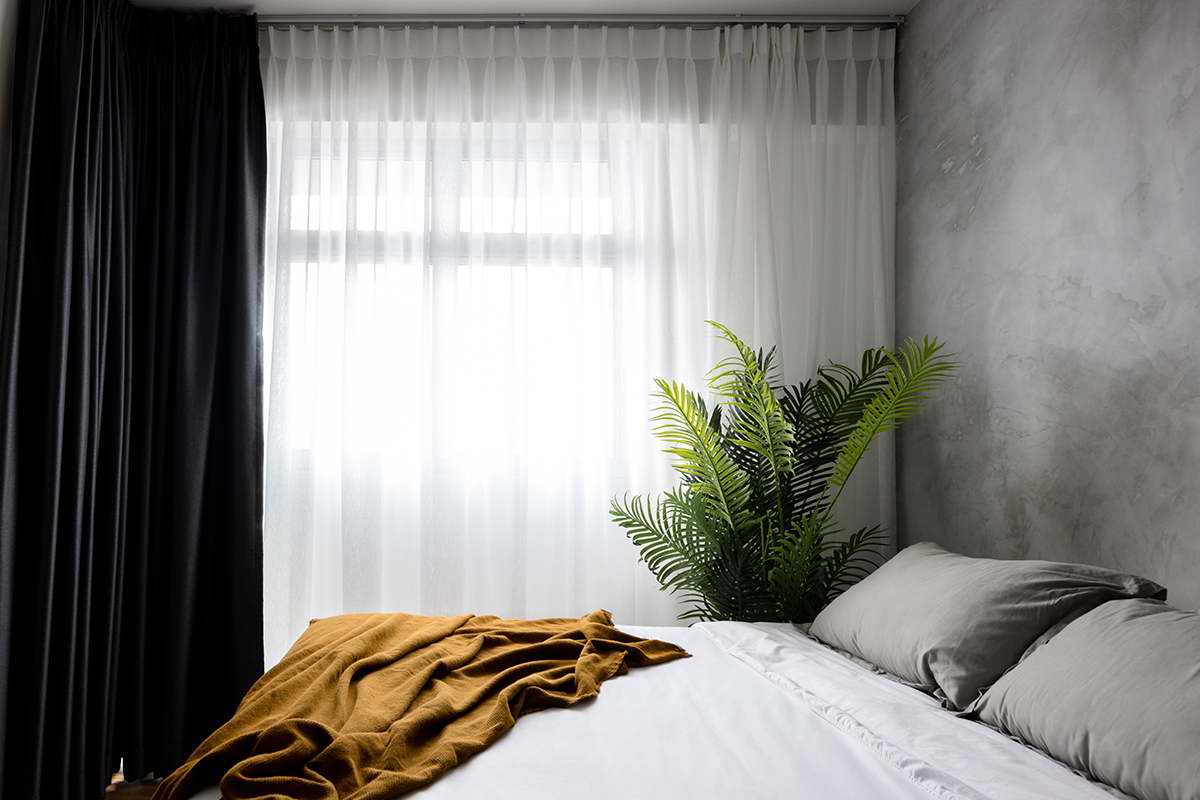
The master bedroom, which sits at the west end of the apartment, shares the same visual divide as the rest of the home. The same large format grey tiles of the transitional areas outside line the wardrobe zone, whilst the area for sleep sports wood-toned vinyl flooring. A pole system wardrobe was also installed between the two spaces for more storage space. The resulting effect is a clearly segmented zone for rest and even creates an illusion of a walk-in wardrobe in the bedroom.
The renovation, which began at the start of 2021, took around four months to complete. The family moved into their new home in May.
This post was adapted from an article originally published in the February 2022 issue of SquareRooms.


