Some of the most common adjectives homeowners use to describe their ideal home are “elegant” or “sophisticated”. The reason is clear—an elegantly designed home is universally appealing. While elegance was no doubt a requirement in their book, the owners of this resale condominium apartment in Flora Drive were not averse to having a spot of fun in the redesign of their home.

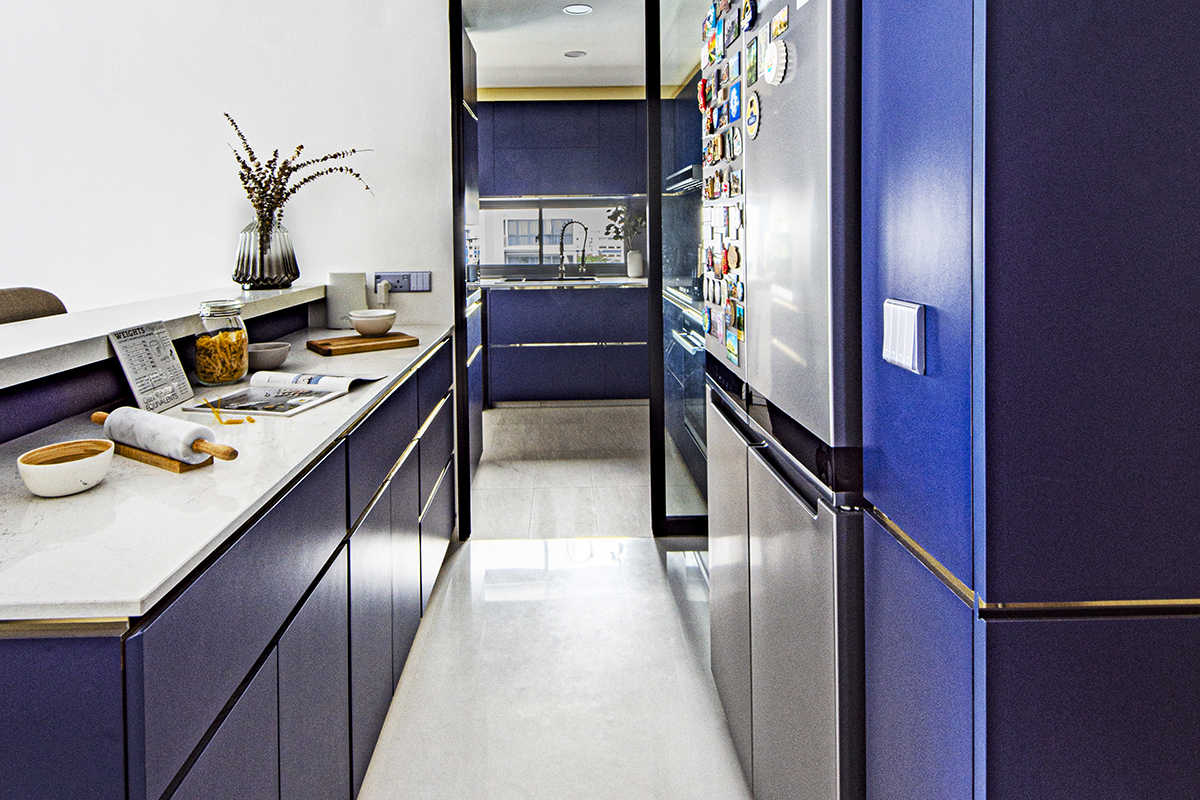
Like many, the owners favoured a light-toned, neutral palette for their interiors, anchored by marble- inspired textures for that coveted touch of class. For their kitchen, on the other hand, they expressed an interest in using a bold statement blue to the designers at DISTINCTidENTITY, who they hired for the renovation of their 1,485 sq ft home. “Though the owners wanted to achieve a grown-up aesthetic in their first marital home, they also wanted to inject a tasteful dose of fun at the same time,” said a design executive from the team. They supported the owners’ bold choice and designed cabinets finished in a striking cobalt blue in both the wet and dry kitchens.
The peninsula countertop in the dry kitchen, a pre-existing feature built by the condominium developer, was made more functional by turning it into a bar counter on the front face. Now it serves not only as storage for utensils and kitchen appliances, it also acts as a countertop for casual dining on the other side. Metallic accents were added along the edges of the kitchen cabinetry to give them just the right amount of sheen and became a recurring design element all around the house.

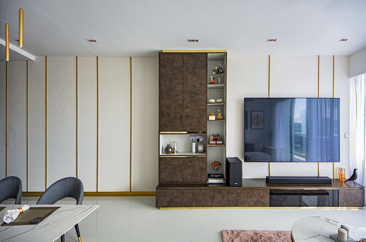
Since the owners found no present need for lots of storage space for their still small family of three, they chose to only build a TV console and an adjacent cabinet in the living area. For visual interest, the designers covered the rest of this TV wall in a cream wallpaper interspersed with vertical brass dividers, which contrast nicely with the bronze cabinetry.
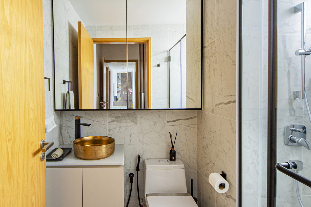
The other spaces in the apartment that needed an overhaul were the bathrooms, originally moody from the dark stone-effect tiles and wooden cabinetry, which the owners disliked. For the redesign, the team clad the bathroom walls with white marble-look tiles and soft-grey marble-patterned tiles for the floor. The same light and dark contrasting effect from the living room is replicated here, with the sleek, black sanitary fittings standing out from the light-coloured backdrop. The same metallic accents can be found here as well, incorporated in the form of a brass washbasin and matching lighting fixtures.

A slightly duskier palette was reserved for the master bedroom. To create a restful atmosphere, the original parquet flooring was retained and a functional integrated headboard and nightstand with a wood-look finish were built.
The family moved into their refurbished home this January after a 10-week-long renovation. Elegance, as this house proves, can be made inimitable by the people who fashion it.
This post was adapted from an article originally published in the November 2020 issue of SquareRooms.


