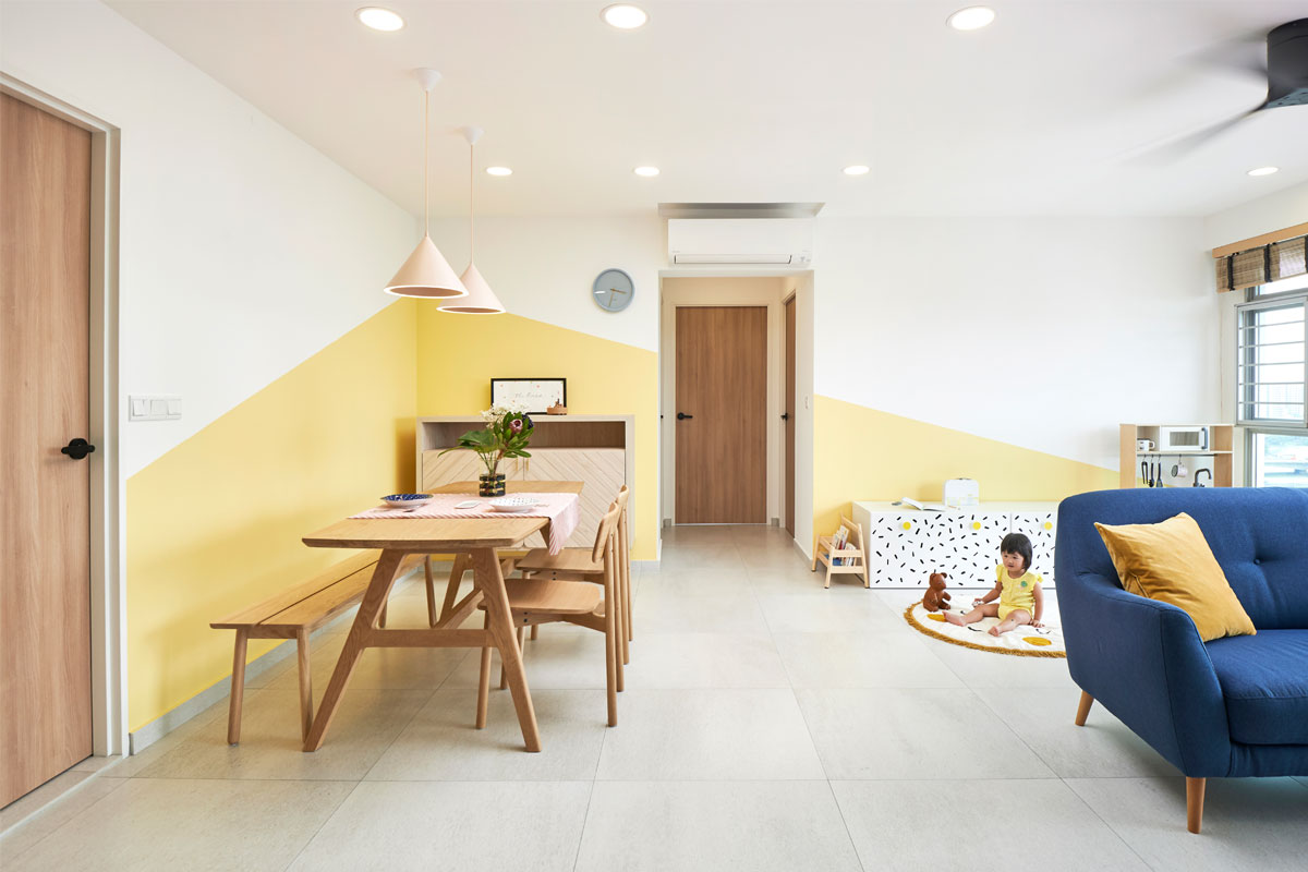
Bright and joyful, the colours in this unit are probably the first things you would notice in this unit. They were part of the couple’s brief to Studio FortyFour as they discussed their plans for their first home. “The owners actually like a few industrial touches and colours. Yellow is their favourite. So, we used painted yellow walls to connect the living, dining and play space,” says Wilson Teng, the creative director of the design studio.

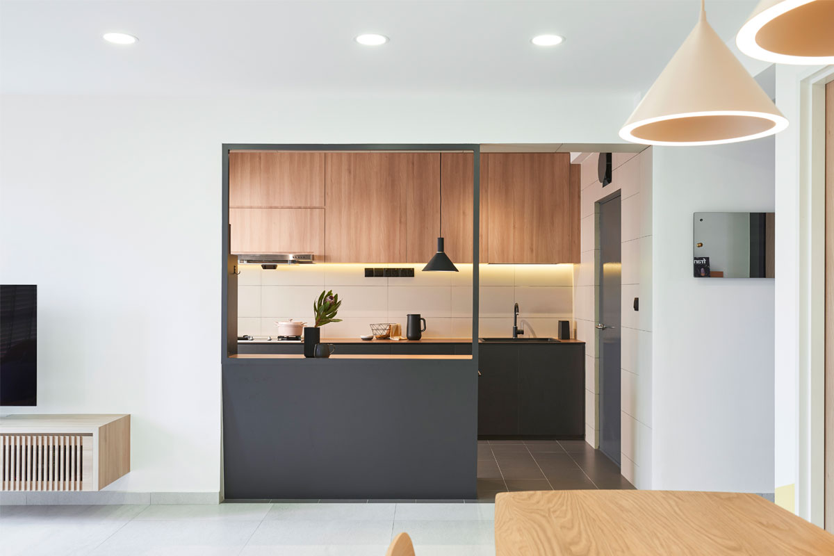
The play area is also one of the couple’s requirements so that they could keep their toddler within sight from different areas of the home. They’ve decided to locate it in the living area. Wilson also considered every aspect of the space carefully during the two-month design stage. For one, he designed a counter at the kitchen entrance. This counter serves to provide ample countertop space for food prep and also storage needs while ensuring that there is visual access to the play area from the kitchen. Here, wood and dark grey make a warm and welcoming combination.

Other finishes seen in the home include grey marble tiles and concrete-like floor tiles. The couple also participated in the design process with Wilson’s guidance. They picked out furniture with soft, rounded lines and compact dimensions. As a result, the home appears spacious and open. The concept ties in with the merits of the original space. The unit faces Sengkang Riverside Park and also comes with a balcony, so it enjoys an abundance of natural lighting.

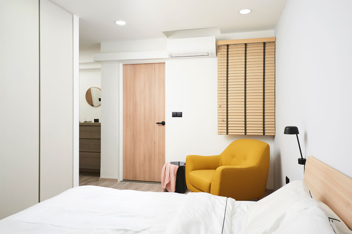
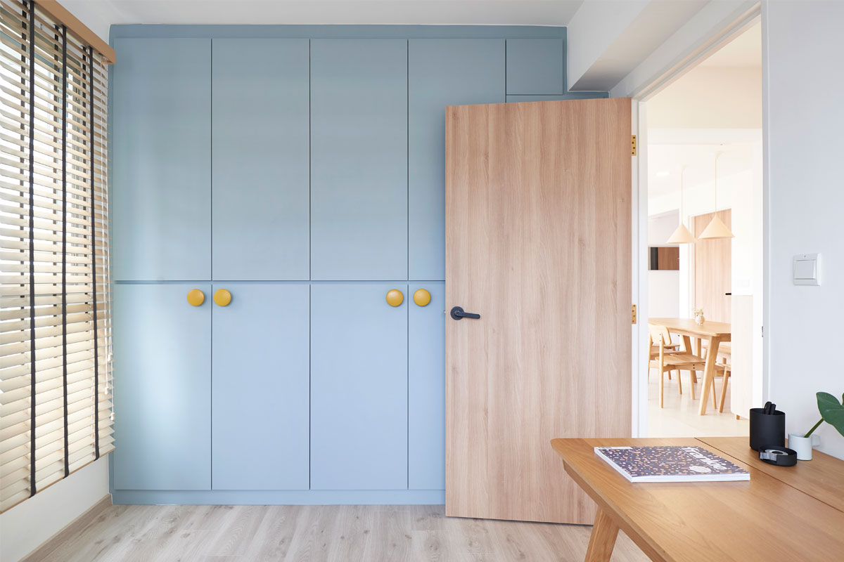
Wilson also looked for ways to enhance the sense of space, removing the wall between the master bedroom and an adjacent bedroom. This allowed him to fit the wardrobe without it taking up too much space in the master bedroom. At the same time, the wardrobe functions as a partition or wall between the two bedrooms. The master bedroom adopts a light palette, which contrasts with the master bathroom decked out in dark hues.

Getting the wall tiles right was a significant challenge for the team. “It is a test of the tiler’s skills as the width of the chevron tiles are slightly longer than the bottom tiles. The tiler had to cut every single piece to connect the grout lines of the bottom tiles,” Wilson explains. As with the rest of the house, each detail has been impeccably addressed to create a harmonious home.
This was adapted from an article originally written by Rossara Jamil published in the September 2018 issue of SquareRooms. Photo credits: Studio FortyFour


