Practicality does not always equate to a predictable floor plan or even cookie-cutter material pairings. At least not to Bean Buro, the design team commissioned to work on a complete overhaul of this apartment situated in Mid-Levels, Hong Kong. Located in an affluent and hilly district receiving breathtaking views of the city, this sumptuously appointed dwelling of almost 2,000sq ft is home to a married couple, their two children and a pet bulldog.
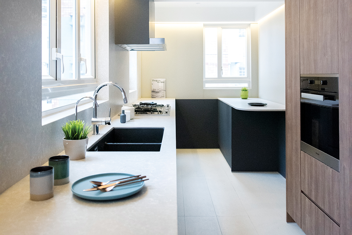
During the design conceptualisation stage, the homeowners were expecting their second child. And like most urban professionals in bustling Hong Kong, the couple leads a hectic lifestyle juggling work, play and family. It was clear to co-founding Design Directors Kenny Kinugasa-Tsui and Lorène Faure that the homeowners needed flexibility in this home to strike a fine balance between their professional and personal lives.
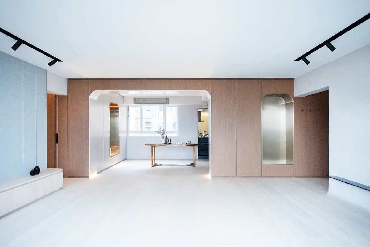
Interestingly, the design team derived inspiration from the theatre to work out a design brief that caters to the family’s lifestyle needs. It actually stems from the female homeowner’s preference to unwind at home and the team’s idea to “open different portals to different worlds, akin to a theatre set,” all in the comfort of home.
The physical boundaries of space in the apartment became challenged as the team sought to create a “dreamer’s landscape in an architectural sense.” Lorène says: “Inspired by the idea of a theatre set, we created a continuous timber wall across the entire apartment with metal portals that open up into the different internal worlds of each room. It also creates a prominent backdrop for the lounge and dining spaces.”
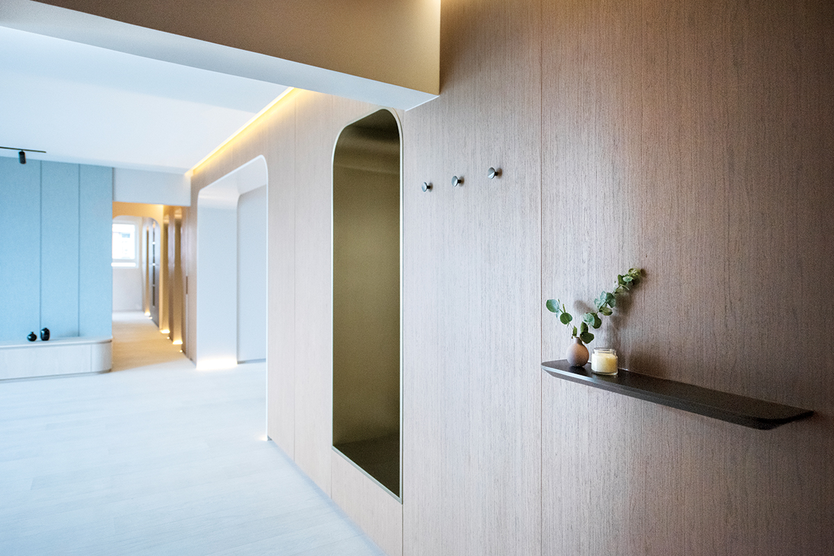
This solid timber installation now stands out as a defining design element of the home. A bold-looking point of connection between the communal zones and private areas of the apartment, it doubles as a high-density storage unit with concealed LED strip lighting. The wood surface contrasts sharply with the recessed details decked in decorative stainless steel and a striking bronze finish. The high-drama material pairing presents a polished aesthetic and is family-friendly with its seamless curved details.
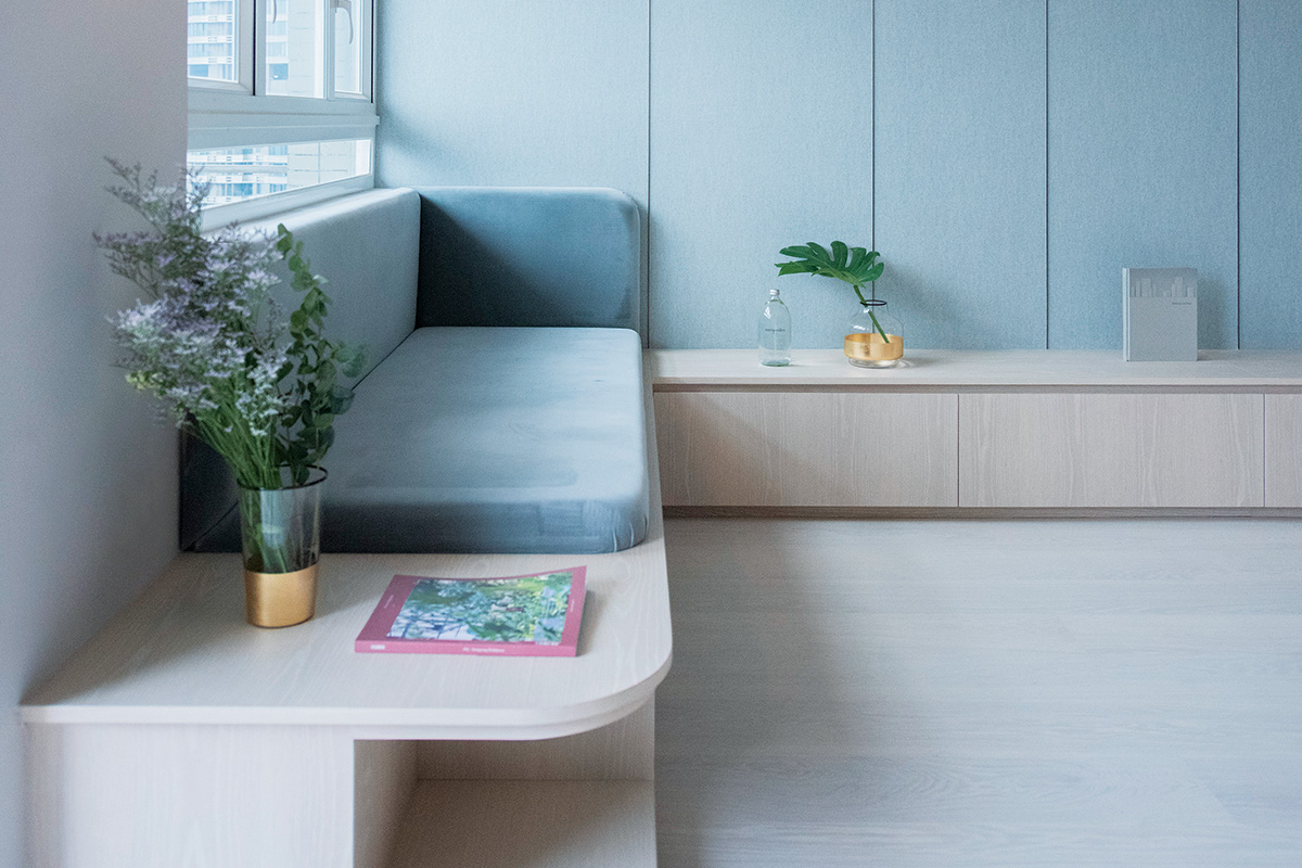
Positioning both the living and dining zones within the same landscape for a fluid setting, these two areas continue the curvy design language evident in the custom-built fixtures and archways. An L-shaped TV console integrated with a settee has rounded corners and offers generous storage and additional plush seating. This falls in line with the homeowners’ tendency to host large family gatherings.
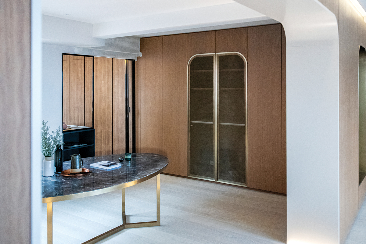
The same goes for the dining space which is outfitted with a spacious dining table. The design team factored in more room here so that it can accommodate up to eight family members. The thoughtful open-plan layout also allows the homeowners and their guests to mingle in a carefree manner while shuffling from the dining to the living zone.
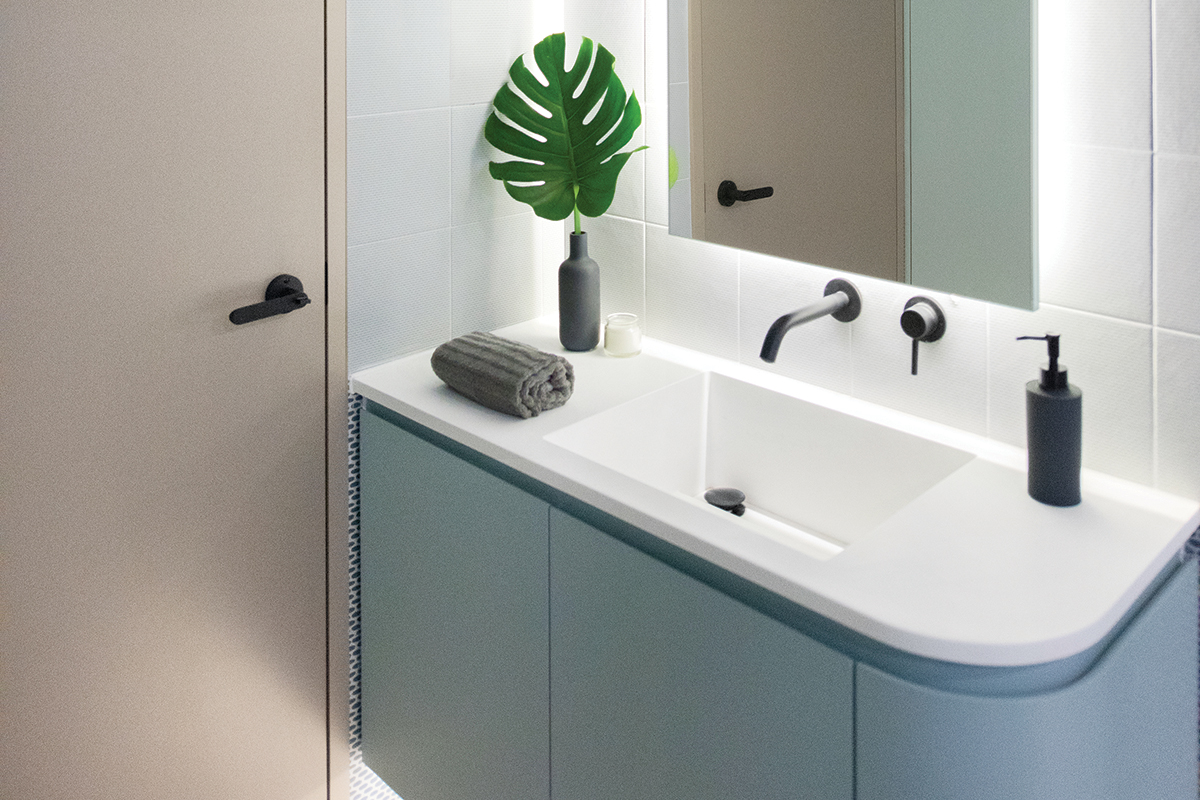 Along the corridor towards the private spaces, hidden storage has been installed on both sides of the walkway rather than in the confines of the bedrooms. This storage arrangement may seem unconventional, but it is used as the walk-in wardrobe which frames the boundary walls of the master bedroom and bathroom.
This post was adapted from an article originally published in the June 2021 issue of SquareRooms.


