This entertainer’s paradise is dripping with ideas fit for Pinterest!
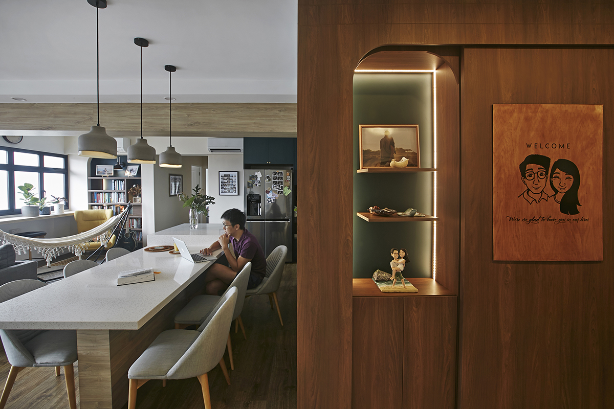
As keen entertainers, the newlyweds of this home wanted their flat to have an unconventionally spacious layout with correlated spaces that would allow them to interact with guests no matter where they are, or what they were doing, shares designer Joey Khew of Fuse Concept. The clients also wanted to veer away from the popular but safe combination of white and wood tones, requesting to inject their abode with pops of colour instead.
For the designer who describes himself as an “enthusiastic avant-garde” who loves exploring different design concepts and materials, having clients who were willing to take style risks was an ideal match. Joey took the opportunity to infuse interesting moments all through the house so that wherever you look, there’s always something that intrigues and excites.
Upon entering the flat, instead of being greeted by a bomb shelter, you’ll see a softly lit, arched display cabinet wrapped in warm woodgrain. Ahead, the now capacious hall was the result of tearing down walls between the living room and the kitchen.
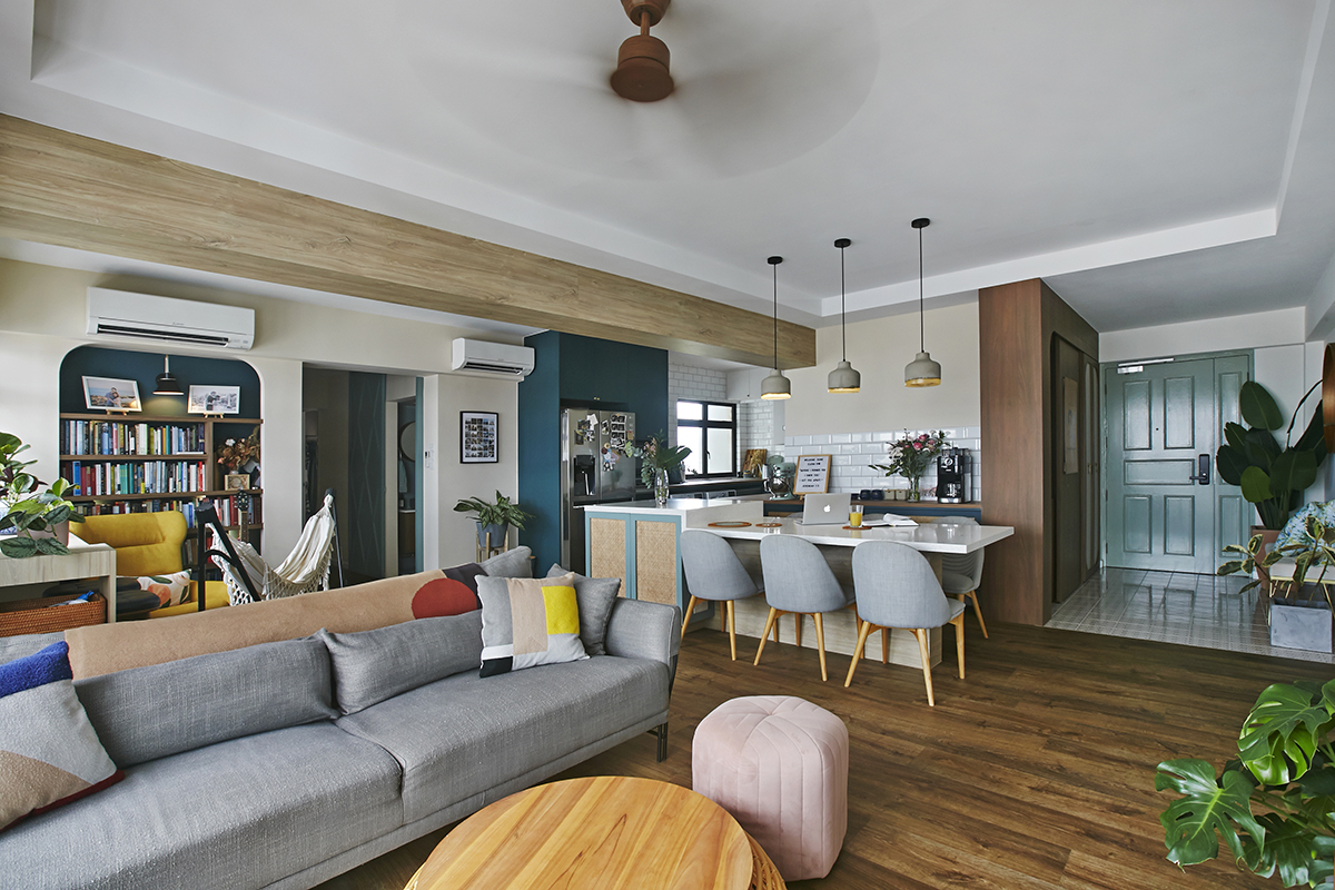
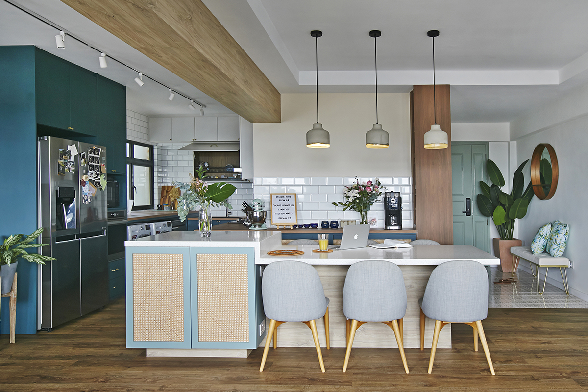
Using astute furniture placement and custom designs, Joey instituted separate zones within this space to serve different needs while maintaining a sense of openness. At the intersection of the three main areas, a generously sized kitchen island doubles up as a dining spot that can sit up to 10 for large gatherings.
Towards the back of the living room, the designer created a focal point with an arched bookcase, picking a teal hue for this accent and a cream shade for the surrounding walls to give the gathering spot a “rather warm and bohemian vibe.” With window seating for enjoying the view, a hammock and a high-back chair, this relaxing corner can’t get any cosier.
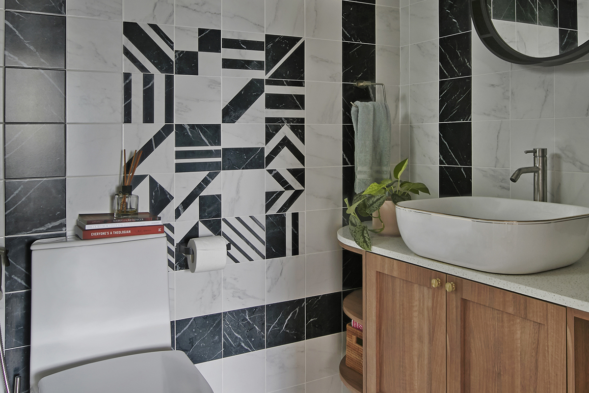
Venture further into the house and you’ll notice the creative touches in the communal area extends to the more private spaces as well. The main bathroom is a particular showstopper, with contrasting tiles used to create interesting patterns and frame the custom cabinetry.
Meanwhile, the main bedroom is understandably more subdued, with soft tones providing a soothing effect. To create a comfortable walk-in closet, the designer eked out a bit more space by tearing down a wall to an adjoining bedroom. He also put up a cane and fluted glass divider to provide privacy while letting in light.
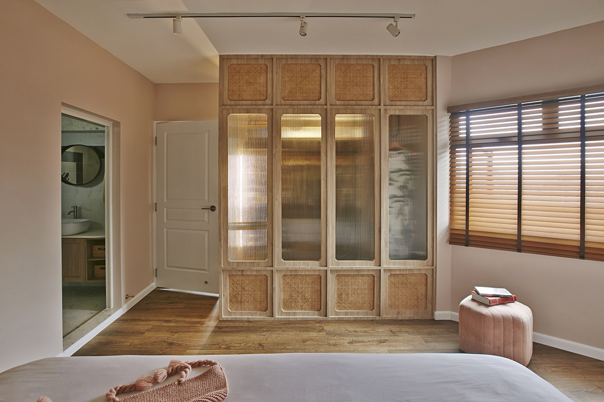
This divider is one of Joey’s favourite features in the flat and a hit with his clients too. “It’s so beautiful and we love waking up to it in the morning,” the couple tells us. With multiple chic scenes like this throughout the apartment, it’s no wonder that the homeowners and their guests are enamoured with this dreamy dwelling.
This post was adapted from an article originally published in the April 2021 issue of SquareRooms.


