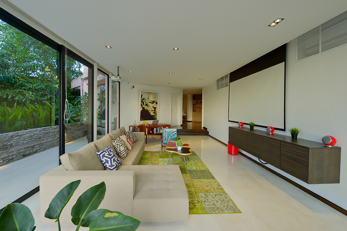
When we think of simple interiors, we picture monochromatic colour schemes and Scandinavian design. Eclectic homes don’t usually come to mind, and yet this landed property shows that sometimes simplicity is not about a lack of decor and all-white aesthetics, instead highlighting spaciousness through a soothing mix of styles and a spotlight on nature.

Undertaking a complete overhaul of the space, the team behind Richfield Integrated gave this home a new lease on life by replacing old floors, walls, doors, windows and even ceilings. Led by Design Manager Veronica Laborte, the team’s priority was to bring the outdoors in, resulting in a host of full-height windows and clear sliding doors, as well as white walls and ceilings to help reflect as much natural light as possible.
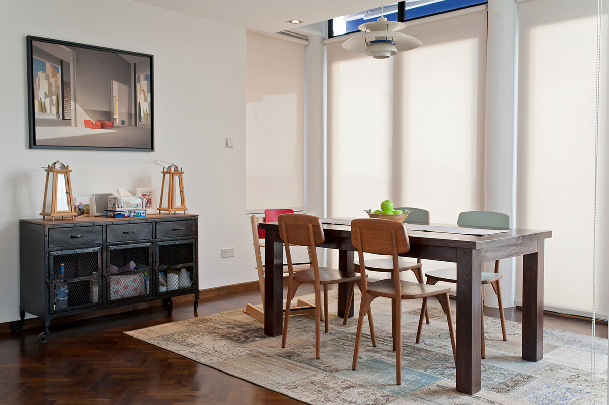
On top of visually brightening the home, the sliding glass doors ease movement between the indoors and outdoors, replacing clear walls that could not be opened beforehand. This establishes a certain connectivity between the living areas and the balcony, making the large space feel cosier and the homeowners less detached from the nature that surrounds them. Custom-made wooden millworks and parquet flooring round off this sense of warmth and familiarity throughout the home, the result being a much more welcoming environment that encourages family gatherings. The homeowners’ favourite room? A spacious living area, bathed in natural light from sunrise to sunset.

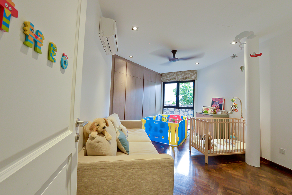
In order for this family of four to feel at home in their new space, the designers incorporated much of their favourite furniture into the updated design. New pieces were then sourced from vintage shops around the country to match the homeowners’ retro aesthetic, while comfy rugs that reflect the outdoors help to break up the monotony of parquet flooring. Similarly, the family’s beloved artwork collection was put at the heart of the renovation with the designers installing directional lights all over the house to spotlight selected paintings and the plain walls helping the artworks to stand out even further. In the kids’ room, the white walls and minimalist design allow the children to complete the space with their own personalities and styles years down the line, functioning like a blank canvas.

While much of this home was renovated from top to bottom, some of its original anatomy still remains. A few structural columns could not be removed and were instead cleverly incorporated into the final look. In the study, for instance, a custom-built desk seamlessly circumnavigates one of the large columns, helping it camouflage as part of the design. Thanks to these visual tricks and a skilful balancing of styles, the various elements of this space don’t disrupt the peaceful ambience of the home, retaining the nature-infused simplicity that this family loves.
This post was adapted from an article originally published in the August 2020 issue of SquareRooms.


