Contoured details in this HDB unit do more than lend visual interest; these exciting forms add dimension and an airy disposition to the space.
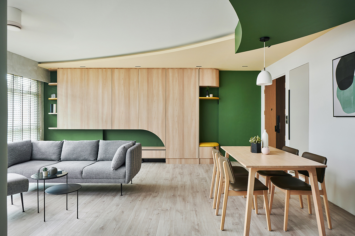
Curved design forms look absolutely freeing and edgy, but these shapely accents can be difficult to execute. Just ask interior designer Ruth Ponnie Tan from UNTITLED (part of EightyTwo), who conceptualised and helmed the renovation for this 1,200sq ft unit brimming with curves and colour. She explains more on the main design brief: “The homeowners wanted a spacious and modern-looking home with lots of storage. They are open to colours, especially mustard tones which are their favourite, and they gave us a lot of freedom to be creative with the concept.”
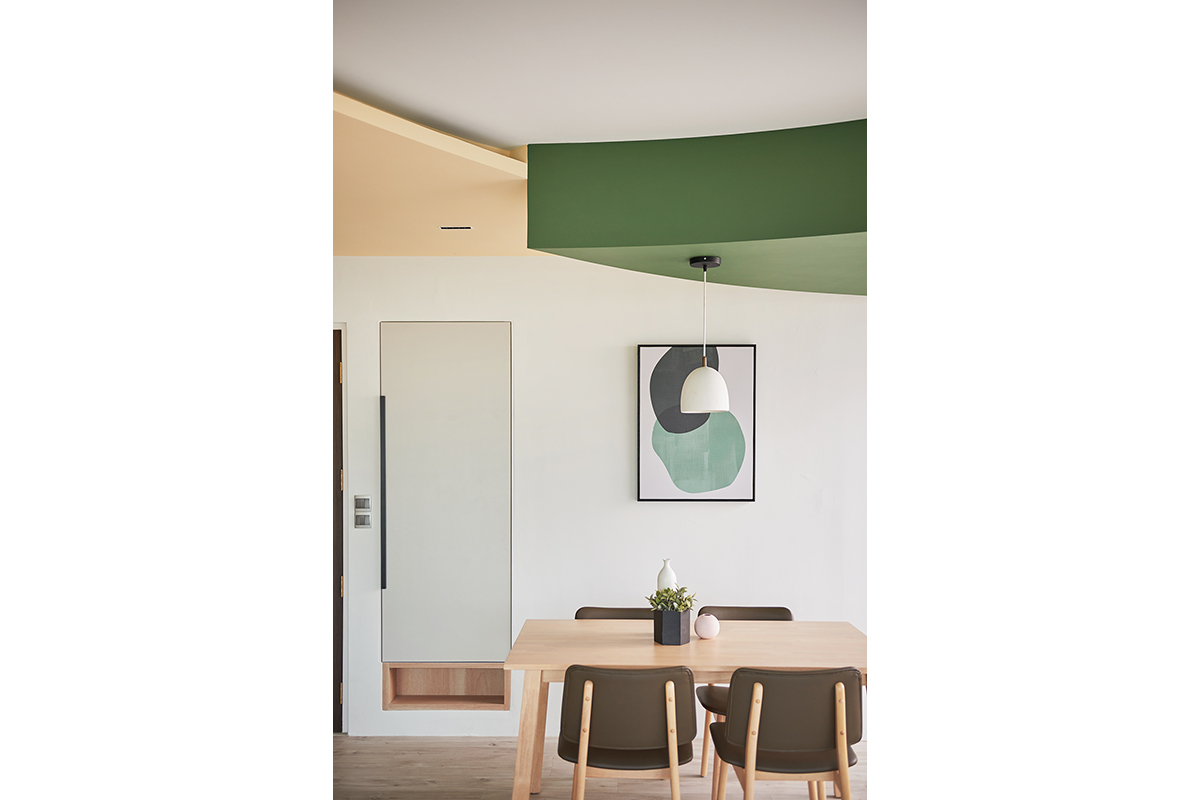
Through her creative intervention, layers of colours and contours come to life in the flat. She recalled a particularly challenging part of the renovation which involved installing the curved ceiling. She reveals: “The dual-toned and double-layered curved ceiling feature was hard to achieve, as the size and curve had to be proportionate to the rest of the room.” To make sure all dimensions were in order, she had to manually draw the shape of the partition on the floor before it was cut and put up on-site.
Her dedication to detail did not disappoint, with the installation materialising into a spectacular centrepiece for the shared living and dining zones. Beyond the curves in brilliant green and yellow hues, the feature forms a smooth visual connection between the kitchen and the other communal zones. She explains: “An existing beam along the kitchen divided the rooms, and I wanted the communal area to be an extension of the kitchen. The ceiling design helps with the extension of the beam into the living space, and the dual colours create contrast and offer depth to the design.”
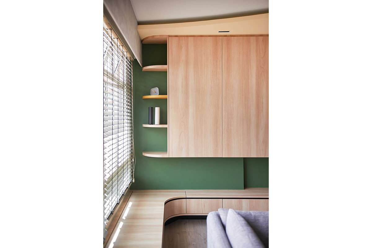
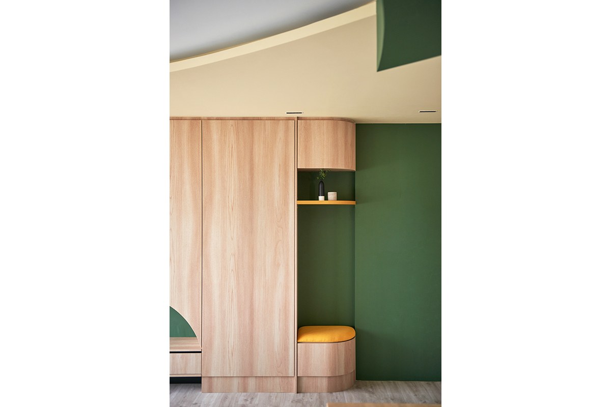
More curves are introduced in the communal area through a sprawling multi-functional fixture that outlines most of the living area. Making up part of the fixture is hanging cabinetry that runs the length of the wall nearest to the front entrance. These storage compartments for shoes are complemented by an elongated settee that extends across the windows. Ruth says: “The homeowners do a lot of hosting, so I wanted to give them more seating and storage space. This makes a good multi-functional solution which they greatly appreciate.”
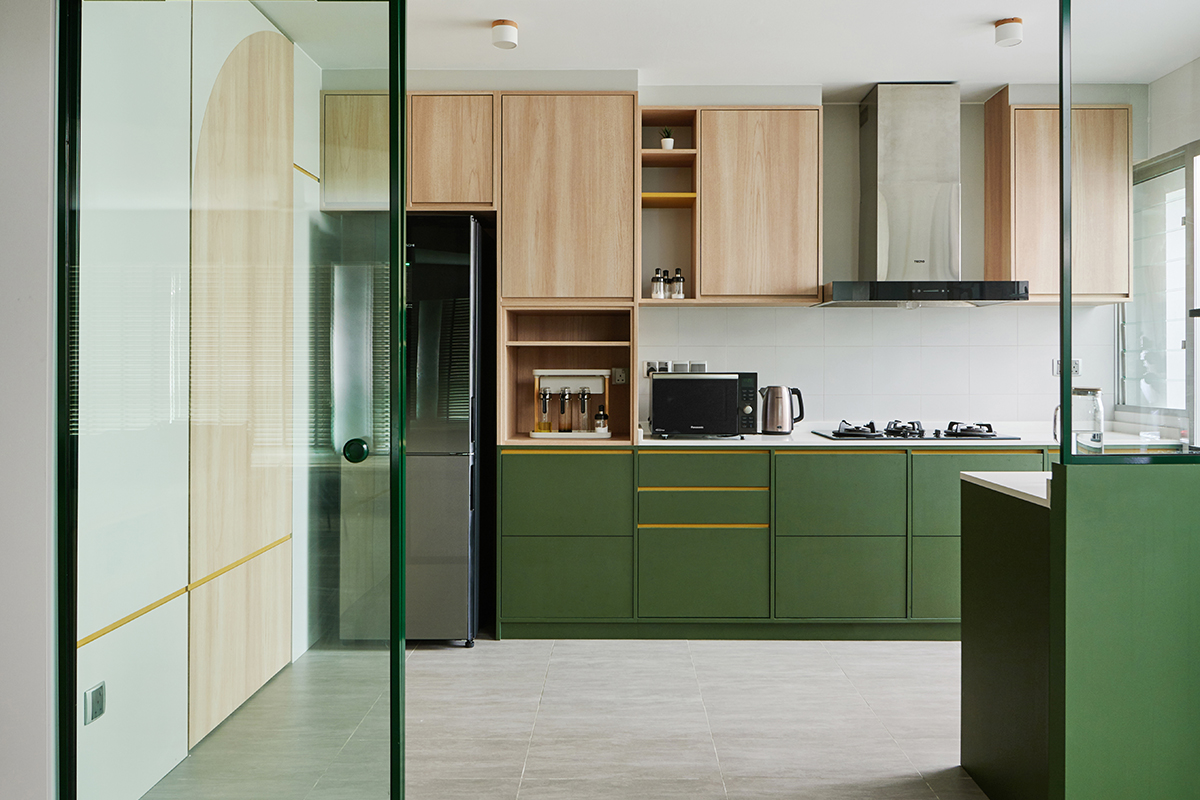
In the kitchen, glass and powder-coated aluminium door frames bring light and an airy disposition into its semi-open confines. This space used to have a half-height wall, but Ruth had it hacked away to make room for the sliding doors. With the doors pulled open, the kitchen becomes a seamless extension of the communal zones and creates a guest-friendly setup.
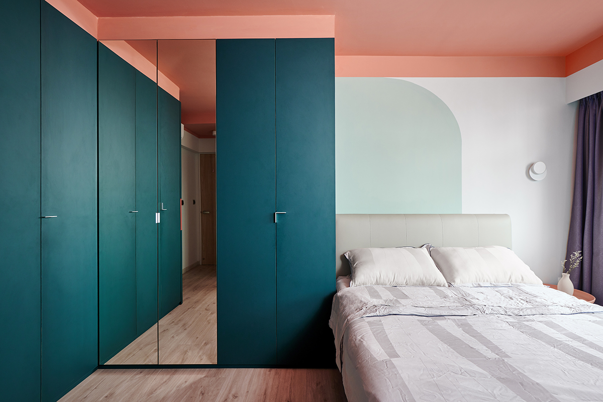
Upholding the uniformity of curved aesthetics in the master bedroom are the painted wall feature and L-shaped wardrobe. The homeowners had a specific colour request for their wardrobe so from there, Ruth needed to select paint tones for the ceiling and the wall behind the headboard to complement their chosen wardrobe hue. The result is a vivid combination of soothing tones in a mid-tone blue accented by a striking blush-hued ceiling and other dreamy neutrals.
This post was adapted from an article originally published in the July 2021 issue of SquareRooms.


