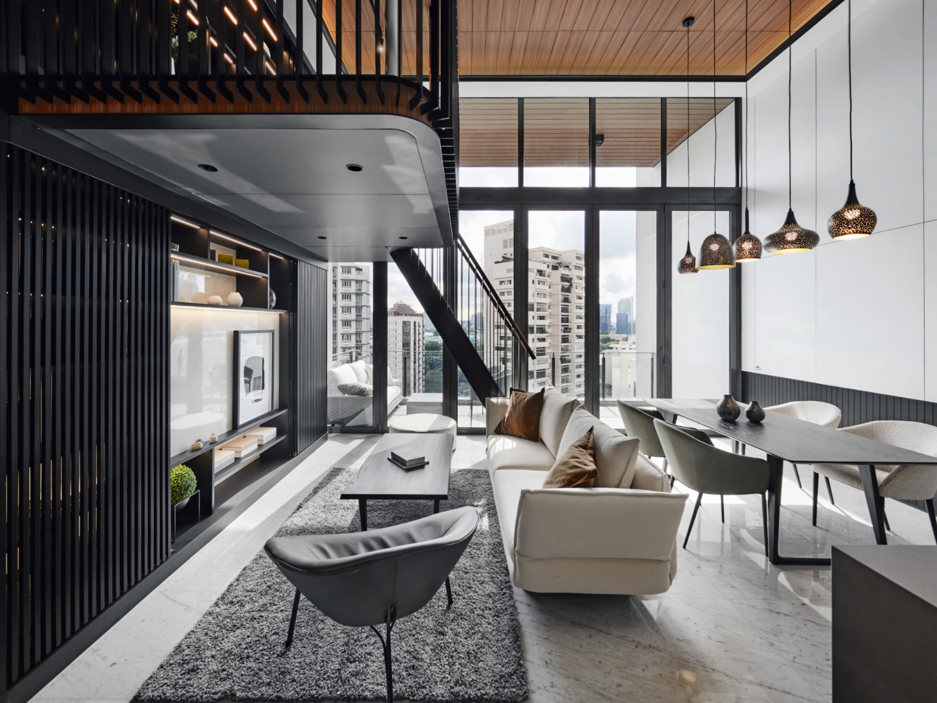
This penthouse incorporates gorgeous architectural features and a classic palette, as well as mezzanine floors to maximise its high ceilings.
It has often been said that first impressions are important. This home makes an impact as soon as you step in, mesmerising guests with its black-and-white palette and extraordinary design features, such as the gorgeous mezzanine that sits as the centrepiece of the living room, architecturally marvellous and fully functional.
One of the homeowners’ main concerns was the lack of space in the unit; while the penthouse spans a rather generous 1,200 square feet, the individual rooms are relatively small. When they briefed the team at akiHAUS, they stressed their requirement to create more room for their family’s needs.
Lead designer Lawrence Puah envisioned this mezzanine floor as a clever way to fulfil their request, as well as to ensure the house-proud owners would have an awe-inspiring design to relish for years to come. A lush living area was introduced as well, conducive to hosting friends and family.
As the husband is Italian and the wife is Singaporean, their respective cultural heritage was woven into the abode. Classic mezzanine railings cater to the husband’s background, while wood finishes reflect tropical, Southeast Asian architecture.
The star of the show
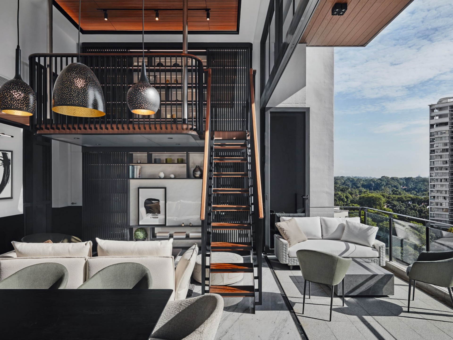
With its floating mezzanine, the living room is undoubtedly the most impressive space in this home. The designers had to work closely with an engineer during the renovation process to craft the unique structure. Incorporating the staircase was tricky too, having to ensure the final design would match the rest of the home’s luxurious appearance and not resemble a ladder.
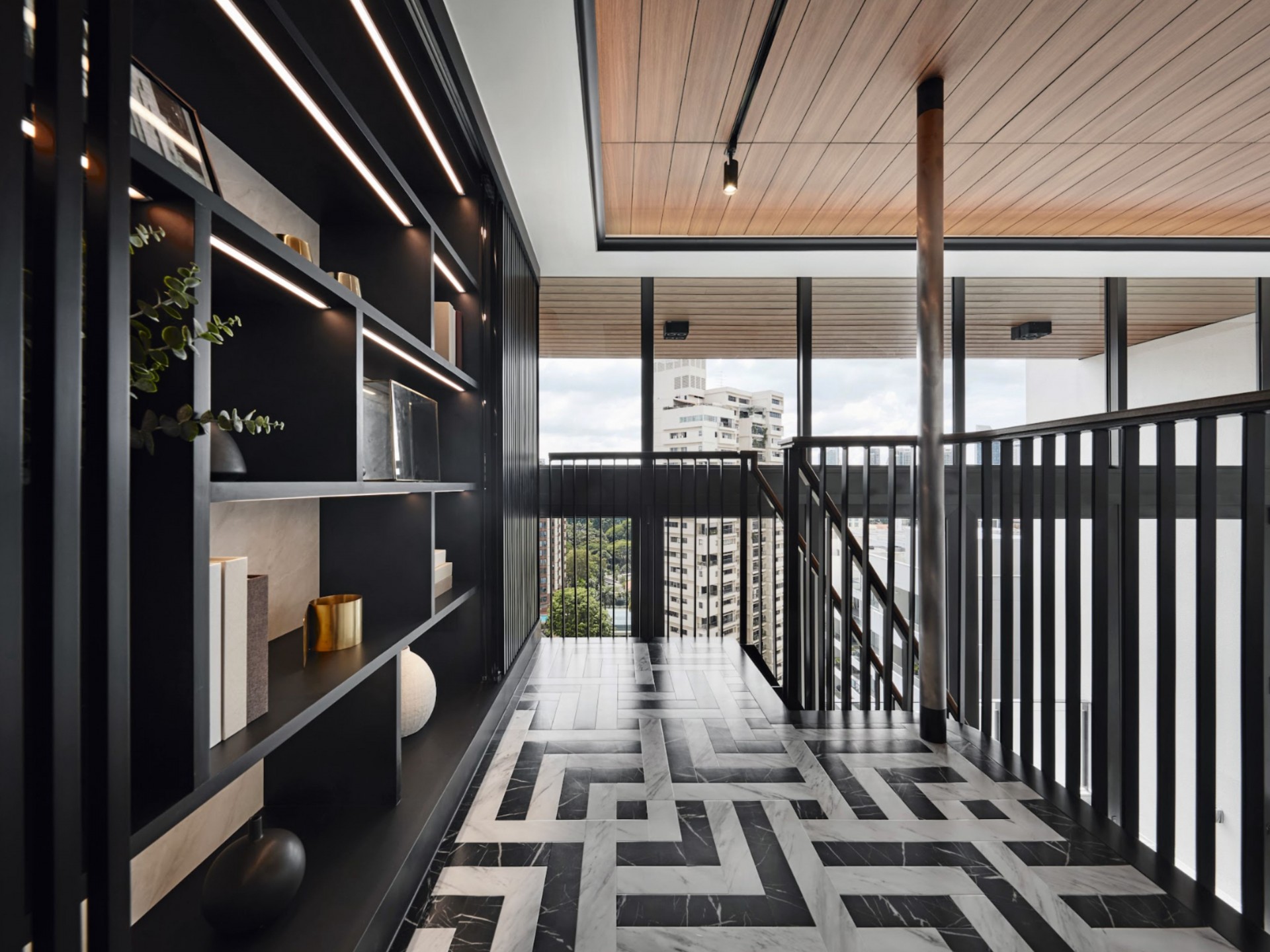
Construction difficulties aside, the floating mezzanine eliminated any bulky columns, making it easier for the family to furnish the space and keep it modular. The upper portion serves as a study area, maximising the penthouse’s high ceilings with bookshelves and artefact displays. Below, the living room can be easily reconfigured depending on the occasion.
For instance, the television can be concealed when the homeowners are entertaining so it isn’t a distraction for guests. When the couple is home alone, the screen slides open for TV time. What’s extra clever is that the timber screen is mounted on frameless glass doors—a thoughtful detail that makes it easier to keep dust out.
The balcony already had a wooden ceiling so the team installed wooden panels in the space above the mezzanine to match it. To avoid weighing down the structure, marble-look vinyl flooring was installed on the mezzanine instead of real marble, the pattern carefully chosen to complement the existing marble flooring in the living area.
Unique bedrooms
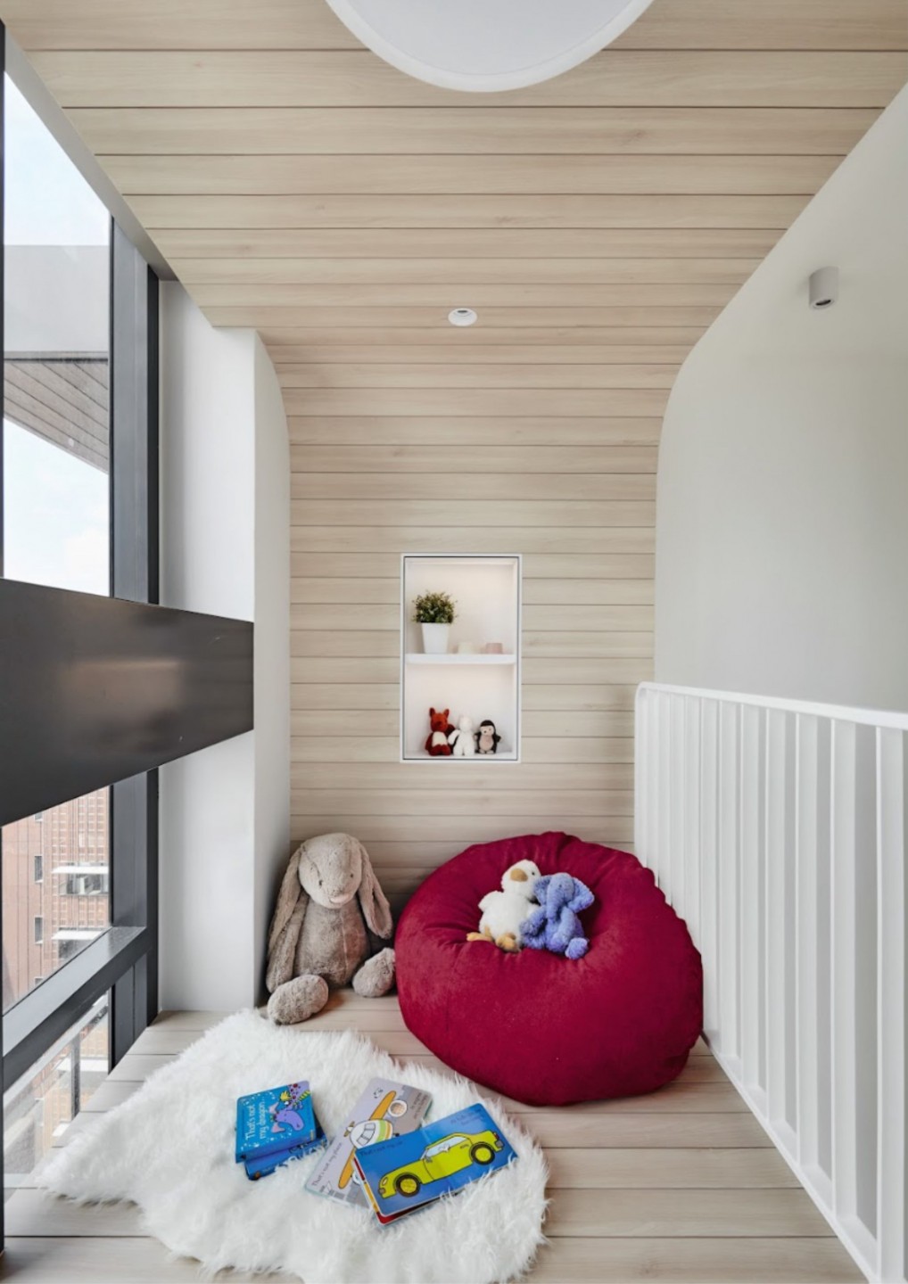
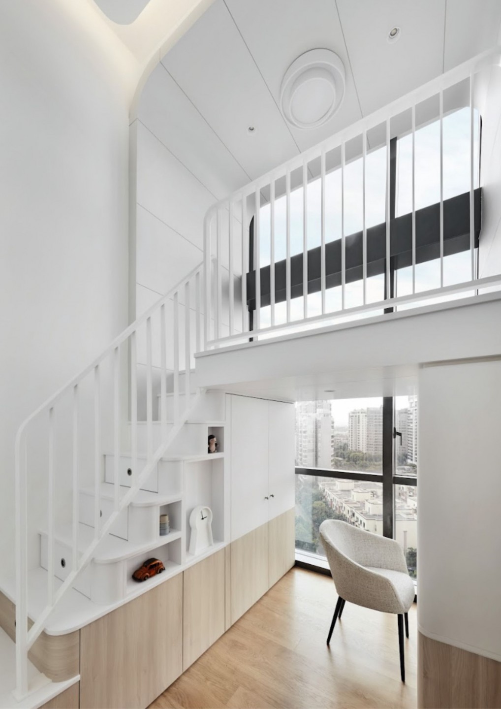
Once again making the most of the unit’s high ceilings, both of the children’s bedrooms were similarly transformed by adding mezzanines that serve as loft beds. Beyond their functionality, they add an element of fun for the little ones, making the sleeping area feel a bit like a treehouse.
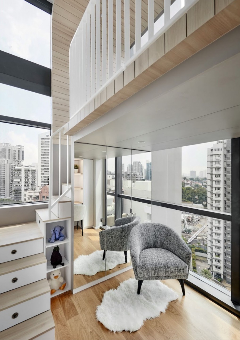
This arrangement leaves the lower level of the bedrooms as the kids’ study area, clearly demarcating spaces for rest and work. The team also created niches for the kids to display their favourite toys, with cabinets at the bottom of the stairs to keep any mess contained.
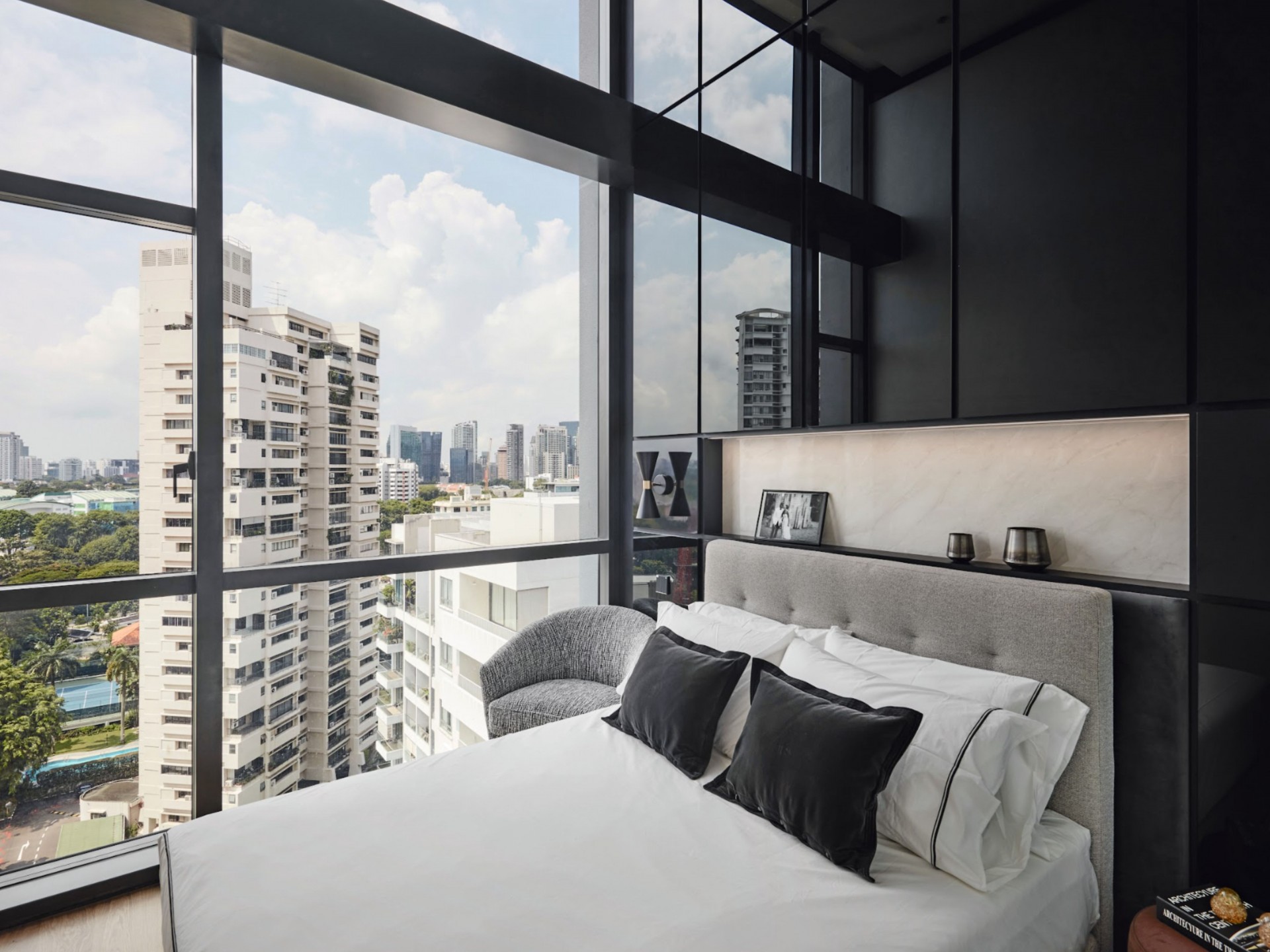
The parents’ bedroom didn’t get the mezzanine treatment, instead retaining its grandeur on a single level. A large window overlooking the city brings plenty of natural light into the compact room, while a floor-to-ceiling black glass headboard further adds to the illusion of depth and expansiveness.
Details are key
As the main bedroom is located just behind the dining room, the homeowners wanted to ensure that the entrance wouldn’t be too obvious to guests. The designers built a door flush with the entire wall so that guests will not feel uncomfortable dining right in front of the sleeping quarters.
Another door along the same wall leads to the wet kitchen, which was left untouched. The dry kitchen is located next to the living area, making it convenient to prep food and serve it straight away—an important consideration for the couple since they enjoy hosting. The original cabinets in this space were retained, with just the doors changed.
The designers also avoided using any strong colours around the home as they would be too jarring in the tight space. Instead, they opted for black and white, further adding to the home’s classic look.
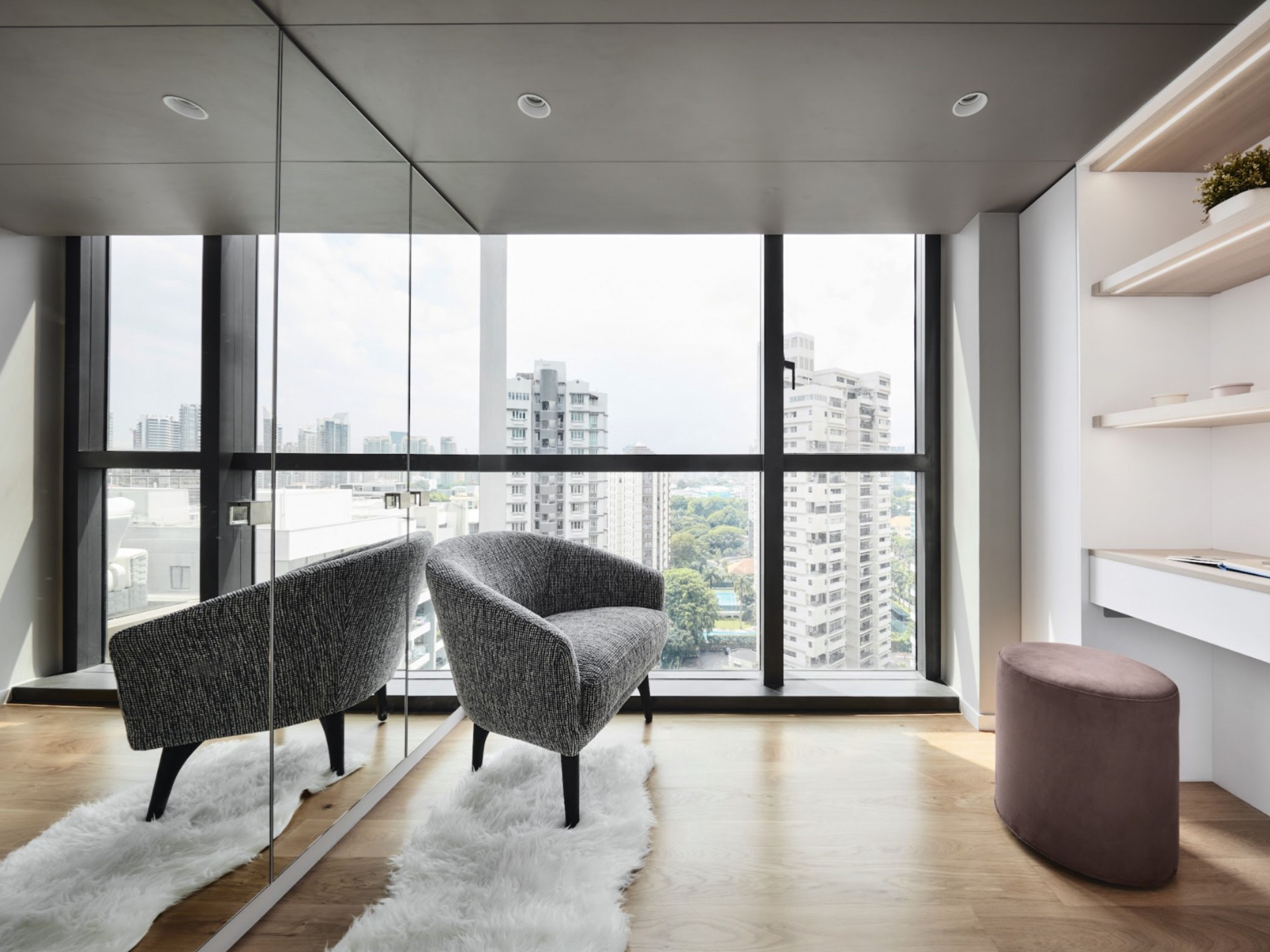
Once the construction works were completed, the penthouse was furnished almost entirely with pieces from King Living. The Australian brand is a long-standing favourite with akiHAUS designer Lawrence Puah, and a perfect fit for the timeless aesthetic of this home.
Talking furniture
akiHAUS designer Lawrence Puah shares his top furniture picks and shopping tips.
________________
What’s your go-to furniture brand?
King Living. We like their wide range of designs that makes their pieces versatile and suitable for different bespoke interiors.
What do you look out for when choosing furniture?
Finesse in the finishing and design. Little details like the form, stitching and leg profile can determine if a piece will look bulky and clumsy or light and elegant.
Name three timeless furniture pieces you never get tired of.
The 1919 Armchair from Poltrona Frau, the Barcelona Chair by Mies van der Rohe and the Zaza Sofa from King Living.
What would you avoid when choosing furniture?
Everything is designed but not everything is designed well. Design is not just what it looks like, but how it works and feels. So I look for pieces that have a good balance between form and function and will avoid furniture that looks good but is uncomfortable or vice versa.
Get the look
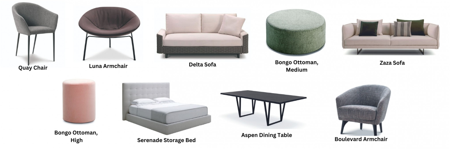
Shop the timeless King Living furniture from this elegant home for your own abode.
1. Quay Chair
2. Luna Armchair
3. Delta Sofa
4. Bongo Ottoman, Medium
5. Zaza Sofa
6. Bongo Ottoman, High
7. Serenade Storage Bed
8. Aspen Dining Table
9. Boulevard Armchair
