A quick search of the term “golden moment” on the internet will bring about this description: “a special moment you will remember for a long time”. For the owners of this 5-room apartment, their magical moment was encapsulated in the most literal and figurative sense upon the completion of their matrimonial home.
To flesh out their ideas for their dream abode, the newlyweds commissioned the help of ROOOT Studio, a local design studio that believes in carving out meaningful and unique spaces through a narrative-driven approach of intertwining storytelling with interior design.
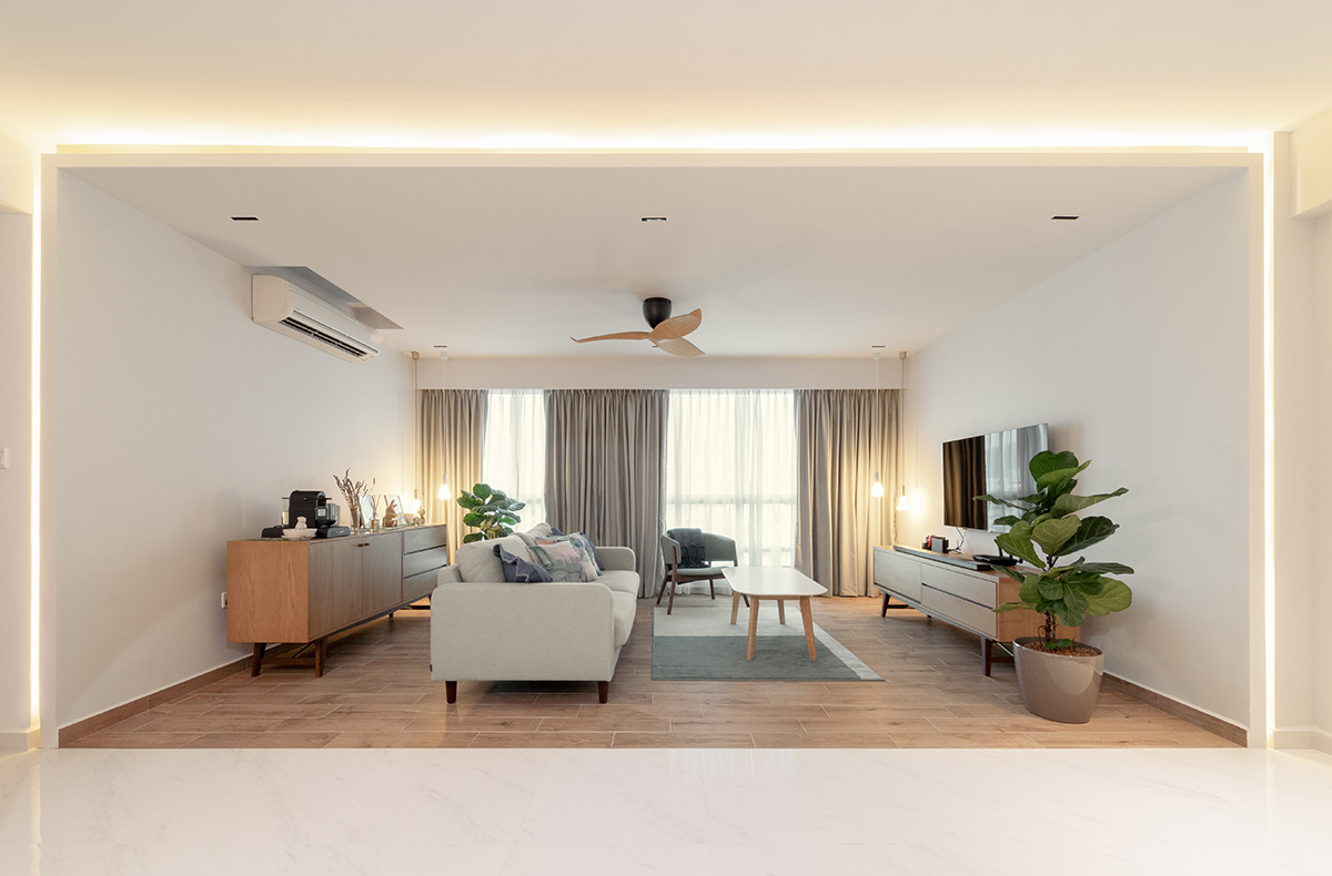
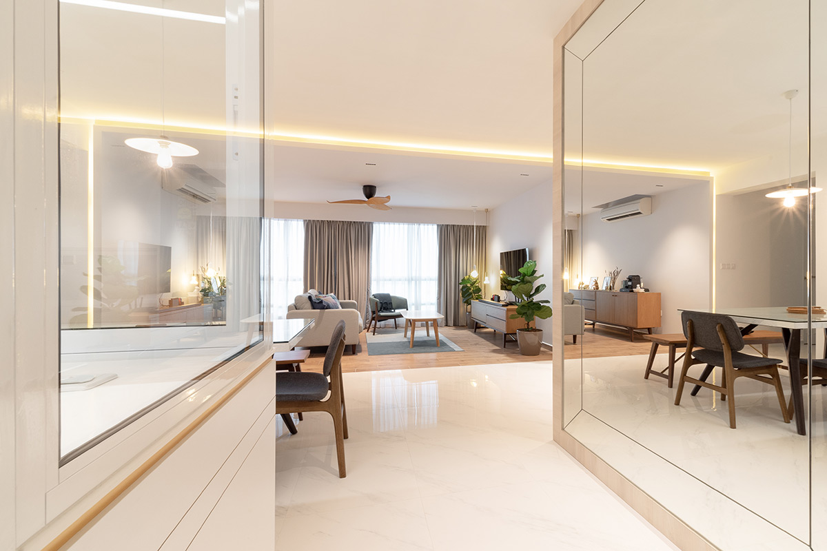
“From the start, the owners didn’t really have a specific theme they wanted to follow. Rather, as they had known each other for a long time, they wanted to celebrate the many special memories they shared, which resulted in the concept of a ‘golden moment’”, designer-in-charge Yeo Shao Jie explained. This then informed the home’s neutral design scheme that comprises a pure white backdrop accompanied with cosy wooden tones and flecks of gold accents.
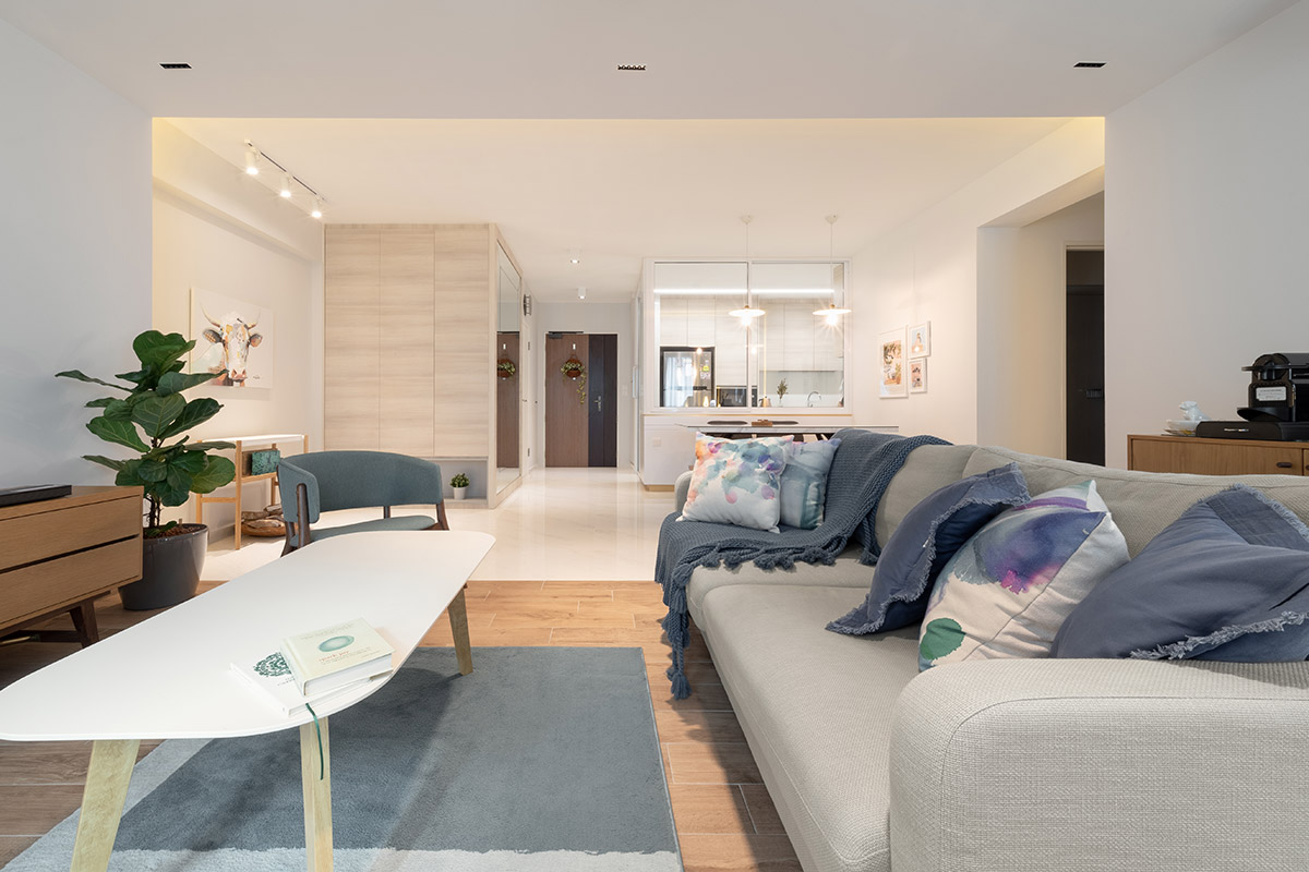
Passing the sturdy light oak door, a towering mirrored panel comes into view, which helps amplify the depth of the entryway while also reflecting light, in turn effectively casting a pleasant glow over the apartment. Further in, a difference in flooring materials segregates the living room from the rest of the communal areas – the former overlaid in wood-effect tiles while the latter in marble-lookalike tiles.
In terms of furnishings, the living area is adorned with loose Scandinavian-inspired furniture pieces from local furniture brands like Commune and Castlery, with no built-in fixtures in sight. “This was done as such to prevent the space from looking and feeling too boxy and cluttered,” explains Shao Jie. As an additional textural element, however, the design team carved out a groove line within the border of the living room”s false ceiling, and fitted warm cove lighting within. By doing so, when the cove lights are switched on, the space is highlighted and framed by a warm glow.
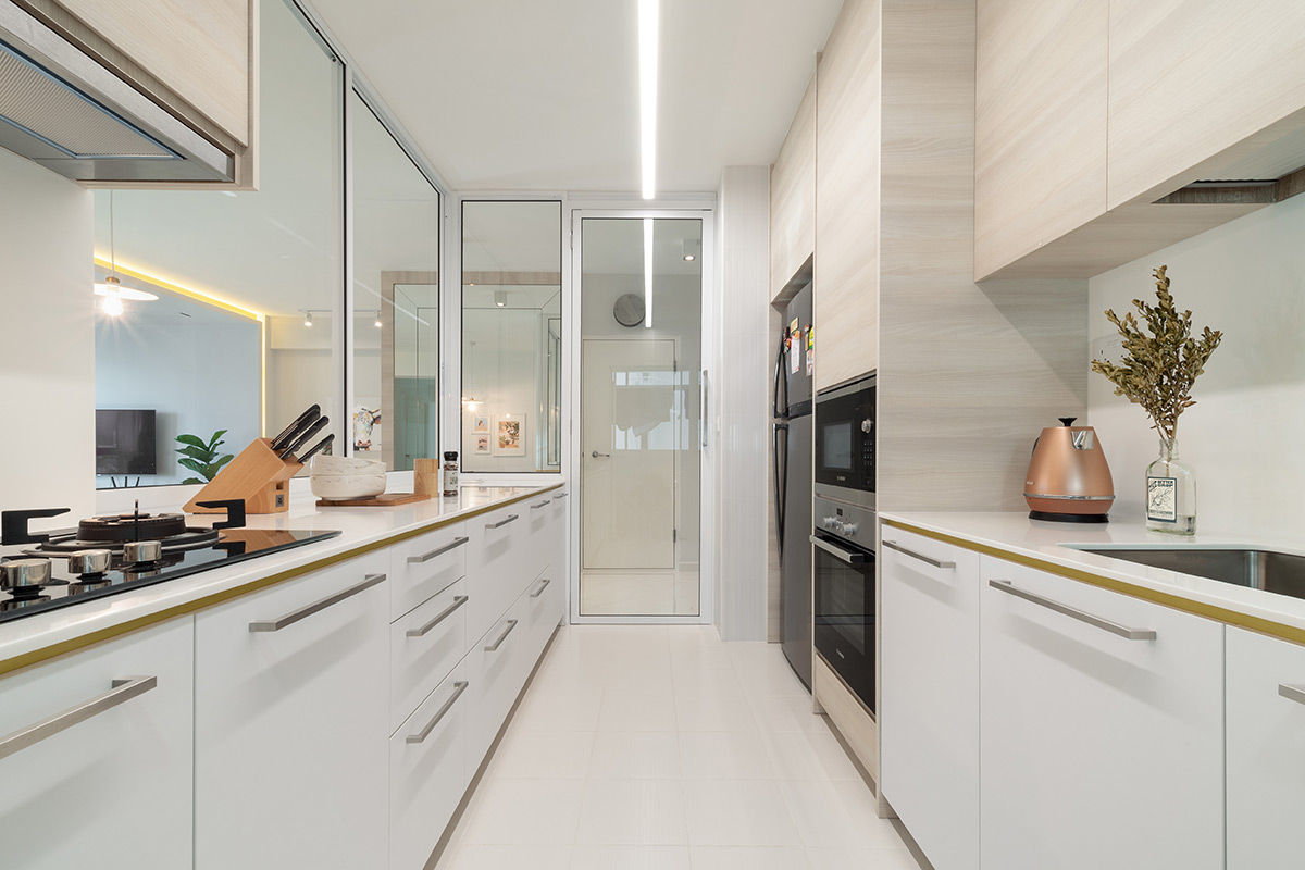
Rounding off the communal zones is the kitchen, which boasts an open-concept layout thanks to the removal of partition walls that gave way to sliding doors. These newly installed fixtures also allow for the quick and easy serving of cooked food from the kitchen to the dining table. On the interior, Silestone quartz countertops and an abundance of cabinets in both a light wood- and white-laminated finish enhance the functionality of the space.
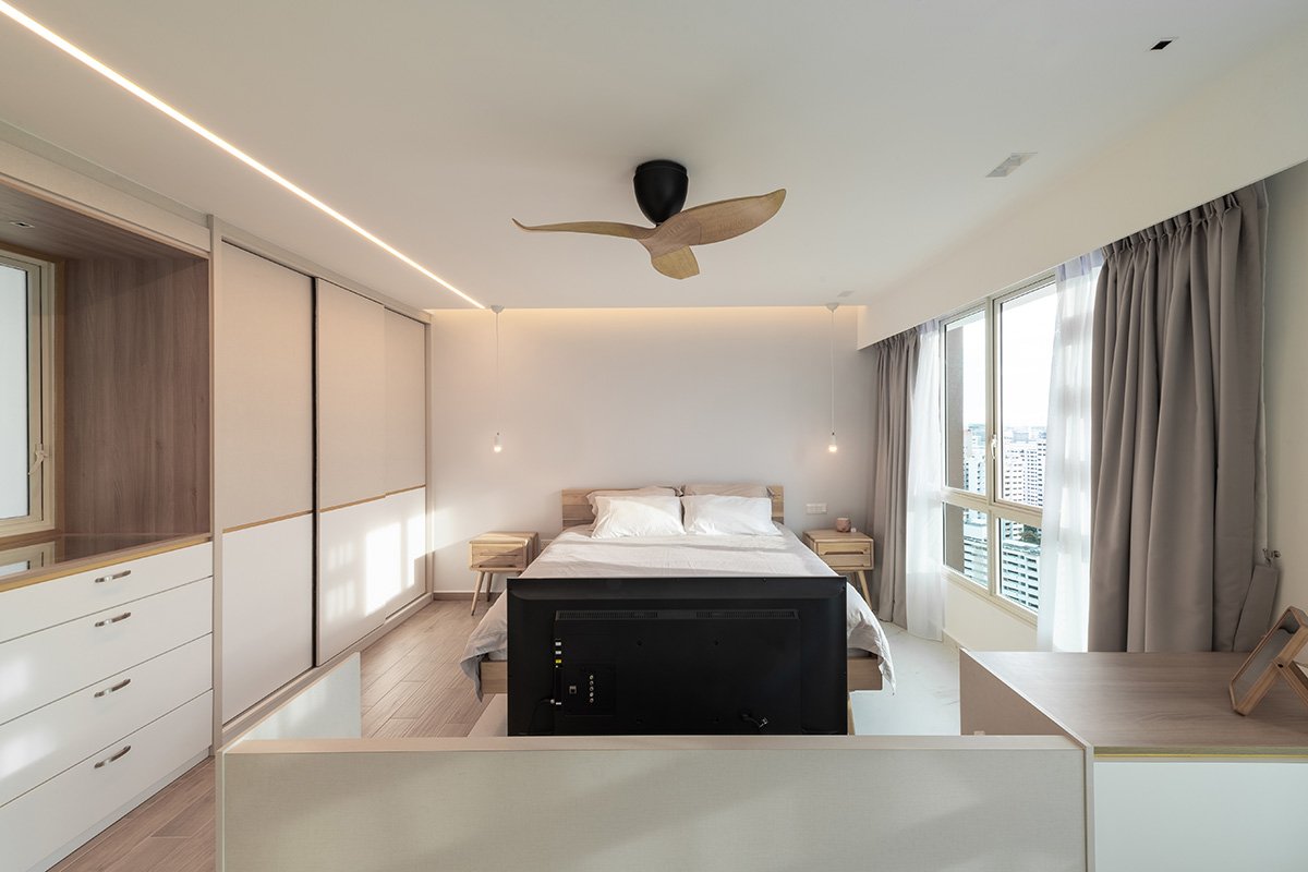
For the owners’ private living chambers, two bedrooms were combined to create an enlarged master boudoir. The newly expanded floor area was then split into a sleeping and wardrobe area on one end, and a study on the opposite end. Then, a custom-made television console-cum-dressing table was installed in the middle to provide a subtle demarcation between the two zones. The difference in flooring materials from the living room returns for another appearance in the bedroom, distinctively marking out the sleeping area and the wardrobe with its marble-lookalike and wood-effect tiles respectively.
Meanwhile, the entire stretch of the wall leading into the master boudoir was fitted with full-height wardrobe units. Clad in dual-toned fabric-lookalike laminates that inject a sense of softness into the bedroom, the contrasting yet complementary colours help to enhance the visual appeal of the space. The wardrobe also hides the entrance to the washroom with a fully flushed door that has been similarly embellished with a horizontal gold stripe, resulting in a neat and cohesive look throughout the walkway.
Past the en suite’s entrance, a series of differently-sized niches come into view. “As the owners didn’t fancy the idea of having their towels and dry clothes exposed to the fluctuating moisture levels within the shower zone, we included these niches so that they would have an easily accessible spot to keep their things,” explains Shao Jie. Inside the shower zone, new homogeneous grey tiles line the floor, while the vanity wall was given a striking accent with the overlaying of travertine-lookalike tiles.
Given the amount of effort and thought put into the apartment’s makeover, it comes as no surprise that the project concluded on a joyous note for Shao Jie and the rest of the ROOOT Studio team. “We believe that interior design is not about following any particular style, but rather making sure that the home is fully customised to each client and their distinct lifestyles. And we believe we managed to achieve this goal with this home,” says Shao Jie.
This was adapted from an article originally published in the July 2019 issue of SquareRooms. Photo credits: ROOOT Studio


