“Less is more” appears to be the design mantra for this 5-room resale flat designed by Wayne Ching and Kate Ng from Design Neu. Fronting the renovation, Wayne says the married couple living here asked for a “modern setting” but wanted to personalise the look with “varying accent colours and geometrical details.” Since the modern style is usually simple and unadorned, the Design Neu team had to find a way to gel everything together without upsetting the design equilibrium.
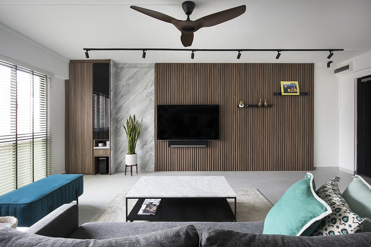
Helming the overall conceptualisation of the space, Kate says they “envisioned the new modern setup to carry a clean and muted colour scheme.” That culminated in a pared back palette of mostly warm monochromatic tones which borrow from nature-inspired elements. “We engaged a line-up of wood-like strips for the feature wall in the living area,” remarks Wayne.“ The wood colour of these laminate strips was carefully considered; we certainly didn’t want it too light or too dark. It had to be a classic wood shade.”

Setting the scene with a subdued wood tone oozing opulence, the laminate strips were then paired with a marble-effect laminate covering. “This marble-style accent wall is meant to break the wood composition,” explains Wayne. “Too much wood would look overpowering,” adds Kate, “and the marble serves as a good visual breather.” The grey veining of the marble style also echoes the neutral tone of the newly-installed tile flooring in the communal areas.
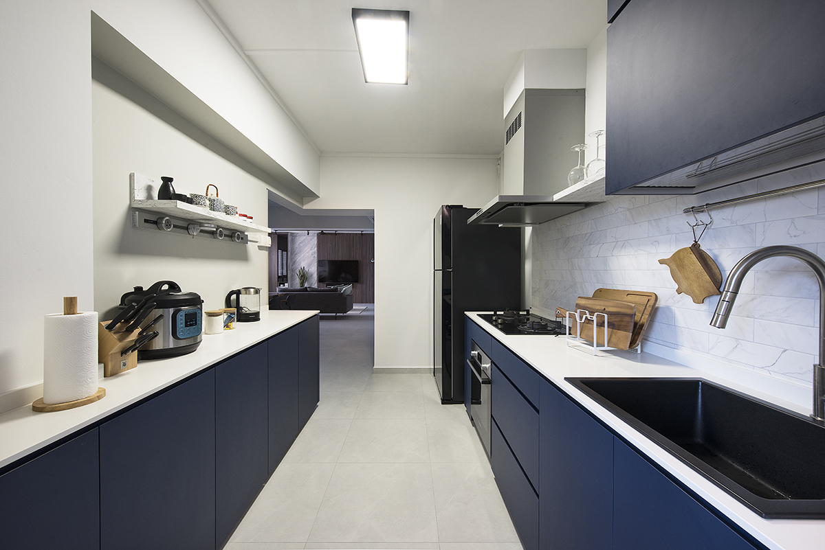
Venturing deeper into the home, the semi open-concept layout of the kitchen comes to light. With the entrance widened, natural light and ventilation now flow throughout the entire home. The abundance of daylight is enhanced by the Smart Glass System which now encases the study and guest-room. Facing the dining area, the Smart Glass divider turns opaque or clear with a quick touch of the button. This allows the homeowners to enjoy some extra daylight, or privacy, especially if they have company over.

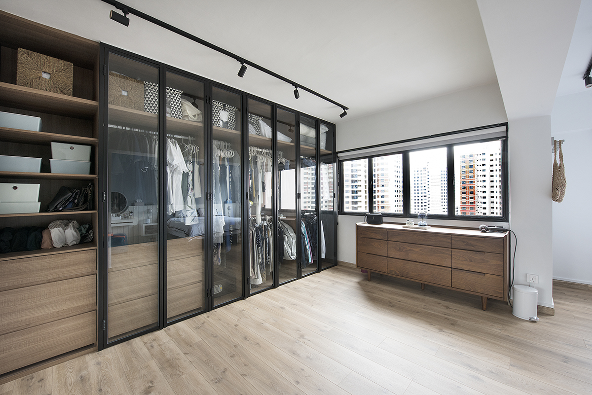
Other than expanding the kitchen’s entrance, the master bedroom was extended as well by merging it with a common bedroom. The jumbo-sized master suite now comprises of a walk-in wardrobe and the main sleeping quarters. “The homeowners asked for an entirely open-concept wardrobe, but we were worried about the build-up of dirt and dust in the long term,” says Wayne. They soon came to a compromise of using clear glass encased in a mild steel frame to outline the entire wardrobe. This still allows the homeowners to scan through their wardrobe contents in an easy sweep without fretting over dust or discolouration.

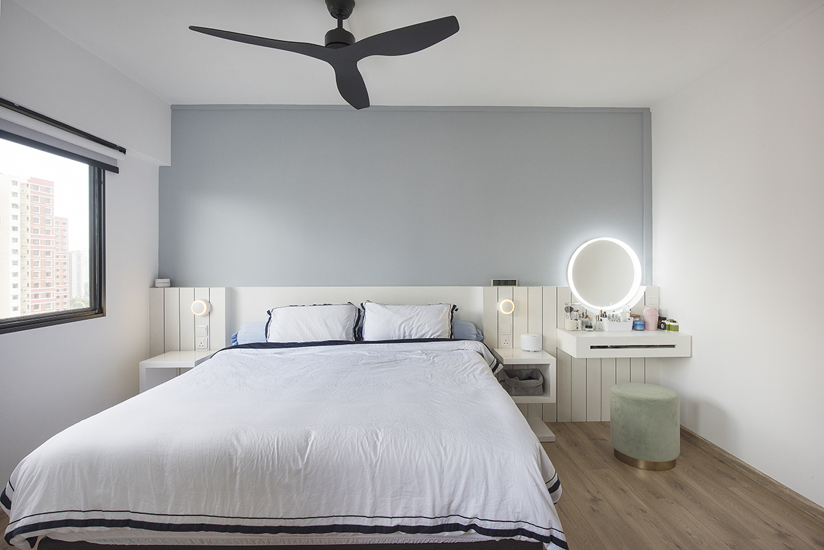
A lived-in sense of sophistication takes over the sleeping quarters via white laminates which line the headboard area. Resembling wall decking, these farmhouse-style accents are matched with a curved cut-out detail to anchor the vanity mirror. With that, the mirror appears to float. The addition of a suspended vanity table further enhances the expanse of space and it comes with a specially-designed niche which works as a sleek handle.

With plenty of thought put into both the form and functionality of this home, every single design element of this home falls right in place. These carefully considered design highlights and colour uniformity introduced by the Design Neu team certainly bring the home into its own.
This post was adapted from an article originally published in the July 2020 issue of SquareRooms.


