Specially chosen furnishings and cool built-ins accentuate this home’s airy and open appeal.
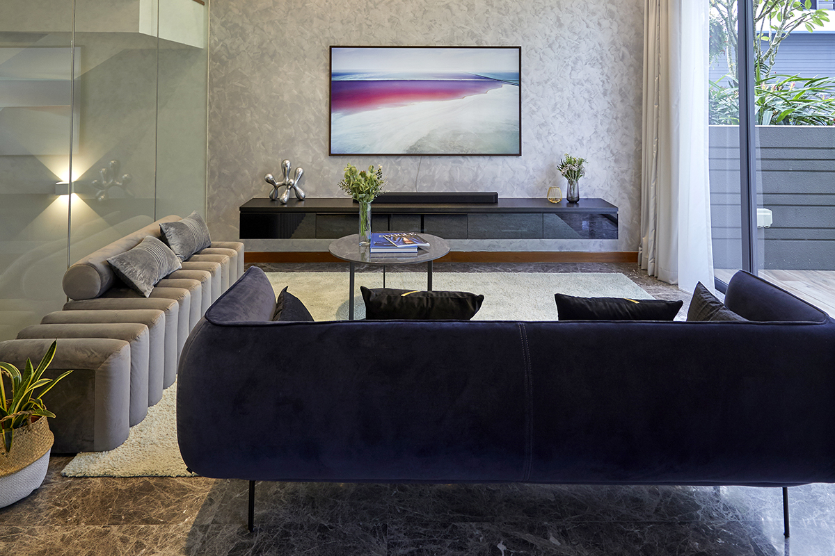
Living room: The furnishings here lie closer to the ground, making the ceiling height appear taller. To avoid a weighty appearance, several pieces are either propped up on skinny legs or mounted on the wall for a floating effect, letting one take in the entire floor space. Above, the contrasting lighting tracks help to visually elongate the room, while cove lighting above the media console provides a soft and cosy ambience for watching TV.
The homeowners and their designer, Cindy Tan of I-Chapter, go way back. Starting out as Cindy’s customers 10 years ago when they worked on an earlier home, the trio are now friends who trust and understand each other.
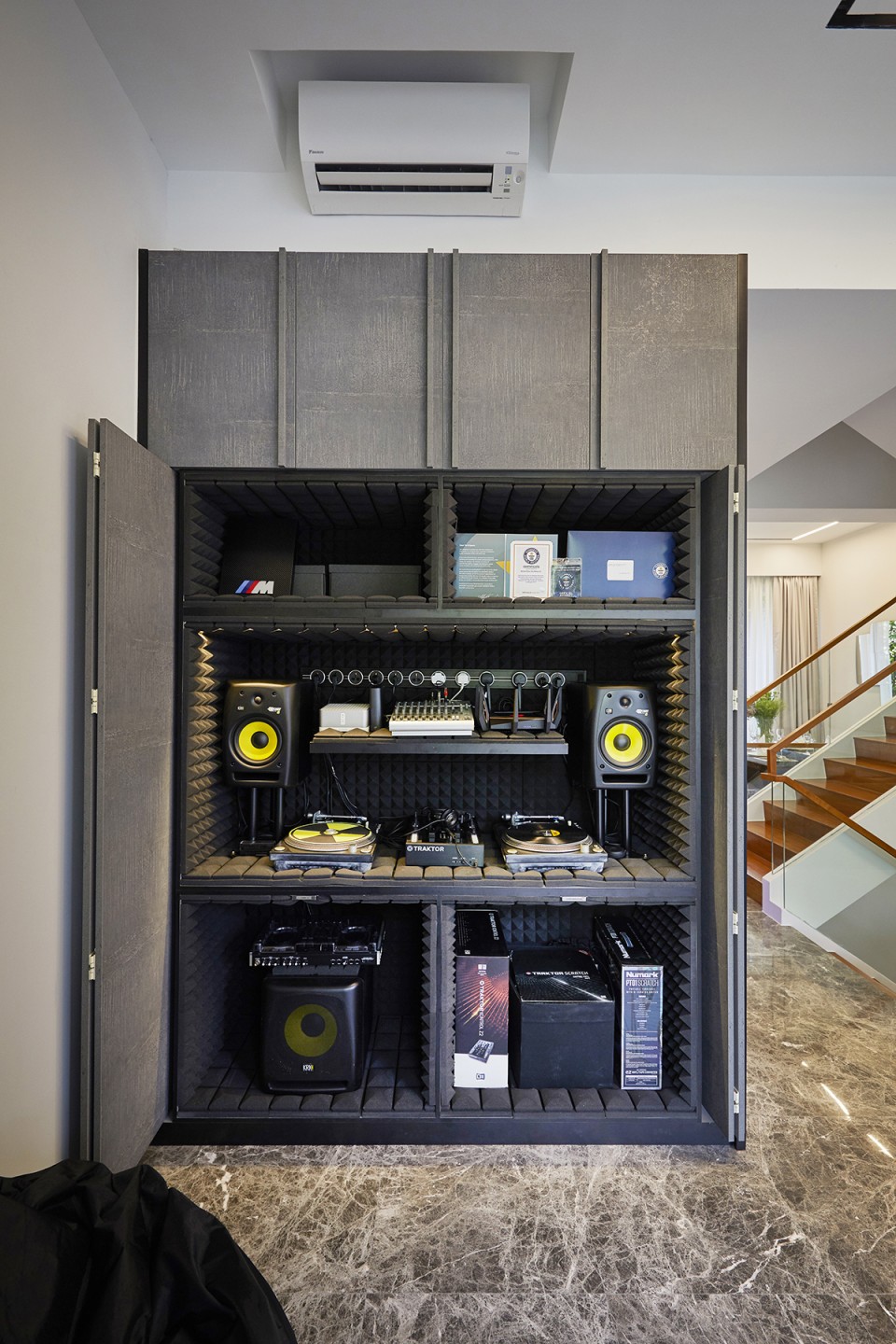
DJ booth: Tucked behind the living room is this elaborate DJ setup. Cindy designed this corner with bi-fold doors that open fully for easy access to all the components, but when the doors are closed, this unit looks just like a regular closet and blends in with the rest of the decor.
Working together again for this terrace house’s refresh, their initial plan was to go with an industrial theme, but that soon evolved to have a more polished feel that would better suit the covetable 4,000 sq ft space. The home boasts a light and airy aesthetic with tall ceilings and large windows, and Cindy wanted to enhance that further.
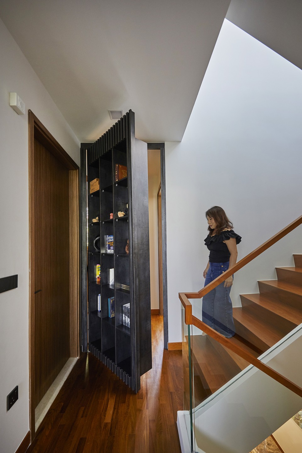
Hidden entrance: The homeowners came up with the idea of having a bookcase door that swings open to reveal the closet and study. Cindy refined their concept, taking the time and effort to hunt down the right hinges (these were made in Europe) to ensure quality, safety and longevity.
In the living room where sunbeams freely stream in, Cindy matched the drama of the dark existing marble flooring with special effects paint on the media wall, adding movement and interest to the gathering space. The designer also altered the ceiling, adding magnetic lights along black tracks to help visually elongate the interiors. Cove lighting was also installed above the TV, creating a moody vibe for cosy movie nights.
To play up the roominess here, the space is outfitted with only essential furnishings that either lie close to the ground to play up the ceiling height, or pieces that “float” or are propped up on slim legs, letting the eye take in the entire length of the communal area.
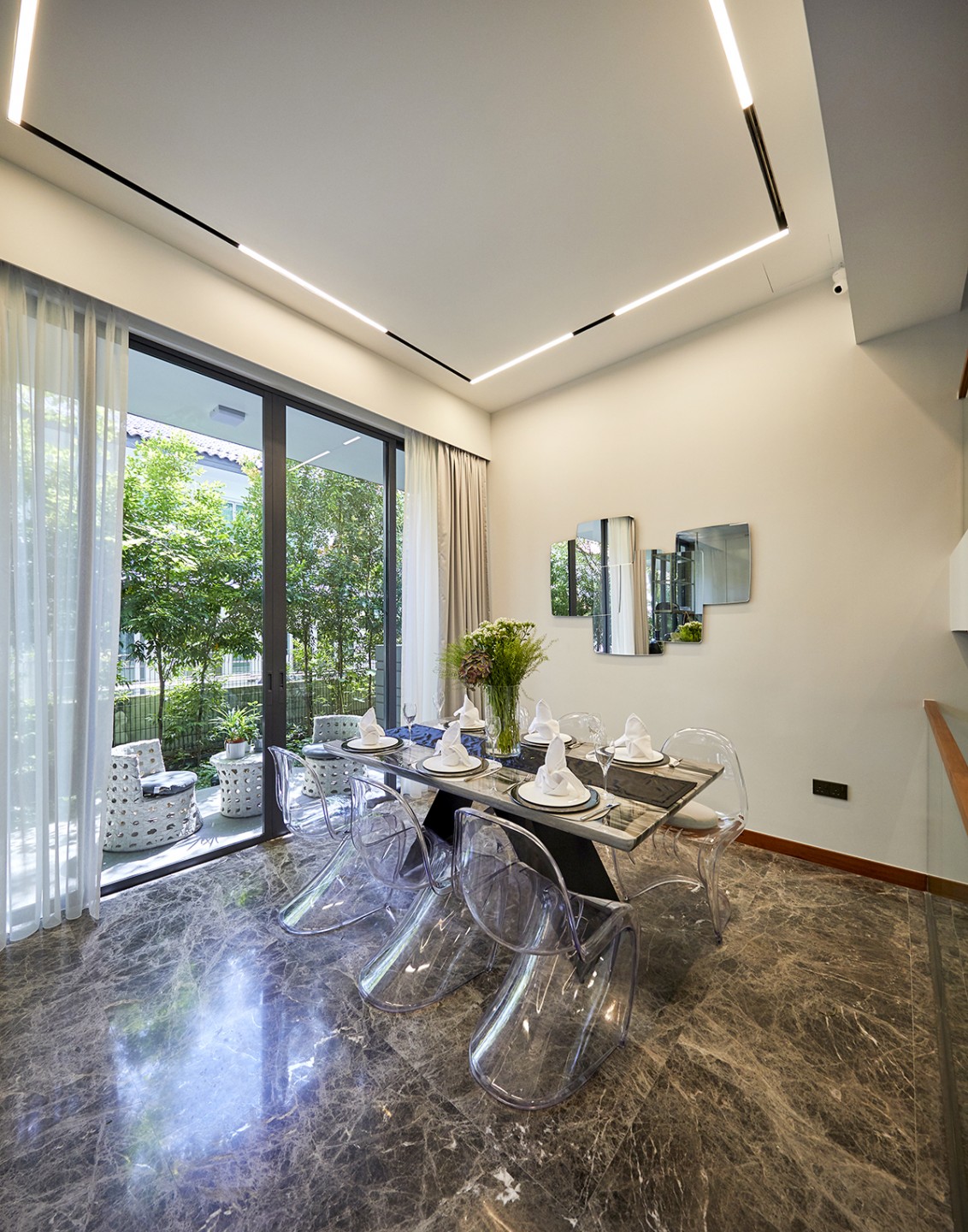
Dining zone: A sleek table and see-through dining chairs keep this area feeling open and airy, while a mirrored art piece on the wall expands the space further. The dining nook opens up to the outdoor patio, allowing the homeowners to enjoy an alfresco dining experience no matter where they enjoy their meal.
In the same space, within a nondescript custom “storage unit,” is a DJ booth to cater to the male homeowner’s hobby. The bi-fold doors open fully to allow unrestricted access to the equipment, but once the doors are closed, no one would be any wiser about its contents.
Across the hall is the dining zone which looks out to an outdoor patio. The dining table comfortably accommodates six or more but doesn’t look bulky thanks to its slim profile. The ghost chairs chosen to complete this setup are an ideal match, letting light and one’s gaze pass through for an expansive appearance.
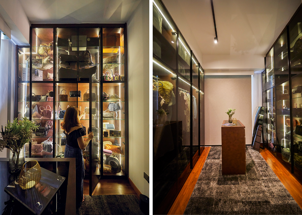
Walk-in closet: Resembling an upscale boutique, the closet is equal parts stylish and practical. A skinny island in the middle holds accessories, while the clothes and bags are tucked behind glass panes to keep them protected. Light strips embedded in the closets illuminate the belongings beautifully and serve to make the room feel wider.
Venture one floor above and you’ll encounter a stately bookcase on the second-floor landing. This cheeky floor-to-ceiling structure affords the homeowners additional storage and display space, but it also swings open to reveal two adjacent rooms: the study and walk-in wardrobe.
Designed to look like a boutique, the closet is a thing of beauty. Illuminated full-height storage units with clear glass fronts allow the homeowners to display their belongings without making the room seem cramped.
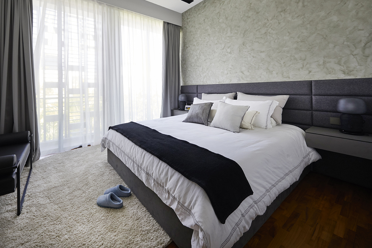
Bedroom: Sporting a similar concept to the living room, the accent wall was swathed in special effects paint and light strips were added above to visually lengthen the space. Cindy wanted a warmer and softer look for the bedroom so she installed a fabric headboard with hidden cove lights and chose curtains in a dark hue to create a cosy and elegant vibe reminiscent of resort hotels.
While space was never an issue in this sizeable dwelling, it never hurts to play up strengths. By employing popular techniques to visually expand the interiors, this home managed to retain its roominess, yet is more comfortable, chic and purposeful than ever before.
This post was adapted from an article originally published in the October 2022 issue of SquareRooms.


