Hailing from New York City, the homeowners asked for their tropical address to have an airy and modern aesthetic with splashes of colour.

Having moved from the densely packed and hectic landscape of New York City several years earlier, the owners of this four-bedroom condominium duplex were drawn to the unit’s open and airy feel. Singapore’s island vibes appealed to them, so they tasked Rashi of Home Philosophy to update the 2,217sq ft interiors with a resort-like yet modern appeal.
The first floor comprising the kitchen and communal spaces underwent a major rehaul where the flooring and walls were completely refreshed and the stairs received a new coat of paint for a more contemporary appearance.

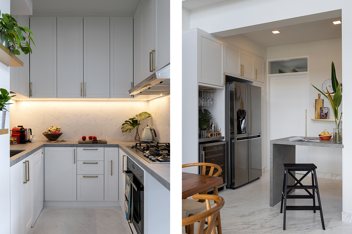
Sited next to the dining space is a new semi-open kitchen, Rashi’s favourite change for this project. The plan was to turn the “very small and dreary” cooking zone into an open-concept space, but wall-hacking restrictions meant they’d have to get creative to achieve the desired bright and roomy feel.
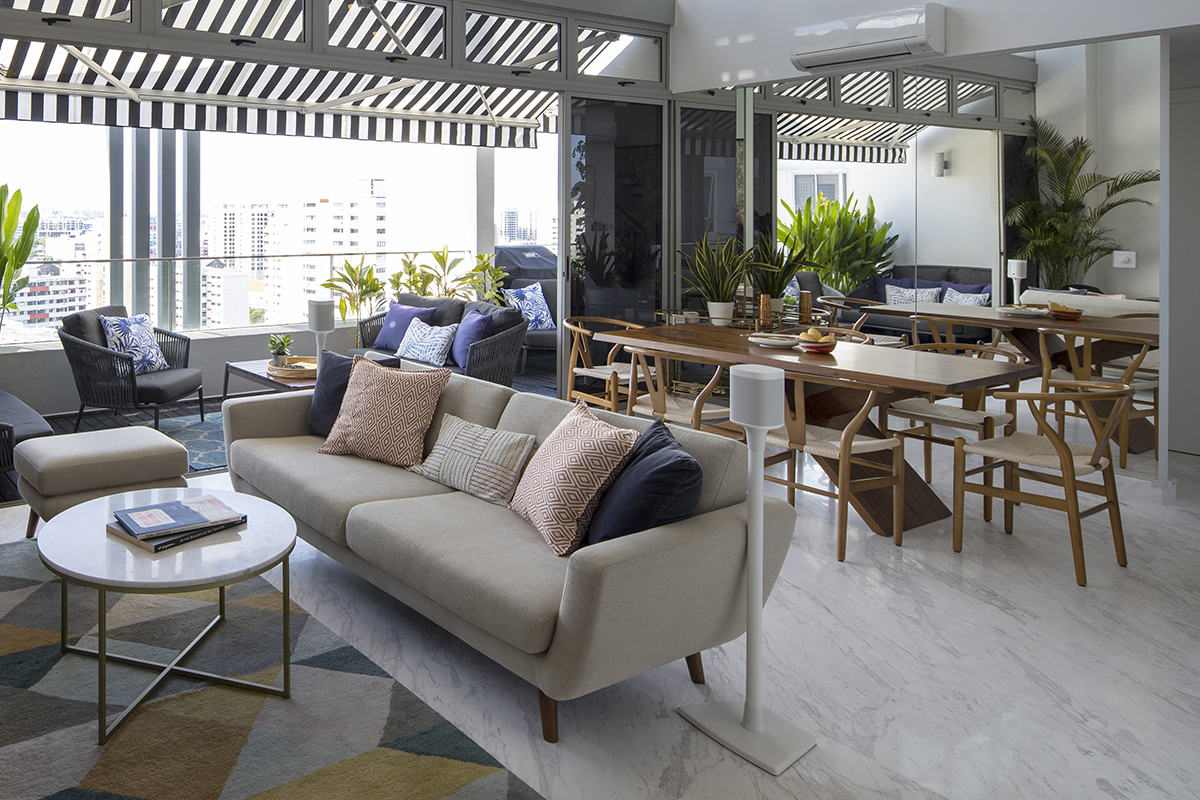
Using the same marble flooring and colour scheme through the kitchen, living and dining areas helped to seamlessly integrate the three sections, and a clean-lined island left open on the underside lets one see right through, making the modest confines feel less restrictive.

All throughout the home, black and white help to set a classic foundation with a contemporary edge. Splashes of colour then introduce the right balance of levity, evoking a relaxed and joyful atmosphere for the family. In the generous alfresco lounging spaces, a coveted and unique aspect of this property, black and white blinds and awnings tie in with the colour scheme of the interiors, blurring the lines between indoors and outdoors.

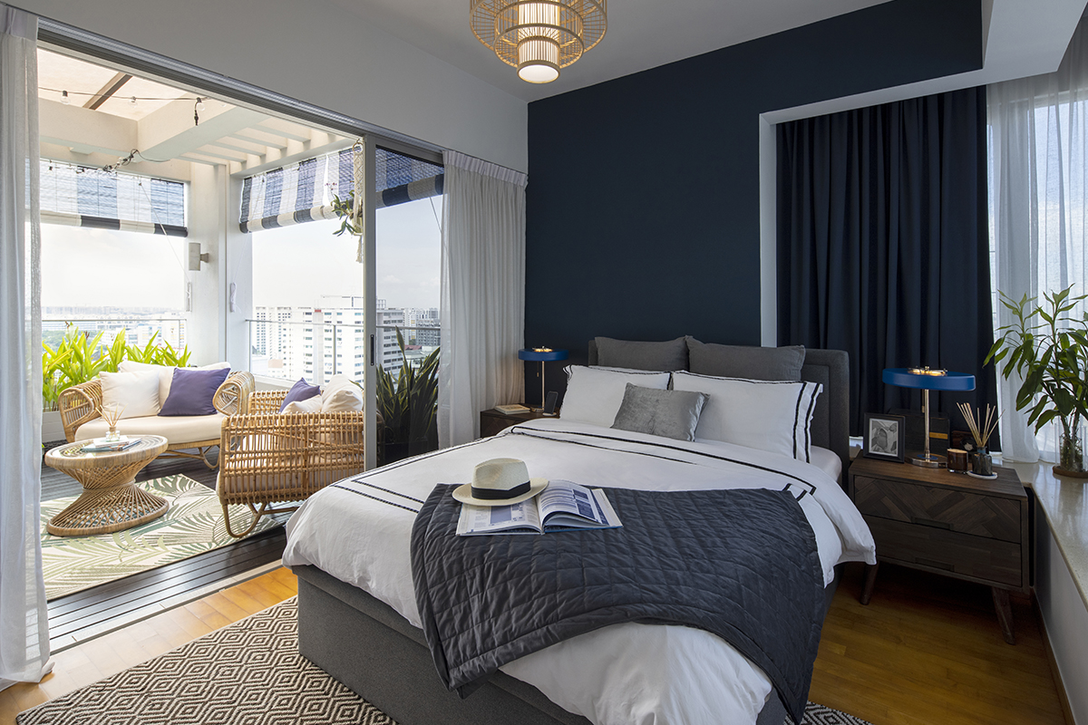
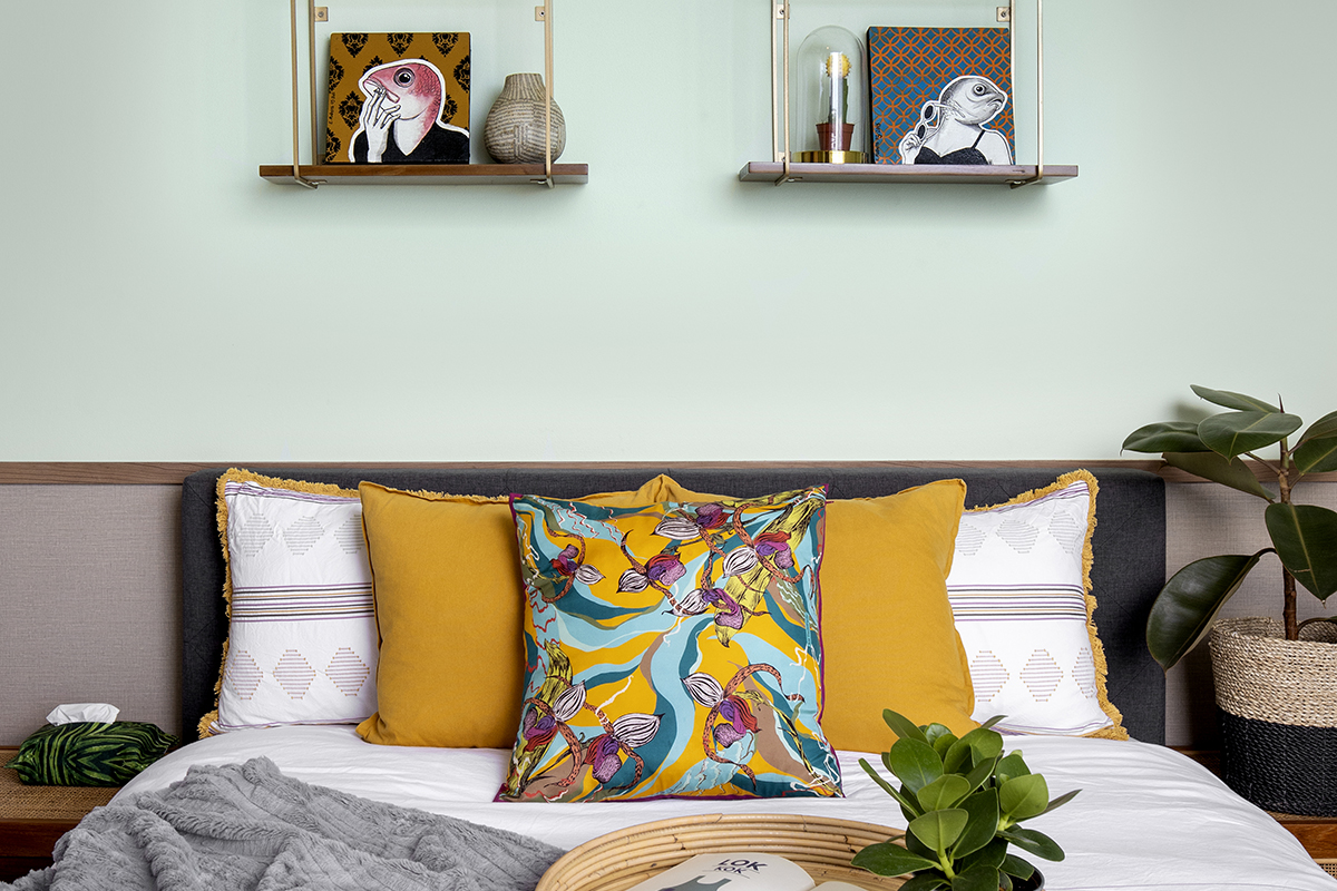
In the bedrooms, the mix of patterns, colours and textures creates calming yet cheerful cocoons for rest and play. Vibrant green, blue, yellow and berry tones along with rattan accents reference the tropical resort aesthetic, while deeper navy and grey elements act as counterpoints to ground the look and prevent the decor from looking too themed.
Even though every aspect of this home was deliberately considered, what makes this home a success is how effortless it all looks, blending utility and style for a haven the family can enjoy as they evolve through the years.
This post was adapted from an article originally published in the February 2022 issue of SquareRooms.


