A complete overhaul gave this 25-year-old home a storage boost while retaining a minimalistic feel.
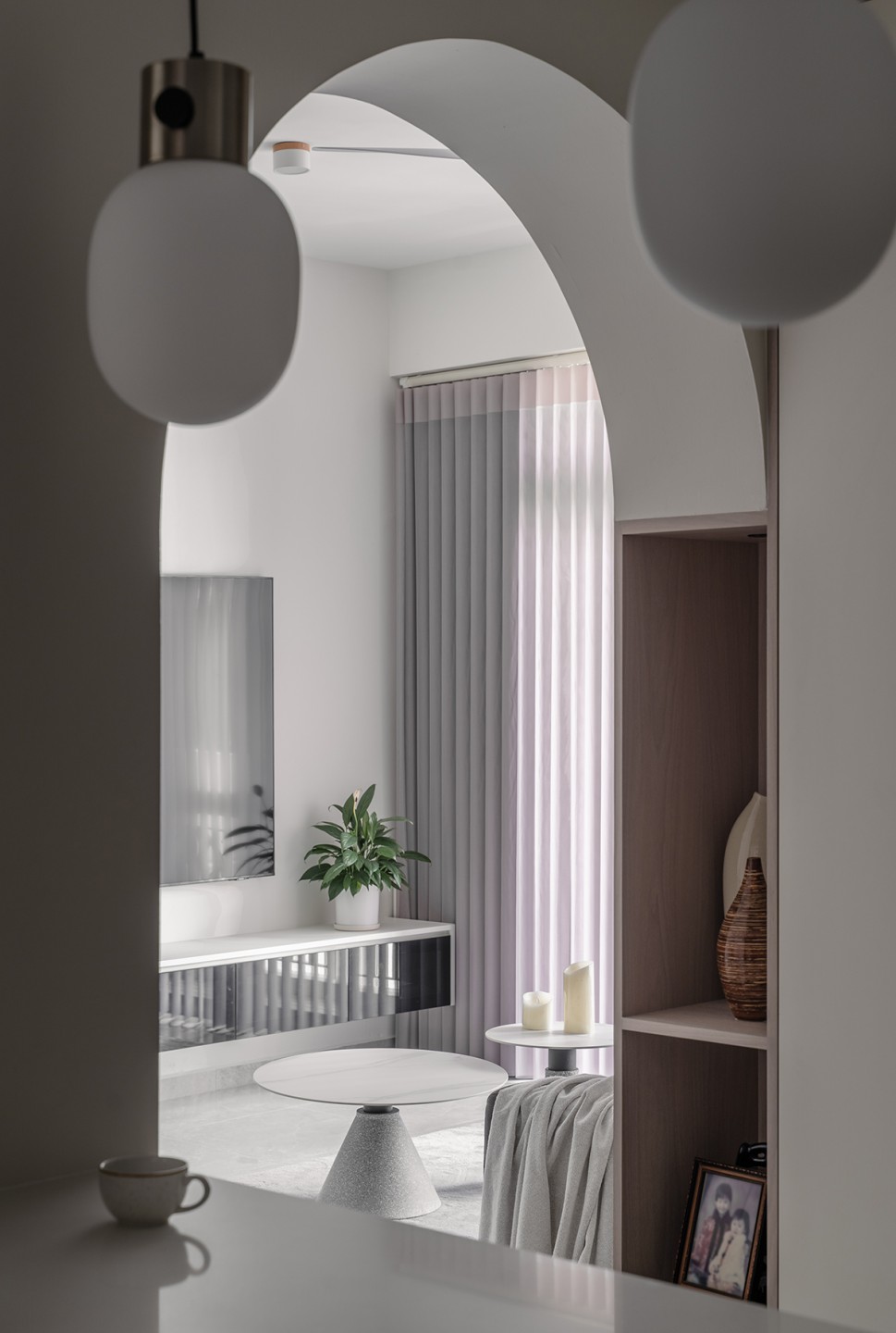
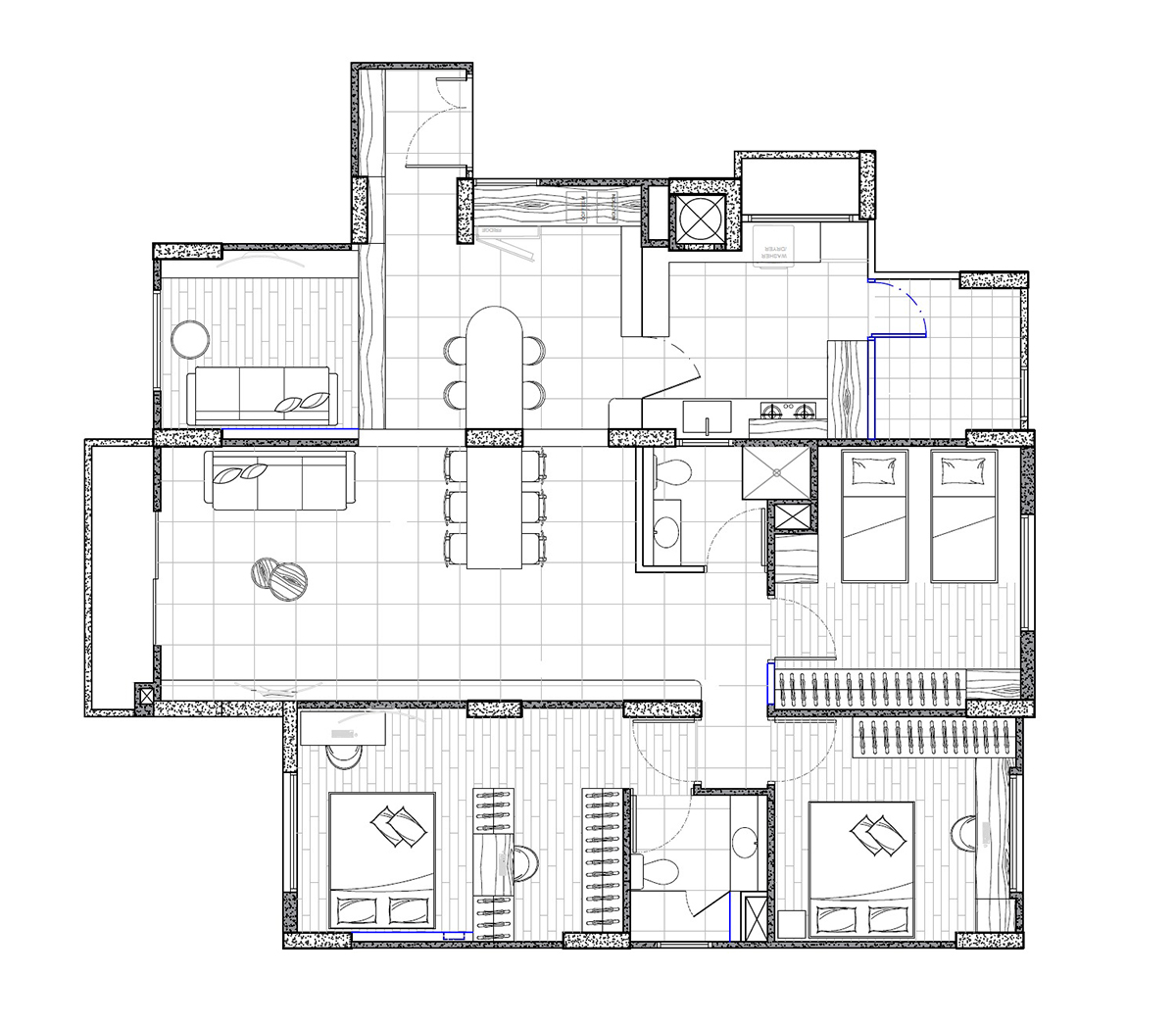
Living room entrance: An archway connects the living room to the dry kitchen, allowing plenty of natural light to stream through.
When the owners of this condominium unit moved in 20 years ago, they didn’t carry out any renovation work, finding that they didn’t need to change much of the home to fit their lifestyle.
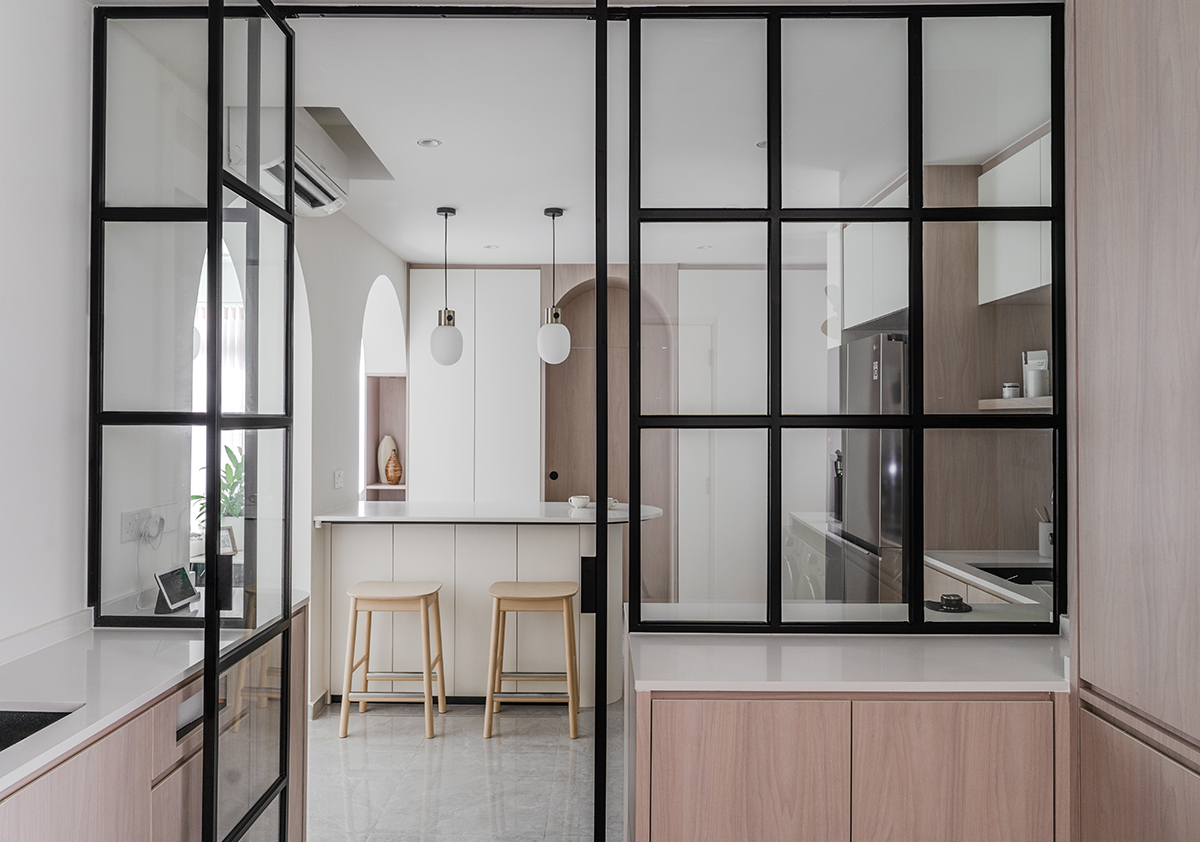
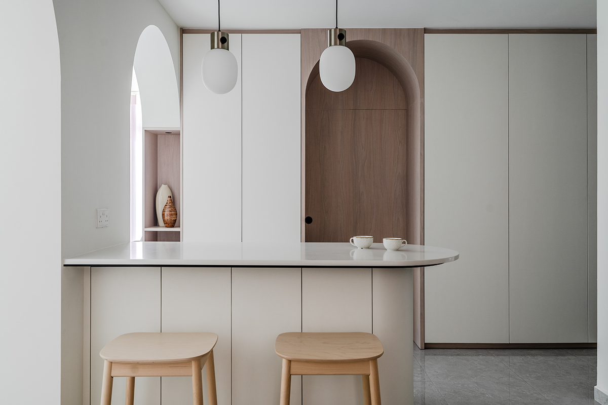
Dry kitchen: The dry kitchen is separated from the cooking zone by a black-framed glass door, which contrasts with the light flooring, walls and cabinets for some extra visual intrigue. A curved island was incorporated as well, giving the family a place to gather and enjoy a wholesome breakfast.
Now, with three grown kids, it was high time to give their home a fresh look and introduce more storage space for their growing needs.
The challenge given to design firm Met Interior was to maximise the storage room in the condo yet make it look and feel as streamlined and spacious as possible.
Although the inspiration for the overhaul was a minimalistic feel, the amount of work carried out was anything but minimal, the renovation turning every room of the house upside down except for the balcony.
From small touches such as adding more cabinets to redesigning the entire kitchen, the 12-week project swept freshness into every nook and cranny.
The main focus of the transformation was the kitchen and living areas. Curved walls were added in the two walkways that lead to the dry kitchen, as well as in the hidden entertainment room, which now sits behind an arched entrance.
While the parquet flooring in the bedrooms wasn’t changed, the common areas of the home were given a fresh look thanks to new marble tiles.
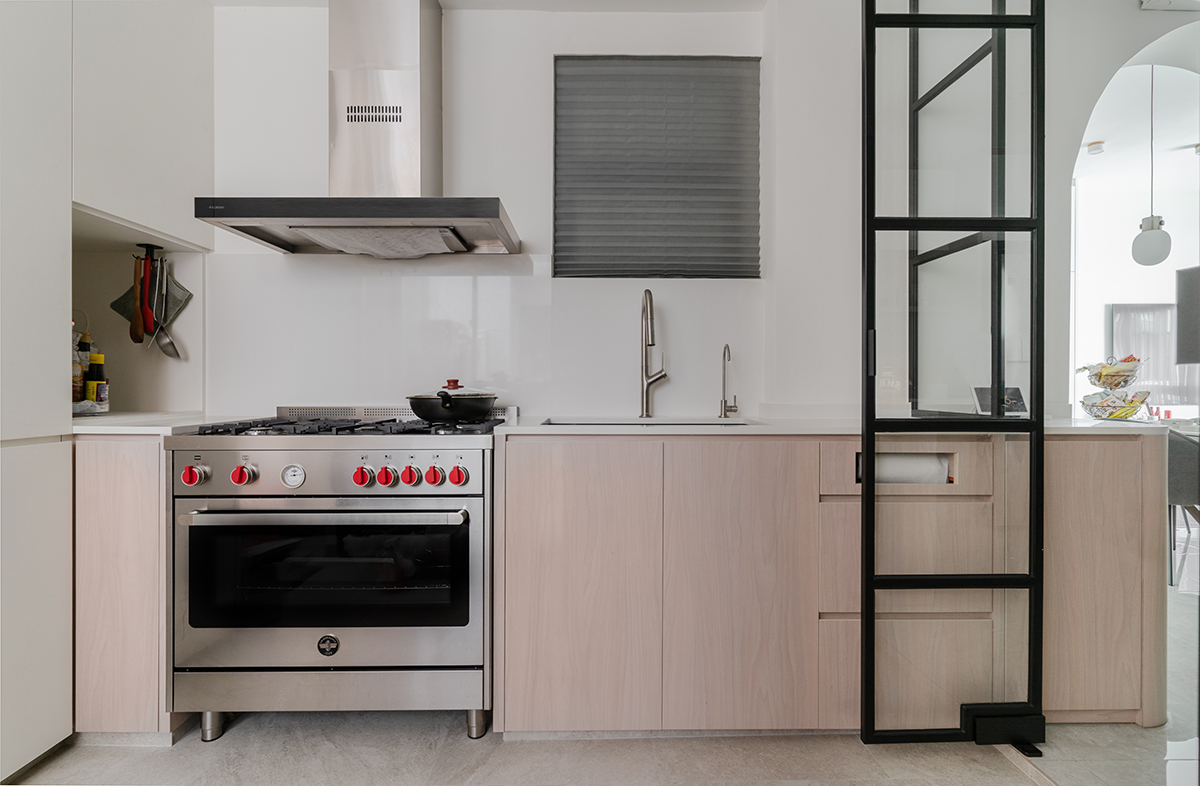
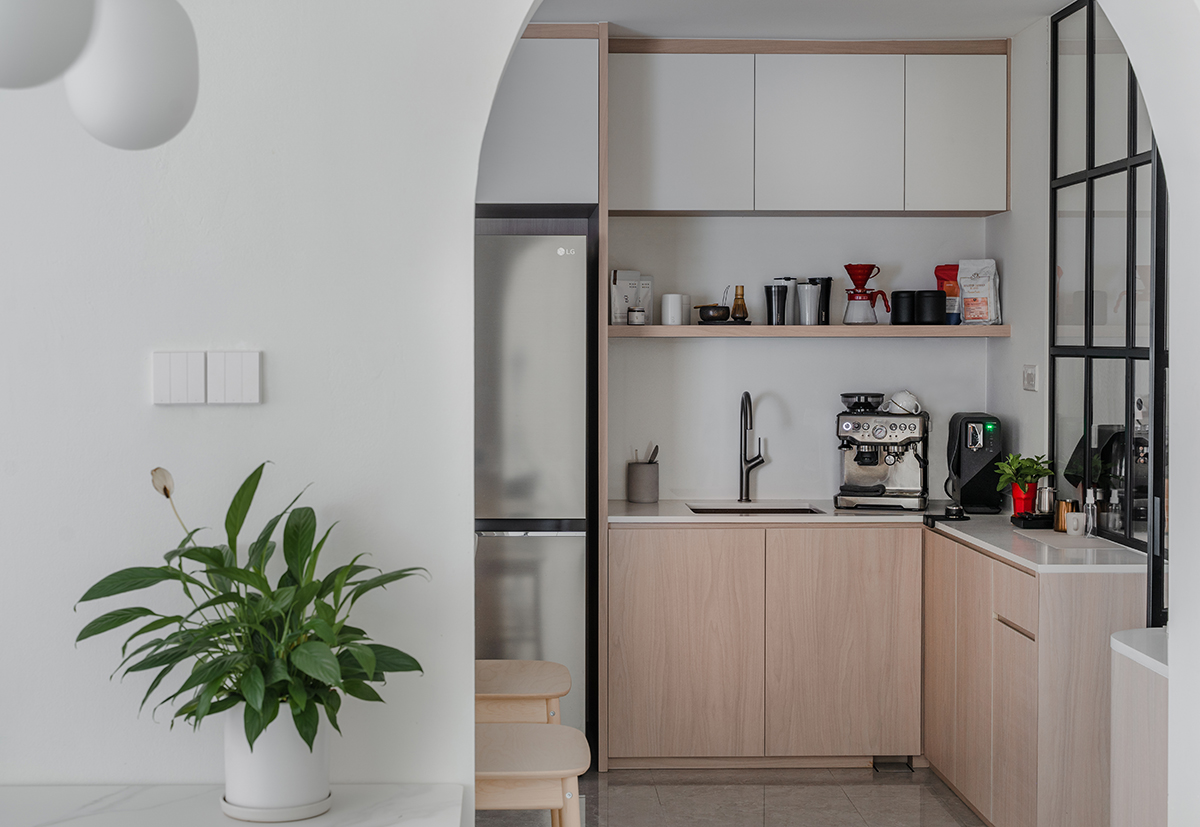
Cooking zone: Fitted out with brand-new appliances, the kitchen’s highlight is the retro-style oven from Bertazzoni, which adds a pop of colour to the muted space with its striking red knobs.
There was one unexpected challenge, though. The plan was to convert the old spare toilet next to the existing kitchen into a wet kitchen.
But the simple task became complicated when a sewage pipe was discovered in an inconvenient position, making construction impossible. In the end, it was covered up with carpentry instead.
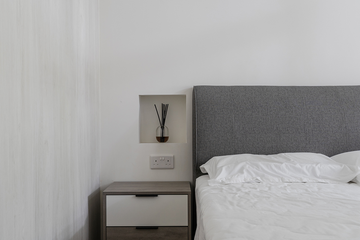
Bedroom: Minimalist through and through, the bedroom was given an understated storage feature in the form of a carved wall niche.
In the kitchen, the aim of the facelift was to fully maximise the storage and worktop space, as well as to effectively segregate the new dry and wet kitchen, all without making the space look confined.
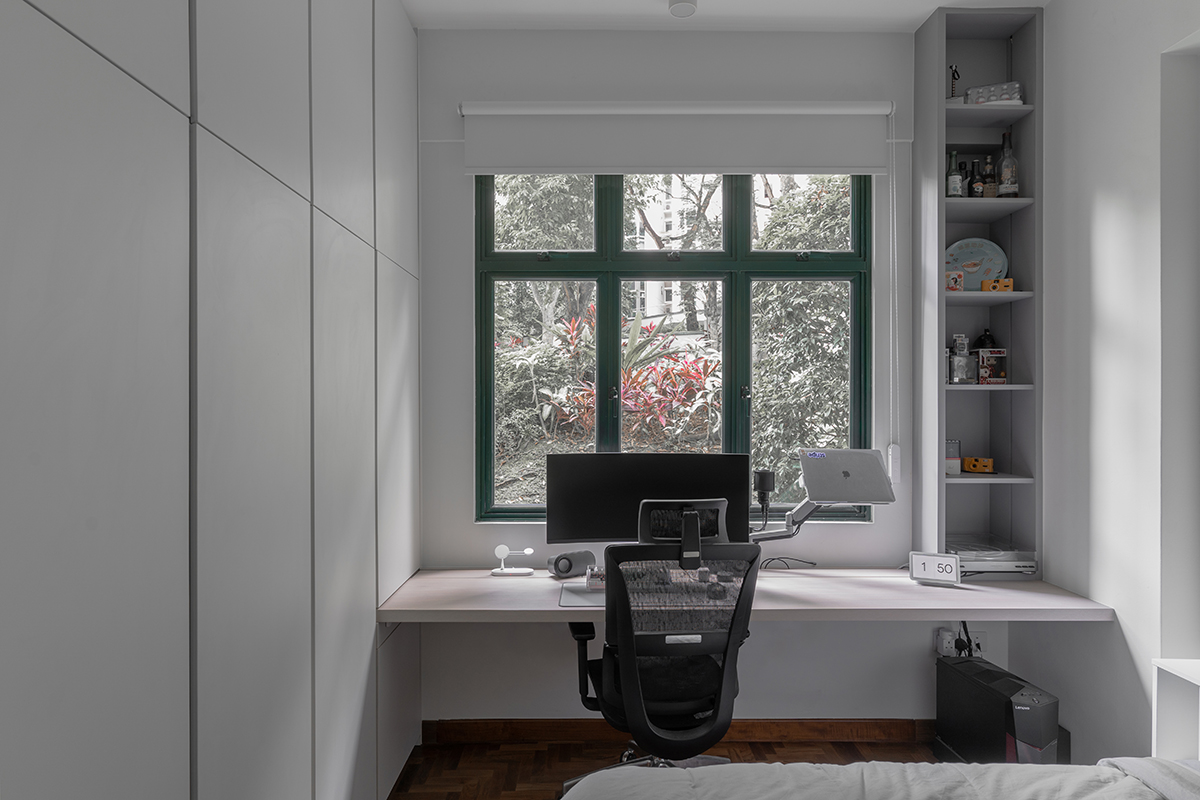
Study area: A long working table was added to the son’s room, allowing him to explore his interest in IT and keep all of his gadgets close at hand. The shelving at the side also provides extra storage space, while a spacious wardrobe was concealed behind the built-in wall panels.
The bathrooms were renovated too; the bathtub in the ensuite was removed to create more space and a wall enclosing the main bathroom was hacked to enlarge the common areas.
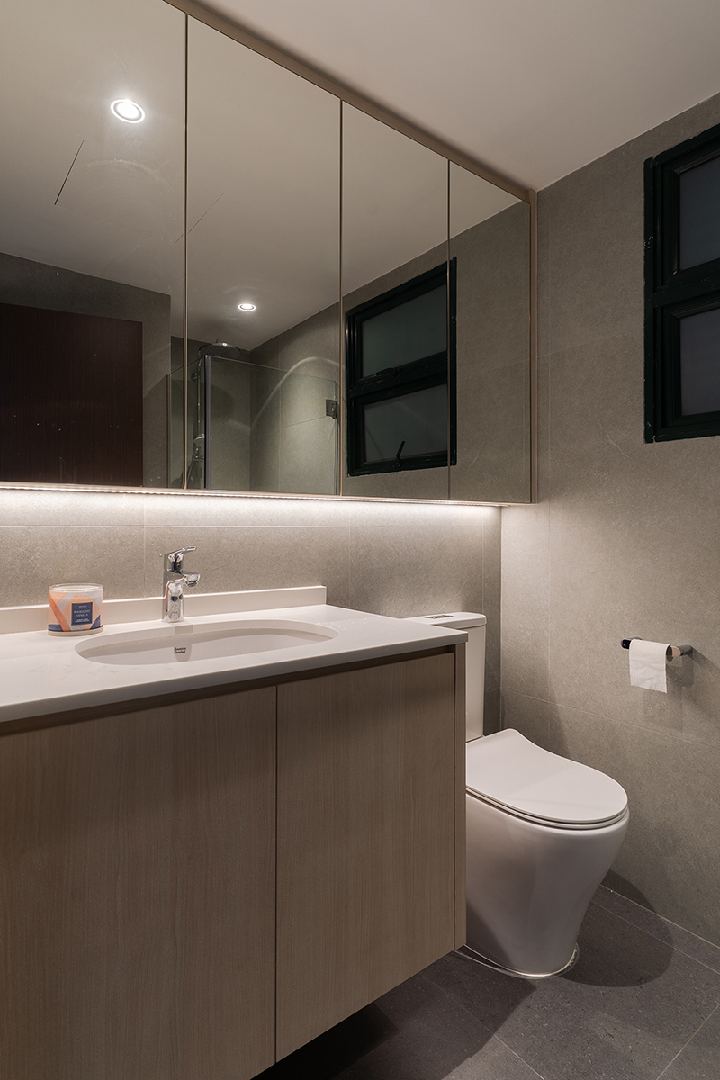
Bathroom: The bathroom was completely renovated, with brand-new flooring and cosy lighting to evoke a comfortable feel, as well as a spacious cabinet to keep all bathroom clutter hidden.
The palette of breezy hues was based on the homeowners’ preferences, including shades such as white, grey and light wood as the main colours. This choice ended up giving the home an inviting, airy look, perfectly complementing the minimalist theme.
This post was adapted from an article originally published in the April 2023 issue of SquareRooms.


