With a toddler who’s checking off milestones day in and day out, Estee and her husband are constantly changing up their home design to adapt to their daughter’s growth. The open-concept, flexible layout they went for certainly helps!
Just because you are full-time working parents doesn’t mean you can’t find time for the little joyful moments in life. For Estee and her husband (@theresudence), life’s pleasures include travelling, good food, music and spending time with family and friends, including their toddler. “A well-balanced life is important to us,” Estee shares.
When it came to choosing their BTO unit, the couple knew they were aiming for this particular stack of flats. “It’s located away from the rubbish chute, there’s private space at the end of the corridor, and it’s away from the main road yet is a centrally located block in our estate,” Estee says. “The flat also has an unobstructed view and there’s good airflow as it is facing low-rise landed properties.”
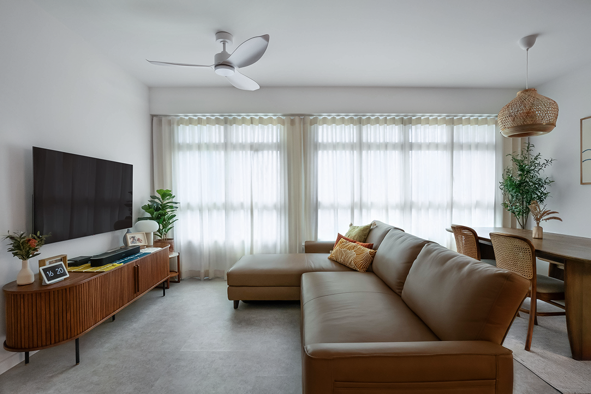
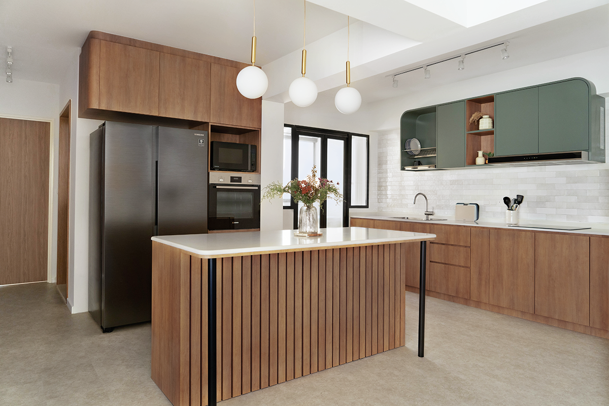
As for the interior of the 5-room flat, the couple decided to keep the space as communal as possible, hence the open-concept kitchen with the island positioned parallel to the living area. The home is warm and cosy, as well as child-friendly and future-proof. The design was executed by Nadia Shihan from BuildBuilt.
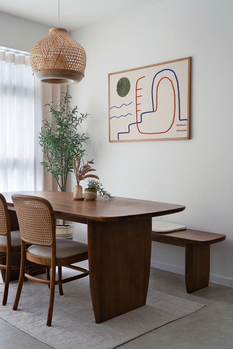
“We did have a long-term vision in mind when planning,” she shares. “We went for smooth, curved edges in our carpentry and furnishings to make them child-friendly, and we opted for an open layout so that our child could find us at any time, even when we are cooking. It’s a functional design without any hidden or hard-to-reach areas to clean.” This means the parents get to spend more time with their toddler and less time doing housework.
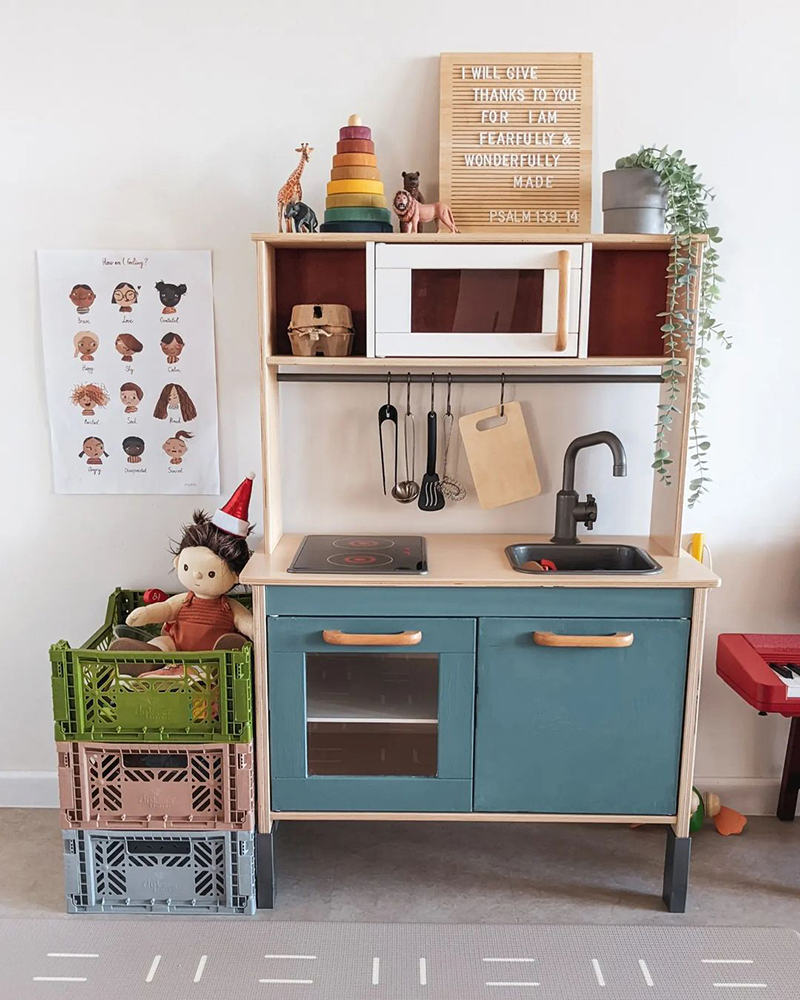
Another great advantage of the open-space layout is that the daughter gets to explore the home freely and develop a sense of curiosity for the spaces around her as she grows. The couple even hand-painted and customised a toy kitchen for the play area in the living room, which fit in nicely thanks to the open and flexible arrangement and the lack of a display niche near the TV, which they initially considered implementing.
“The choice to keep it as a free space allowed us to change it up as she went through different developmental milestones from crawling to learning to stand and walk,” the parents share in a heartfelt Instagram post. “Each time we did, it was a bittersweet feeling of not wanting her to grow up too fast.”
To find out a little bit more about their parenting journey and home life, we caught up with Estee and her family.
Let’s talk about your daughter’s room—what was your approach to designing this space? How did you plan it to be future-proof?
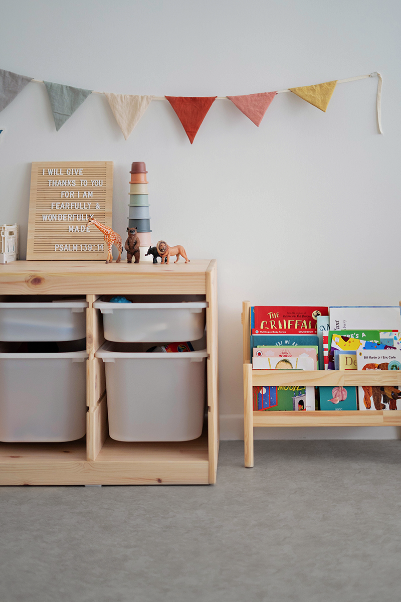
We avoided all sharp edges and chose short furniture she could reach at her toddler height, so she could take things out and put them back herself. This also means there is no furniture that could potentially topple over and fall on her. We sold off her rotating bookshelf when we realised it was too high for her and took up too much space in the room to allow for rotation.
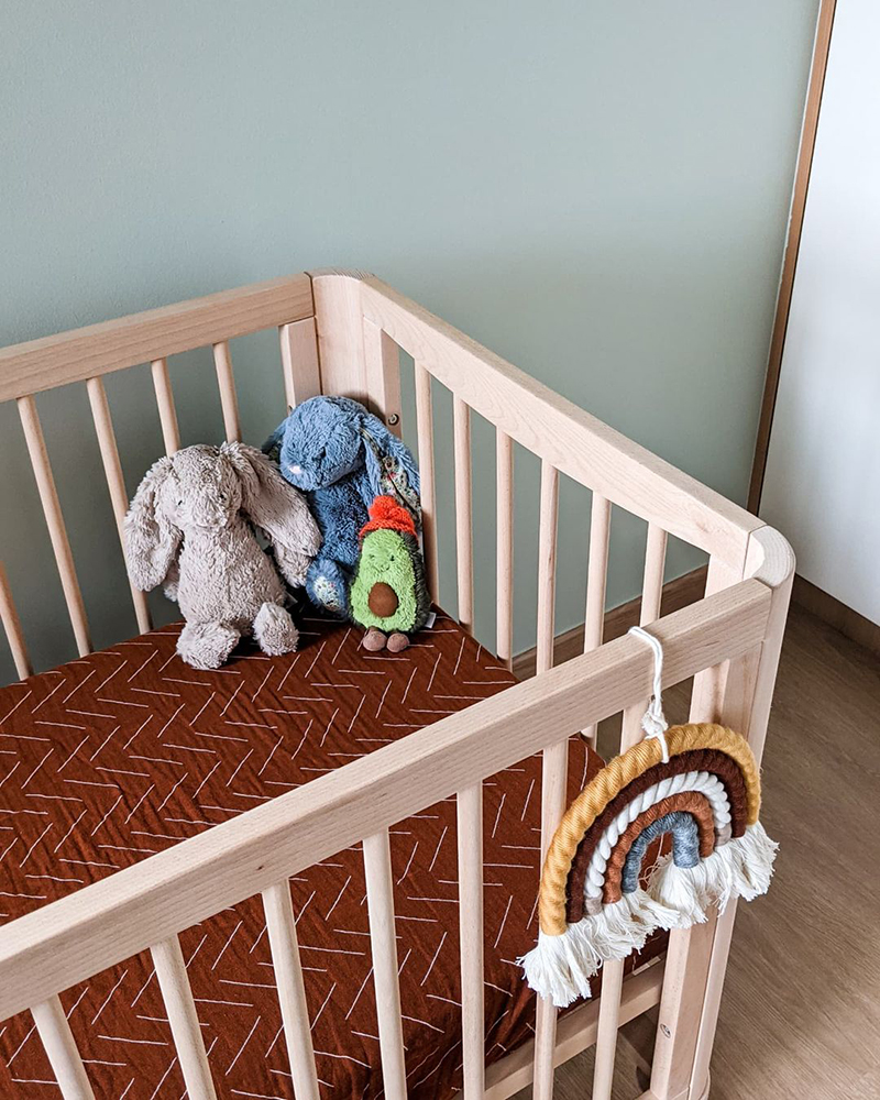
The only carpentry we built in the room is a wardrobe, which we knew we would need. The rest is moveable furniture to grow with our child as she gets older. For the wall, we actually had it repainted three times until we finally found a timeless, muted wasabi green.
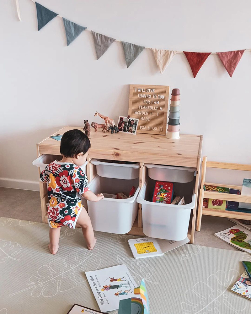
We also installed window restrictors as we did not want grilles to obstruct the view, while still ensuring the room is safe for our kid to play independently.
How did you go about planning your storage space? Do you feel there’s enough room to stow everything away?
We initially planned to keep the entryway without any carpentry and instead go for moveable furniture. However, after speaking to an older relative, we decided to do up the whole front area with floor-to-ceiling cabinets and complement those with a settee. We have more than enough storage space now and we have not regretted it.
What did you find the most challenging during the renovation?
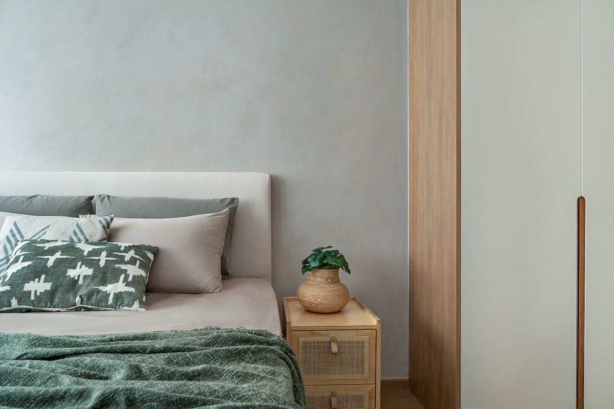
Not knowing how everything would eventually fit together, especially wanting a common theme to run through the house. The colours had to be spot-on and match the textures for all the furniture, fittings and carpentry.
You mentioned that you avoided having any hard-to-clean areas in the house. How do you keep your home clean and do you have any more tips for other parents?
I have found storage crates to be so useful to ensure things are organised; she can just put her toys in them and it teaches her to tidy up after herself. In a similar vein, we encourage her to play with a Dyson toy vacuum!
I also try to select toys that look aesthetically pleasing so that they fit the theme of the flat and don’t stand out too much if they end up in random places around the house.
Now that you’ve lived in your home for quite some time, do you have any reno regrets or things you’d do differently?
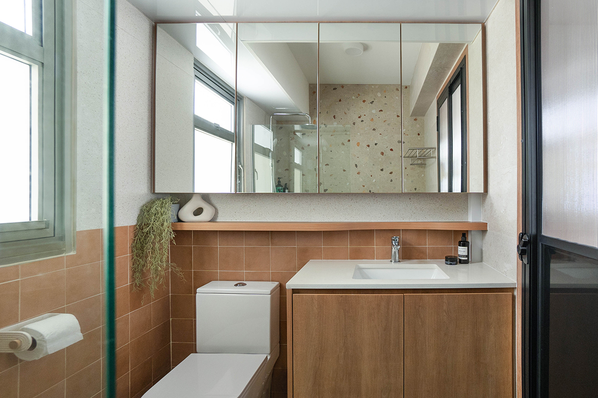
We feel that we should have built more backlit carpentry and added nightstand lights in our bedroom. Tiling an additional wall in our common toilet would have been nice to make it look warmer and more welcoming too. We also wish we had gone with a bold, patterned tile in the service yard to lend it more character.
Looking ahead, do you think you will move house again? How do you feel your future home might be different from your current abode?
I don’t think we will move anytime soon; we love the current space and our estate, with lots of amenities and an upcoming MRT station nearby. If we had to choose a new home, it would be a maisonette, so we could have a larger common area and a potential balcony to lounge on.
This post was adapted from an article published in IdealHomes 2023.


