While most interior design partnerships involve a process of listening to and understanding homeowners’ needs, designing one’s own home is quite a different story. Edward, the lead designer at Arche, experienced this first-hand when renovating the 3-room HDB flat he shares with his wife at Bukit Merah.
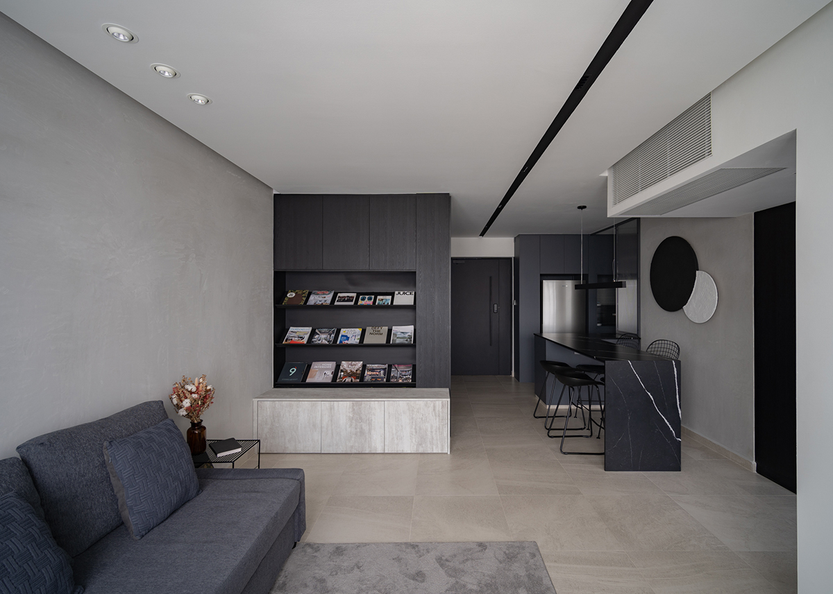
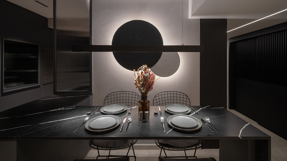
The central concerns for the two homeowners were the lack of storage and the limited space, which they struggled to share while leading vastly different lifestyles. In order to achieve a more ergonomic distribution of square footage, the designer quickly realised that a full transformation was in order. All removable walls were hacked for a complete rearrangement of the layout, turning the home into a blank canvas that opened up a host of new possibilities. The structural walls, which could not be removed, were niftily concealed in plain sight, integrating the bomb shelter into the overall design with an eye-catching wall niche.

The designer’s industry experience came in handy at this stage, allowing him to efficiently combine aesthetics and functionality. “It is essential to understand how one would interact with their space,” the designer shares. “Some homeowners can be a tad too obsessive about trends, but I would rather focus on planning around our living habits and lifestyles.” Not only does the space marry the homeowners’ personal tastes in the monochromatic colour palette and dark ambience, but it works to accommodate their practical needs as well. The loose segregation between the different areas of the home emphasises communication and free movement while maintaining a sense of personal space, striking a balance that satisfies both parties.
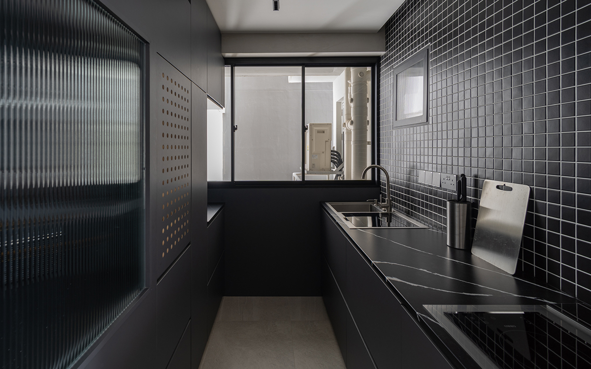
The homeowners’ need for storage was equally taken care of by Edward’s professional background, crafting a wealth of custom-built furnishings for the 3-room flat. The constraints of the home required precise measurements and exact fittings, resulting in a customised walk-in wardrobe, a tuck-in vanity and a few hidden storage compartments scattered throughout the flat. The bedroom was kept comparatively simple and small, making way for the large wardrobe and living area, spaces the homeowners chose to prioritise. The living room in particular serves as the hub of the home, where the couple can gather to unwind and communicate at the end of a long day. Sparse furniture pieces aid the calming atmosphere in this particular space, encouraging relaxation through the clean environment and positive flow of movement.

Ultimately, Edward believes that the focal design principle should remain the same when designing one’s own space—authenticity. The primary difference, he muses, is the extent to which one is willing to experiment and take risks. “I hope that my home can serve to show that we can adopt less conventional ideas and remain functional at the same time.” The dark colour scheme that dominates his home, for instance, tends to be advised against for such small spaces, often making them appear closed-off and gloomy. Despite this rule of thumb, the grey-hued palette makes for a striking environment that is unique and meaningful to the homeowners and facilitates their own sense of peace. The result is a home that functions as a “display of lifestyle and personality,” true to the heart yet practical at the core.

This post was adapted from an article originally published in the July 2020 issue of SquareRooms.


