The Oo family was already residing in Yishun when they decided to move to their current home in the same neighbourhood. Sited on top of megamall Northpoint City, they were won over by the condominium development’s unbeatable location and convenient access to myriad amenities and facilities. Likewise for their 1,023sq ft penthouse unit, the pragmatic family were inclined towards functional interiors that would support the seamless lifestyle they so favoured.

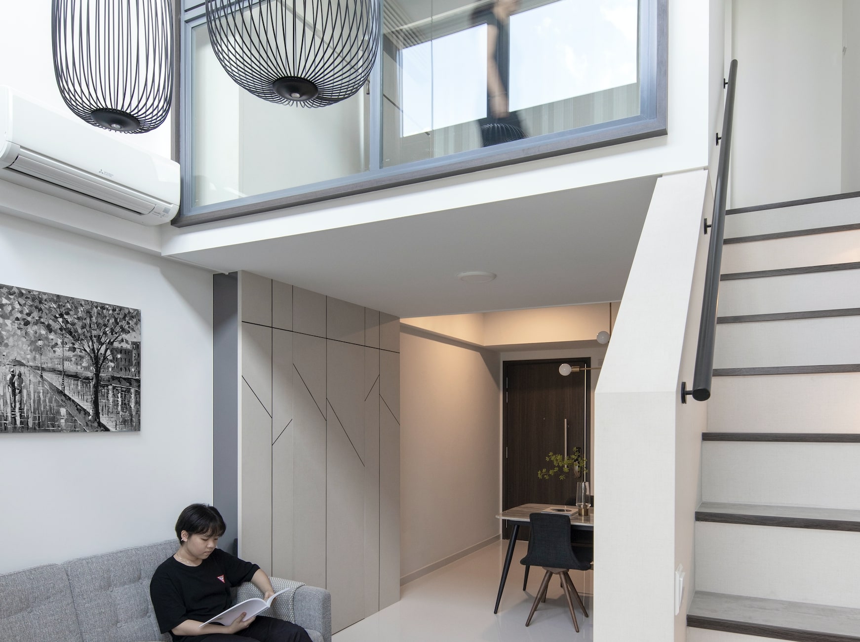
Impressed by previous projects showcased in this magazine, they approached and tasked Derrick Lim, design principal of D’Marvel Scale, with the renovation of their new home. The family’s requirements, while few, were not the easiest to execute. For one, the homeowners hoped to create a loft in their penthouse apartment’s 4.5-metre double volume living room. “The clients wanted additional living space they could use to work in, that could also double as a guest room if needed,” says Derrick. To fulfil this request, Derrick and his design team meticulously designed and constructed a loft level using mild steel hollow sections. Demonstrating the extensive thought put into its design, the loft’s folding window panels and blinds installed flexibly allows for both privacy and openness depending on the space’s use.

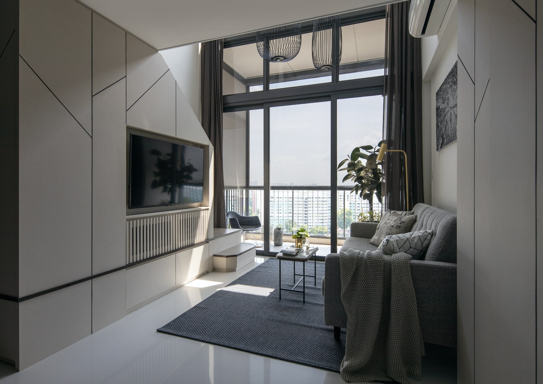
To access the loft, stairs had to also be built to connect the living room to the new space. As a space-saving feature, Derrick sealed up what traditionally would have been the staircase baluster to create the TV wall. Just deep enough to house the TV set, less apparent to the naked eye is the concealed storage space carved from underneath the staircase to hold miscellaneous cables and audio equipment.
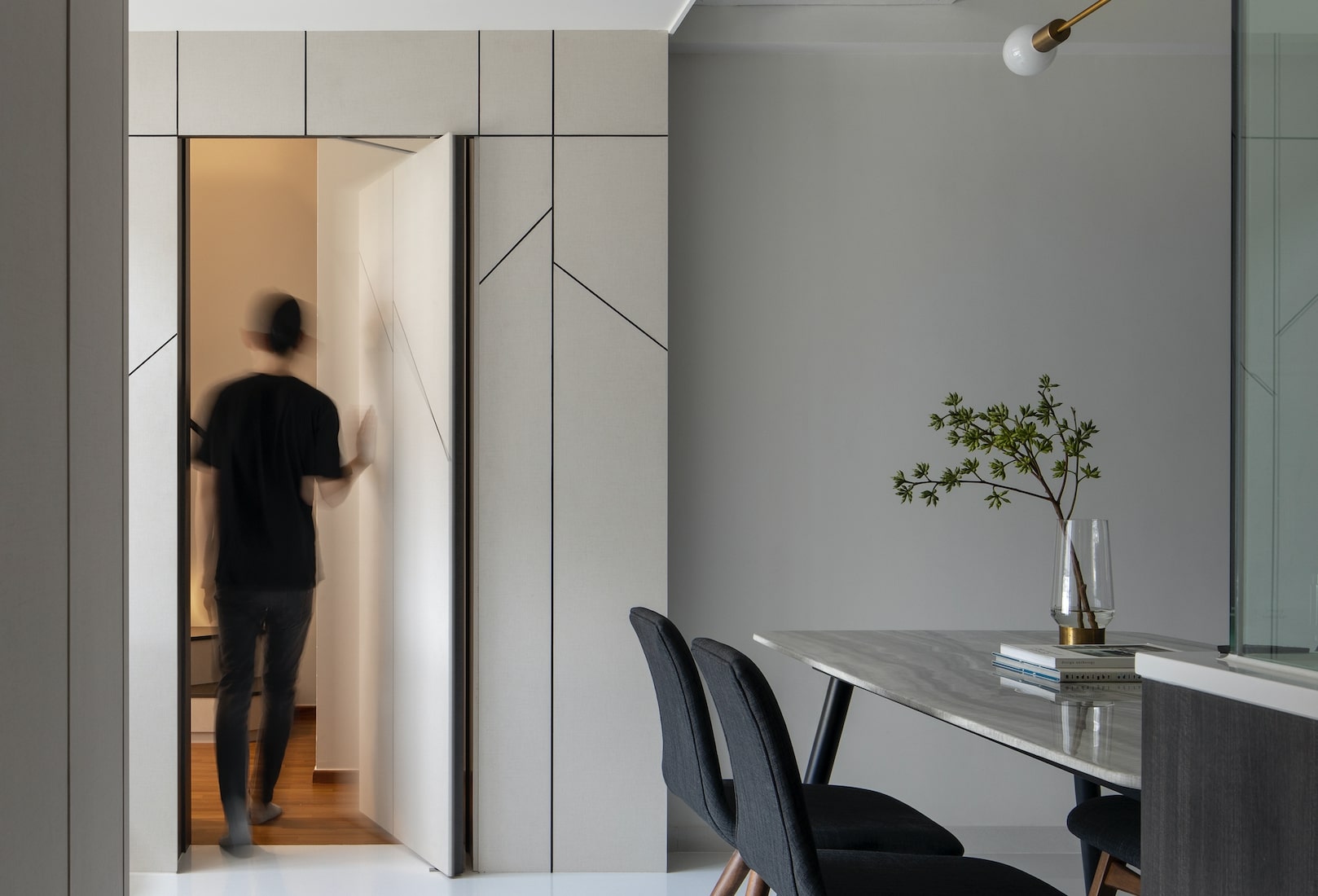
The simple aesthetics of the TV wall belies Derrick’s greatest sleight of hand in this apartment’s design. The carpentry’s vertical and angled groove lines are a bare-bones take on trees, inspired by the condominium’s name, North Park Residences. This minimalist design was not only used as a continuous motif unifying all the spaces of the home, but to also solve numerous design challenges at the same time.

For instance, a similar feature wall is repeated opposite the TV wall, but in this case, was used to disguise the door to an adjacent bedroom. For this bedroom, Derrick replicated the design strategy used in the living room to create a queen-sized loft bed and connecting stairs.

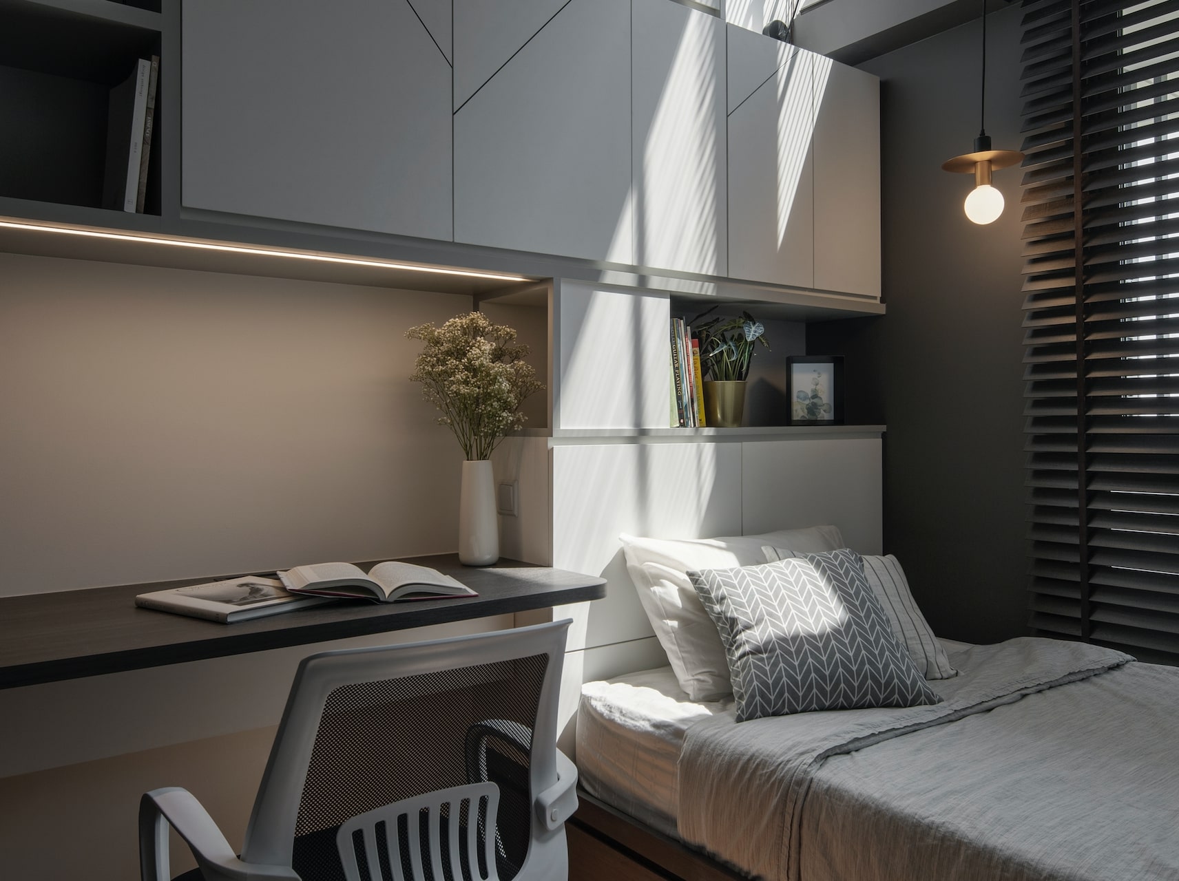
Another requirement by the clients was to keep the existing wardrobe placements in all the bedrooms. Accommodating this in the second bedroom, which belonged to the owners’ undergraduate son, while ensuring a clear path of movement meant that all furnishings—including a study desk he absolutely needed—had to be custom designed. Closed shelves are hidden behind the branch-like laminates from the headboard to the ceiling, and a platform bed with drawers does its part to maximise storage space.
The family moved into their refurbished home last June after a two-month-long renovation. Though it all appears deceptively simple, the cohesive design language was cleverly utilised as a problem-solving tool throughout the home and achieved a truly seamless living space.
This post was adapted from an article originally published in the October 2020 issue of SquareRooms.


