Chancing upon this light-filled resale flat during their house-hunting days, the homeowners were pretty much sold. “Ample sunlight is something that can’t be bought,” exclaims Director Kevin Teng from The Safe Haven Interiors, “so they made a wise choice in snapping this unit up.” Taking charge of the renovation for their “sun trap” of a home, he was briefed to create a timelessly contemporary abode with lots of storage.

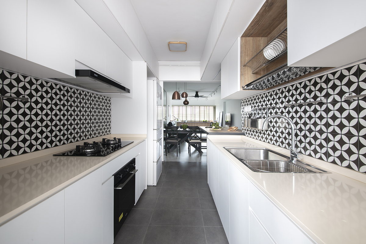
He enhanced the roominess and daylight in the communal area by first hacking away the kitchen’s boundary wall, thus effectively creating an open-concept space. With that, daylight spills into the entire length of the communal zone and emphasises the spacious connection between the shared sections.
With the kitchen now in plain sight, Kevin worked in patterned tiles for the backsplashes to deliver that wow factor. The monochromatic details of the tiles perk up the galley kitchen setting and, with a peninsular counter fronting the cooking space, it adds a layer of depth and warmth. Explaining this design choice, Kevin reveals that “the lady of the house specified for some pattern play.” These backsplashes serve as the perfect canvas to highlight these striking details without upsetting the sleek setting.

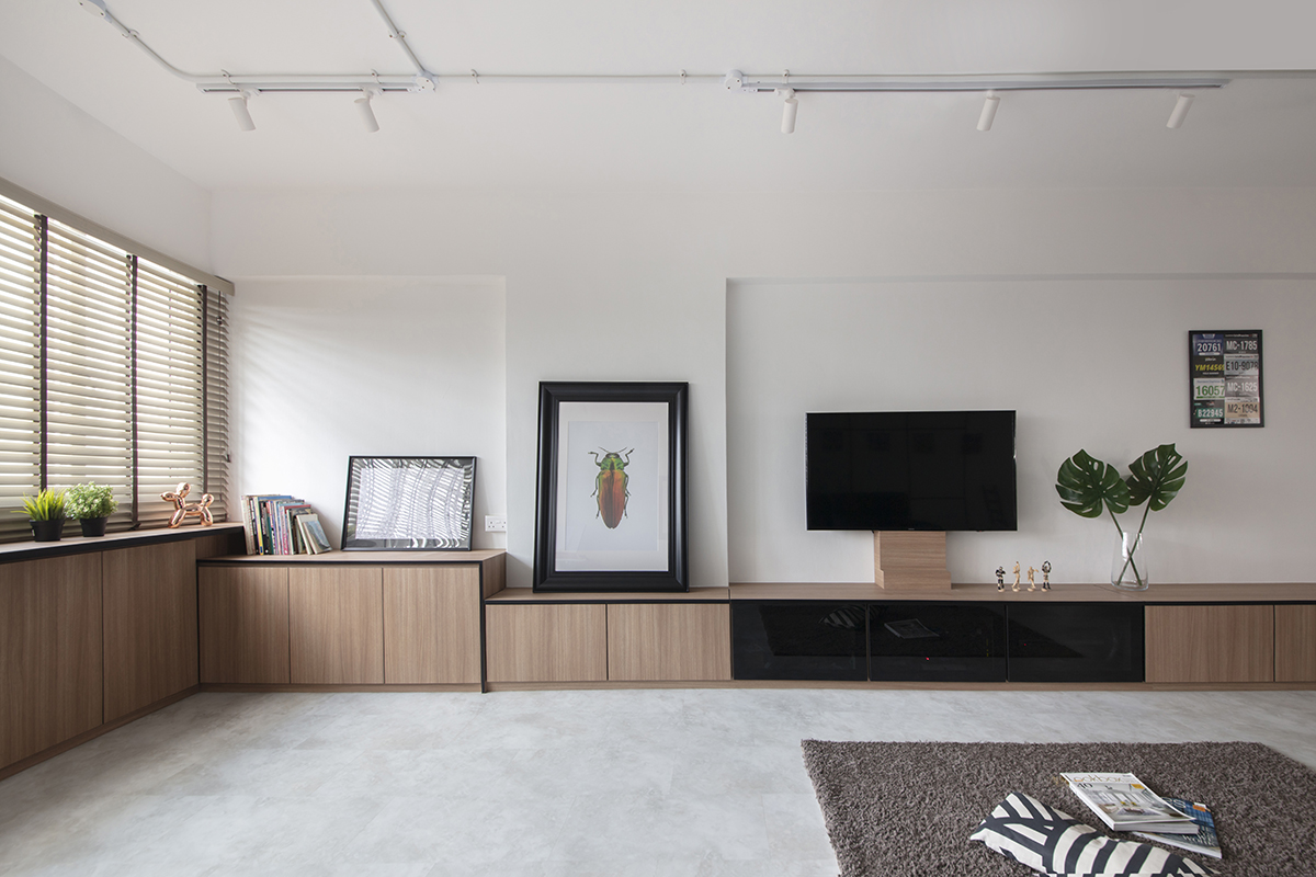
Flanked by a streamlined order of built-in cabinetry, the rest of the communal zones present a fresh feel. Form and function follow with this row of storage which comprises a full-height shoe cabinet integrated with an extended settee and TV console. Kevin shares details about his intention to design such an elaborate storage setup: “We wanted to follow the source of light which flows throughout the entire perimeter of the communal zones, and that helps to elongate the appearance of the visual space tremendously.” The seamless row of wood-effect laminate cabinets instils a soothing uniformity, and with its warm, grainy tones, it contrasts well with the cooler hue of the marble-patterned vinyl flooring.
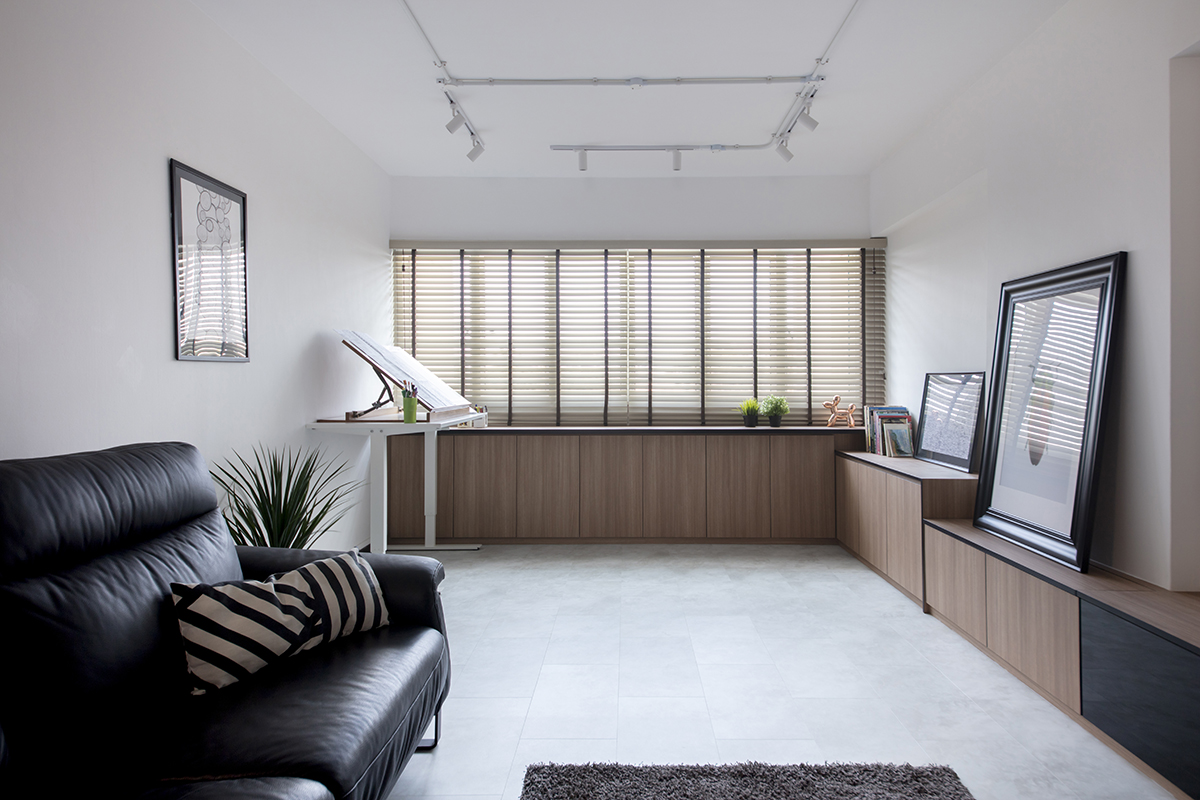
A separate space for the female homeowner to indulge in her creative whims has been carved out at the end of the living area. Kevin says: “There’s no place better than a light-filled space to work on her art projects in her spare time, and this corner is perfect with its airy and laidback vibe.” He also worked in an L-shaped console to store her art supplies and a lower display ledge to showcase her best work.

Standing behind the sofa is a glass wall. This full-height fixture is supported by a dark aluminium frame with a sleek, pane-like design. The see-through divider fills the space with modernity and adds to the light-filled appeal of the living zone. Kevin explains why they wanted to add this divider: “We wanted to have a backing for the sofa and create a proper walkway towards the bedrooms.”
In the master bedroom, the area looks enlarged partly because it hosts a modestly sized yet well-equipped walk-in wardrobe. Much spatial contemplation has gone into making the most of this room, and it shows in the well-planned layout. The heart of the space is a dual-sided divider with storage compartments, and it provides much practicality as well as privacy to the sleeping quarters.
This post was adapted from an article originally published in the November 2020 issue of SquareRooms.


