Together with Happe Design Atelier, the homeowners set out to create a personal space inspired by their new home’s locale.

Typically, when a person is planning the interior design of their home, whether with the help of a designer or not, their design decisions would most likely be informed by their own personal preferences: whether in the form of things that they like or drawing on themes and concepts inspired by overseas travels and other lived experiences.
However, for the new owners of this 3-room resale flat, they decided to have their home honour the history of its location. Situated within the North Bridge Road district, Crawford Lane used to be referred to by the Chinese as “sio poh” (Hokkien for “small town”) during the 1830s. This term was used to differentiate the area from Chinatown, or “tua poh” (Hokkien for “big town”).

“Sio Poh was once a popular and luxurious place complete with sea views, and after meeting up and discussing with the owners on the design of their home, we came up with the idea to bring back the vibe and that feeling of nostalgia from that time and place,” explains Ean Chu, the designer from Happe Design Atelier who was tasked to oversee the project’s renovation.
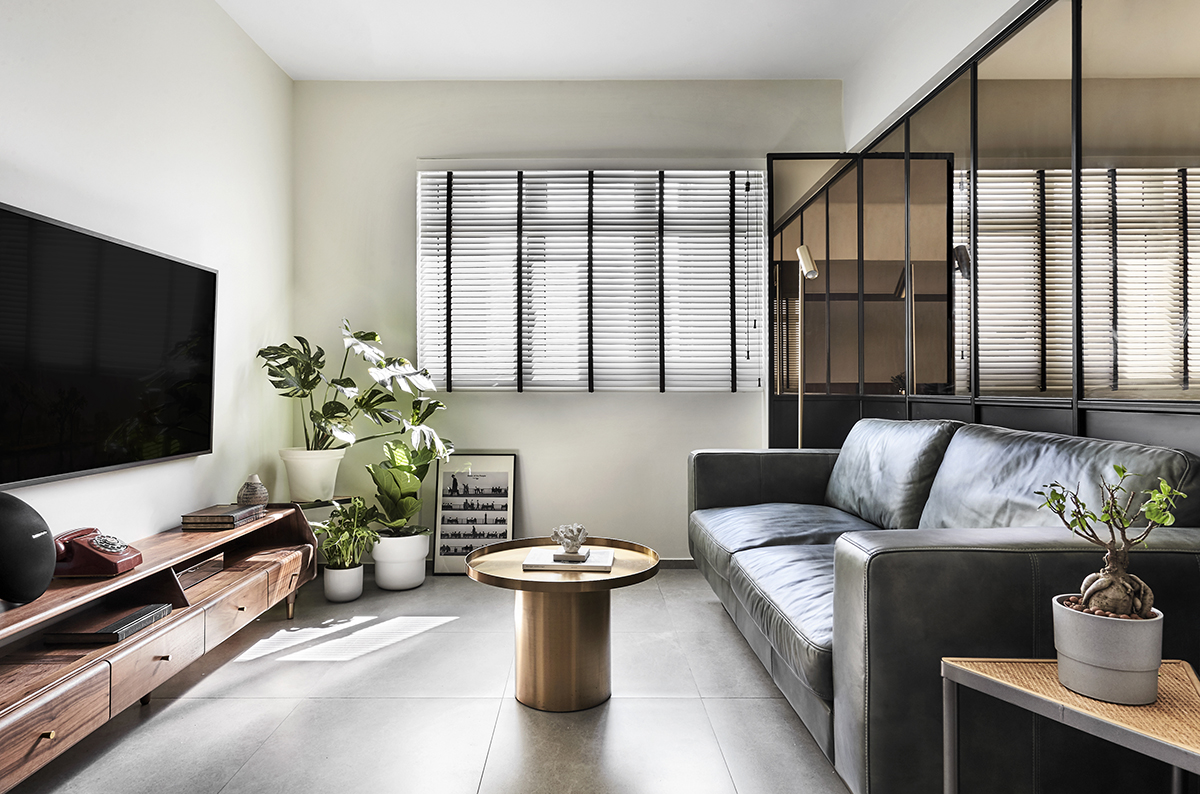
This didn’t mean that the new space was to be completely remodelled after the design style of that particular time period though. Instead, the design studio chose to go with a contemporary style and sought to introduce retro and luxurious elements through their selection of materials and textures in the loose fixtures.

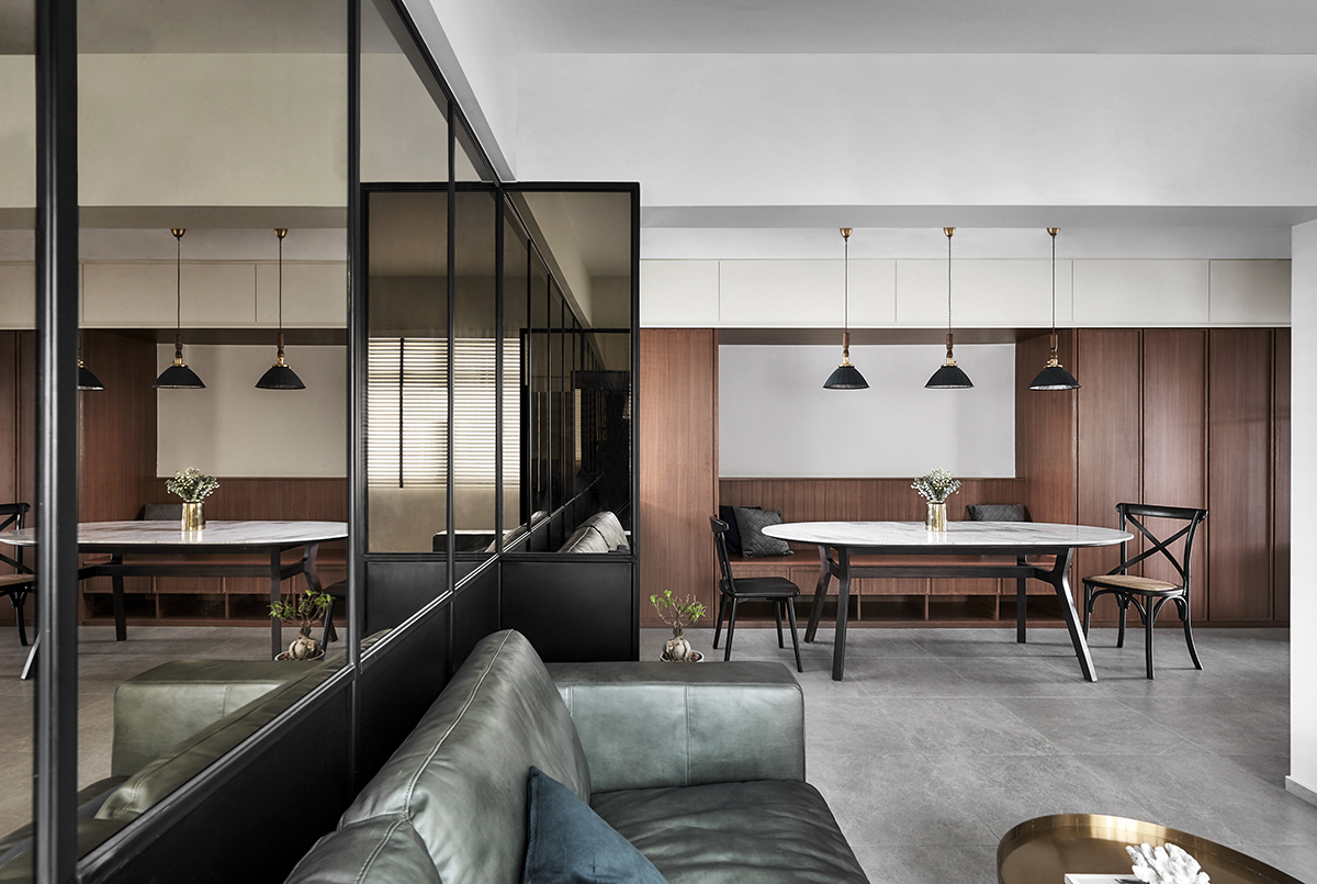
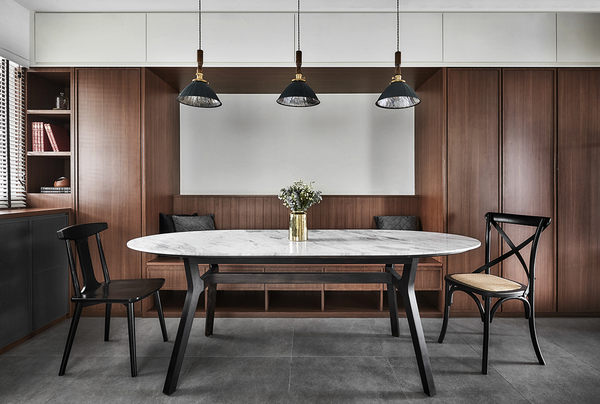
But first, they had to tackle the home’s structural and layout modifications. “We hacked almost all the walls in the home. We extended the master bedroom’s wall out to give the owners a larger private space, converted the original spare bedroom into a cosy family room, and the living room into an expanded dining-cum-activity area that also functions as a home office,” the designer says.
With there being no storeroom in the house, one of the owners’ main requirements was ample storage space to keep things stowed away. To cater to this, the entire stretch of the home’s main wall was outfitted with floor-to-ceiling cabinets that fully maximise available space.

Meanwhile, other clever design tweaks include the installation of wall-mounted mirror panels and wainscoting in the living room for the illusion of a larger living space. Concealed magnetic door handles for the built-in cabinetry moreover achieve the clean lines and subtle sophistication that contemporary design is known for. With the exception of the master bedroom, dark wood laminates were used throughout the home. Ean says, “We actually toyed with the idea of using light wood, but decided against it as it was lacking in essence and character. Dark wood laminates have the ability to ground any space well, and it matches with the other furnishings and fixtures in this home really well.”
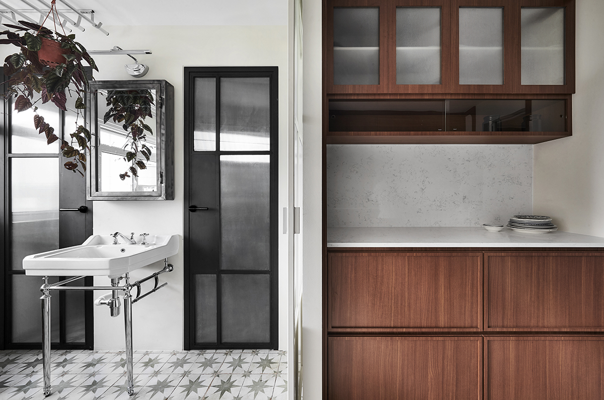
For Ean and the rest of the design team, the almost three-month renovation process was a highly rewarding one. “The atmosphere in the new home is all about harmony, warmness and eloquent uniqueness with a touch of retro that creates intimacy and comfort abound. Light walls and furnishings contrasted with dark-accented furniture, the main door in olive green, combined with the colonial tiles, create a luxurious and calming space to relax and unwind in,” he summarises.
This post was adapted from an article originally published in the March 2021 issue of SquareRooms.


