Having kept in touch with their interior designers for four years, a married couple entrusted them to turn their new (but weary) apartment into a sophisticated farmhouse.
There’s no doubt that great interior designers get plenty of referrals, but given the nature of their work, returning clients are hard to come by. However, when Jamie and Jon engaged Ruby and Yue Qin for their previous home four years ago, they knew their paths would cross again.
“We were only able to give brief details of what we were looking for, but just by mentioning the phrase ‘farmhouse concept’, they were able to perfectly interpret and materialise what we had in mind,” says Jon.
So, when the couple got their keys to a resale condominium unit at Ascentia Sky, it was a no- brainer. However, the task was far from easy, despite their strong chemistry. Although the development was only a decade old, the house had been poorly maintained and desperately needed a refresh.
A fixer-upper
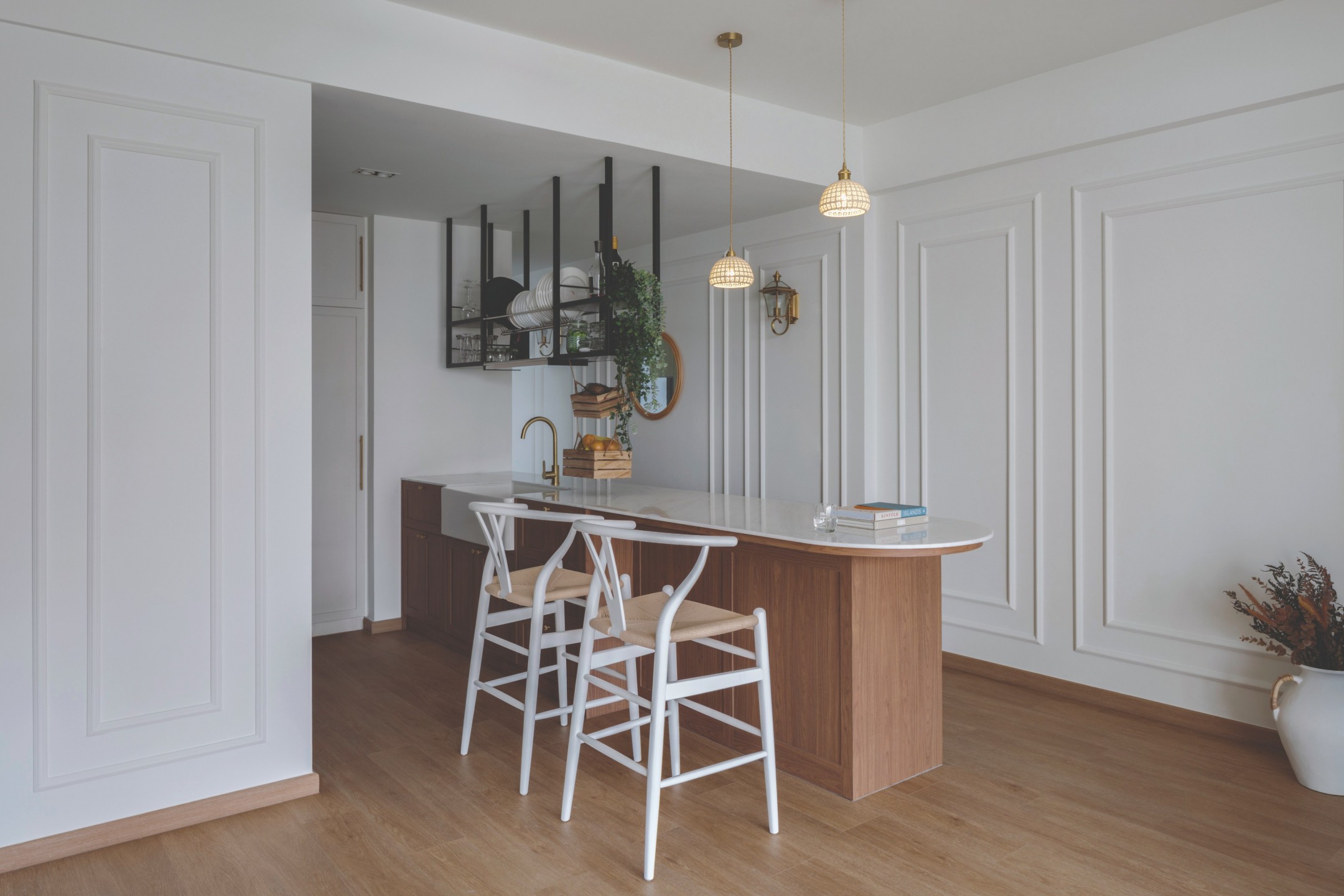
According to Ruby and Yue Qin, the kitchen used to be tiny, poorly ventilated, and crammed with built-in cabinets – a far cry from the open-concept kitchen that Jonathan, a foodie who loves to cook, had envisioned. Naturally, the first order of business was to tear the walls down and open up the space before they could beautify it.
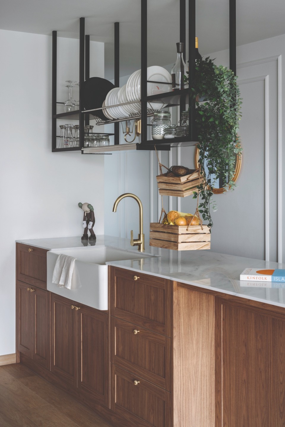
“The wood tone island contrasts with the rest of the oat-coloured kitchen units and places a spotlight on the farmhouse sink – our clients’ favourite fitting in the kitchen,” Ruby highlights.
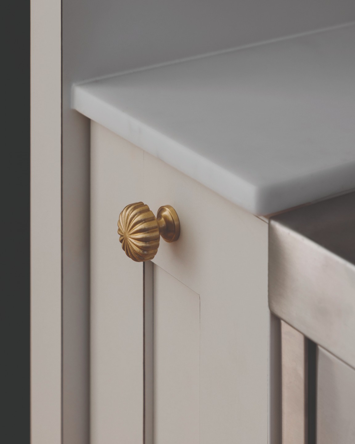
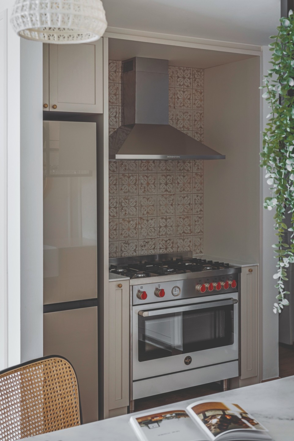
The kitchen’s design is all about balance. Whereas hemp and rattan furniture created a pastoral atmosphere, a decorative backsplash polished the look. And while the pumpkin knobs gave the cabinets a dainty demeanour, the pendant lights embellished the space and elevated the marble worktop below.
Proportions were considered, too, with the sleek lines of the open-faced metal rack offsetting the heavy visual weight of the island. The latter extends into the living room, blurring the division between both programmes and anchoring the communal space.
“The far end of the island features a curved cantilever for day-to-day activities like casual meals and light work. Fun fact: this also happens to be where we hang out whenever we pop by for coffee and catch up,” Ruby quips.
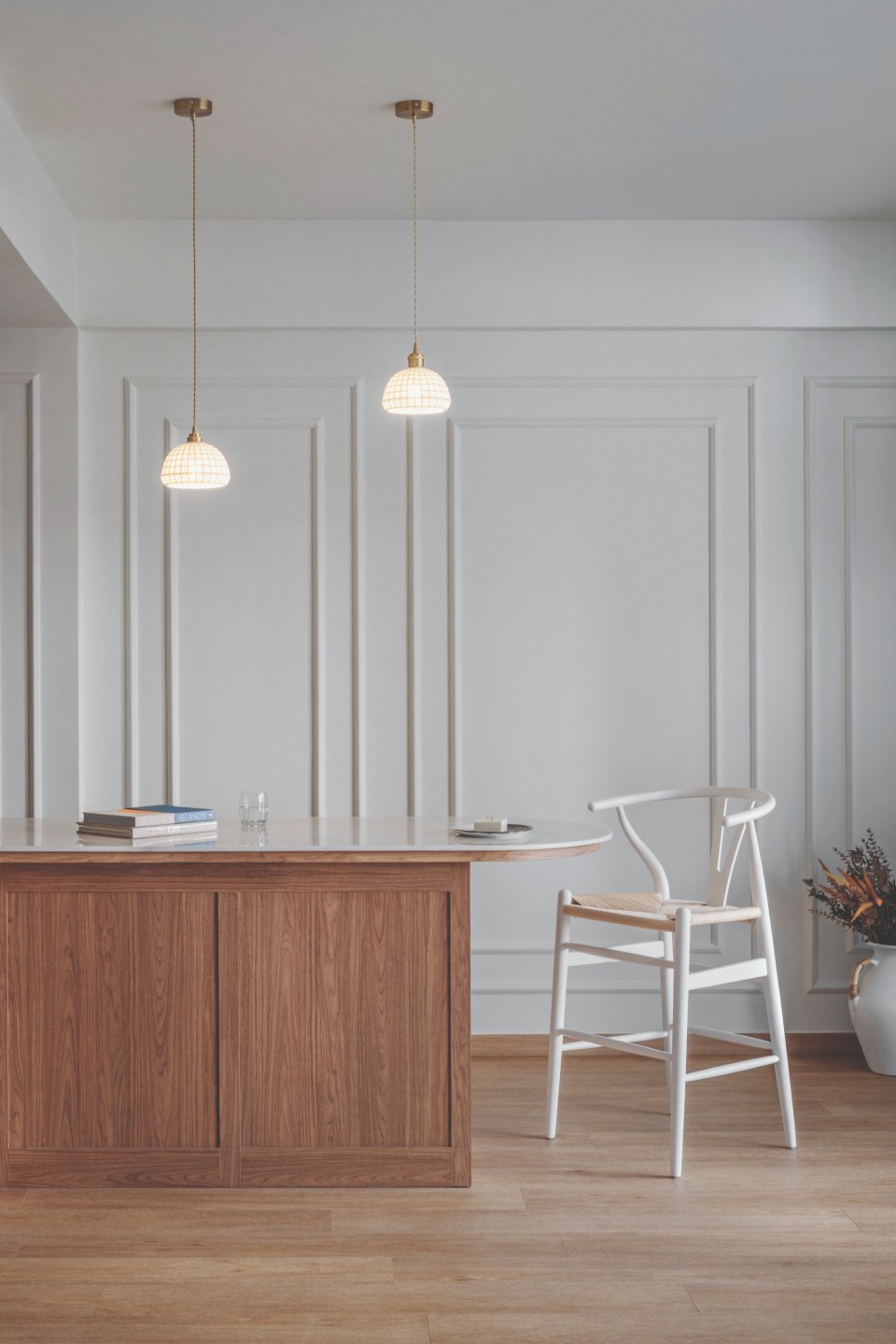
Countertop clutter can ruin an open-concept kitchen, which is why the designers aligned the island with the walkway, maximising the storage space within and ensuring easy access from either side.
This was a major tickbox for the couple, who have an arsenal of kitchen appliances including two refrigerators.
Jamie and Jon knew from the get-go that they didn’t want to use the balcony as a laundry yard. Since they host frequently, Ruby and Yue Qin extended the living room’s flooring into the balcony and seamlessly transformed the latter into an alfresco dining area. They left just enough room for Jon’s herb garden and a lamp post.
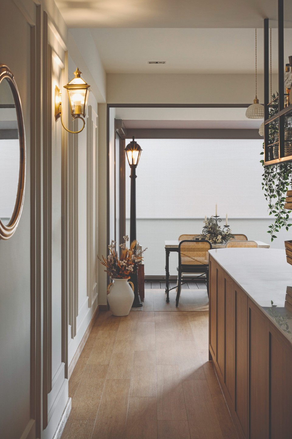
“It was love at first sight with the lamp post for Jamie, and we thought it would add a whimsical touch to the alfresco dining area, resembling a romantic candle-lit dinner along the streets of Paris,” Ruby adds.
Reimagining the space
The European flair continues in the living room where wainscotting features heavily. To accommodate large gatherings and a 3-metre couch, Ruby and Yue Qin enlarged the living room by making the corridor a part of it, shaking up the typical TV and sofa placement in the process.
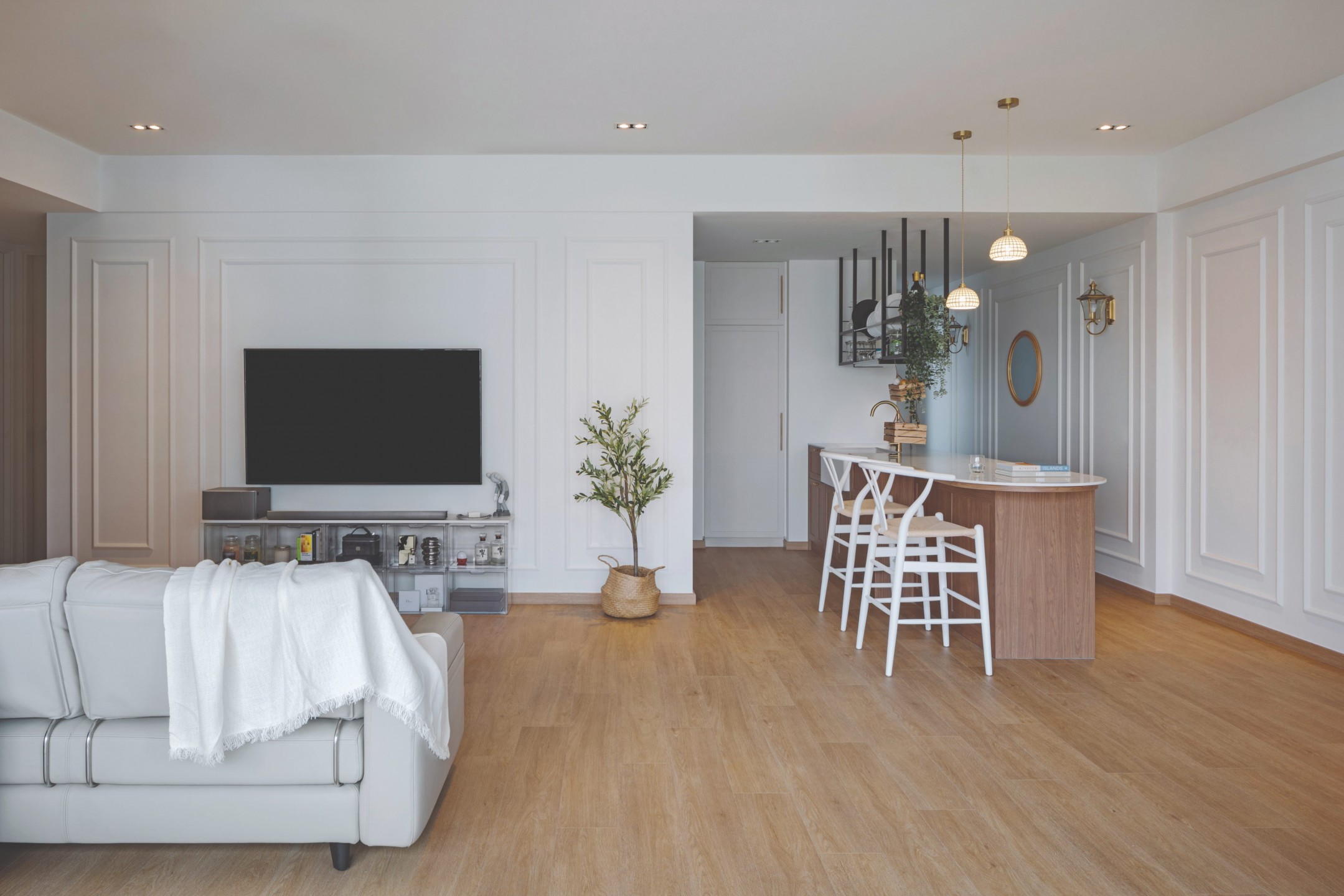
“This orientation also allows the kitchen appliances to be hidden from view from the living room, thus creating a neater backdrop,” Ruby says.
She added that the usual TV console was substituted with modular acrylic boxes, allowing the couple to flaunt their prized possessions without the need for a display cabinet.
“…a spotlight on the farmhouse sink – our clients’ favourite fitting in the kitchen.”
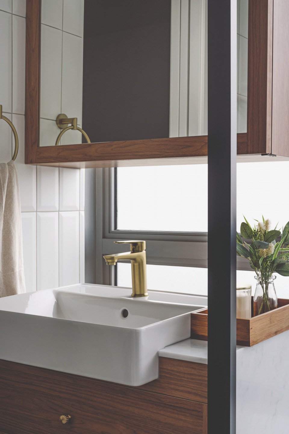
Other bold choices were reserved for the bathroom – the biggest bugbear from the outset. The space was tiny, and the encroaching bay windows and bathtub certainly didn’t help. To carve out room for a vanity cabinet, the two designers had to get creative.
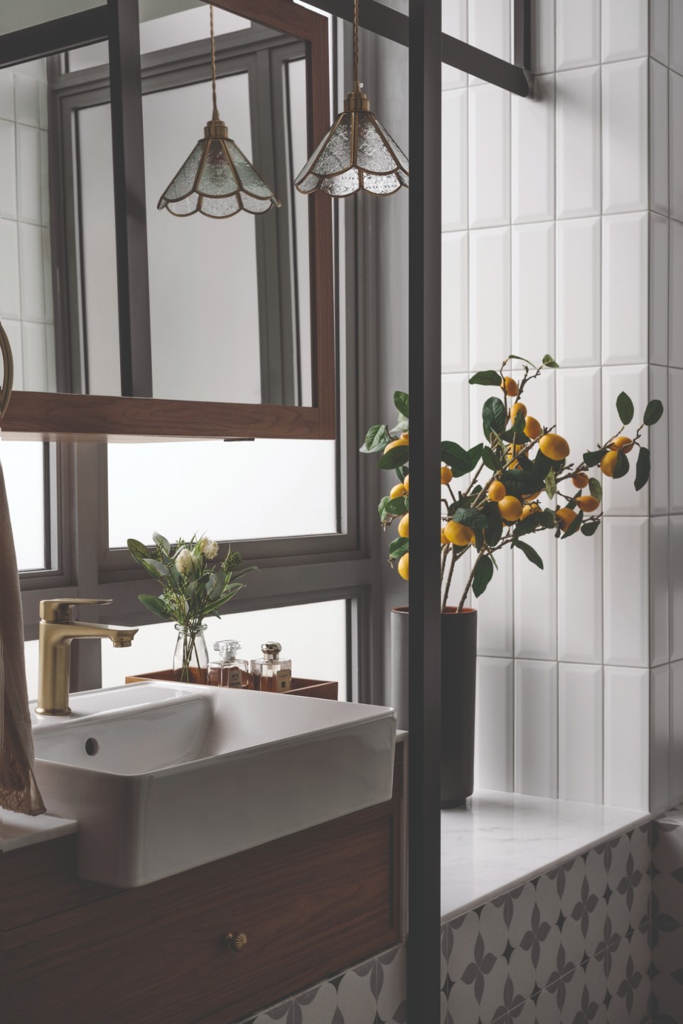
“We designed sliding tracks that were suspended from the ceiling for the shower screens and an overhang vanity cabinet for convenient access to the storage behind the mirror. This retains the lightness of the bathroom space,” Ruby explains.
Instead of trying to conceal the existing structure, they decided to embrace it by juxtaposing decorative glazed tiles against the white bevelled subway tiles. By the end of the project, the bathroom became Ruby’s proudest work in the entire house.
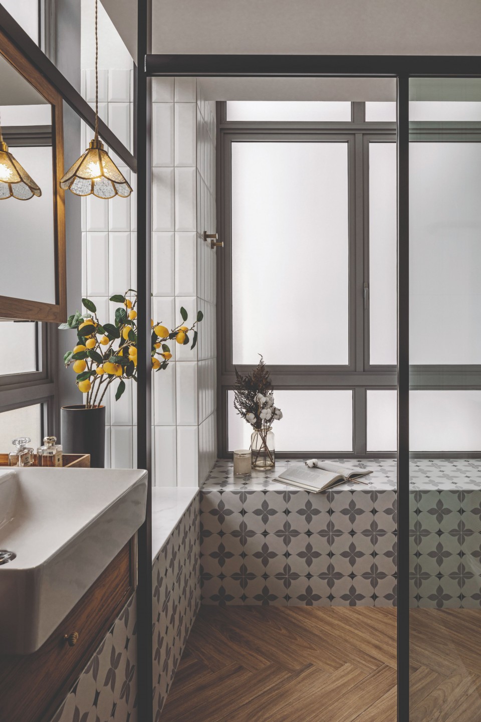
“Despite it being a small area, there were a lot of details to look out for particularly (when) working around the windows. It was a challenge to mix and match three different tile patterns within such a confined area and we are glad it turned out well.”
Fittingly, Ruby and Yue Qin named this project “Silver Lining” – the paint colour of the house. No location is flawless, and dealing with resale units can pose additional challenges. But in the hands of an artist, even an imperfect canvas can transform into a masterpiece.


