This multigenerational family adapts their dual-key apartment to suit their personal needs.

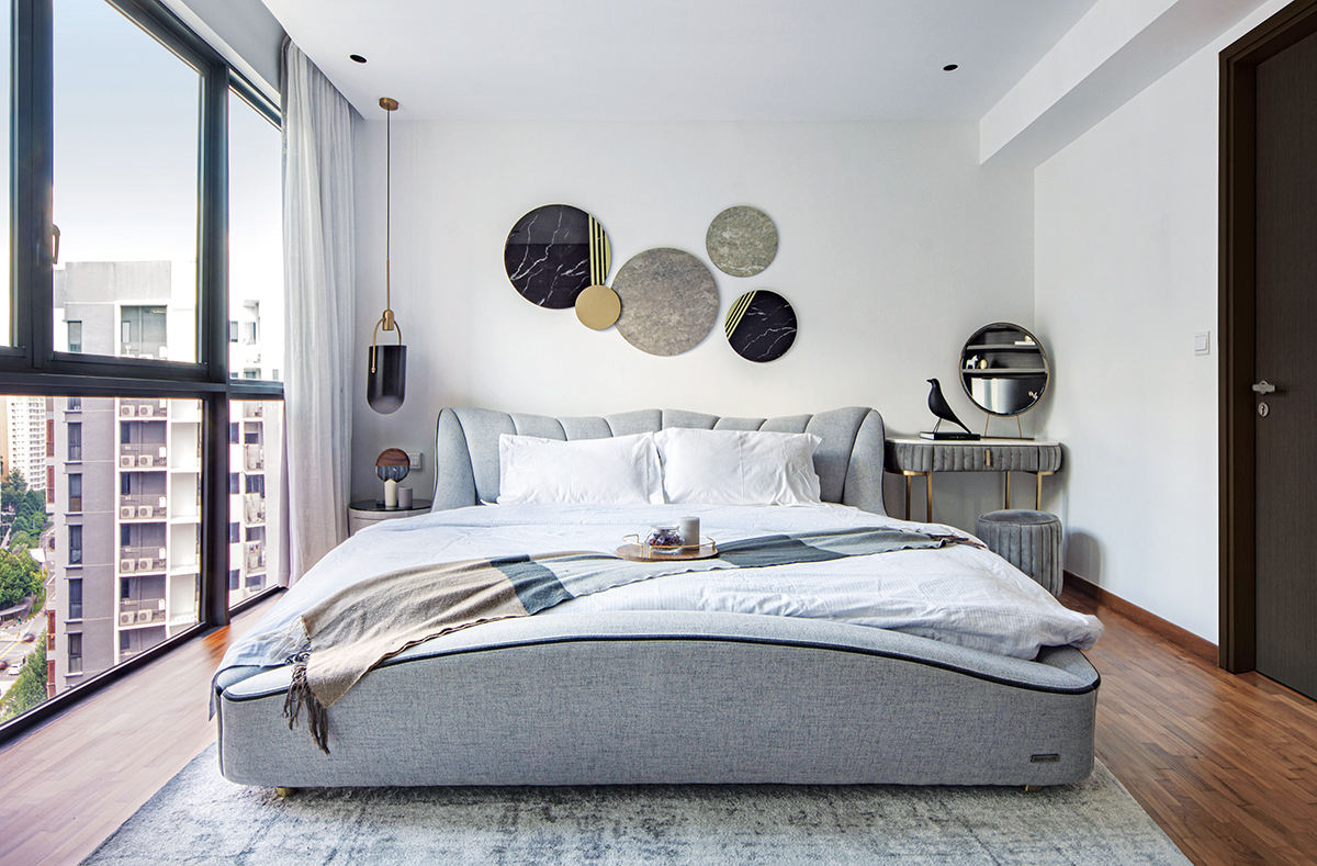
Dual-key apartments are often marketed and appeal especially to multi-generational families, since the adjoining sub-unit, which is designed like a studio, is spacious enough to accommodate elderly parents whilst affording them privacy from the main unit where the rest of the family dwells. While the Tans are a three-generational family, the eldest member had little need for the biggest room in the house and was willing to concede it to the owners to occupy as their master bedroom.
As the sub-unit had been designed like a self-sufficient studio, the owners decided to remove the pre-existing kitchenette—now a superfluous feature for a master bedroom—and to imbue their entire home with a seamless contemporary look. They conveyed these conditions to the interior designers at DISTINCTidENTITY, who had a few creative solutions to propose.

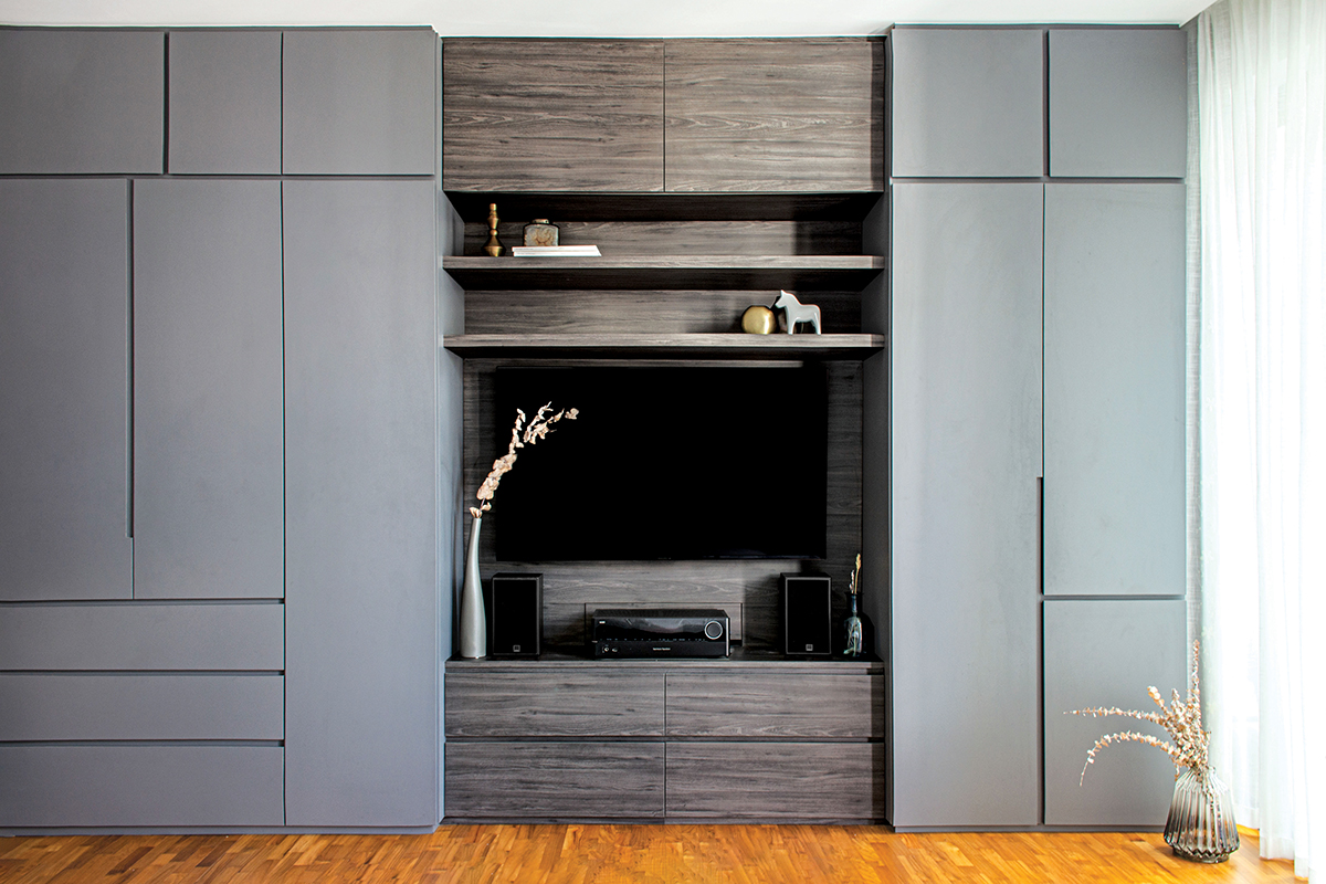
Being a businessman, Mr Tan had expressed his desire for a study area where he could work in comfort. So the designers suggested converting the kitchenette into a study area for him and relocating the wardrobe to the long wall to accommodate for a larger wardrobe and TV for the missus.
This layout made much more sense for the room’s new occupants, but it meant a complete overhaul of the space—not only did the kitchenette carpentry come down, but the built-in wardrobe, too, was dismantled. A fully fitted workstation now takes the place of the kitchenette, and a commodious wardrobe-cum-TV console lines the opposite wall.

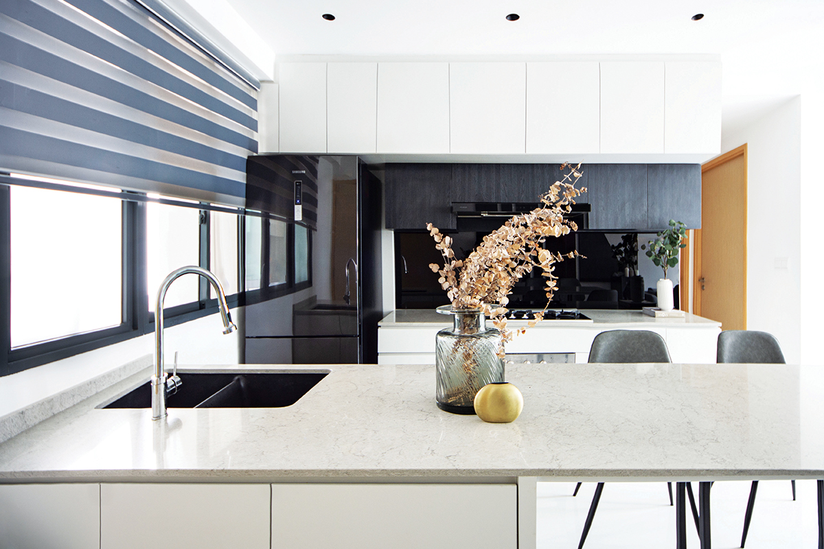
The kitchen also underwent significant tweaks to its layout. Being the first area that one sees upon entering the main unit, it was imperative that it bore a sleek and tidy design.
The designers faced a challenge to fit a dining table that could seat at least five while maintaining ample room for cooking and moving around. They found the original dimensions of the kitchen to be limiting, so it was extended lengthwise, encroaching a little into the living area, but not by a perceptible amount. The enlarged space was utilised by building a long peninsula countertop onto which the sink was shifted and where the entire family now takes their meals.

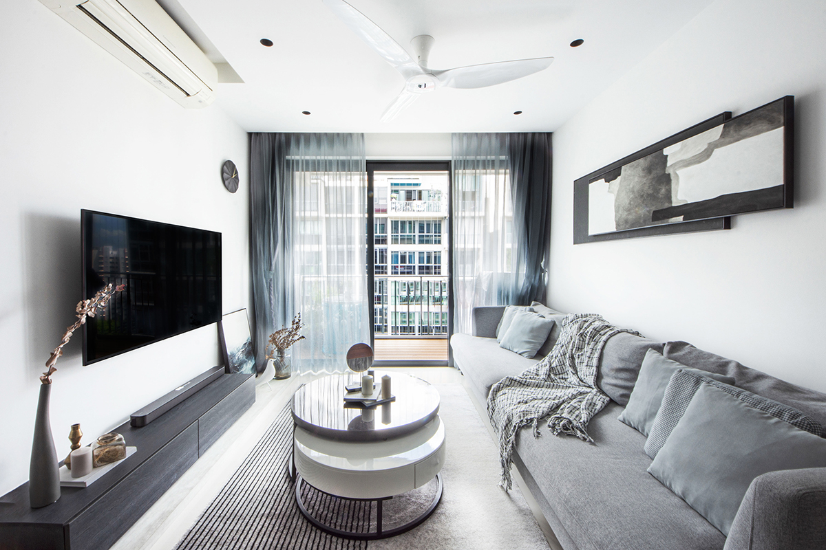
The contemporary language of luxury that was developed for the home is best represented by the living room. The designers curated a neutral palette of dove grey and cream, contrasted by black accents for an understated polished look. The makeover of the spacious 1,480sq ft apartment took a speedy five weeks to complete, and the family was able to move in just in time for Christmas to enjoy their newly refurbished home.
This post was adapted from an article originally published in the May 2021 issue of SquareRooms.


