Escape to this colonial-inspired HDB flat, where a laidback lifestyle is carved out through idyllic botanical details and a breezy, open floor plan.
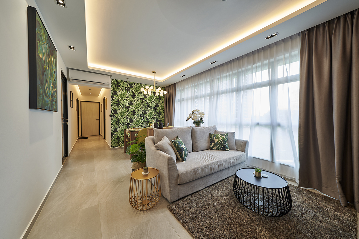
A colonial-inspired style is not particularly common in HDB flats, so it was quite the original choice for this BTO unit. Commissioning the renovation to the Cozyspace Interior design team, the homeowners, a married couple, specified a request for a bright and airy living space first and foremost. To project a spacious and breezy expanse of space, the team worked with a pared-down yet inviting colour scheme, the subtle palette allowing the dark furnishings and bold designs to pop against the neutral surroundings.
Casual sophistication takes over in the shared living and dining space, where whitewashed walls and light-coloured tile flooring evoke a sense of openness. This clean-lined backdrop sets the stage for a wall decked in botanical wallpaper prints. Besides lending an eclectic tropical touch, these lush patterns sit in well with the rest of the design, enhanced by a rustic wooden dining set.
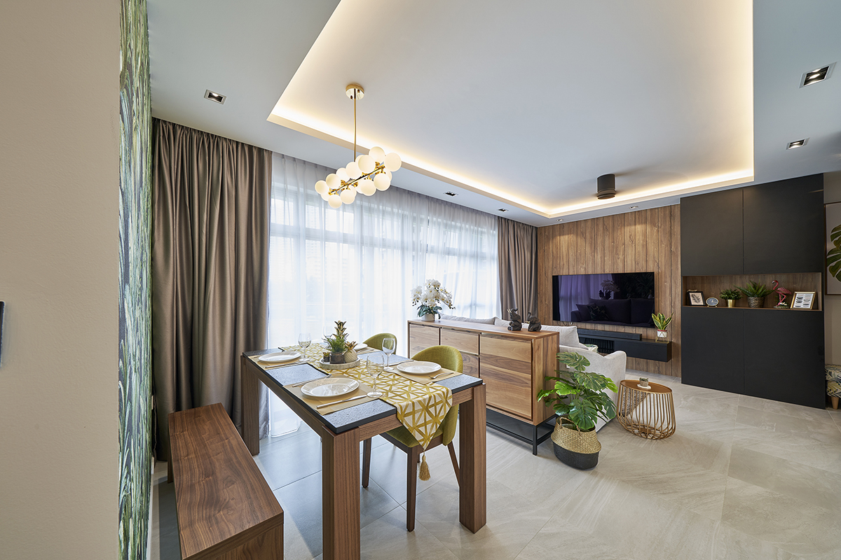
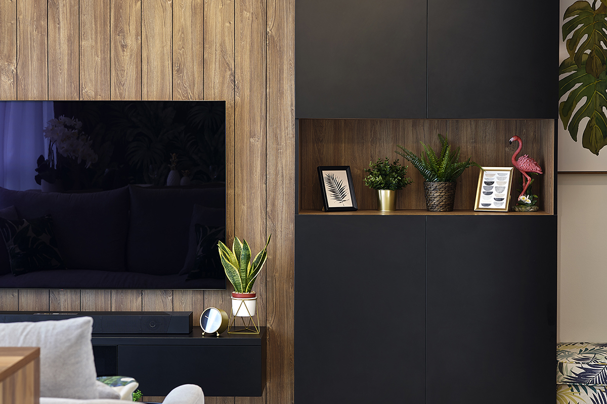
These rich wooden textures are also prevalent in the living area, where wood-effect laminates line the entire height of the TV feature wall. For a more authentic look, the grainy laminates sport v-groove details to emulate the look of a solid wood panel. They’re paired with a wall-mounted TV console in a matte black laminate finish, the low-rise structure allowing the wooden textures to reign supreme. The polished combination of wood and matte black detail is then seamlessly brought over to the connecting shoe cabinet. Taking into consideration the dark matte laminates framing the cabinet doors, the team worked in an open niche to lighten the visual load. This also allows the homeowners to display a charming vignette of their cherished ornaments.
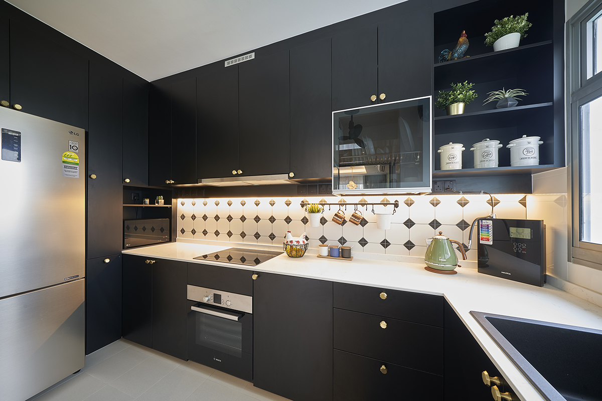
Moving on to the kitchen, this high-traffic area is fitted out with a clear glass door, which lets more light permeate the cooking zone for a spacious look, all without the need to knock down any walls. The extra brightness furthermore highlights the tiles used for the backsplash, where the monochromatic hexagonal details draw out a heritage charm reminiscent of the colonial style, while the white background contrasts brilliantly with the dark cabinets.
As far as the private quarters go, the homeowners wanted to merge two rooms to form one large bedroom. This combined space was to integrate their master bed, a walk-in wardrobe and even a study area. Assessing the situation, the designers knew they would not be able to hack away the structural boundary wall segregating the two areas; instead, they designed it as a privacy divider between the sleeping quarters and the rest of the amenities.
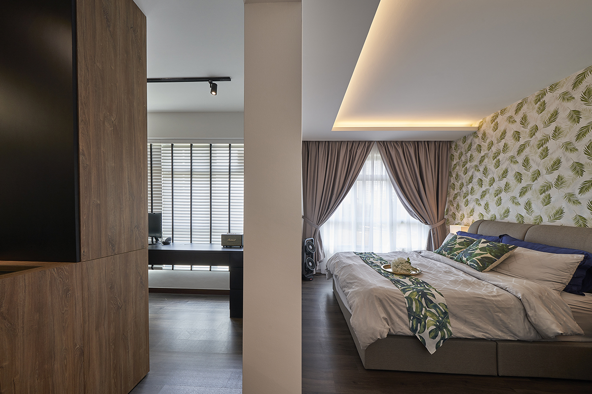
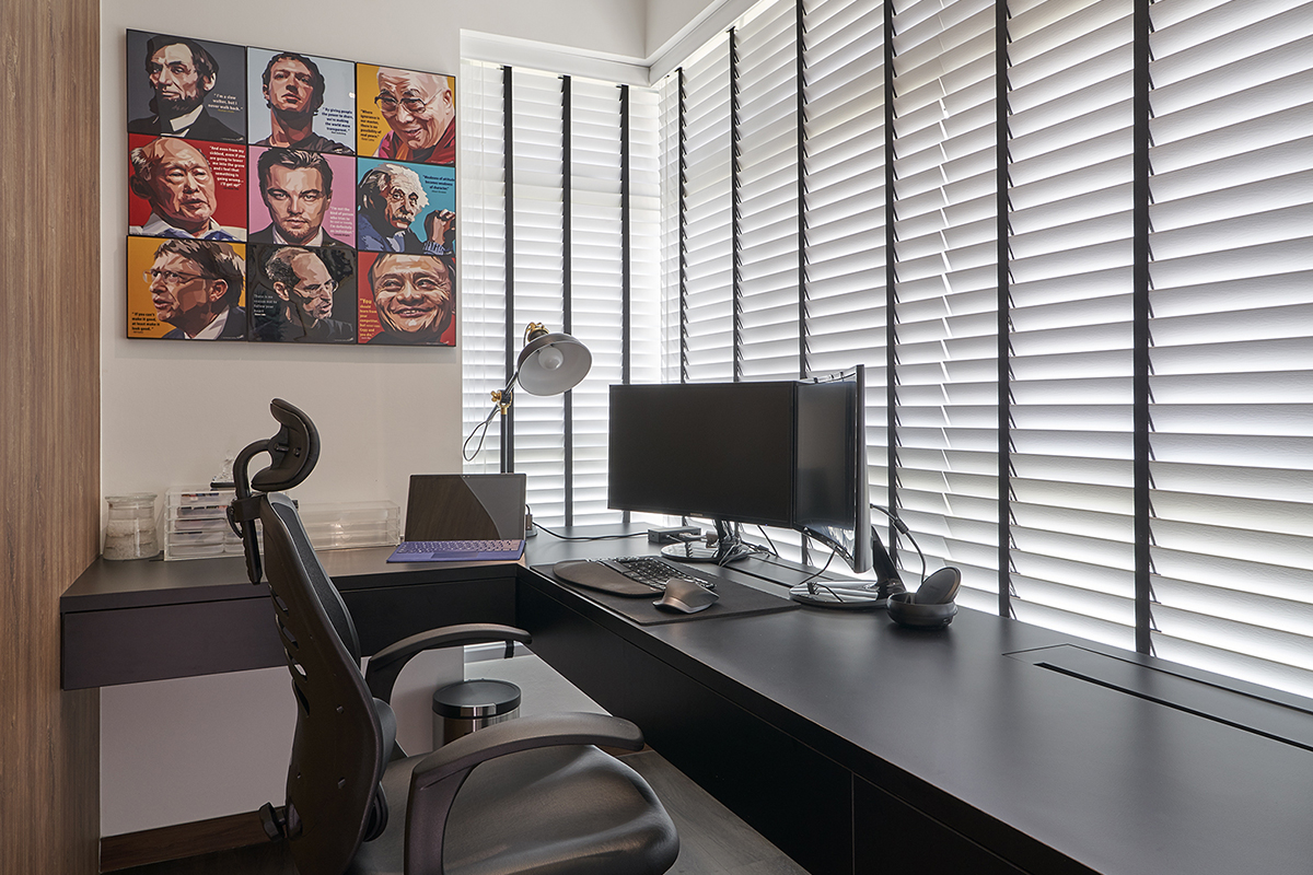
A boutique-inspired walk-in-wardrobe now occupies the original master bedroom, together with the homeowners’ study area. The team maximised storage space here with a well-planned order of carpentry works. Starting from the full-height wardrobe with a strategically-placed sliding mirror door, this fixture is complemented by an L-shaped dressing table and a display cabinet. On the other side of the room, the designers ingeniously worked in a floating study table that spans the length of the entire window. Well-lit and far away from distractions, this quiet study corner proves to be the perfect spot for productive and contemplative moments.
This post was adapted from an article originally published in the January 2021 issue of SquareRooms.


