Prized for their spaciousness and flexibility, resale executive maisonettes are still very much in demand amongst homeowners today, despite new units no longer being built. So when the owners came across this unique four-room apartment in Bukit Panjang, they knew they had to make it their home. While they already had a clear idea of how they wanted their new abode to function, they needed some help to bring their dream into reality; and that is where design-and-build workshop The Merry Men Interiors come in.
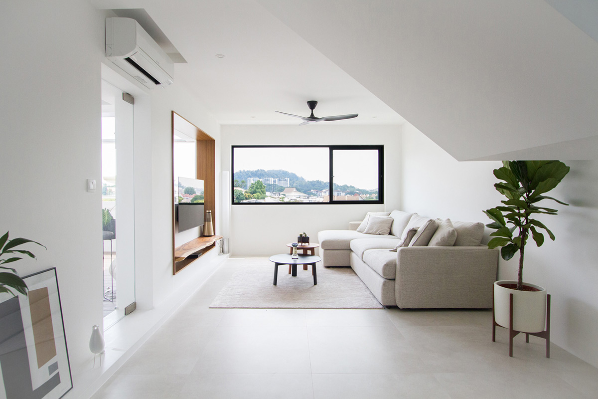
Besides just its sheer size, this apartment actually had a lot more going for it, in that it also opens up to striking, uninterrupted views of Bukit Timah Hill. To celebrate these fantastic views, the design team opted for a minimalistic concept along with a monochromatic colour palette to carve out a restful atmosphere that would allow the home to serve as an intermediary to the scenery that lies beyond. This was then enhanced with wood accents that not only imbues the space with warmth but also brings about a quality of simplicity and lightness into the apartment.
Other than the colour palette, this home’s minimalist aesthetic is also attributed to the absence of boxy wall-mounted built-in fixtures. When asked about this, principal designer Clarence Lee had this to say, “The design of the living area is as such because it was part of a larger scenographic experience that incorporates the view beyond and the design of the adjacent areas, where one has to personally move through the house to see how each composition relates back to the whole.”
Despite the relatively pared-back design, the television area is a striking feature within the space. Although originally a sliding-door entrance to the balcony, the design team relocated this to the side and built up a half wall to accommodate the television set. What remains is now a more visually contained living area that still preserves a sense of openness that was once there. After the creation of the half wall, however, a rectangular window remained, and the designers were left wondering how to elevate the visual weight of the television wall. “That was when the idea of a wood accent border came about,” Clarence explains, “This was then complemented by a specially handpicked suar wood plank with a highly interesting live edge to visually underline the TV area.”
Over in the balcony, the homeowners requested a cosy and intimate outdoor area that they could retreat into to escape the bustle of life. Although originally encompassing quite a small floor area, the designers decided to increase its perceived footprint by extending the decking all the way into the partition wall that separates this space and the adjoining kitchen. Then, the partition wall was swapped out for a single full-height glass panel to make the balcony a physically inadmissible feature through a technique called “teasing”. Often used in the design of traditional Japanese gardens, what this does is further heighten the significance of the balcony when viewed from the kitchen or even at the main door entrance.
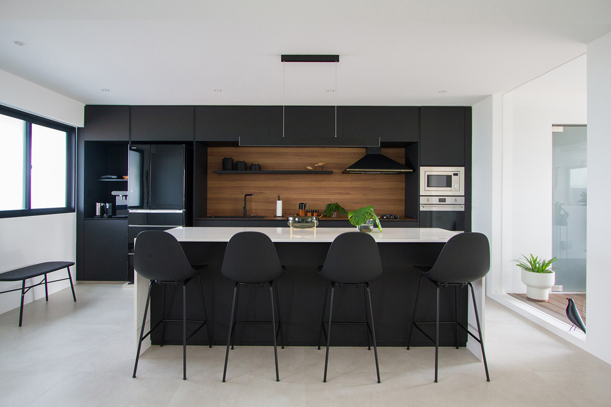
As the couple cooks and bakes often, they wanted their sessions in the kitchen to be a social affair especially when they have guests over. To achieve this, the design team carved out an open kitchen and installed an island unit in the middle to offer additional prep space. Additionally, to keep up with its frequent usage, highly durable materials were used – which can be seen through the Silestone quartz island countertop, the KompacPlus New York Teak backsplash and countertop surrounding the hob, as well as the cabinets that were finished in black Jennings Clean Touch Nero laminates. Additionally, the absence of door handles on the cabinets contribute to a much cleaner look within the utilitarian zone.
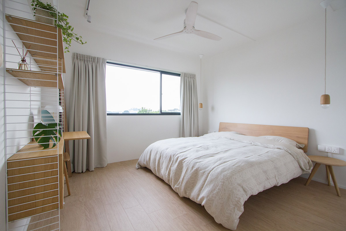
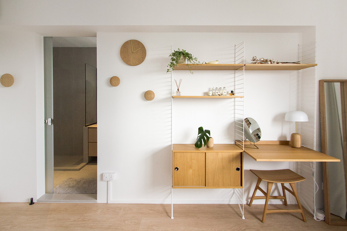
For the apartment’s second level, the design team was advised to keep the three bedrooms on this floor as individual and pared-back spaces to make for an easy transition between the room’s functions should the need for it arises. As such, the owners’ private living chambers were simply furnished with loose designer pieces like a wood-accented bed frame and a modular String System shelving unit from Grafunkt. Similarly, the study was kept free from any built-in fixtures to allow the space to be converted into a baby nursery when the couple decides to expand their family. However, given that this room was next to the staircase landing, the designers carved out an aperture on the wall to encourage natural light flow into the corridor and the stairwell.
At its core, this home is all about living with fewer but better things, as well as saying so much more with less. And with the clever design sensibilities of The Merry Men Interiors team coupled with the homeowner’s eye for design, what results is a timeless and spacious abode that’s perfectly catered for long-term living.
This was adapted from an article originally published in the June 2019 issue of SquareRooms. Photo credits: The Merry Men Interiors


