Bay windows are something many homeowners love to hate. After all, these sometimes unasked-for fixtures seem to only take up precious floor area and offer little else in return. However, with a little creativity, bay windows can actually turn from restricting features into beautiful space-enhancers. Case in point: this three-bedroom resale condominium unit designed by local interior design studio akiHAUS.
Before addressing the bay windows, the design team – comprising Lawrence Puah, Ash Ashiqin and Jenny Phumthida – had to figure out what design theme the owners wanted for their home. “They settled on a mix of resort and hotel design sensibilities,” Lawrence recalls, “This explains the white and wood tones in the outer communal areas, which give the shared spaces a more breezy and airy vibe. Conversely, linen-like laminates were used in the bedrooms for a touch of softness, while the darker shades in the bathrooms add luxe and elegance”.
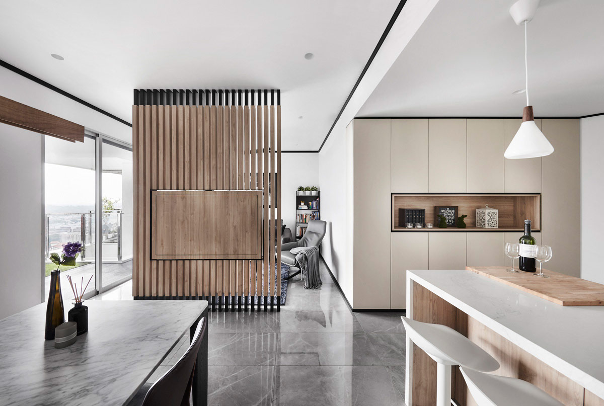
At the front of the home is an angled walkway. Besides just being a path into the inner sanctums of the home, however, the corridor was made more functional with the installation of full-height storage units. In addition, recessed niches embedded within serve a number of purposes. For example, the vertical niche at the front not only serves as a display shelf for the homeowners’ personal knick-knacks, but the mirror backing also lets the owners check themselves out one final time before leaving the home.
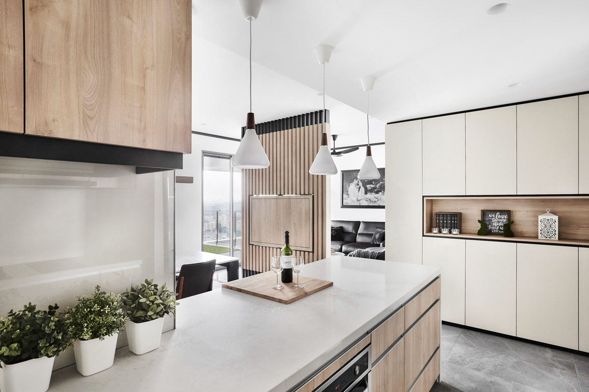
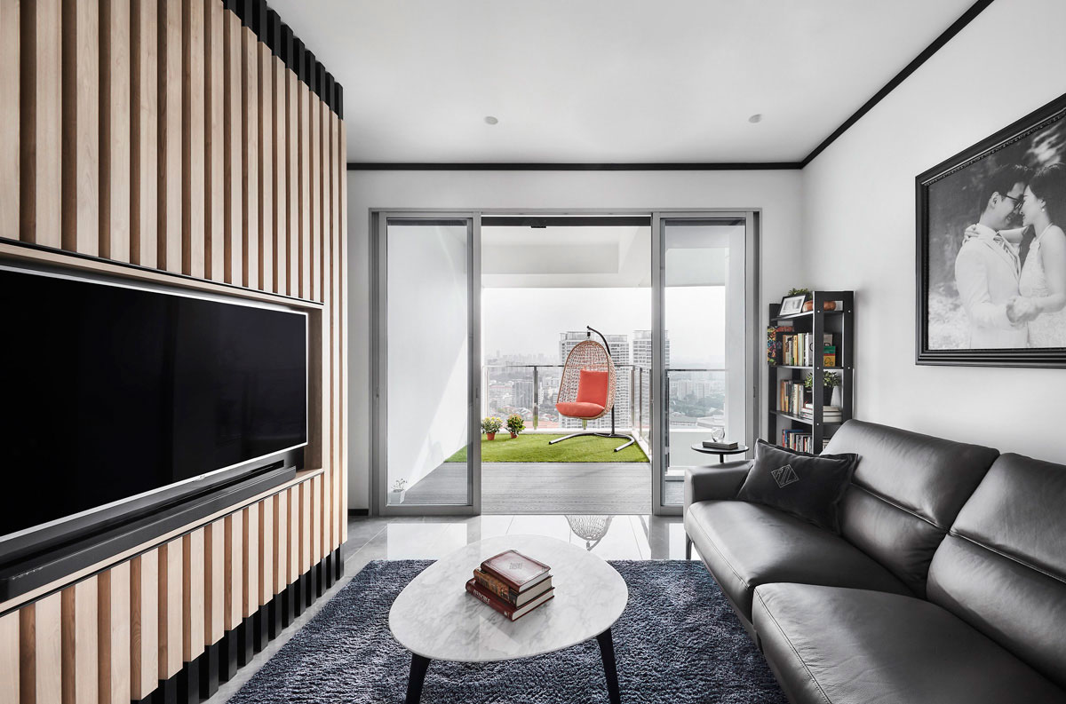
Farther into the home, a floor-to-ceiling wooden slatted screen-cum-television wall comes into view, which separates the living from the dining and kitchen spaces. By doing so, each section of the home is offered privacy but they don’t feel closed off from each other as the space between each individual slat creates a see-through effect.
As the footprint of the apartment is relatively small, the designers refrained from tacking on built-ins to the living room’s walls. Instead, loose furnishings were favoured, such as a luxurious King Living leather sofa and the marble-topped coffee table. The lightness of the living area also bodes well for the transition into the balcony. Being on the 35th floor, the unit has unobstructed views. As such, a new timber deck, as well as an astroturf, was installed to provide the inhabitants with a spot to enjoy the luscious greenery that dots the surrounding landscape.
In the kitchen, the once closed-off utilitarian zone is now a free-flowing space thanks to the removal of partition walls. In its place, a Caesarstone quartz-topped bar counter lines the kitchen entrance. “Kitchens are the heart of any home, and the counter serves as an informal gathering spot when the owners have guests over,” Lawrence added.
When it came to the private chambers, two bedrooms were combined to create a larger master boudoir for the owners. As there were bay windows present in all of the bedrooms, the designers decided that building over these fixtures was necessary to create a more practical interior without wasting precious floor area. As such, a custom bed frame was installed over the bay window, complete with a step that makes getting on and out of bed safe and easy. In addition to being a sleeping zone, two sets of fittings on either side of the bed offer the occupants two additional functions in the room. A study table makes up the work zone on the left, while a settee on the right provides a cosy spot to sit in while enjoying the scenery.
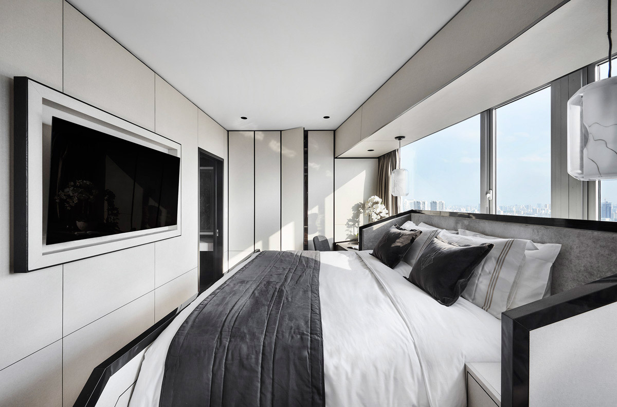
For storage purposes, both walls parallel to the bed were converted into full-height wardrobe units. Instead of using typical doorknobs, however, the homeowners are able to access their clothes and accessories through recessed grooves. “If you look closely, the wardrobe doors are clad in linen-like laminates, which are also the same materials used on most of the other surfaces of the room. So by tucking away the access to the wardrobes, what you get when you look at the boudoir overall is a visually cohesive and seamless experience,” Lawrence explains.
Past the sleeping area, the master en suite wows with the use of matte and high-gloss black marble-lookalike tiles, which inject the private sanctuary with an air of luxury. To carve out a dressing room for the female homeowner, the perimeter walls of the bathroom were extended further out into the bedroom. The newly assigned floor area was also kitted out with a dressing table and a back-lit mirror to offer the perfect lighting for getting all made up.
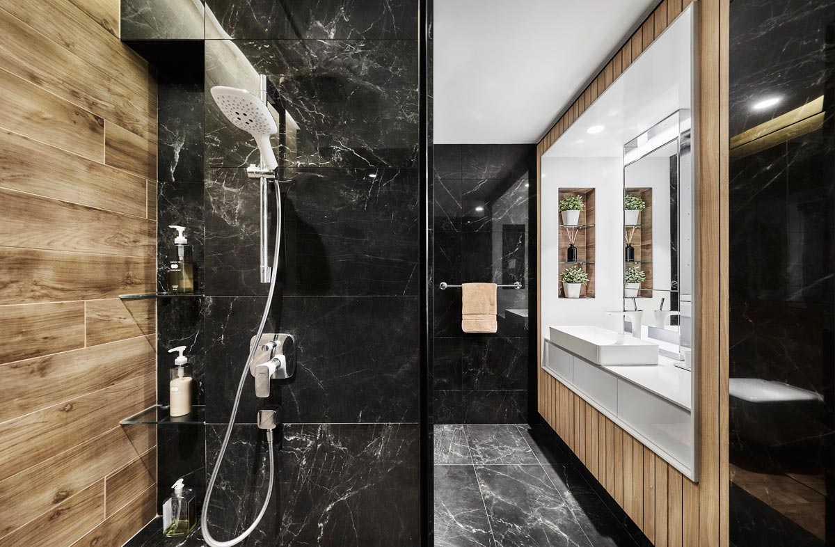
Next to the dressing area, what was once a standing shower next to a bay window has since been converted into a vanity, with the sink and pull-out drawers built atop the bay window. By doing so, every single inch of the bathroom is fully maximised. Meanwhile, the opposite end of the room is divided into two separates sections – one for the standing shower and another for the water closet.
With an emphasis on clean but strong design lines, what the akiHAUS design team has delivered to the homeowners at the end of the three-month renovation is undoubtedly a home that boasts polished aesthetics and a spacious and timeless appeal at the same time.
This was adapted from an article originally published in the March 2019 issue of SquareRooms.


