Homeowners typically have a favoured interior style that they wish to emulate in their home. Most of the time it is a singular aesthetic—popular picks include Scandinavian or industrial or Muji-inspired—but there is the occasional owner who wants a mix of styles for their home. The Teos were one such family, who approached designer Michael Lau of Juz Interior with a request to deck the various spaces of their 1,115 sq ft 5-room BTO apartment in an eclectic mix of Scandinavian, industrial and modern styles.

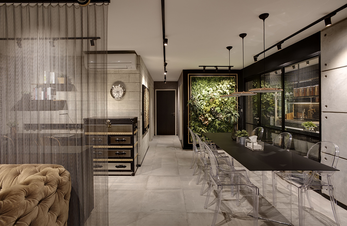
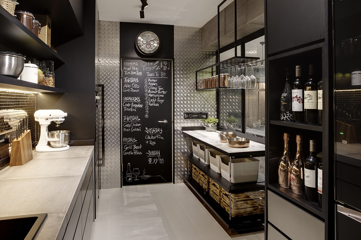
The edgy, industrial side of the overall design can be found in the communal areas like the kitchen, dining, living, and study. Unifying these spaces is a colour scheme of dark, cool tones like black, silver and brown. To create the illusion of greater space, Michael replaced the walls separating the kitchen from the dining area with a glass-panelled door and partitions. Bearing a subtle wire mesh design alluding to their industrial inspiration, the glass partitions provide the see-through effect that the owners desired whilst functionally enclosing the kitchen so that cooking fumes don’t escape.
Built-in cabinetry maximises storage in the long kitchen, which even sports a feature wall. A full-height checkered steel plate is applied to the sides of a black chalkboard, which cleverly camouflages the door to the bomb shelter. When viewed from the dining area, the stucco-finished wall delineates the external face of the bomb shelter from the kitchen.

Chic yet functional, the crystalline dining set reduces visual clutter thanks to a custom table with “invisible” legs and clear armchairs. A lush green wall anchors one end of the dining space, adding a vibrant splash of colour to the otherwise fairly muted interior setting.
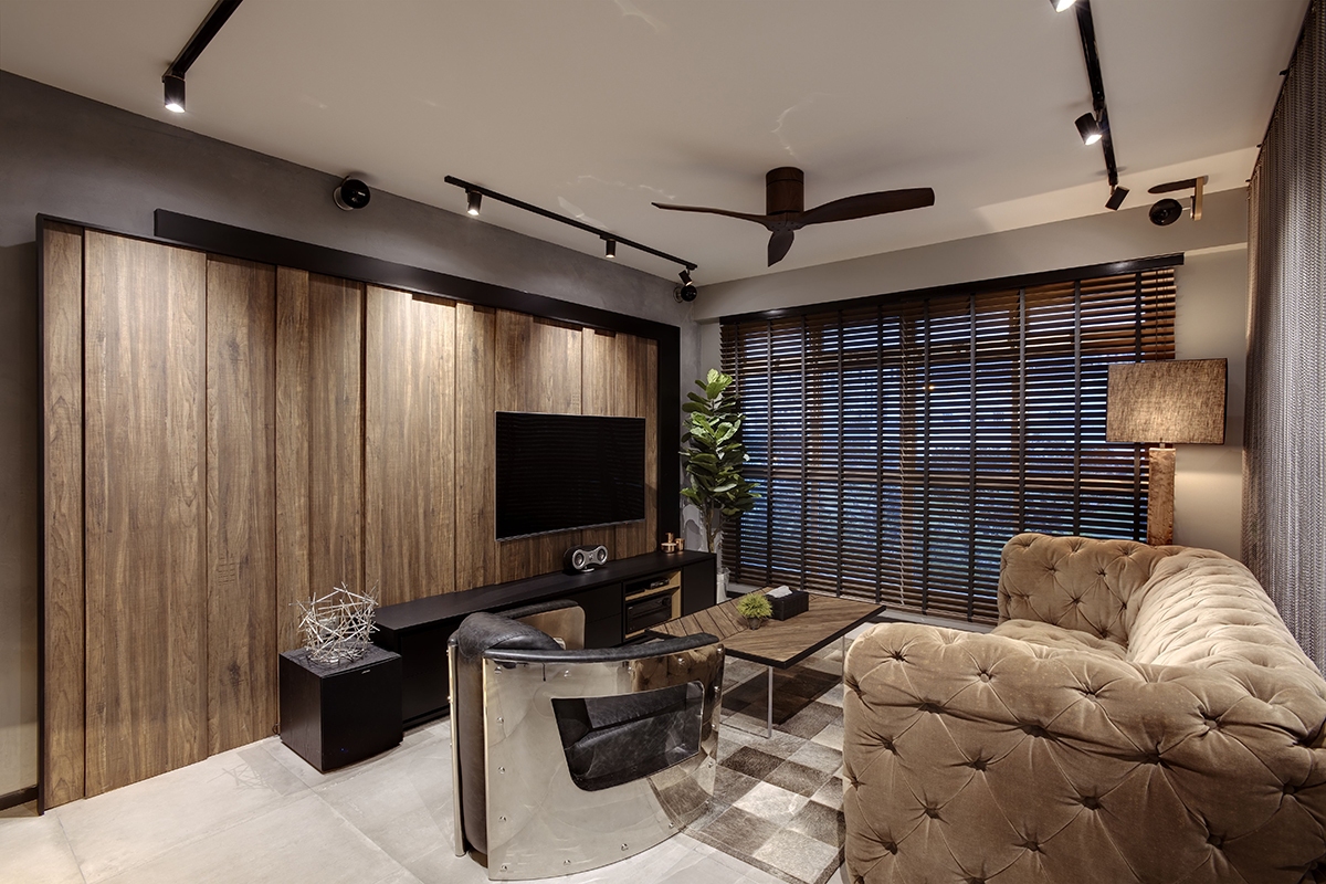
The centrepiece of the living room is undeniably the sprawling TV wall, a piece that Michael fashioned with numerous wooden panels to create an uneven, staggered surface. Although the TV wall is the most prominent feature, the other furnishings in this space are also strong contenders for attention. The luxurious chesterfield sofa and futuristic leather armchair certainly steal the show.

Subtly separated and segregated by mesh curtains is the cosy study, situated right behind the living area. More raw and metallic elements recur in this space, drawing the eye to the chairs, outsized storage chest and stucco-finished wall reminiscent of stacked concrete blocks.
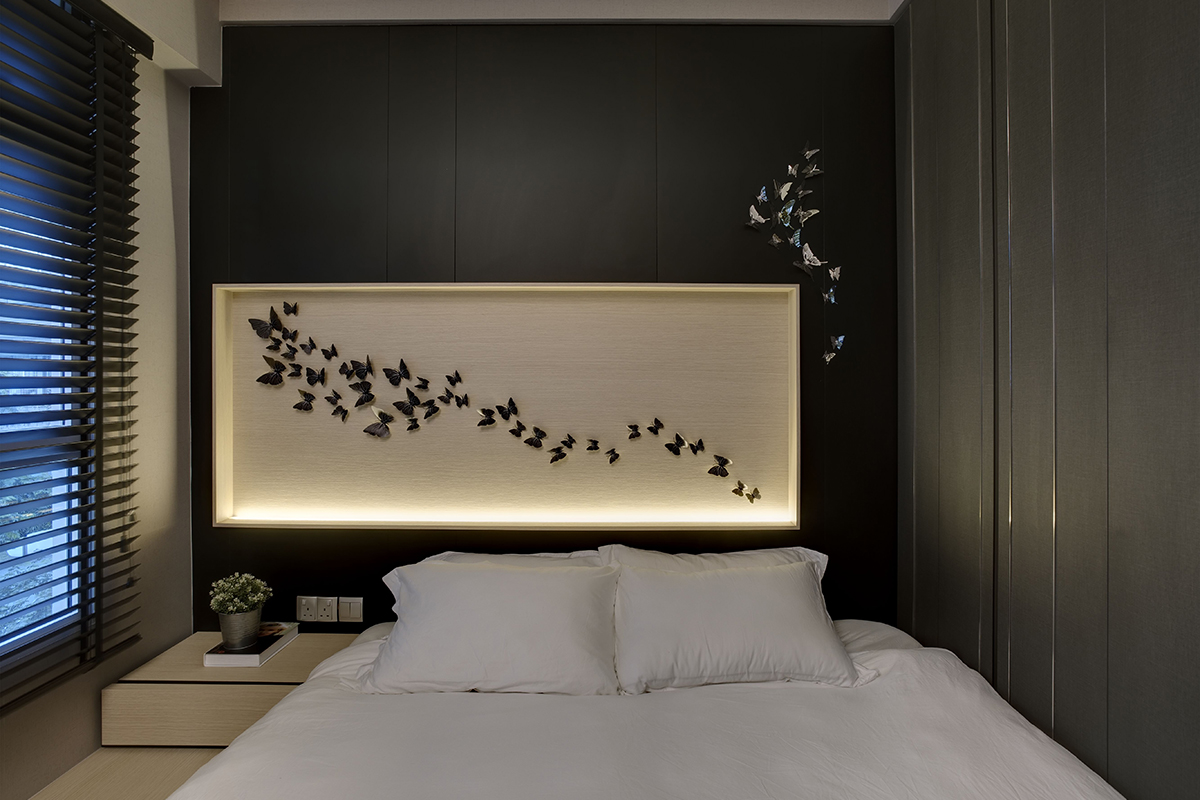
The bedrooms diverge from the industrial theme as softer aesthetics were intuitively preferred. To create a soothing setting optimal for sleep, stark lighting was eliminated from the master bedroom and replaced with softer, diffused illumination coming from the base of the headboard. Michael honoured the owners’ request for a walk-in wardrobe by carving out space from the adjacent bedroom, which is occupied by the couple’s child. Although space was taken from this bedroom, it avoids looking cramped with its made-to-measure carpentry for everything from the wardrobe to the desk and bed frame. Light, pale oak and white, Scandinavian-style tones also keep the interiors looking fresh and conducive for study.

The Teos moved in at the beginning of 2017 after a three-month-long renovation. Putting together a patchwork of different interior styles is often a challenging task. A clumsy delivery can result in a messy look, but Michael pulled it off with a skilful hand.
This post was adapted from an article originally published in the December 2020 issue of SquareRooms.


