Contrasting styles, vivid colours and patterns come together to create a compelling home.
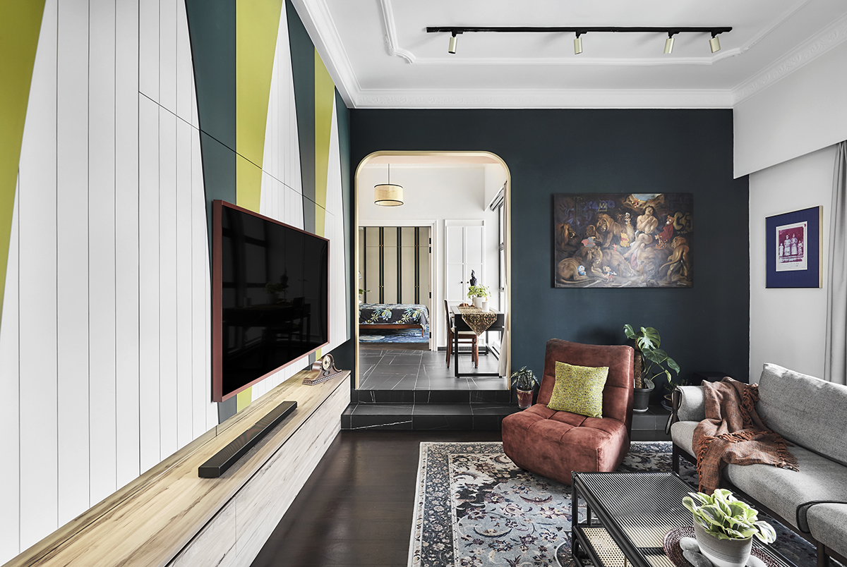
One peek at this project and you can tell the designers held nothing back. Tasked with remodelling this 1,300sq ft walk-up flat using both constructivist and maximalist themes, Marc Wong and Azmira of Linear Space Concepts expertly brought together the two contrasting styles in the most seamless way.
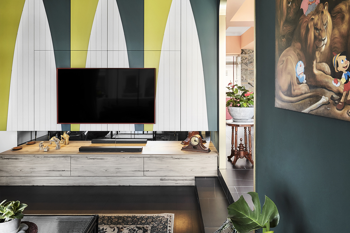
Sleek and angular designs informed by constructivism give the apartment a tailored and confident foundation. From there, Marc shares that they then “cautiously” chose the right mix of bold tones and patterns for every detail from the floor tiles to door handles to invigorate the interiors without skewing too ornate.
In the living room, a mural with angular patterns draws the eye up, further accentuating the 3m ceiling height. Past the archway edged with gold is the kitchen and dining zone which is drenched in colour. Vivid teal and pink along with intricate tiles make for a striking meal prep space.
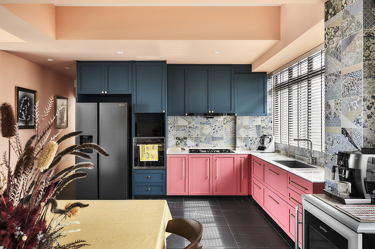
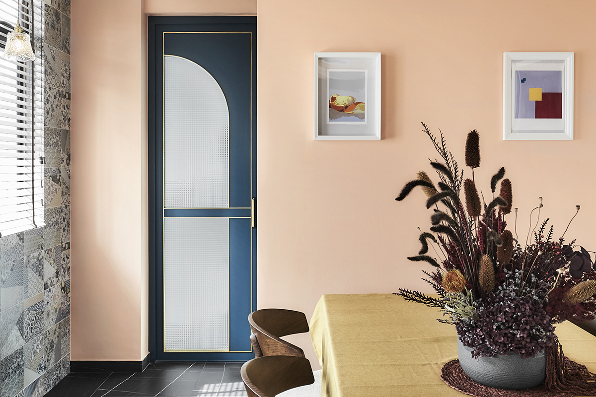
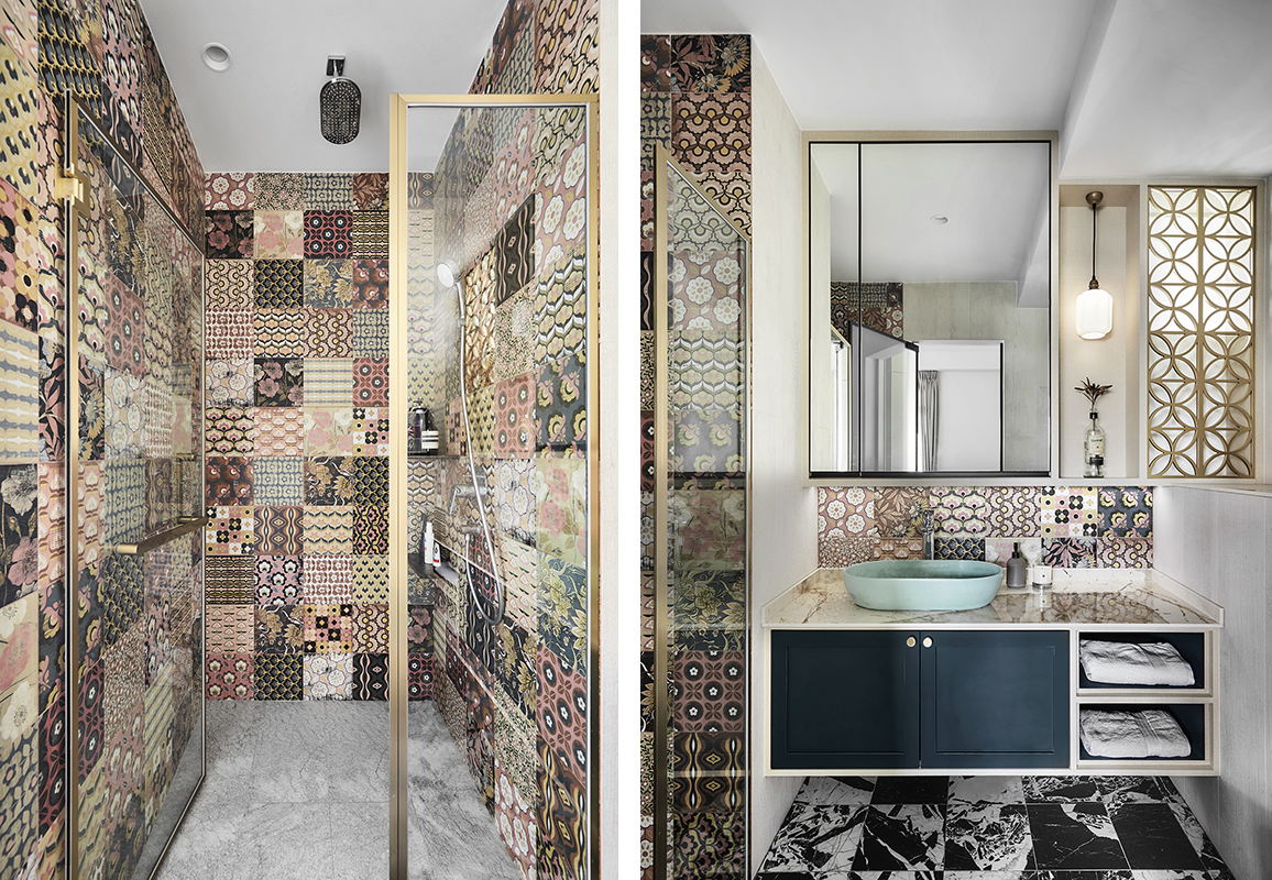
The surrounding walls and hallway are wrapped in a peachy hue which imparts a joyful and inviting glow. In the en suite primary bathroom, the design duo pushed the envelope further, taking bigger risks by mixing and matching patterned tiles for a fresh and energising appearance.
In terms of the layout, the original three-bedroom unit was converted into a two-bedroom flat, a change which allows the zones to flow more smoothly into each other. By opening up the bedroom, the kitchen and dining areas are now situated together in the same space and don’t feel as confined or segregated as before.
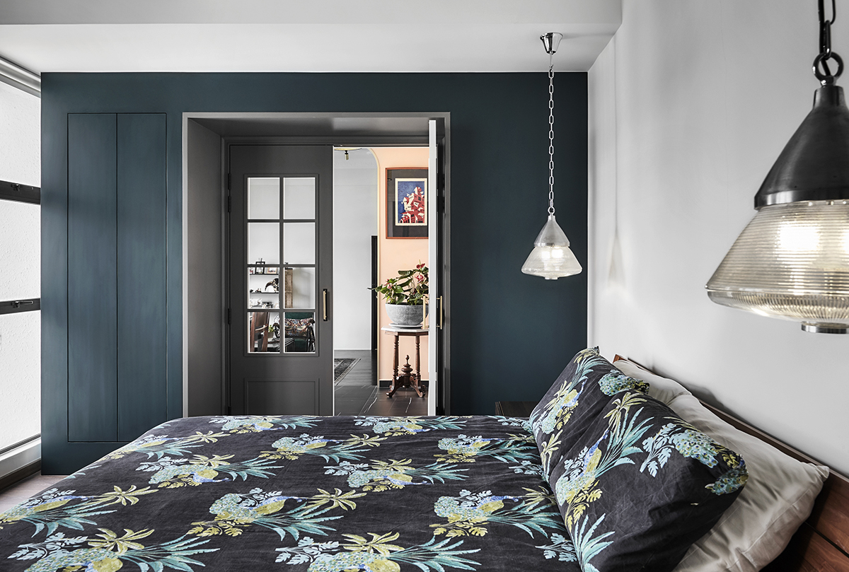
The main suite is also larger, incorporating part of the previous dining room to create a new and grander entrance outfitted with statement-making French doors and closets on either side. With all the complexities involved in accomplishing this unconventional yet welcoming home, it’s easy to see why we turn to the pros.
This post was adapted from an article originally published in the April 2022 issue of SquareRooms.


