Rev up the game of your living and dining layout with these brilliant design solutions.
Botanical motifs
Go big and bold with verdant shades of botanical prints. These can be imprinted on cushions and even blinds. To match these nature-inspired textiles, go for a muted colour palette of grainy tones for the flooring and walls. You can also take it to the next level with an outdoor lounging set instead of a regular sofa.
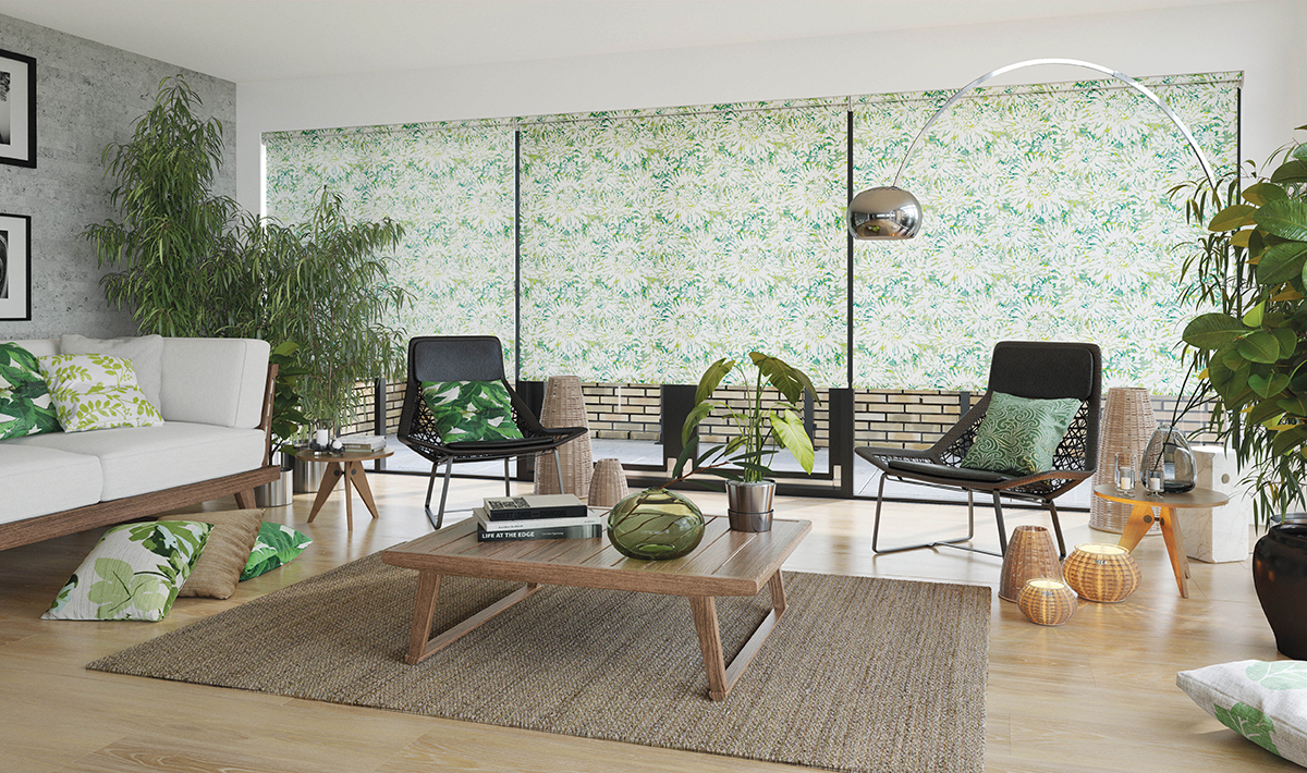
Image credit: English Blinds
Daylight delight
Plan the location of the communal zones in the way that the dining room is right next to the windows. Natural light can bathe the dining set, and choosing light-enhancing surfaces like a glass tabletop or a lighter wall colour can accentuate the source of light. This brings the outdoors in with minimal effort.
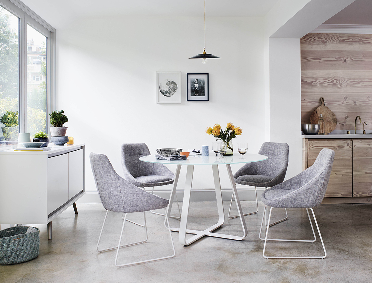
Image credit: Furniture Village
Take it outside
If you do have the luxury of owning a balcony, merging it with the living space might not be such a bad idea. Allocating the dining set to this semi-outdoor area can offer an al fresco dining experience which would make eating-in more appealing. This also frees up more space for the other communal zones.
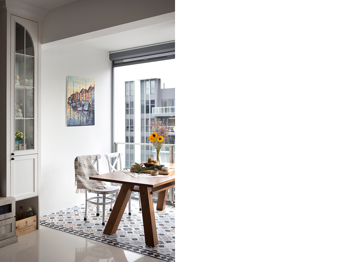
Image credit: Story of Us
Half & half
Select a two-toned backdrop for the main wall shared by the living and dining zones. Have one in a solid tone and the other with decorative motifs like patterns. Establish a visual link by injecting complementary colours and with that, you get a two-for-one feature wall to helm your separate living and dining sets.
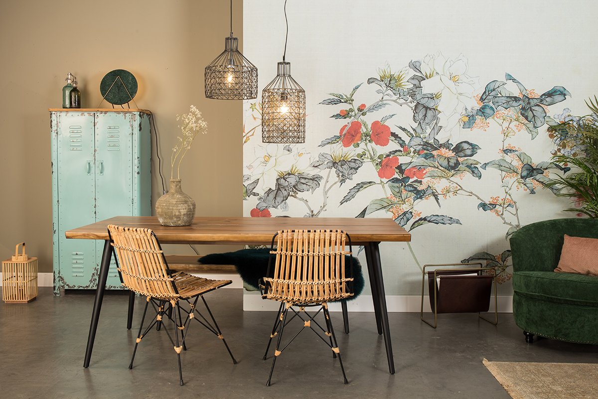
Image credit: Househology
Soft touches
Wispy organza drapes make great room dividers because of their versatility and soft elegance. Draw it between the living and dining areas to add a layer of sophistication for both sides. By day, the diffused daylight coming through will infuse a cosy, comfortable setup and by night, the mood turns into a romantic one.
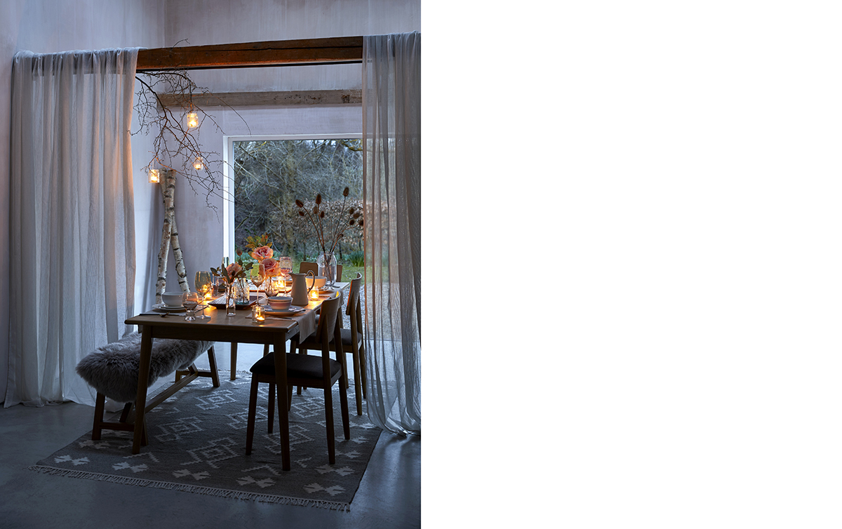
Image credit: Dunelm
Keep it flexible
If you are big on entertaining and often have friends over, it might be practical to consider separating your private areas from the communal zones. These sliding glass doors with a mild steel powder coated frame are a good option and offer flexibility in terms of space usage.
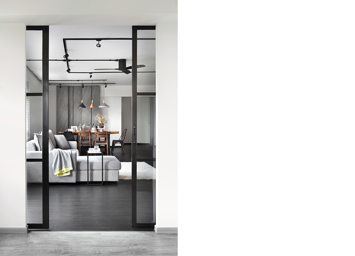
Image credit: Story of Us
Tall order
The centre axis of this open-concept area belongs to the full-height shoe cabinet. This divides the living and dining zones clearly and with the walking area adding to the demarcation, the design flow is both orderly and engaging.
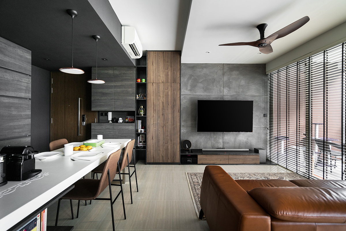
Image credit: Mesh Werk Studio
Go off-centre
To save on space, the common placement of the sofa is usually pushed to the wall. However, if you have the room, a centralised position can create a statement piece out of your sofa so that it doesn’t fade into the backdrop. Having a slightly irregular-shaped sofa will also add a stronger visual impact and will embrace a curved coffee table better.
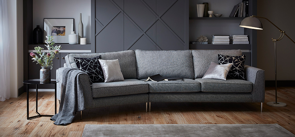
Image credit: DFS
This was adapted from an article originally written by Disa Tan published in the July 2018 issue of SquareRooms


