Jeremy Rowe, the Managing Director of AkzoNobel Decorative Paints Southeast & South Asia, Middle East, the parent company of Dulux, gives us an insight on how colour trends for the home are determined.
What are the consumer trends for colour selection that you have observed in Singapore?
Homeowners continue to favour white and off-white shades in their homes. Shades of grey also remain popular. However there are now more variations to these shades of grey – from the commonly observed bluish grey to reddish grey and greenish grey. So while homeowners are still sticking to neutral colours, they are opting for shades that have a subtle difference and understated charm to it.
What are our choices like compared to our regional neighbours? For instance, do Indian households prefer bright colours compared to us?

The further south you travel in Asia, the more colourful it is. When you get into India, home colour choices start to shift towards vibrant shades such as reds, oranges, and purples.
Singapore, like most Southeast Asian countries, tend to be a balance of both extremes. There are homeowners who prefer white, off-white, pale, and pastel hues, but also some who gravitate towards bold shades. So even in Asia, there is a wide range of colour combinations within the market.
Dulux comes up with the colour of the year a few months before the year begins. Can you tell us more about the process on how the colour of the year is identified?

Every year, AkzoNobel Global Aesthetic Centre invites experts in design and colour to discuss trends that occur worldwide. They come together to discuss what they think will be the major global developments in the coming years, based on global social and design trends. This process allows us to nominate a number of trends, with one overriding idea that captures the mood of the moment; and then consider how this will influence the consumer.
By talking with people who are designing for the future in the same way that we are, it is possible to identify long-term, constantly evolving trends; translating theory into a future we all recognise.
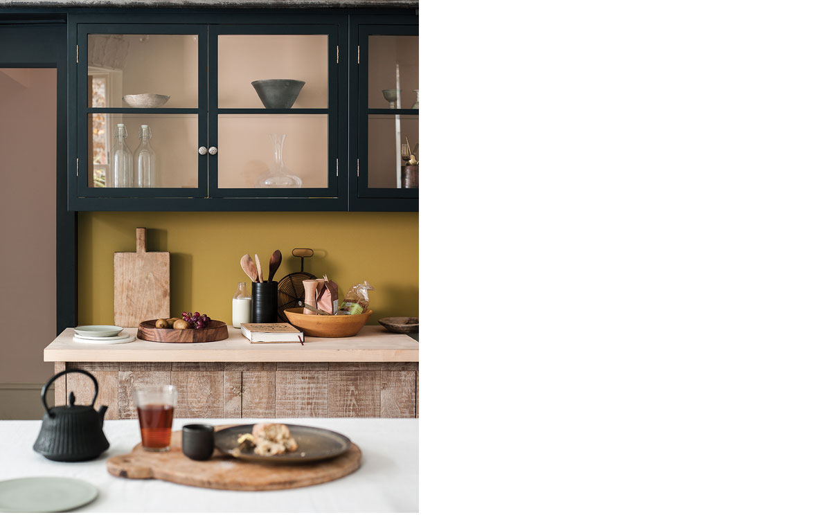
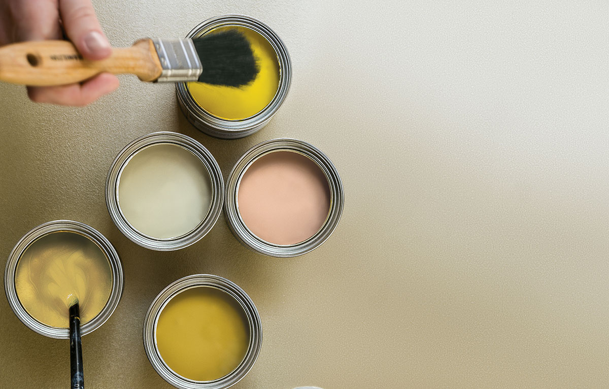
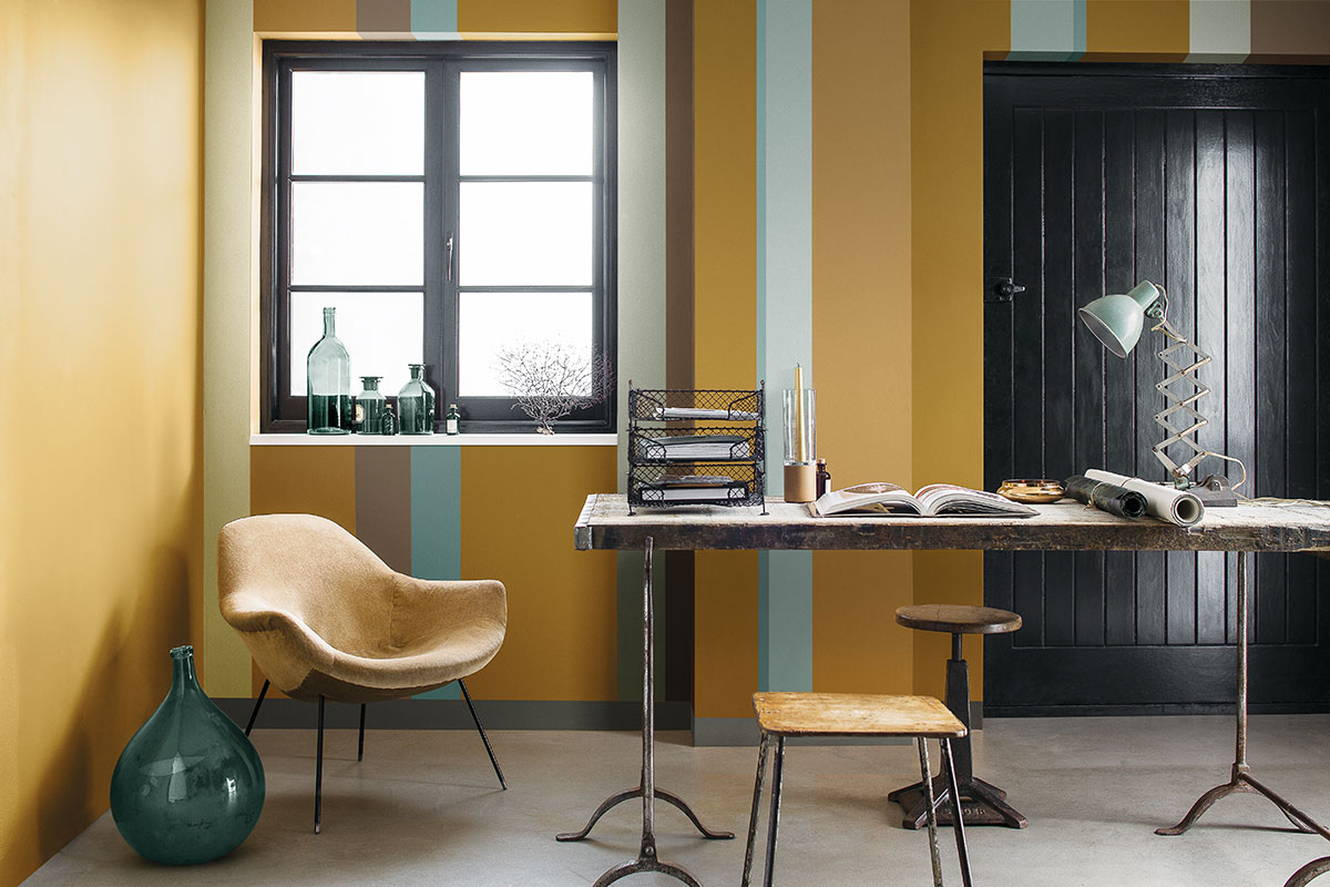
This theme of duality is the driving influence for 2016. The philosophy is perfectly translated into the Colour of the Year, Monarch Gold, an ochre shade that is bright enough to attract attention, yet still harmonious when combined with other colours.
What are some new innovations we can expect to see in the world of paint in the near future?
Sustainability is at the core of AkzoNobel’s business, and we constantly seek to produce eco-certified products that result in benefits for our customers. We already have paints that help reduce energy bills (Dulux Weathershield KeepCool), reduce air pollution (Dulux PureAir) and stretches to cover cracks (Dulux Weathershield Powerflexx).
Consumers can also look forward to more eco-certified paints that result in direct benefits to homeowners in the near future, such as Dulux’s Paint Happy range of interior products (Dulux PureAir and Dulux Ambiance All) that allow consumers to instantly enjoy their freshly painted room, with no discomfort from paint smell.
Is there a particular hue you would like to see more in homes?

I’m hoping to see more homeowners gaining the confidence to experiment with different colours and textures on their walls. I’d love to see how creative our customers can get with the metallic, linen, marble, and velvet finishes!
Image credit: Dulux


