Playfully dubbed “Fifty Shades of Cream” by the designer, this 5-room BTO flat in Punggol Northshore is the result of daring design choices.
Viva Magenta may be Pantone’s colour of the year of 2023, but curves have got to be the defining shape of the decade. There’s something about them that makes a space feel more organic. As the saying goes, there are no right angles in nature.
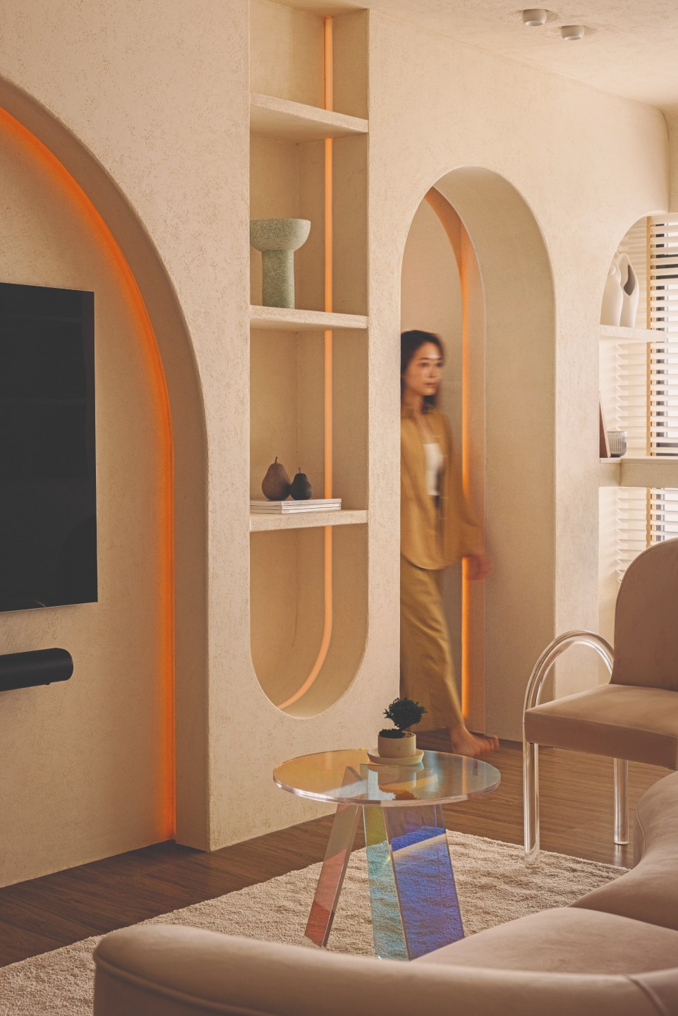
Project Curvalore, however, did not stop at a wee arch. Set against the picturesque backdrop of Punggol Northshore District, Jianhong and his wife’s first home is a timeless take on the trend.
“We had a rough design in mind and (visualised it) using a 3D home design software. The initial theme for the living room had pops of colours, arches, and curves, but was not particularly coordinated,” he recalls.
For Brandon of Authors Interior, the couple’s DIY render was love at first sight, but the dumbbell layout of the 5-room BTO unit was a different story. There were awkward corners, including a suggested study within the living room, that made maximising the space a mounting task. Realising its potential, it appeared, would demand a radical overhaul. So they demolished the walls and started over.
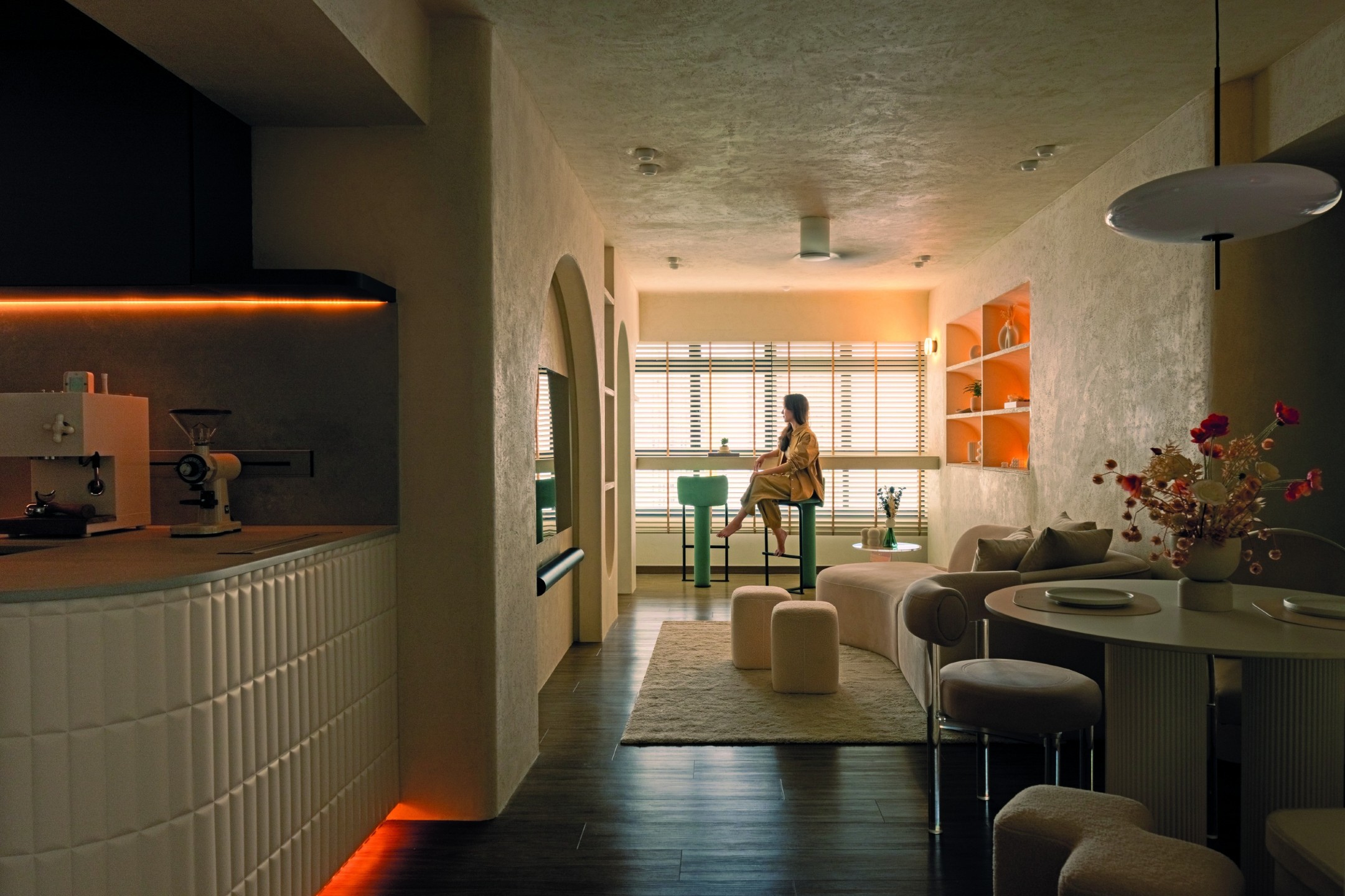
“Many visitors have commented that our house does not look like a typical HDB home and that the layout is unique. (This is because) we did away with corridors in the house and combined several rooms and spaces from the original layout,” Jianhong explained.
Curves and continuity
Upon entering, the sense of spaciousness is palpable, heightened by the foyer’s full-length mirrors and patterned floor tiles, creating a grand entrance. There’s a feeling of suspense as much of the home is concealed from this vantage point, but an iridescent window in the shape of an inverted arch offers a glimpse.
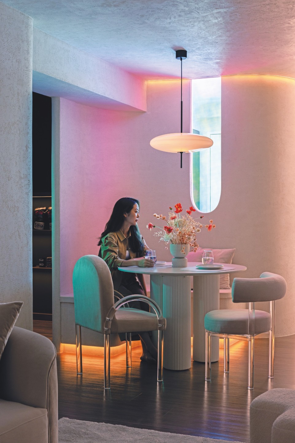
On the other side, a pendant lamp and strip lighting accompany the six-seater dining booth, lending it an otherworldly atmosphere. But once the lights are out, one is grounded by the stucco wall and meandering settee in its wabi-sabi glory.
“Our friends were impressed with the dining corner and commented that it exudes cafe vibes,” Jianhong quips.
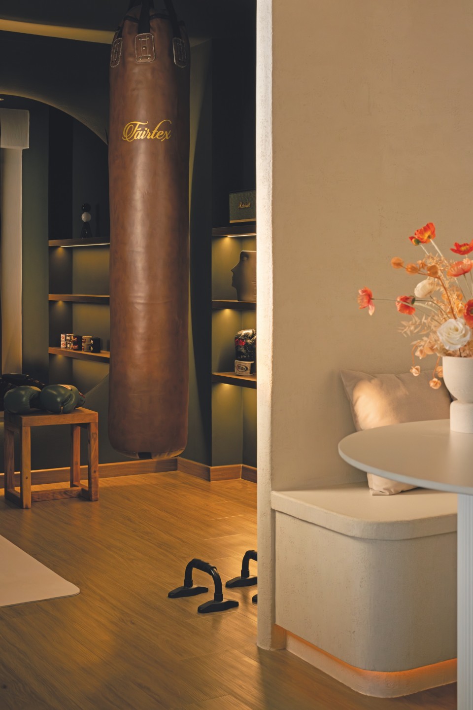
Adjacent to it is a home gym, a space deliberately crafted to be a sanctuary rather than a mere storage corner for fitness equipment.
“We strive to work out at home when we can’t do it outside, so having a dedicated gym space with a heavy bag at home was ideal,” Jianhong explained.
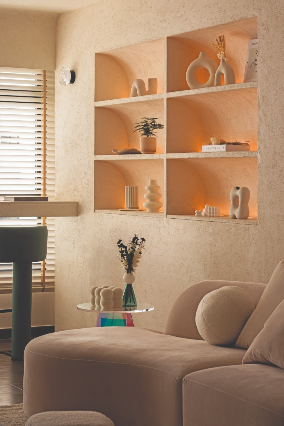
A sense of flow extends to the living room, where an organic modern sofa and a series of arches take centerstage.
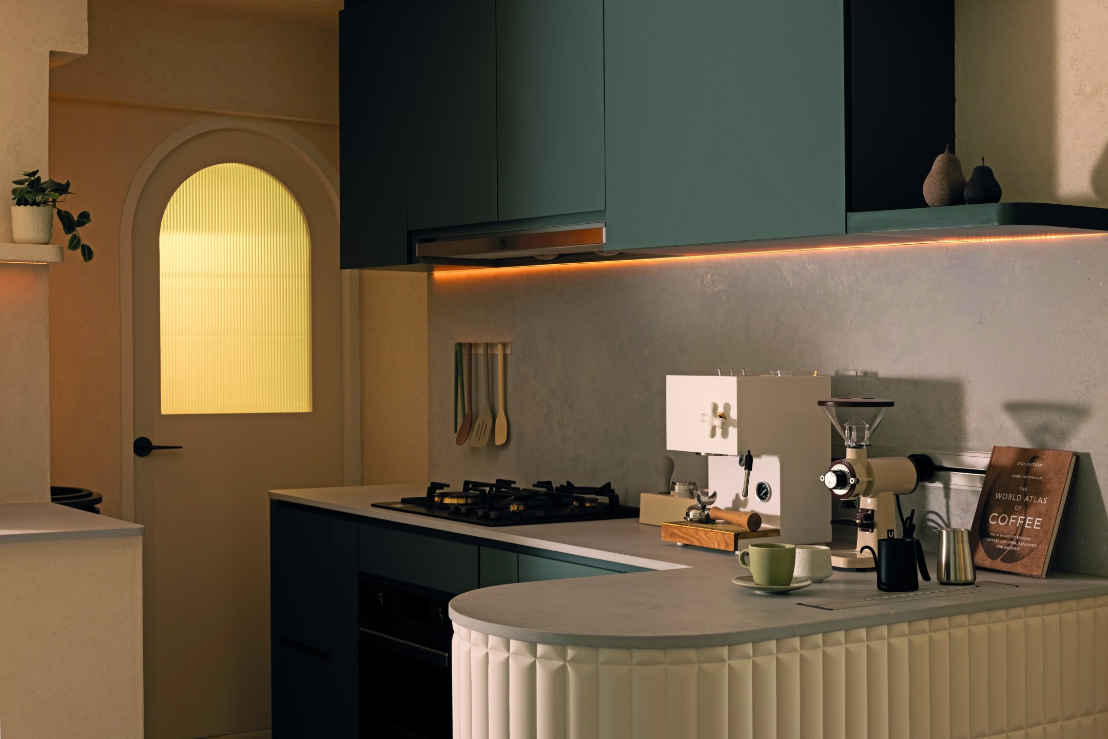
The surprises continue in the open kitchen, featuring a cylindrical pedestal sink with an exuberant backsplash and a curved peninsula adorned with biscuit tiles, accommodating the couple’s morning espresso ritual.
“These arches serve a utilitarian purpose. They integrate the TV feature wall with display shelves and a hidden door,” Brandon said
Breaking the boundaries
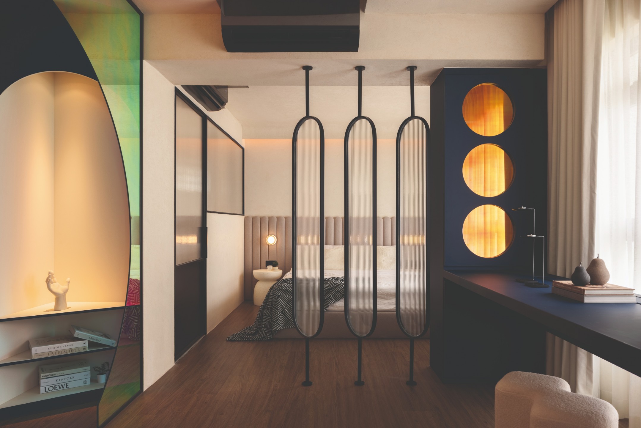
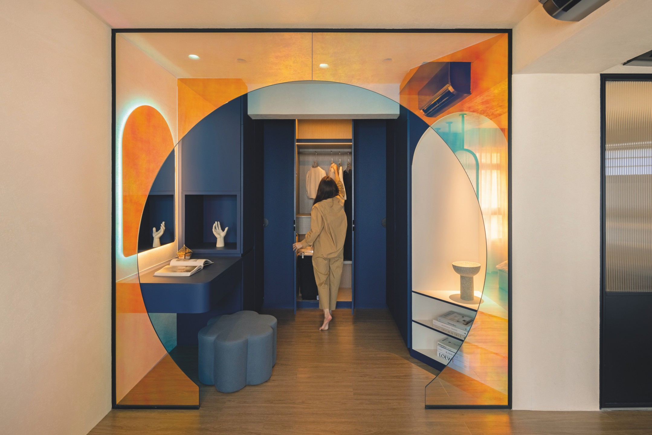
Across the room, the display shelves are decidedly distinct, concave and backlit to add visual interest to the room. Consider this part of the unit a portal to its: what was once two bedrooms is now a ginormous master suite comprising the couple’s walk-in wardrobe, bedroom, and bathroom.
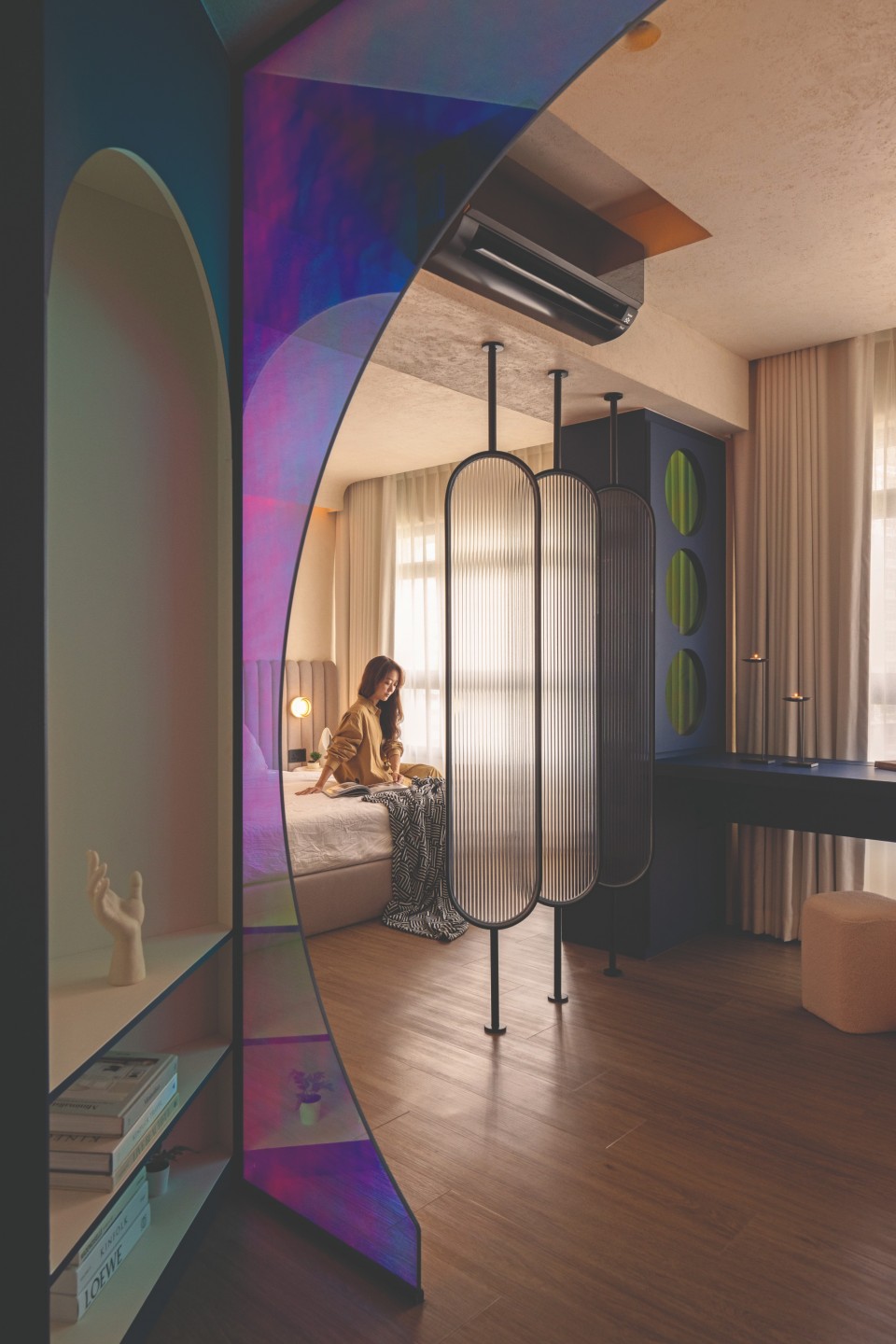
“We like spacious resting spaces, and the master bedroom and bathroom reflect that. The idea came from a boutique hotel that we stayed at before, and we wanted something similar to be recreated,” Jianhong explained.
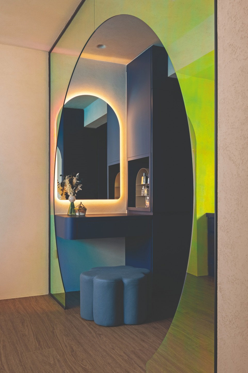
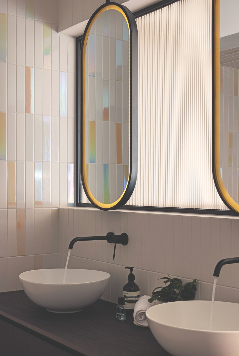
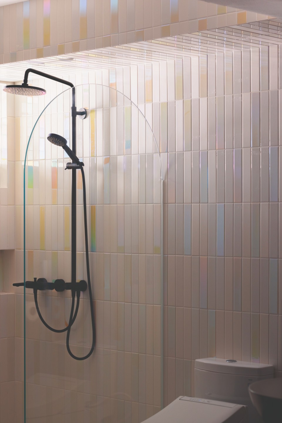
Inside, the unit’s reconfiguration pays off handsomely. The master bedroom and bathroom have doubled in size, featuring a sprawling shelf, his and hers sink, and an arched glass screen dividing the wet and dry areas against holographic and cream-coloured wall tiles. The walk-in wardrobe is framed by an iridescent glass panel, which adds a whimsical touch to the retreat within.
“It was a dream come true to see the design elements of the boutique hotel come to life,” Jianhong added.
Not to sound corny, but the devil is in the details for a project of this complexity. According to Brandon, the main challenge lies in conveying their vision to contractors and collaborating on practical solutions.
“An example would be the kitchen sink. We had to relocate the water pipes together with the carpenters and tilers to achieve a curved backsplash with a wall-mounted tap,” he said.
“We also wanted to capture the three Cs – curves, calm, and character – and to use lighting to marry them. With the help of smart lighting, we were able to emphasise the curves and create different moods.”
It seems reductive to box Project Curvalore up in a single theme. It embodies the quirkiness of an eclectic home, the warmth of an organic modern space, and the minimalism of wabi-sabi. Above all, it exudes the personality of its inhabitants.
“Overall, we wanted a space that is both calming and cosy so that we can both unwind after work. We are not outspoken people and prefer quietness, so the serene and peaceful ambience of the house reflects that,” said Jianhong.


