When it comes to interior styles, it’s not unusual to find couples with preferences that are poles apart. Case in point, the lady of the house finds the minimalist aesthetic appealing, while her significant other likes the raw quality of wood and natural textures. As the designer leading the owners’ brand-new apartment’s renovation, Raymond Seow of Free Space Intent thus worked alongside the two to find and identify a happy medium that suits them.

The combination of white and wood would typically veer towards either a Scandinavian or modern resort-themed interior—both of which the pair had adamantly vetoed against from the start. Raymond mentions that the owners had wanted a more upscale vibe for their apartment. And since they both agreed that the luxurious lobby at The Ritz-Carlton made them feel relaxed, the designer proposed a luxurious yet lived-in look that incorporates elements of style that both individuals have an affinity for.
For the perfect marriage of style to happen, he first laid down a foundation of calming neutrals. A carefully curated set of furniture, customised pieces and an edited use of texture, ranging from rustic woods and plush textiles to metals and polished surfaces, help to pull this relaxed but luxurious approach to design together.
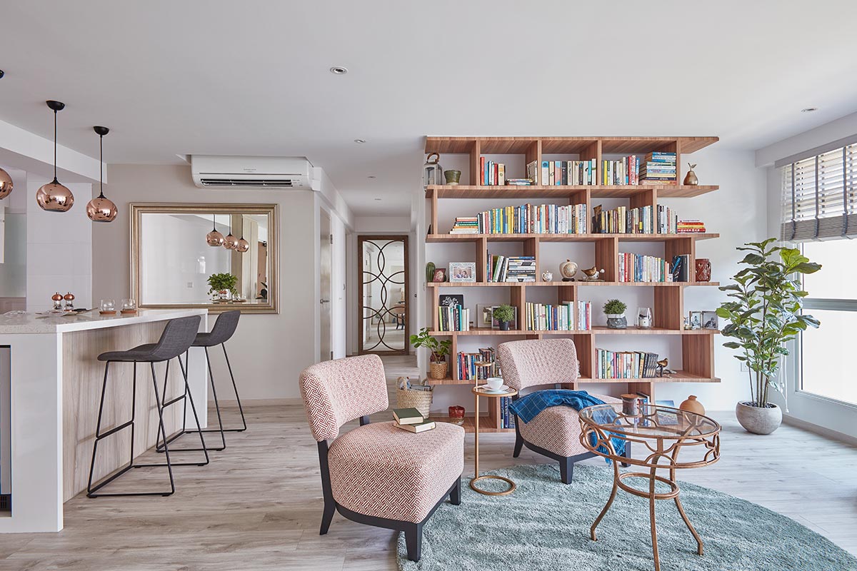
The living room—akin to a hotel’s lobby—is the first area that greets guests, so Raymond decided to mirror it after the grand foyer at The Ritz-Carlton. Furniture placement in this apartment’s living space is unlike your run-of-the-mill residence. Most communal zones revolve around the television, but here, plush accent chairs in a true-blue hotel manner are turned in towards each other to encourage intimate conversations even with those seated on the sofa. Throw cushions and a blanket arranged on the lounge as well as a sumptuous rug laid underfoot further heighten the ambience of comfort in this common zone. A full-height custom-built bookshelf takes pride of place as the room’s focal point—replacing the conventional media centre.
Raymond explains that the male owner had specifically requested a bookshelf not only to cater to his extensive collection of literature but also to own a meditative area where he could focus on the old-fashioned manner of acquiring information. In fact, with the television out of the way, distraction is greatly minimised as well. The designer elaborates that this piece was inspired by the wine rack displays commonly found in hotel bars. “This brings a hint of the hotel chic look to the interior as well,” he explains. To avoid it from sticking it out like a sore thumb, it is clad with laminates with a tone that closely resembles the glow of the metal accents that dot the premises.

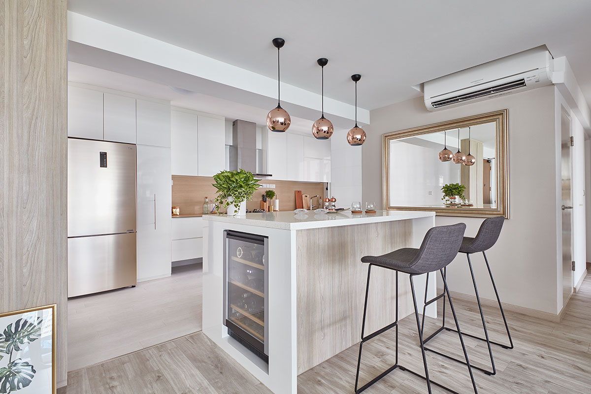
Another of the owners’ requests at brief was to place an island right at the entrance of their open-layout kitchen. But while most units serve as a prep space, theirs is intended as a hub for socialising to complement the couple’s love for hosting and entertaining. What better way to play host than with their very own home bar? The pair had a clear inkling of how they want their island to turn out. It had to have a built-in cooler for storing bottles of tipple as well as a niche on the worktop that acts as a wine bucket. But that’s not all; the island is also fitted with storage along one side. This way, everything they need to serve guests is within arm’s length.
Nearby, the kitchen marks the entry into the wife’s territory. This part of the home truly reflects her affinity for minimalism with its pared-down refinement and an all-white palette. Floating cabinets enhance the sense of spaciousness in this brightly lit room. Raymond, however, suggested adding a touch of wood tones—in the form of the counter and backsplash surface—to connect between the cooking space and more communal areas. Furthermore, this element provides warmth to an otherwise sterile setting.

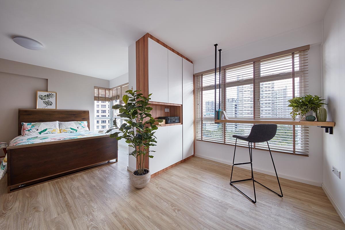
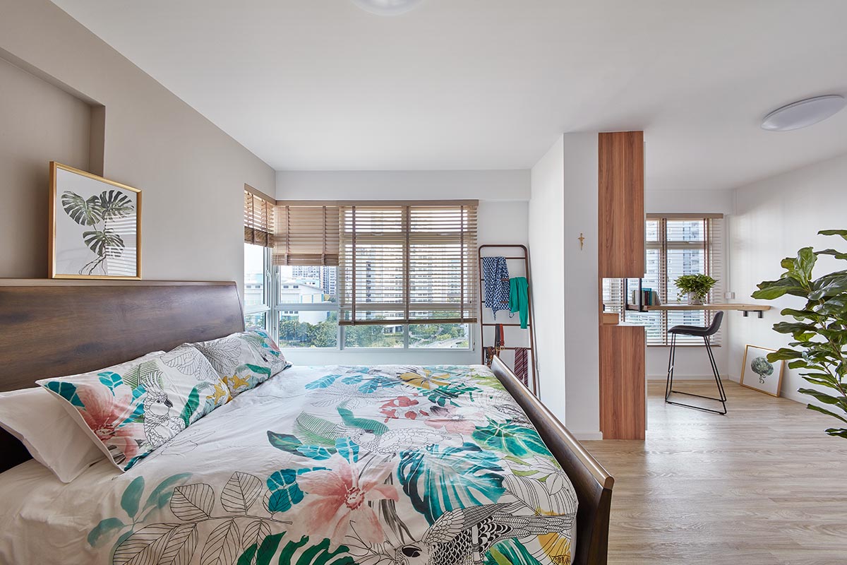
As it is meant to be a sanctuary of calm for its dwellers, the master suite sports a more pronounced earthy quality as compared to the rest of the apartment. A base of white-and-wood scheme makes it appear bright, airy and full of life, while potted plants interspersed around add colour and calmness—setting the mood for unwinding. With the wall that separates two adjoining rooms taken down, more natural light is able to stream into their private haven, further brightening it up.

The study sits within proximity of the sleep space, so it had to remain unobtrusive. To do so, a built-in wall unit is crafted to hide away work-related paraphernalia. Adjacent to it hangs a floating desk crafted from natural suar wood—this higher-than-usual table provides the perfect perch for working or gazing out the windows. Sans legs, it opens up the room further, beckoning more light to enter.
By taking into account the two owners’ preferences and then weaving them harmoniously together, Raymond managed to craft a space with a distinctive look that balances clean aesthetics with cosiness—and all wrapped up with a ritzy bow. Now that’s a true marriage of style.
This was adapted from an article originally published in the January 2019 issue of SquareRooms.


