In the world of interiors, it is often said that homes are physical manifestations of their owners’ needs and tastes. And this statement does indeed hold true for the residents of Eastville Apartments, a walk-up residence in Joo Chiat with a history that dates back to the 1960s. Each of the development’s 16 homes is just as unique as their occupants who count international expats and young local families among their number.

Diverse backgrounds aside, the entire community is very much united by a congenial kampong spirit that has been present “prior to the current batch of occupants”, according to Simon Wong, the incumbent chairman of Eastville Apartments.
In part 1 of a 2-part series, we take a closer look at the home of young parents Daniel Fung and Sandra Ong, who adopted a modern look for their conservation ground-floor apartment. Decked out in luminous neutrals and cosy wood tones, the home exudes peace and tranquillity.
“The materials and palette lean towards a more modern sensibility because we wanted a relaxing, resort-like atmosphere,” says Daniel, who drew upon his architectural experience to create an interior that melds his personal tastes and those of his wife, Sandra.

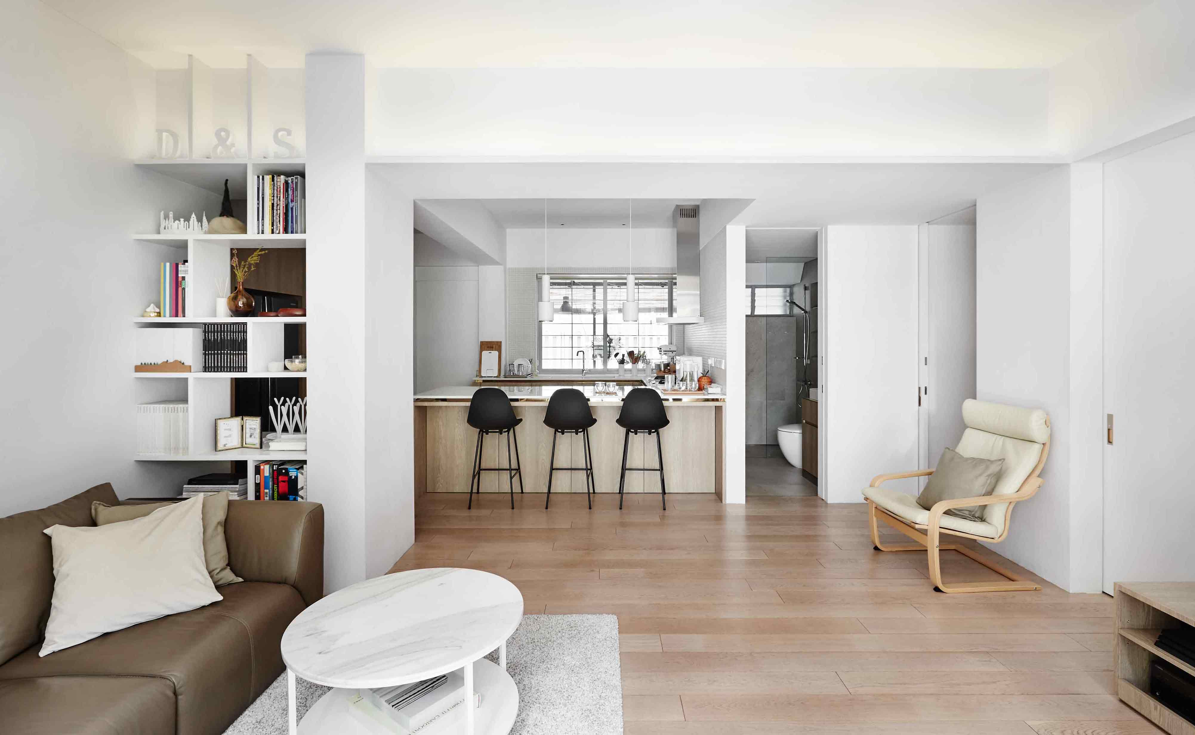
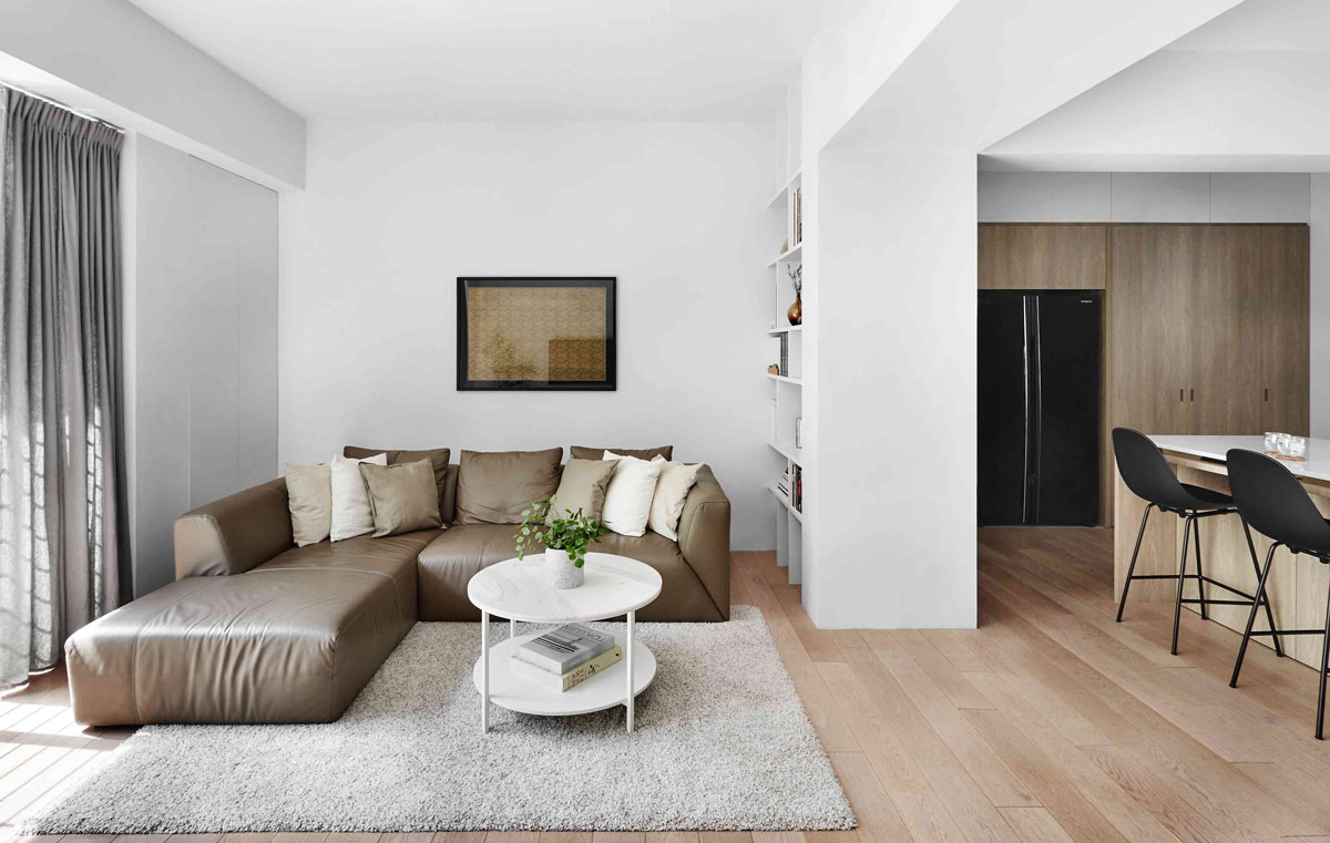
Ultra-pale violet walls give the living room an immaculate look, which is in turn anchored by Daniel’s own IKEA hack: a VITTSJO coffee table, topped with a circular slab of polished marble.
Close by, a built-in shelf, designed with smooth panels, plays an important role in ensuring aesthetic harmony as it conceals a structural pillar – identical to the one in their neighbours’ home upstairs.
The kitchen’s makeover presented some challenges due to the conversion of what used to be a third bedroom into extra kitchen space. Apart from the removal of extraneous plumbing, a generous U-shaped island, which features a band of gold trim beneath a glossy white quartz countertop, was installed during the renovation.

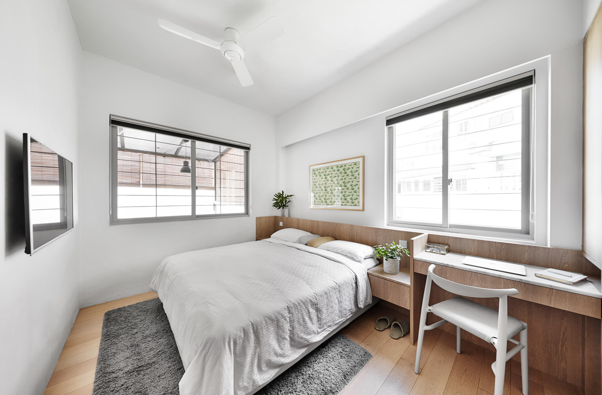
To establish a consistent language between the communal and private spaces, Daniel kept the master bedroom’s design neutral and restrained. Uncomplicated in form, the bedhead hides several charging points behind its rectangular frame – which comes integrated with a pair of side tables and a marble-topped dresser.
Daniel says, “We are glad that the current look and feel of the apartment came out as we envisioned it to be and it fulfils our wish for a comfortable first home.”
This was adapted from an article originally published in the September issue of SquareRooms. Photo credits: Wong Weiliang


