It’s always a challenge to design a space that feels like home, but when the homeowners work in real estate and assess properties for a living, things can get particularly nerve-racking. Joey Khu’s design team was faced with this challenge when renovating this condominium unit for a young family of three. “Being in the real estate line themselves, they know how to appreciate good design,” Joey shares with us.
The parents opted for “a very sleek and luxurious look,” wishing to inhabit a space that reflects their preference for modern luxury. In order to maintain this clean, minimalist look while making space for large gatherings of friends and family, the designers had to get creative with plenty of hidden storage solutions around the home. Most of the original built-ins and fittings had to go and were ultimately replaced with more functional yet stylish fixtures, such as a large mirror with hidden storage in the master bedroom. The layout of the home, however, was mostly left untouched, as the homeowners didn’t require too many structural changes. The only major modification to the unit itself was shifting the entrance to the walk-in wardrobe, which now utilises a sliding pocket door.

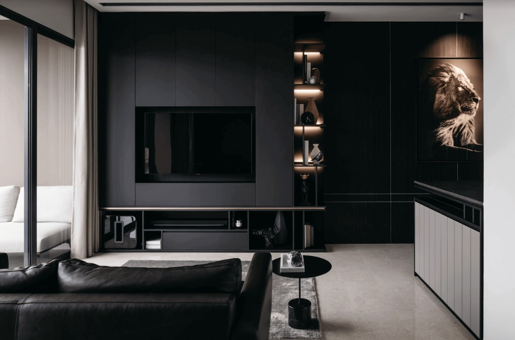
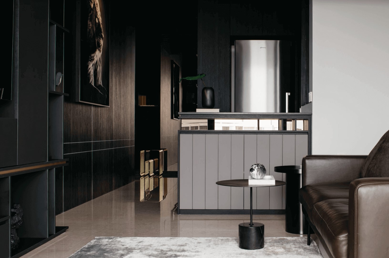
Both the residents and the designers are delighted with the end result. “The home is dark but not dull,” Joey tells us, pointing out the shapes and textures that give the condo some extra dimension. “The furniture alternates between clean lines and embracing curves, offering a different visual experience from every angle. The marble flooring and copper accents also help to lift the dark colour scheme with lighter tones.” Of course, the statement lighting, contemporary decor and eye-catching artwork cannot be understated either, hand-picked by the designers to provoke a striking effect against the black ash veneer of the cabinets, feature wall and ceiling. The feature wall in particular stands out as the highlight of the living area, the dark veneer complementing a highly opaque FENIX laminate from EDL.

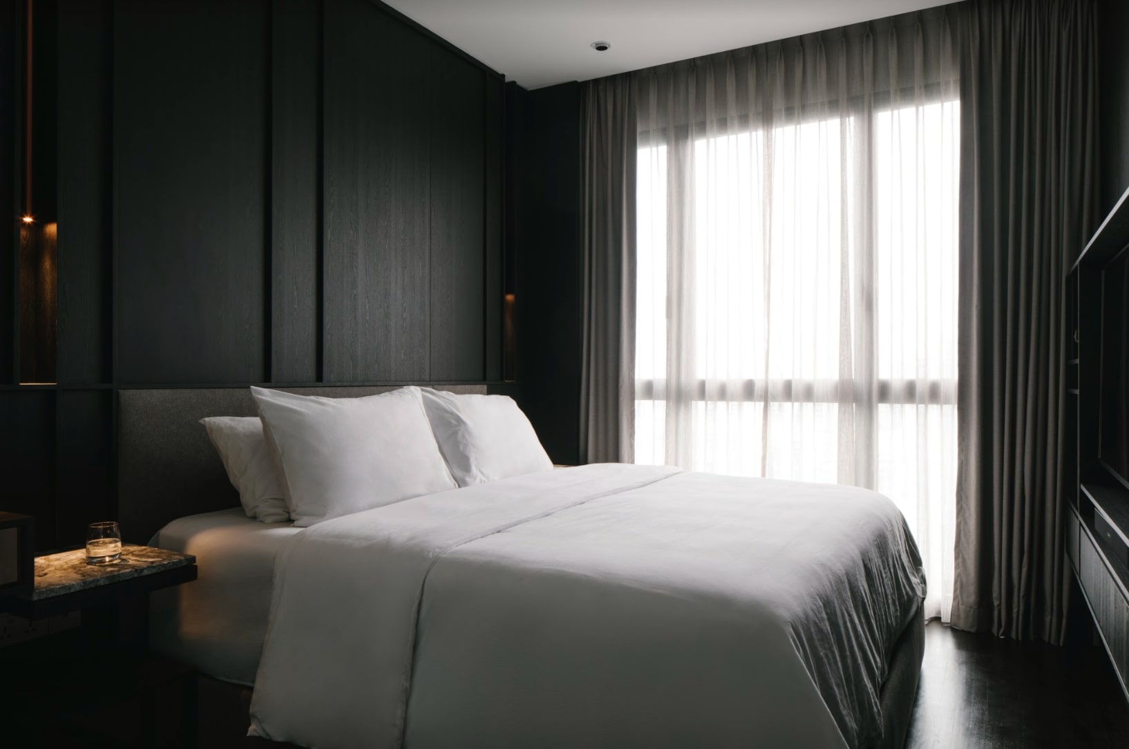
Other key features of the home include a large portrait of a lion in the foyer, impressing the home’s majestic ambience on guests as they enter the space, as well as a lush marble wall that forms the centrepiece of the entire home in the dining room. In the private quarters of the house, the same slab of Italian marble makes up the top of a custom-built nightstand, which is integrated with a full-height headboard and a plethora of hidden storage. Next door, a walk-in-wardrobe showcases the extent of the designers’ clever storage solutions. These are particularly appreciated by the busy homeowners, giving them the opportunity to stow away their large luggage and travel items in the hidden nooks and crannies of the room.

In the capable hands of Joey Khu’s design team, this condominium was transformed into the home that this new family needed: a sleek and luxurious unit that yet includes all of the homeowners’ practical storage needs, making it a place where they can comfortably start a new chapter of their lives.
This post was adapted from an article originally published in the September 2020 issue of SquareRooms.


