With a passion for travel and exploration, a closed-off, dark home was not ideal for the residents of this 4-room condominium unit. They wanted plenty of natural light and space to roam freely around the house with better storage solutions and updated facilities. They did not, however, want their home to be entirely new and unfamiliar, choosing instead to incorporate many of their pre-existing pieces into the renovation.

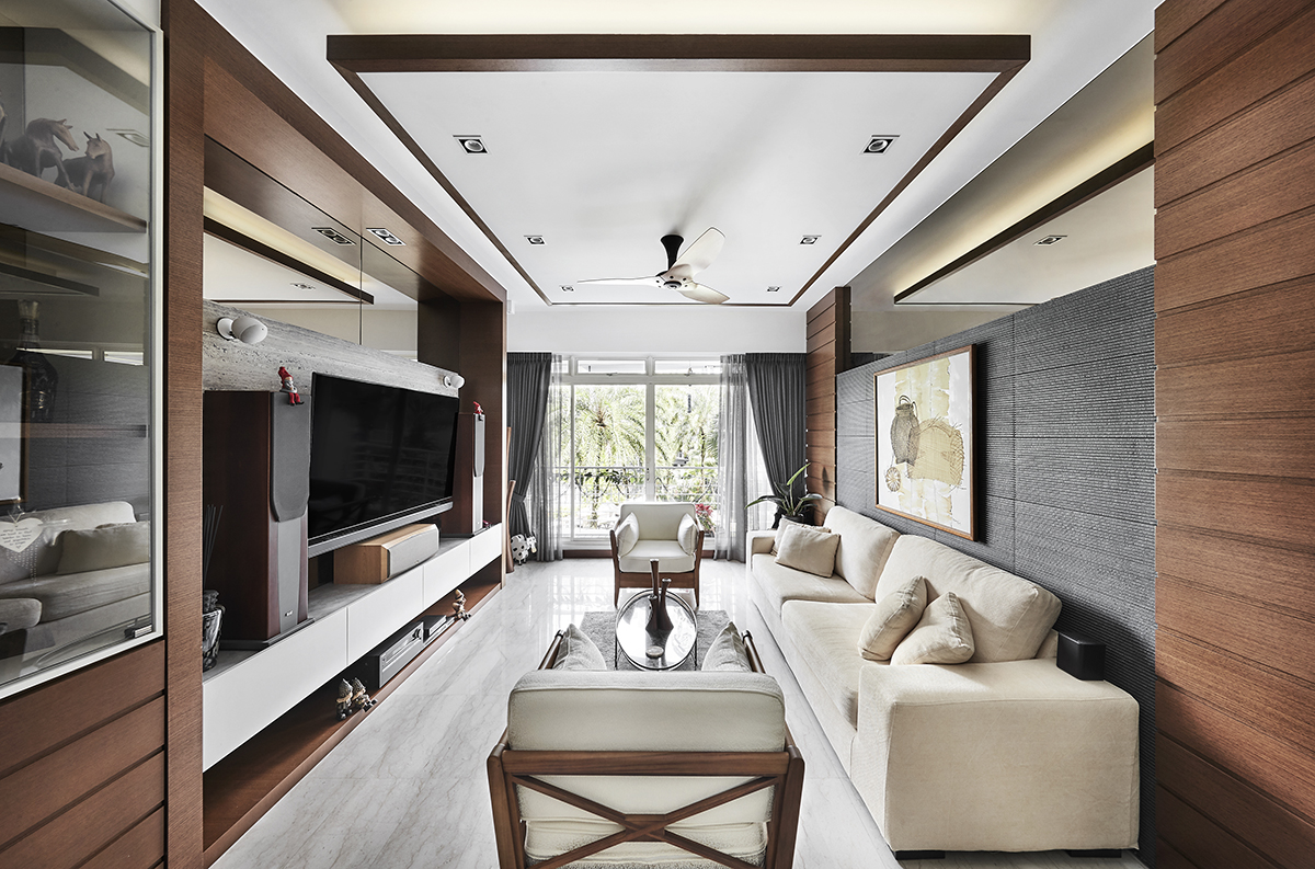
For a bright and inviting home, the designers at Richfield Integrated opted for clean, modern lines, neutral colours and the use of natural elements. The neutral colour palette not only gives the home a fresh, contemporary look but helps the more rustic elements to blend into the new design. A number of large windows and balconies brighten up the dark laminates and stone tiles for a raw yet welcoming ambience.
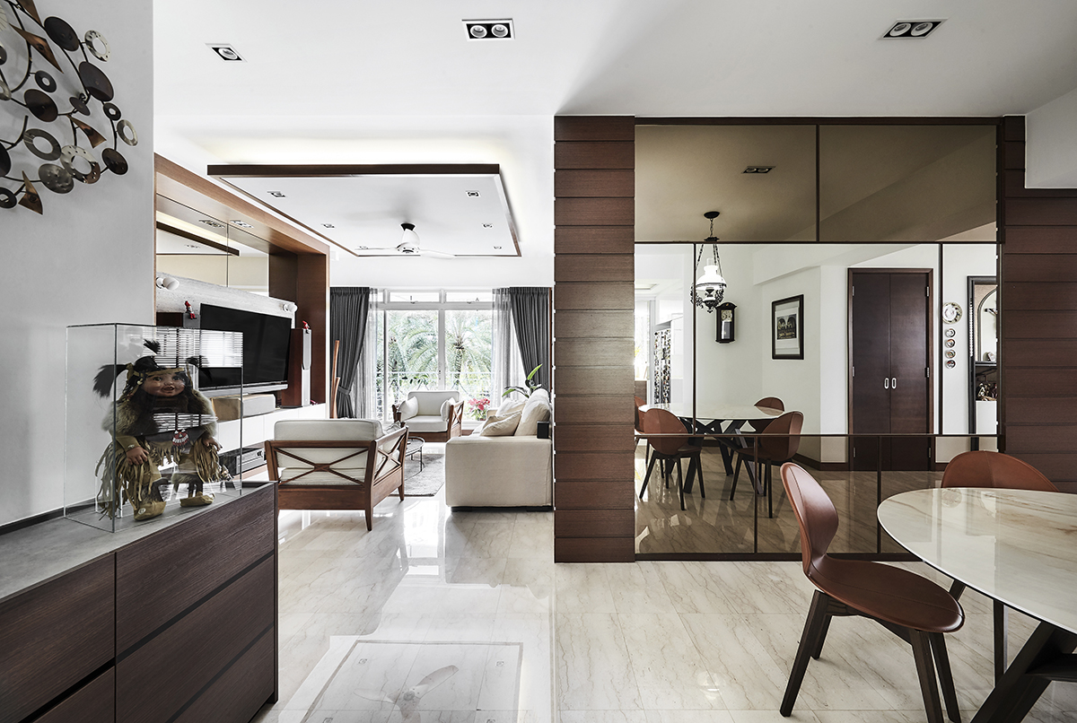
From the living room to the smaller, personal spaces, the designers took care to keep the home consistently appealing. The millworks, once mismatched, now weave a seamless aesthetic flow between different rooms with a harmonious finish, creating visual interest with varying tones. Large mirrors were turned into feature walls in the living and dining areas, paralleled by the smaller mirrors we can see in other areas of the home.

The living room was particularly important to the residents as the centre stage for their religious gatherings. To elevate the elegance of this space for the couple’s friends, a previously blank wall was fitted with a custom-made TV and feature wall. The pre-existing couch was further reupholstered with a textured, white fabric. This allows for a brighter, more contemporary space that is yet familiar and welcoming.
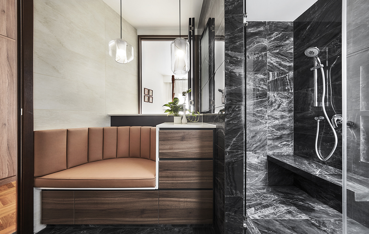
While these aesthetic changes did the trick in breathing new life into the home, the space was likewise in need of functional updates. Previously separated from the bathroom by full-height sliding panels, the master bedroom was instead fitted out with a sturdy wall, providing increased privacy. A small folding window above a built-in cushioned seat now connects the two spaces, the seat taking the spot of an outdated bathtub. A shower coated in sensuous, dark quartz is the new centrepiece of the master bathroom.

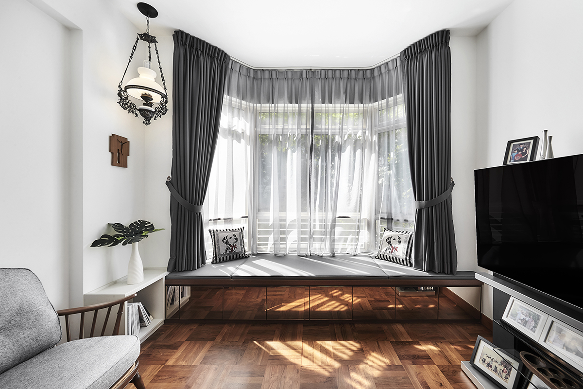
Once fully separated from the bathroom, the master bedroom was further outfitted with practical, space- saving storage. In the designers’ hands, a new built-in wardrobe took over the majority of the left-hand wall, doubling up as eye-catching paneling. Similarly, the cosy bay window in another bedroom of the house was fitted out with handy, hidden drawers covered in mirrors. These mirrors help to brighten up the pre-existing wooden floors, adding a modern touch to the farmhouse-style room without taking away any of its rustic charm.

In order to improve on the unit’s storage spaces even further, the kitchen underwent its own large-scale makeover with custom-built cabinetry. In the adjacent dining nook, a suspended shelving unit takes centre stage, serving as a fuss-free display for the couple’s many souvenirs from around the world. Below this unit, a classy counter is accompanied by elegant bar stools, which were imported from Italy to bring yet another piece of the world into this condominium.
This post was adapted from an article originally published in the SquareRooms Mid-Year Special 2020.


