Home is where the heart is, and for this Singaporean couple based in Hong Kong, their condominium at Marina One Residences acts as their sanctuary whenever they wish to come back for a sojourn to be with family. Befitting of its prestigious address, the domicile is already gorgeously luxurious to begin with, but it lacked the personal touch that is integral to any home.
For the space to be reworked, the pair sought help from local interior design company Wee Studio. “The apartment comes equipped with a fully furnished kitchenette and bathroom, as well as luxurious accompaniments such as a walk-in wardrobe,” says JJ Yip, the designer who helmed the project. The lady boss and one half of the powerhouse duo behind the agency also adds, “Our task was mainly to personalise it with customised complements and make it more habitable for its occupants when they fly home from Hong Kong.”

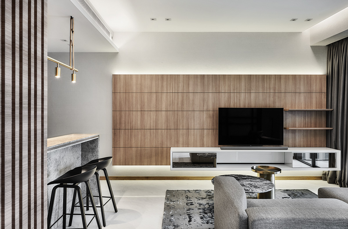
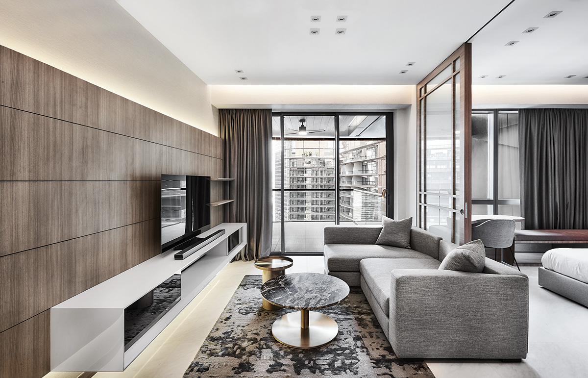
As it’s the first stop the weary travellers make as soon as they land in Singapore, the condominium has to be conducive for rest and relaxation. One of the key finishes that JJ employed in the setting is wood veneer because of its comforting and calming quality. Large swathes of grey run through the home to boost the laidback vibes, but because of its neutral quality, it doesn’t call attention to itself. Black and white accents underline the abode’s subdued colour scheme while pops of gilded surfaces bring sparkle into the place. Marble and tinted mirrors are also incorporated into the scene, infusing the abode with a touch of luxury and refinement.
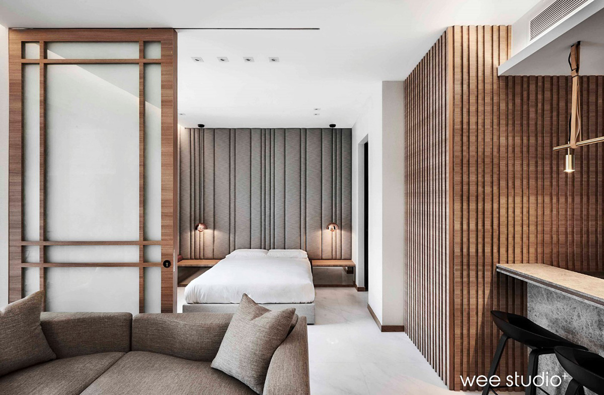
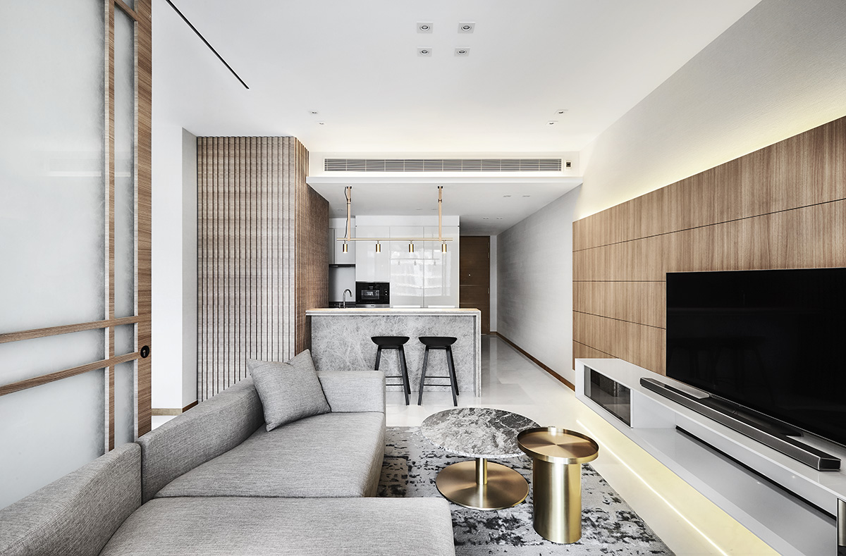
Owing to its constrained footprint, the apartment sports narrow pathways, and although human traffic isn’t an issue in a place meant for two, JJ endeavoured to find ways of opening up the interior. The first step to do so was to remove the partition that lay between the living and sleeping zones. “The bi-fold doors that led to the bedroom took up precious square footage,” she explains. “They had to be replaced.” In their place stands a sliding screen feature that could be left agape for an open concept feel or shut close for privacy in case a surprise guest pops by.

Likewise, the television feature wall and console in the common zone were designed minimally in lieu of space constraints, but JJ explains “we customised the feature wall with lines as a design element to give the illusion of a longer wall space.”
Similar linear patterns are reflected on the feature wall by the kitchenette as well. The vertical timber slats not only make a visually arresting backdrop, they imbue the high-traffic area with a relaxing vibe and give off an inviting ambience.

“It helps that there is enough clearance space, such as the high ceiling and long walkway from entryway to balcony, to allow the lines to be exaggerated,” continues the designer. “This way, we are able to make a statement with it.”
The play of lines continues in the master suite where a headboard feature that spans an entire wall commands attention. Apart from visually elongating the small sleep area with its linear details, the upholstered bedhead also adds depth and texture into the room. Plus, it provides a sumptuous backrest for leaning back with a book or warm beverage before slumber. “Due to the room’s diminutive size, we kept the design clean and simple by integrating it with built-in bedside tables and a reading nook by the window,” explains the designer. Besides, the clean and minimal built-ins mean that maintenance is hardly required each time they return home for the holidays.
Now that this luxurious apartment looks like a hotel suite while still feeling like home, it won’t be a surprise if the owners are searching for every excuse to make a trip back here again.

This post was adapted from an article originally published in the April 2020 issue of SquareRooms.


