This condo unit’s layout makes it easy for the family to do things together, while giving them ample personal space too.
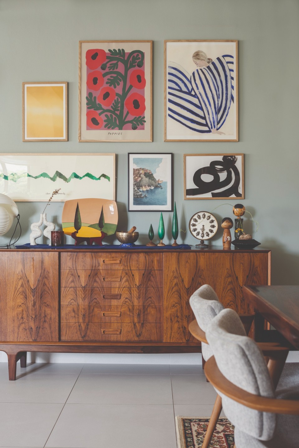
Feature walls are a great way to make a visual impact as well as accentuate a specific design style. For the owners of this condo unit, they wanted such an accent as a nice backdrop for their bookshelves and display items. So the design team at Monocot added a splash of green in the living space to make this large wall stand out. However, the light hue means it doesn’t overwhelm the rest of the room while also providing a contrasting setting for the homeowners’ artwork.
This renovated condo unit has a wholesome theme – the designers wanted to create a very family-centric environment where the family can be involved in their individual activities while still being very engaged with each other. An open layout encourages this behaviour, especially in the kitchen and living areas.
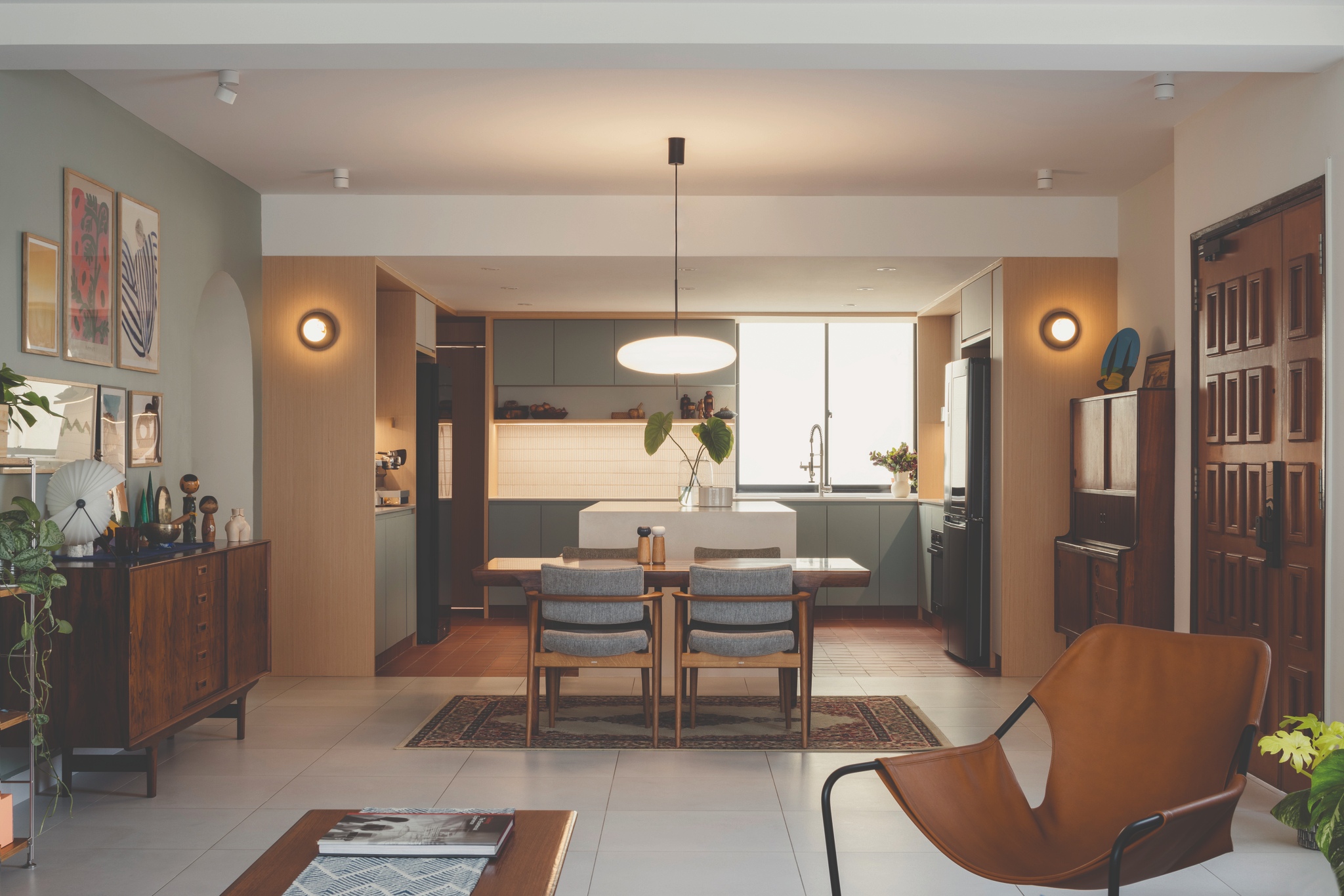
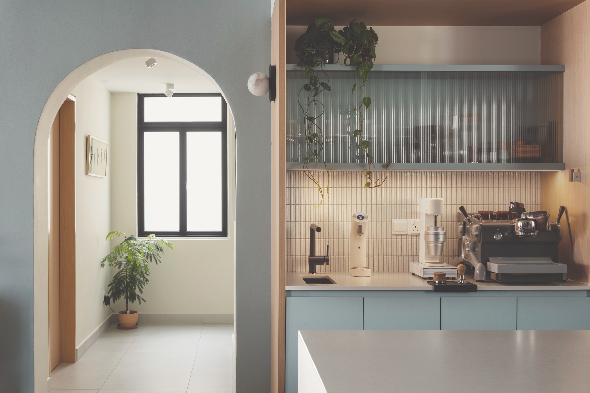
The designers cite the kitchen as the best transformation of this renovation, especially where it now opens up to the dining area completely and connects well to the living space and balcony in a single axis. In fact, the kitchen itself allows the family to go about their activities cohesively, after being divided into smaller sections. There are now three counters as well as a generous central island, and each space can be used for different things. So there is ample counter space for food prep and the family can also easily gather around the island to eat or chat about the day’s activities. Plus, there is a separate area to prepare coffee throughout the day, with a small tap and sink too, to easily mop up any spillage.
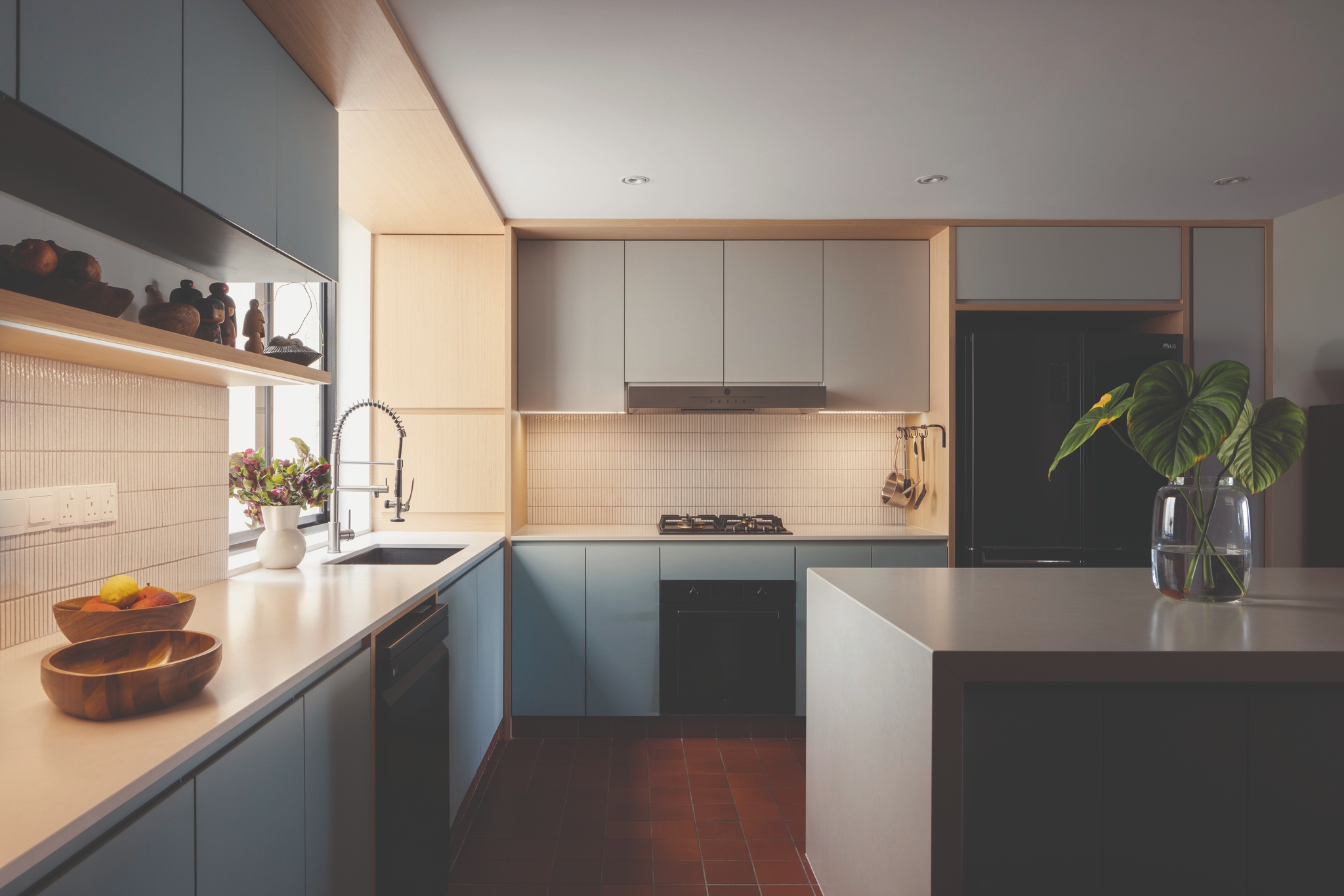
While large format tiles were used in the living area, terracotta tiles were laid in the kitchen. The design team reveal that they like using terracotta because “it’s a very cheap and humble material, almost like a basic building material that can pair with more luxurious materials”. These brown tiles provide a stark contrast to the light-coloured kitchen cabinets. A slightly blue laminate was chosen for the cabinets as the homeowners wanted a pop of colour. All the appliances here are new too, giving the space a refreshed, modern look. This area also has a new powder room, making it easy for the homeowners to freshen up while in the kitchen area.
Elegant and stylish
The home’s two bathrooms also got makeovers. The master bath was extended slightly, resulting in larger dry and wet areas so it’s now more comfortable for the homeowners to use this space. Both this bathroom and the common one have a similar half-half tile look, albeit in different colours – blue and grey for the ensuite, white and grey for the main bathroom. Colours were chosen to keep within the proposed palette for the house. The slimmer mosaic wall tiles on the top half of these bathrooms add a stylish touch to the more common type of bathroom tiles.
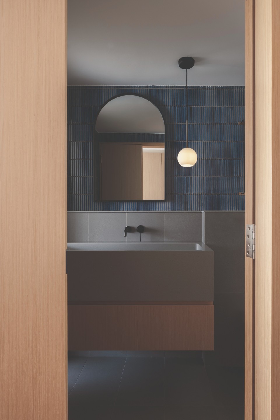
Both bathrooms have large, overhanging sinks, custom made from a solid surface. Wall niches in the shower area allow for neat storage of toiletries. New black accessories such as towel holders and taps give the space an elegant touch.
The main bathroom has a circular mirror while the ensuite’s vanity area houses a mirror that’s curved at the top. In fact, curved elements are seen all around the house, such as the lighting, taps and doors. The designers did this to create a softer look and also to match the development’s architecture.
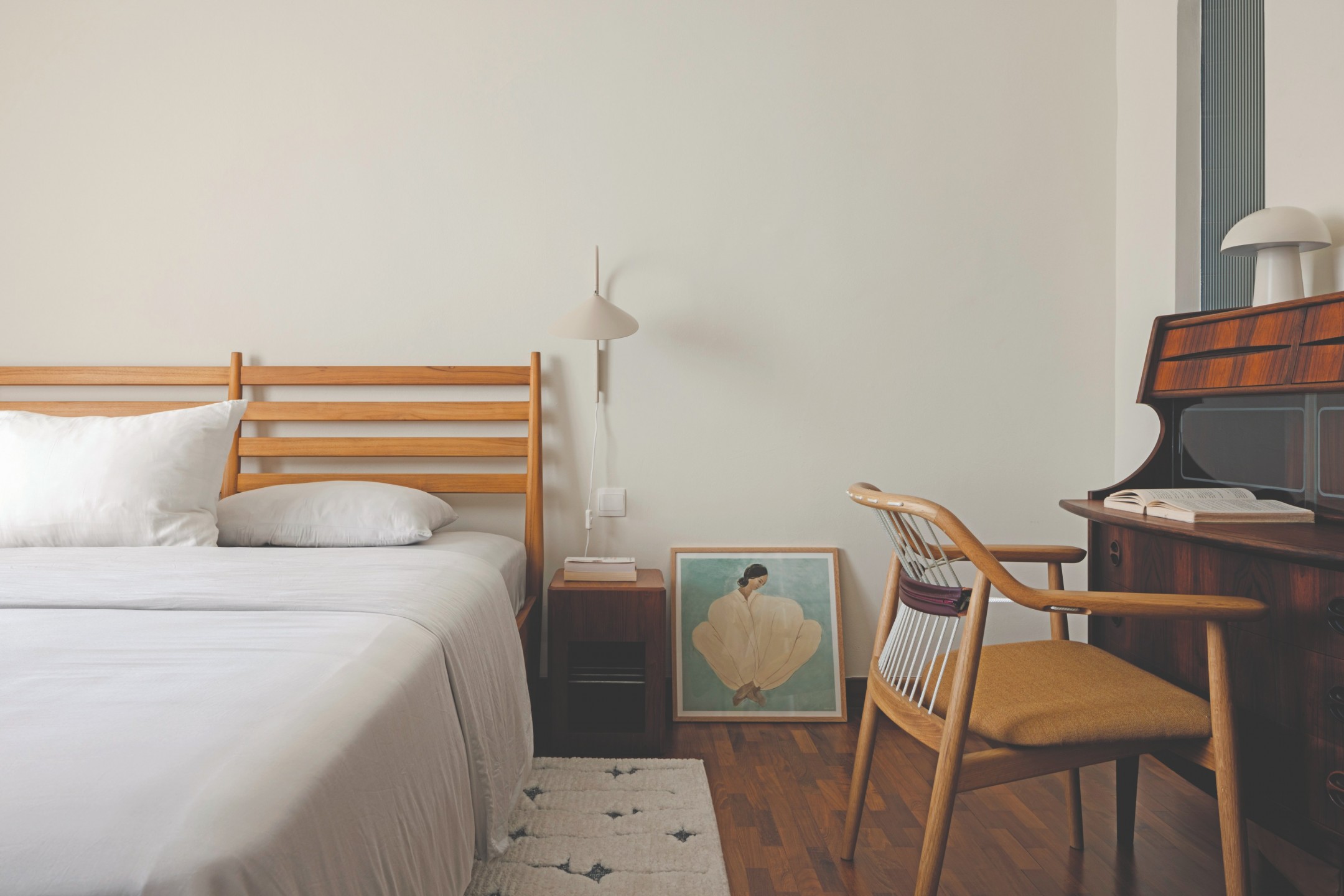
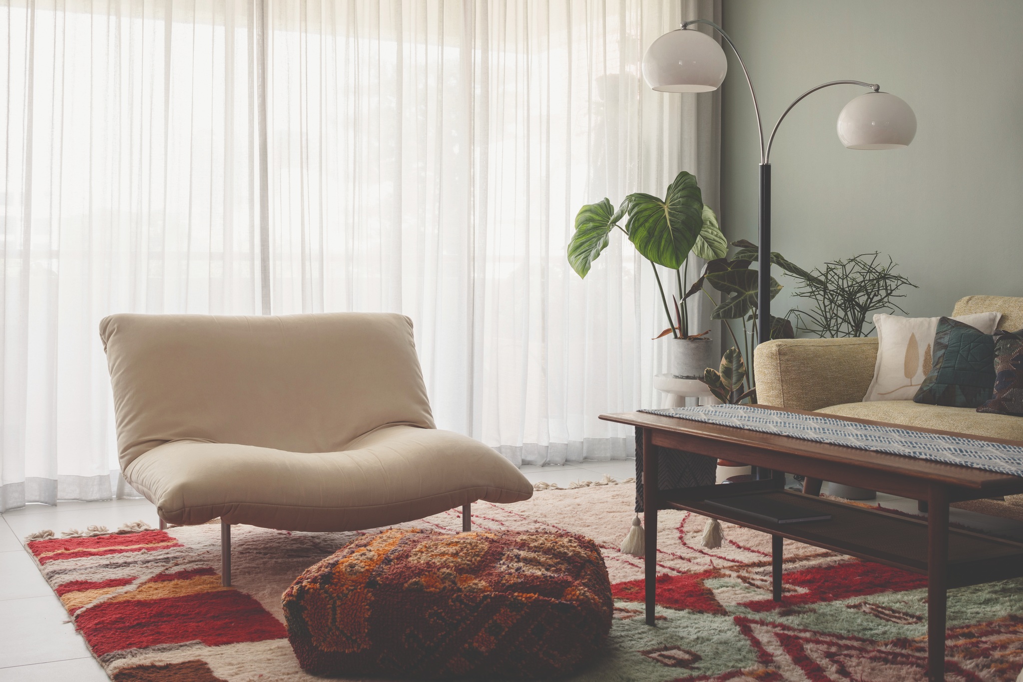
The home has three bedrooms and while the existing parquet flooring was retained here, they all now have new wardrobes. The renovation has transformed this home into one that’s bright, comfy and conducive to family bonding. Plants littered all over the home add to its snug vibe. The only challenge of this project? Selecting the materials to fit the design intention while remaining fun and elegant, the designers reveal.


