When it comes to interior design, a good design plan should be something that results in a space that is closely related to our lifestyles, while being beneficial to everyone in the family. And this concept is best expressed in this five-room BTO flat located in Yishun. Hoping to create a home that combines their Korean influences – the female homeowner being originally from Korea – and the specific requirements that came with having two dogs in their lives, the homeowners turned to designers Wilson Teng and Vandra Png of Studio FortyFour to transform their vision into a reality.

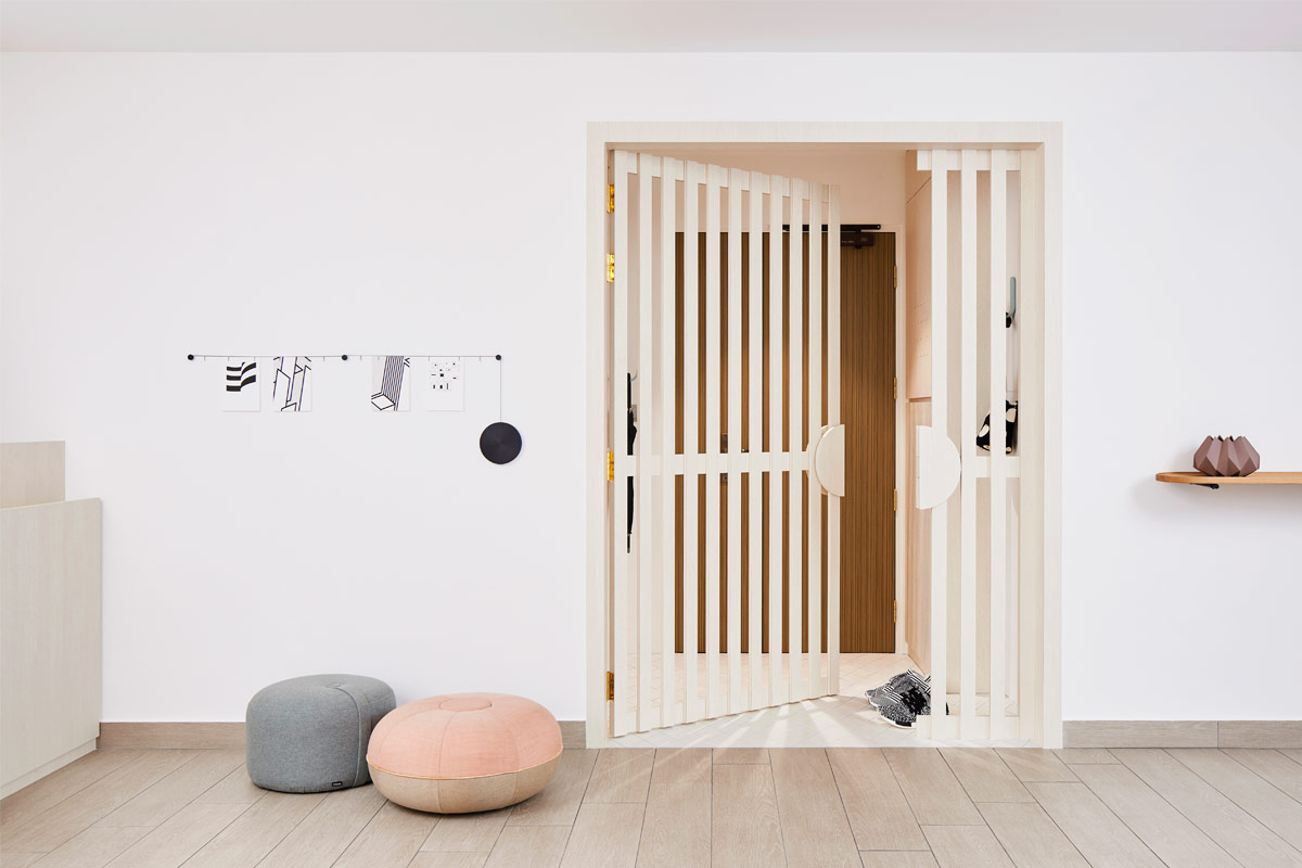
Similar to how Korean homes are designed, the inhabitants requested for their abode to have two doors. As such, Wilson separated the entryway from the living room with a screen door. By doing so, a new foyer was created that allows the homeowners and their guests to leave their dirty shoes outside before entering the home. The space also serves as a prelude to the apartment with the use of textures and materials that mimic those used in the interior. Not only that, the lineal design of the screen door is repeated in the living room’s television console and in the base of the kitchen island, serving as the unifying element between the different spaces.
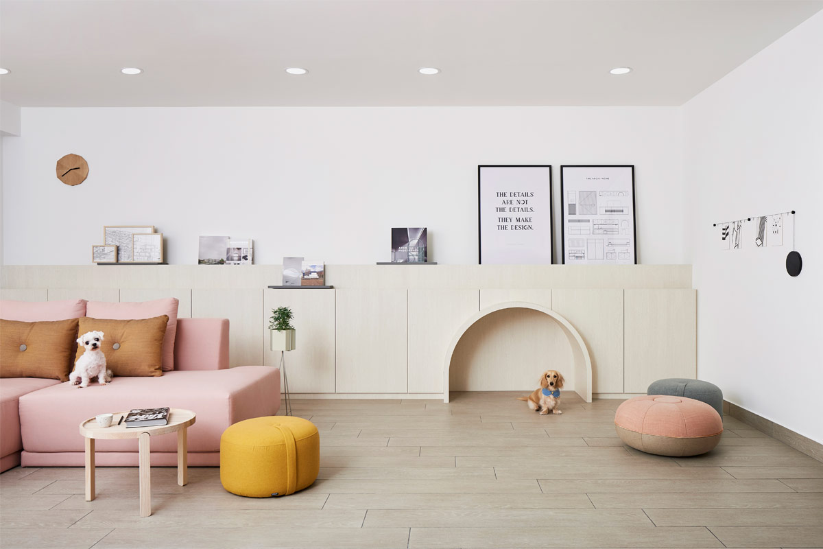
In the living room, a bright pink customised sofa from Blafink and coloured poufs add punches of bright and vibrant colour into the space. But what really steals the show is a half-height storage feature that goes the full way lengthwise of the main living room wall. Clad in light wood laminates, the built-in storage houses the male owner’s extensive collection of architecture books, and features a two-tiered design to prevent it from looking too bulky. Keeping the two dogs in mind, a corner of the feature wall was converted into an arch-shaped house for them to sleep under. Meanwhile, the original flooring was laid over with textured tile flooring from RICE. Speaking of the material choice, Wilson says, “The grainy texture allows the dogs to grip onto, preventing them from unnecessarily slipping when they’re walking or running around.”
Maintaining the home’s open concept floor plan, the kitchen is framed by a large arch that is highlighted in light blue and wood laminates. A space most often used by the female occupant, the kitchen is predominantly splashed in her favourite colour: blue. Seen on the upper and lower cabinetry as well as the kitchen island, the soothing hue is accompanied by wood tones on the countertops and backsplash. These are paired with strong black fittings that provide a visual contrast to the pastel shade. As the couple’s meals are similar to that of Korean culture – in which multiple appetisers are served before the main course – there was a need for a kitchen island to better facilitate the movement of dishes from the kitchen to the dining area. As such, a narrow island unit was installed, with the corners rounded to make it less bulky and more streamlined.

As the common bathroom and master en suite were situated back-to-back, there was a conscious decision to clad each room in a different colour – the former in mint green tiles and the latter in light blue tiles – to better differentiate between the two spaces. Both bathrooms however, feature strong black silhouettes that can be seen through the black-rimmed round mirrors and contemporary shower systems. But as having all the fittings in the space with the same dark hue would have been too overpowering, the designers decided to use grey countertops and laminates for the sink cabinet. This colour choice also allows the green and blue mosaic wall tiles and the wood-effect floor tiles to be the focal points in the space while still maintaining overall cohesiveness.
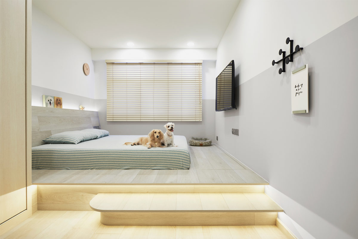
Moving on to the master boudoir, the entirety of the space next to the full-length series of wardrobe units was converted into an elevated platform. Instead of laminates, light wood-effect vinyl flooring from FloorXpert’s Pulse collection was chosen for its extra-long and wide planks that minimised visible grout lines. Besides encompassing storage units within, the platform’s steps are backlit by cove lighting which bathes the room in a soft warm glow when the ceiling lights are switched off. On the walls, a mixture of white and grey paint were used. When asked of this colour combination, Wilson explains, “The upper white half gives the illusion of a brighter space while the bottom grey half provides a cosier ambience. This way, the homeowners will get a different feeling when they are up and about moving in the room and when they are sleeping on the bed respectively.” Lastly, completing the space is an angled headboard where the occupants can comfortably lean on when they’re watching television or having conversations.

Looking back, Wilson remembers the project – affectionately known as “The Archi-Home” by the team at Studio FortyFour – with much fondness. When asked what he likes most about the home, he says, “I am personally very satisfied with the design because we were able to give the homeowners a space that closely revolves around their lifestyles.” After all, isn’t that what good design is all about?
This was adapted from an article originally published in the June 2018 issue of SquareRooms. Photo credits: Studio FortyFour


