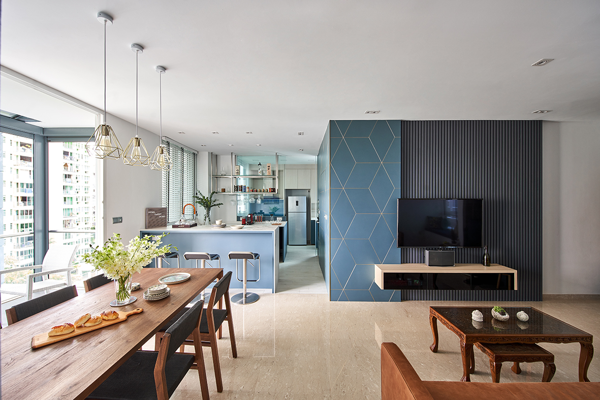
For the young residents of this resale condominium unit, home is about the people you share it with. The original layout—comprising a small dining room and closed-off kitchen—was therefore out of the question. The 1,000 sq ft unit had to be opened up, making space for lively dinners and plenty of mingling.
The design journey towards the residents’ dream home began with the aim to achieve an overall more sensible space. Caine from IdeasXchange was put in charge of this focal mission, and shares with us that interior design is, at its heart, about space planning. The arrangement of walls, doorways, cabinetry and furniture has to allow for efficient movement around the home above all else. With this consideration, the living and dining areas were switched, bringing the dining space into the heart of the home, where the young homeowners spend the majority of their time.

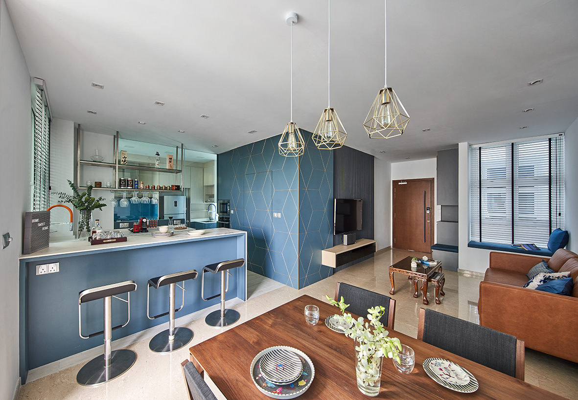
Hacking the kitchen walls was another crucial step towards an ideal layout, opening up the space to combine food and entertainment. What was previously a closed-off kitchen that isolated the homeowners from their guests is now an inviting area that welcomes visitors to bridge the gap between the different spaces. A bar-style counter further brings the two areas together, giving friends and family a space to sit and mingle with the residents while food is prepared in the kitchen. The new layout thus not only accommodates a larger number of people, but makes for a warmer and overall more pleasant atmosphere.
To further liven up the space and bring some of the homeowners’ young spirit into the unit, the designer opted for a vibrant shade of blue as the focal colour. “Every home design must have a central colour that ties the aesthetic together,” he shares. The blue hue adorns the custom-made feature wall in the living room and sweeps all the way into the kitchen, serving the double purpose of hiding the condominium’s bomb shelter and establishing continuity between the two spaces.

The colour is then repeated across the bar and within the kitchen itself, lending life to the neutral tones of the cabinetry and the pre-existing marble flooring. With tight space constraints and an awkward layout as the foundation for its design, the kitchen was transformed into an attractive and uplifting environment using the power of a bold shade. A few very exact measurements completed the look, resulting in custom-made cabinets crafted to fit the limitations of the kitchen space, the designer opting for sturdy quartz to ensure a long-lasting design. The kitchen floors were then fitted out with tiles for particularly easy maintenance.
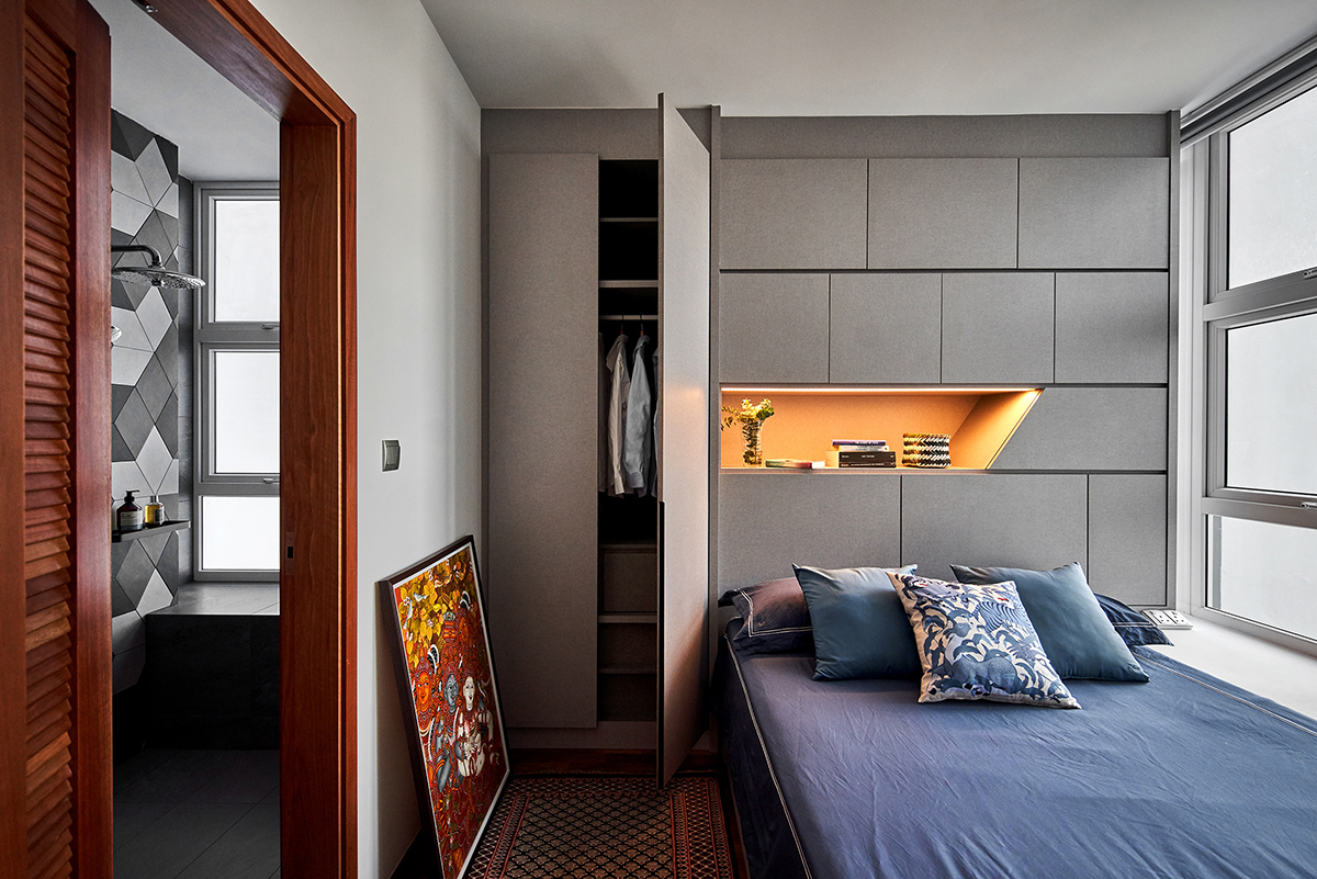
The practicality of these choices carries on deeper within the home, tiles making the bathroom floors equally fuss-free to clean while a custom-built vanity cabinet floats off the ground for increased floor space. In the guest bedroom, space-efficient storage takes centre stage in the shape of a hidden cabinet, wall-mounted behind the bed. It is thanks to these functional details and the attention paid to the nooks and crannies of the home that this resale unit became the space the homeowners dreamed of inhabiting—one where they can spend time with their loved ones and create memories to last a lifetime.

This post was adapted from an article originally published in the July 2020 issue of SquareRooms.


