To dial up on the luxury level in this brand new condominium unit, the homeowners and their designers from Versaform took inspiration from designer fashion boutiques. “They really took a shine to the marble installations in the boutiques and wanted to achieve the same look of finesse in their home,“ says the design team. While it would be straightforward enough to completely emulate the look of these Carrara marble fixtures, the designers took time to tweak the fine details.
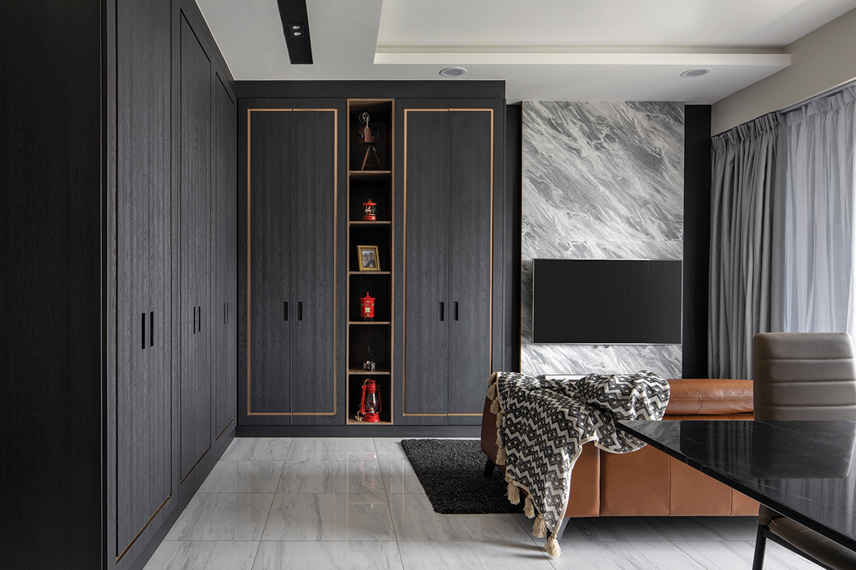
“We wanted the marble accents in the home to stand out and we selected a marble-look laminate finish with dramatic grey veining to offer that visual impact,” say the designers of the marble-effect feature wall in the living room. It immediately stands apart from the custom cabinetry of dark wood textures. The homeowners were also keen on a darker colour scheme and that culminated in the appointed dark and woody colour palette.

To downplay the heavy wood textures, the designers employed rose gold trimmings as a moulding design for the cabinet doors. It dresses up the doors with a contemporary flair and to complete the look, the designers implemented inset handles. “These recessed handles do not take attention away from the beautiful wood and rose gold finishes, and prove to be harder to be accessed by the homeowners’ young daughter,” say the designers. This unexpected child-friendly design element also establishes design uniformity for both the communal and private zones of the home.
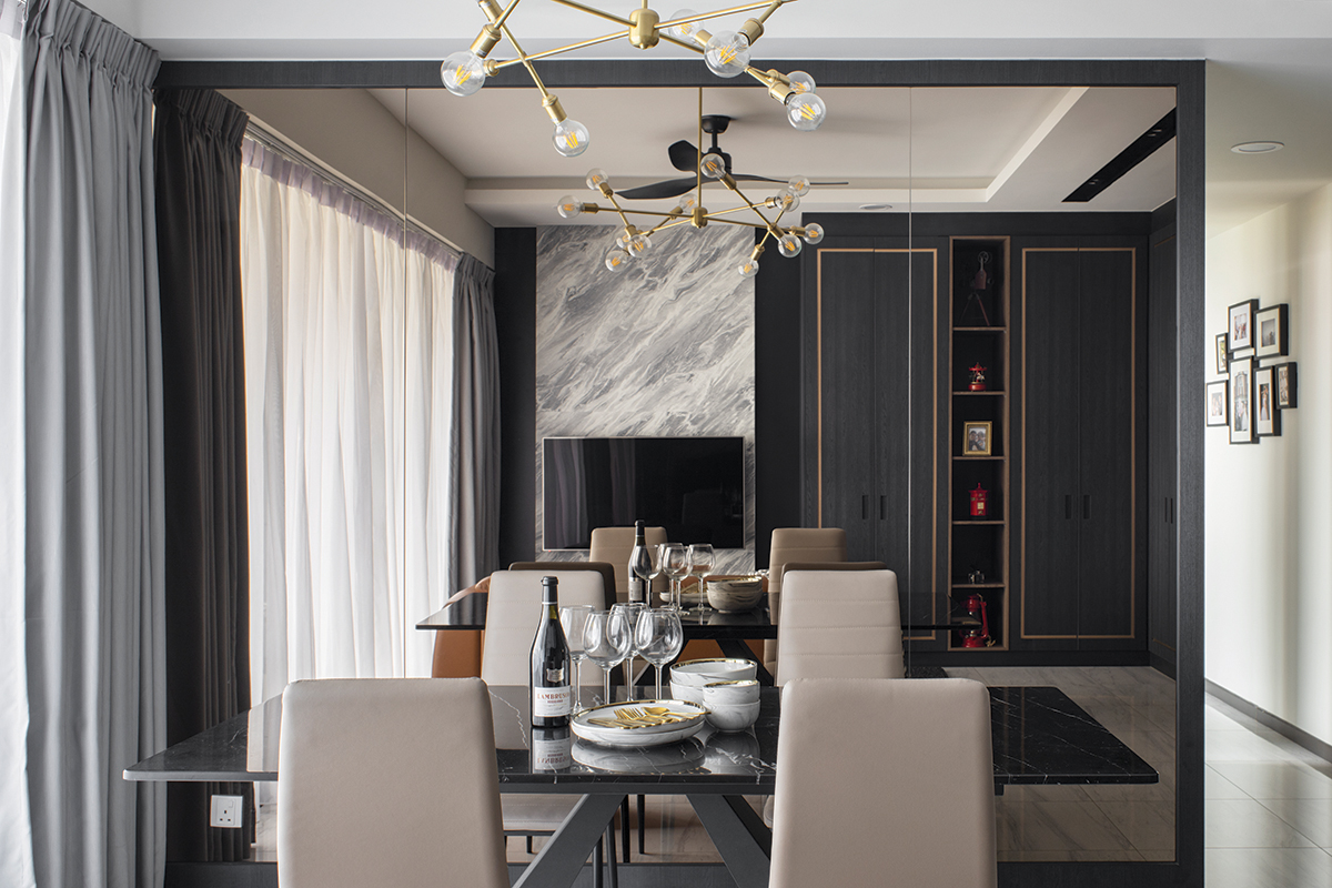
Crossing over to the dining area, the simple but sleek application of a large tinted mirror takes precedence as a focal point. The reflective and lustrous surface amplifies the sense of space in the shared communal areas. The team deliberately chose a tinted finish to project a warmer and inviting style take. They explain: “These mirror strips double the visual space footage of the dining area effectively and the tinted finish softens the ambience in the dining space.”

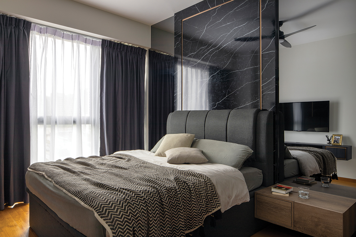
In the master bedroom, the rose gold trimmings make another appearance as an embellishment for the marble-effect feature wall. Much like the sleek juxtaposition it offers in the communal zones, the application of these trimmings plays up the modern grandeur in the bedroom. It highlights the gorgeous white veining details of the marble-look laminate feature wall. Dark tinted mirror panels finish off the look of opulence and this well-appointed ensemble echoes the material palette in the communal zones.
Flanking the bed is a pair of hanging bedside tables custom-designed by the team. While most bedside tables host drawers, the designers decided to take the unconventional route by working in double storage compartments. They say: “The bedside storage comprises a pull-out drawer as well as a flip-down cabinet door unit.” The rolling drawer allows the homeowners to store their usual bedside essentials while the flip-down unit makes it convenient for them to place their charging devices.

With every detail – be it in form or function – carefully considered, the team has created a family dwelling that makes a lasting impression. It goes without saying that this elegant escape and its enduring style have definitely nailed the art of good living.
This post was adapted from an article originally published in the February 2020 issue of SquareRooms.


