It’s true that a picture is worth a thousand words. Case in point: the owners of this resale unit were in the neighbourhood when they happened to pass the storefront of interior design agency Dan’s Workshop. Their curiosity prompted them to explore the brand’s social media sites, revealing a portfolio that resonated with their own taste. The couple thus met with Dan Wu, founder and designer of the company, and that sealed the deal.
Dan’s designs possess a distinctiveness that surpasses trends. Perhaps this is why the homeowners didn’t specify a theme. Instead, they shared with Dan their preference to include an element of colour in their apartment. “The young couple weren’t afraid to inject colour into their flat,” shared the designer. “It’s refreshing to receive such requests.” Together, the three adopted blue as the abode’s accent colour, selecting a rich hue with cobalt undertones that had a fresh vibe.

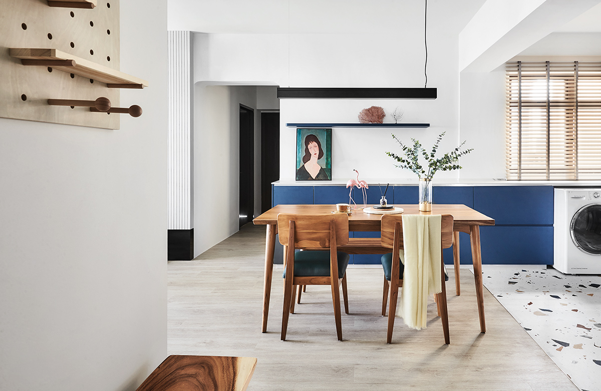
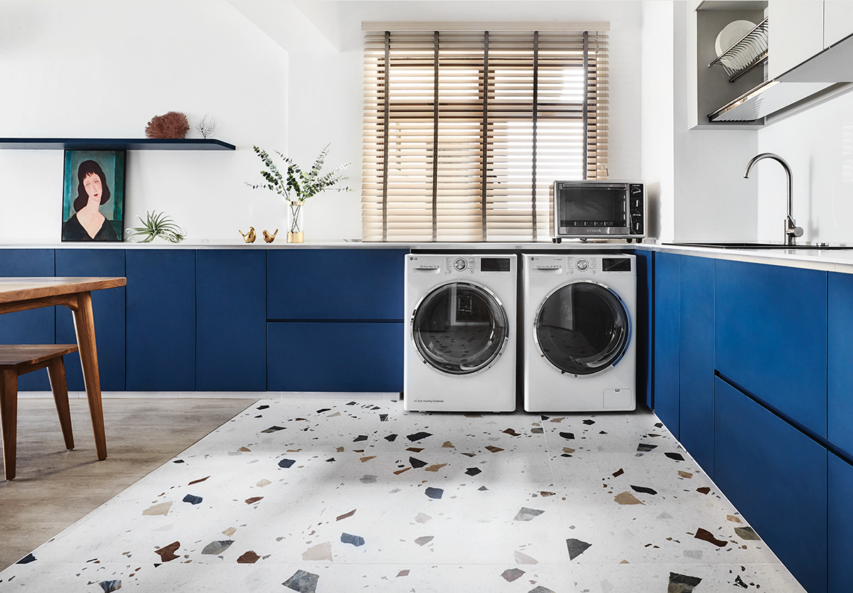
The hue makes a grand statement in the kitchen where an existing wall that restricted the space was taken down. Apart from showing off the gorgeous kitchen to full effect, this open concept provides a better-ventilated setting for the man of the house who is an avid cook.
Having the signature colour swathed only along the lower cabinets stirs up the perfect dose of interest in the cooking zone. Its intense tone juxtaposed against the ivory backsplash and grey upper sections creates a vignette that’s oh-so chic. What’s more, the pale palette used above reflects light to optically widen the surroundings. Taking into account its open layout, the kitchen was designed with concealed storage so that supplies are kept out of sight. Pared-down hardware-less cabinetry contributes to the uncluttered feel. The tiles — cherry-picked by the occupants — boast geometric motifs that define the free-flowing space, delivering an element of fun and adding texture into the place. “They absolutely loved how the pattern mimics terrazzo and how it added a spunky edge into this high-traffic area,” shares Dan.

To ensure that the connecting zones feel cohesive, Dan extended the lower storage units into the dining area, simultaneously fulfilling the pair’s request for sufficient storage space since there weren’t any in the living area.
The blue hue is carried over to the living room too — with a fabric couch and window coverings in a similarly arresting shade. The scene’s simple anchoring palette of creamy white walls and pale timber floors plays an integral role in establishing balance as it provides a calming backdrop for the shots of colour to pop. On top of that, the surrounding black elements emanate an elegant sense of drama indoors.
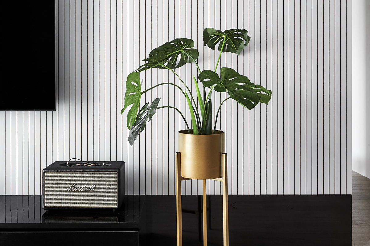
Nearby, a custom-made TV feature wall reinforces the residence’s contemporary appearance. The vertical grooves along its surface are actually grout lines formed by laying down strips of laminate piece by piece onto the wall. Other than adding to the home’s design, they do wonders in making the room look taller. At its base lies an adjoining entertainment console dressed in black and tailored with straight lines to mimic the rectilinear elements on the wall. It is deliberately flushed to the floor to keep housekeeping duties at bay. “As the flat houses two other furry occupants, keeping the dwelling pared-back and relatively maintenance-free is a priority for the busy urban dwellers,” explains Dan. “By positioning the console right on the floor, there wouldn’t be any gap or surface that might potentially accumulate dust.” This is also the reason why the domicile relies on durable materials such as vinyl, tiles and laminates.

The bespoke headboard in the master suite is also uniquely conceptualised. “We sourced for tiles from Hafary and crafted this bedhead by arranging them one by one together within a black frame,” explains Dan. The two loved it because unlike traditional fabric types that are tricky to maintain, the bedhead is a cinch to clean and also offers material longevity. Dipped in the interior’s accent hue, it saturates the room with just the right amount of colour.
Upon the owners’ request, he knocked down part of the wall to create an entryway for the pair’s new walk-in wardrobe. Sliding doors in a pale wood tone that matches their closet breathe a sense of tranquility into the now-spacious sanctuary.
This post was adapted from an article originally published in the April 2020 issue of SquareRooms.


