Creating a design that highlights lines seems easy and straightforward enough, but Design Principal Derrick Lim from D’Marvel Scale will tell you that there’s a lot more to this less-is-more style. With it as a central theme in this resale unit whose renovation he helmed, he explored the dominant use of stark white walls punctuated by dramatic dark stripes.
“The homeowners are partial to a monochrome palette but the main design inspiration lies in the female homeowner’s interest: pole dancing,” reveals Derrick. Taking reference from the form of the metal pole, he conceptualised a frame style concept which boxes up different design elements within the home. He had to be careful not to dwarf the dimensions of space, since boxing things up can create a bulky and uninviting appearance.

With a trained eye and restrained hand, he first worked in a uniformed material palette of vinyl flooring and crisp white walls to set the stage for a breezy Scandinavian-inspired background. “This was another design requirement by the homeowners who like the relaxed Scandi aesthetic,” he says. Introducing a pared-down colour scheme was also more practical to brighten up the confines of this 10-year-old resale unit, which did not have a lot of daylight to begin with.
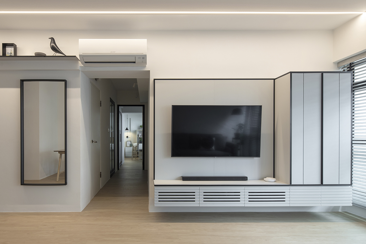
Drawing upon the high contrast of dark outlines against white walls, he then dressed up the communal spaces with black trimmings to frame the white backdrop of cabinetry and walls. This is evident with the entertainment console where black lines stretch across the wall-mounted cabinet to offer visual depth to an otherwise flat-looking installation. Adjacent to it is a framed mirror and shelving with matching black borders, and this ensemble creates a light and airy effect by showing off more wall space.

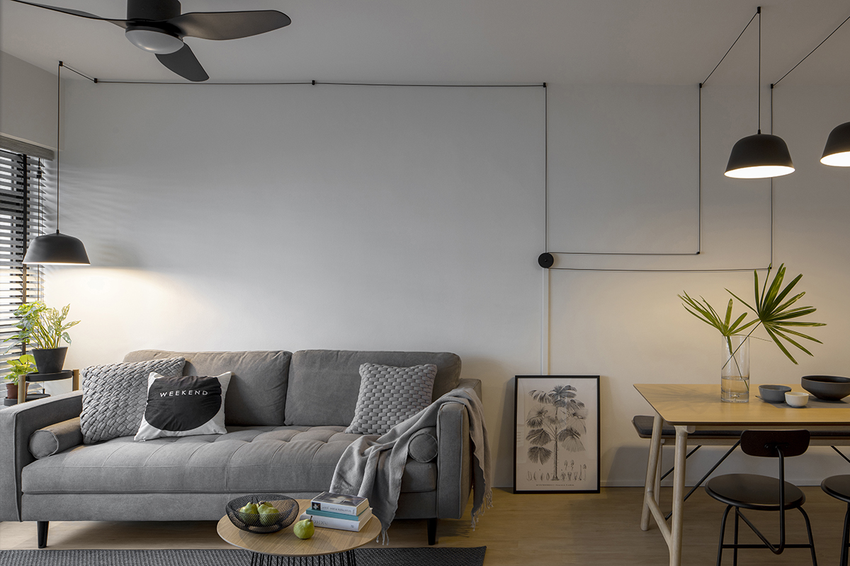
Moving towards the shared living and dining zones, Derrick arranged the exposed wiring of the pendant lights in a neat order on the ceiling and wall. The striking symphony of lines are well-tempered by the cosy sofa and warmth of the wood dining set. This curated balance also helps to tone down the clinical look of the monochromatic design scheme and brings forth a more welcoming living and dining space.
While cove lighting is a norm in many homes, Derrick did not want to compromise on ceiling height which might further reduce the visage of space. He did the next best thing with LED lighting, trawling lights along the perimeter of the ceilings in the communal areas and bedrooms. These trails of LED lighting resonate with the linear design theme and elongate the span of the ceiling for a sleek and spacious appearance.
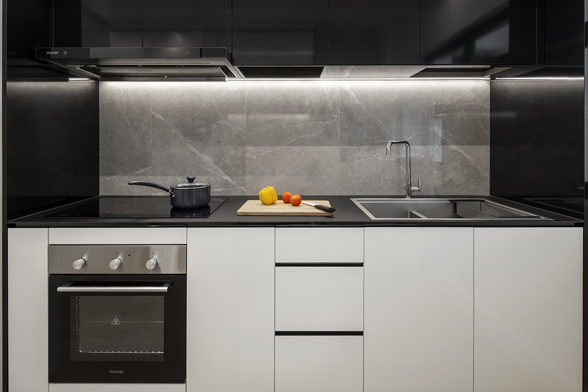
In the kitchen, an outline of different materials adds textural layers to the kitchen counters. Matte and high-sheen surfaces shroud both the counters and overhead cabinets to create a frame effect. To prevent a sterile look, textural interest is injected through a grey tiled backsplash which comprises marble-effect patterns.

Despite it being an easy style to execute, the monochromatic Scandi look of this home requires delicate balance. This has been beautifully demonstrated by Derrick and his team who managed to hit all the expectations of the homeowners. Through their well-planned efforts, form follows function in a spacious flow within this clean-lined HDB flat which is not devoid of character or homely charm.
This post was adapted from an article originally published in the August 2020 issue of SquareRooms.


