Just like most first-time homeowners, the lady of the house wants hers to be extra special. But a prosaic theme that doesn’t inspire simply doesn’t cut it.
In fact, one of the expectations she seeks in her condominium’s makeover is a design that is ‘insta-worthy’. And this lady isn’t afraid to break boundaries to achieve that.
To kickstart the transformation, she needed an expert’s assistance.

“Not only was she willing to push the envelope in terms of design, my client placed her utmost trust in me and my team,” shares Sean Hafiz of Mr Shopper Studio who led this renovation project.
The opportunity to take the rein allowed the senior designer free play – and after much creative brainstorming, he decided to give the residence the ‘wow’ factor with a dramatic setting. “The aesthetic that I went for was a dark scheme with touches of forest green,” he explains.
Although most dwellers of small pads tend to shy away from dusky shades, Sean doesn’t share the same sentiments. On the contrary, he firmly believes that moody tones have the power to make an interior feel cosy and sophisticated – precisely the mood and look that his client had wanted for her home.
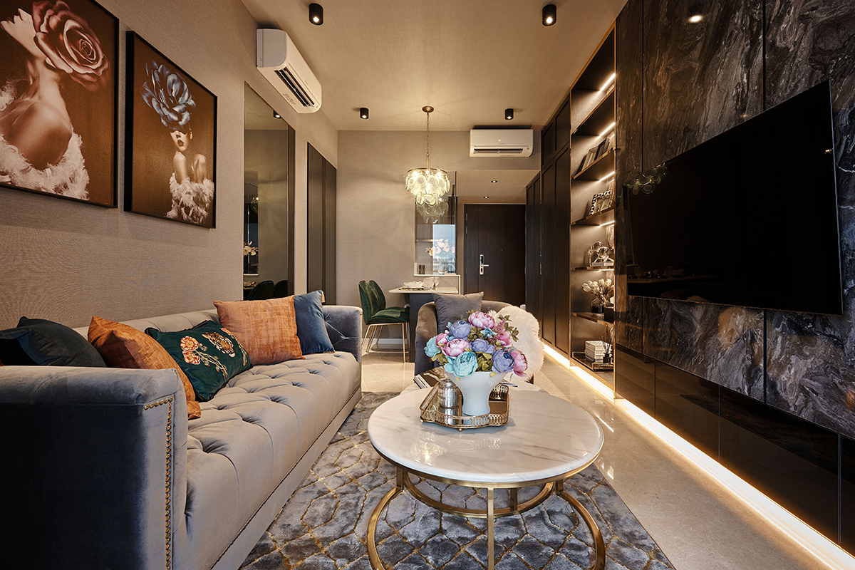
A base colour scheme comprising neutrals such as charcoal grey, black and white saturates the 2-bedroom apartment through the use of furniture and finishes. Wall coverings, instead of traditional paint, clad the walls in the living area – but what’s unique is that Sean papered the ceiling as well.
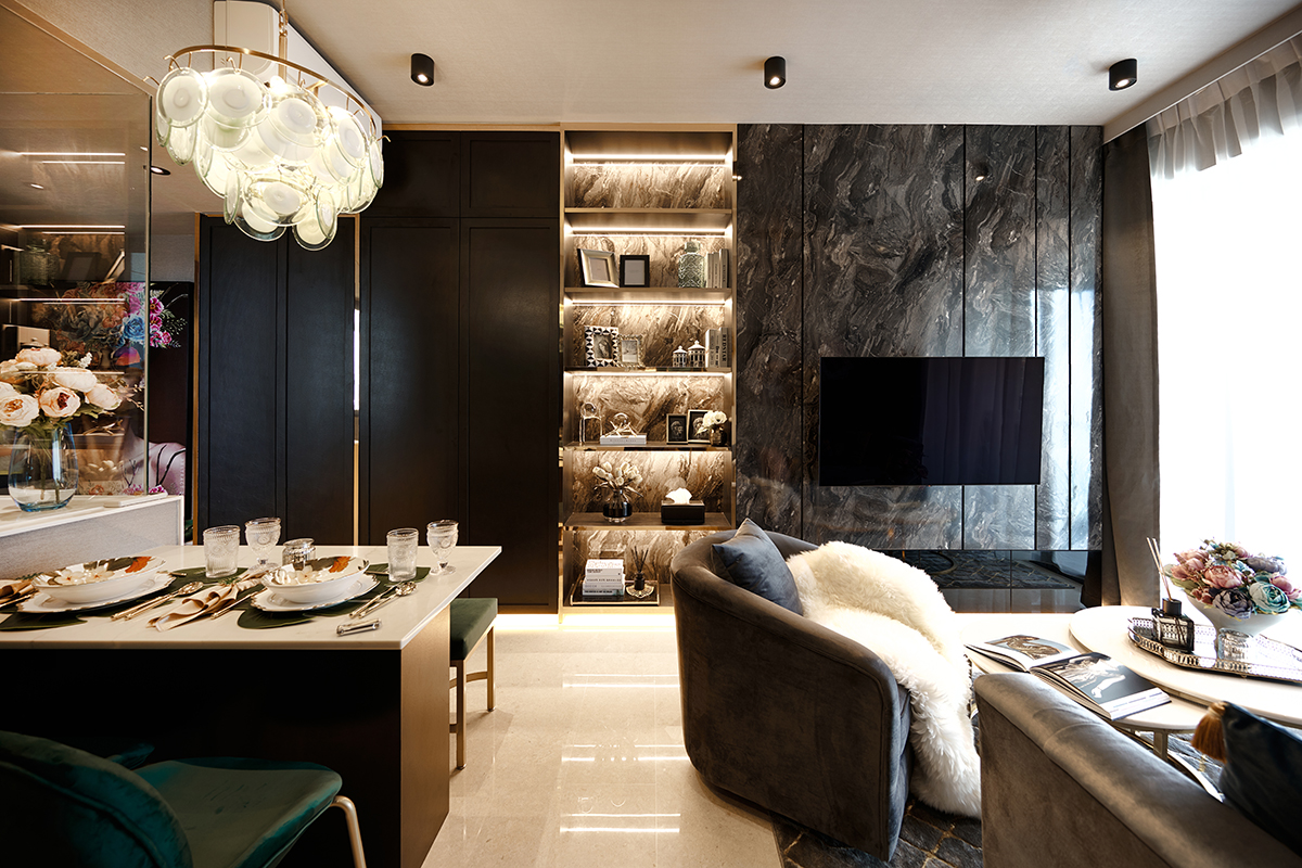
“Wallpaper softens the harshness of walls as compared to paint,” says Sean, explaining his plan to texturise the entire interior. In addition, he outfitted the seating area with a wealth of sumptuous soft furnishings to heighten its inviting atmosphere. Facing the lounge zone lies a full-length bespoke cabinet that spans an entire wall.
Black laminates that impersonate marble’s resplendence clad the side where the TV feature wall is, while brushed brass laminates frame the adjoining display and storage units to balance the piece’s dark-toned veneers. The latter’s shiny surface also serves to inject a fresh and modern edge into the overall visual experience.
Plus, it picks up on the other metallic accents found within the proximity—tying the room seamlessly together so that it shines with effortless style.

Speaking of sparkle, the lady of the house’s boudoir is bound to appear as stunning on screen as it does in reality – no filters needed. To keep the aesthetics across the apartment consistent, Sean adhered to a similar colour and materials palette for this place of retreat.
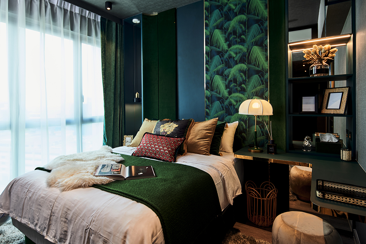
Only he decided to take things a notch higher here by designing the master bedroom to emulate the tropical luxe theme. The forest green hue that is wielded in moderate amounts in the communal zone appears more consequentially here.
This ranges from the headboard panel draped with a wallpapered print of dense jungle foliage by Cole & Son to an assortment of decor items and furnishings in deep emerald tones. The result is enchanting. No wonder the homeowner dubbed this space her secret garden.
Gilded elements and velvet keep the look high-end, while reflective surfaces stealthily help make the darkly glamorous suite appear more spacious.

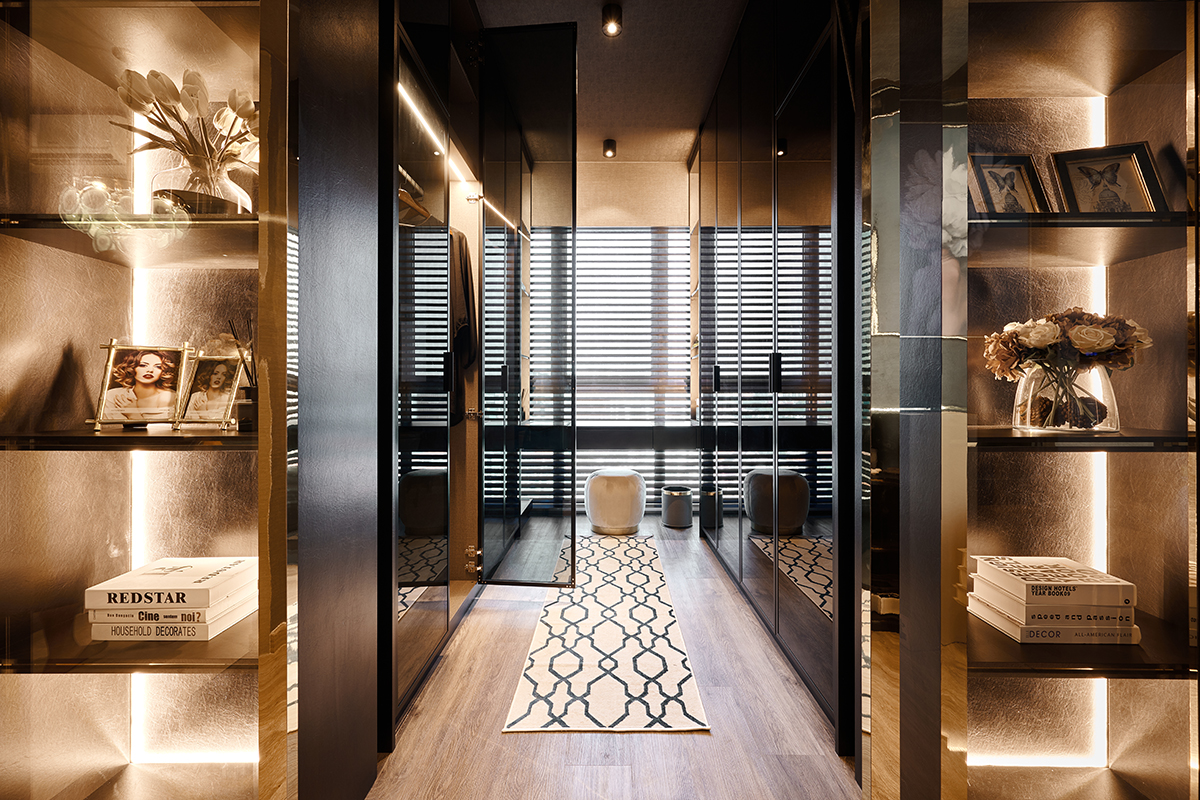
Nearby, a luxurious walk-in wardrobe dressed in all black brings to mind a sophisticated secret lair. Glass doors lined with gold laminates slide open to reveal wall-to-wall storage with a selection of open and closed compartments to cater to the fashion-savvy lady’s variety of outfits.
The interior sports clean lines that do wonders in widening up the narrow dressing room. Ample wardrobe lighting doesn’t simply aid with the task at hand, it enhances ambience and creates a calming space to start and end the day.
With furnishings, a pouffe and a plush rug keep things comfortable during deliberation sessions.

Dramatic, atmospheric, yet comfortingly cosy, this condominium cuts a stunning image both on and off screen. But what’s most important is that it also provides its owner with the perfect sanctuary to rest, relax and go about her every day with ease.
This post was adapted from an article originally published in the January 2020 issue of SquareRooms.


