A relaxing combination of warm neutrals and open spaces gives this four-room apartment a laidback vibe.

It’s no surprise that many Singaporeans love staycations and will often find any reason to treat themselves to a weekend getaway. The newly minted homeowners of this premium 4-room BTO unit loved staycations so much that they wanted to transform their flat into the ultimate staycation experience.
“Bearing in mind how many hotel rooms typically have an open layout where everything is interconnected, we knocked down the kitchen wall and merged the living room and kitchen into one big, free-flowing space,” says Tayllen Phoo, the Authors In Style designer who was tasked to oversee the renovation. This structural modification also allows for easy interaction within the communal area so those on either side can still maintain close contact with each other.

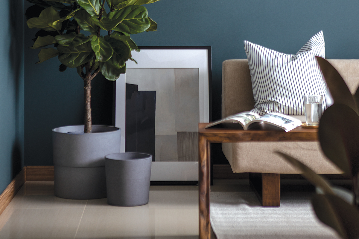
Characterised by greyish-green painted walls, the living room is outfitted with loose furniture pieces that made the area conducive for entertaining. “They didn’t require much storage in here so we did away with built-in fixtures to keep the space airy. Instead, we focused on creating a space that would allow them to fulfil their frequent hosting duties with friends and family with ease,” the designer explained.
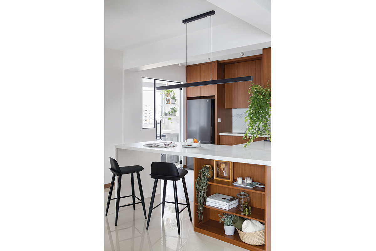
Similarly, the quartz-topped island at the entrance of the kitchen was designed with hosting in mind. Here, the owners and their guests can mingle over food and drinks. While one side of the island was left open to make seating more comfortable, the other plays host to a series of shelves. Nicknamed the “Lay’s shelf,” this feature was specifically requested by the owners to store their collection of Lay’s potato chips, Tayllen recalls.

In the cooking zone, straight lines and clean forms give the space a sleek look. Open shelving and closed cabinets offer plenty of storage solutions for the owners who love to bake, while large-format, marble-effect tiles on the backsplash create a striking focal point in the utilitarian zone.
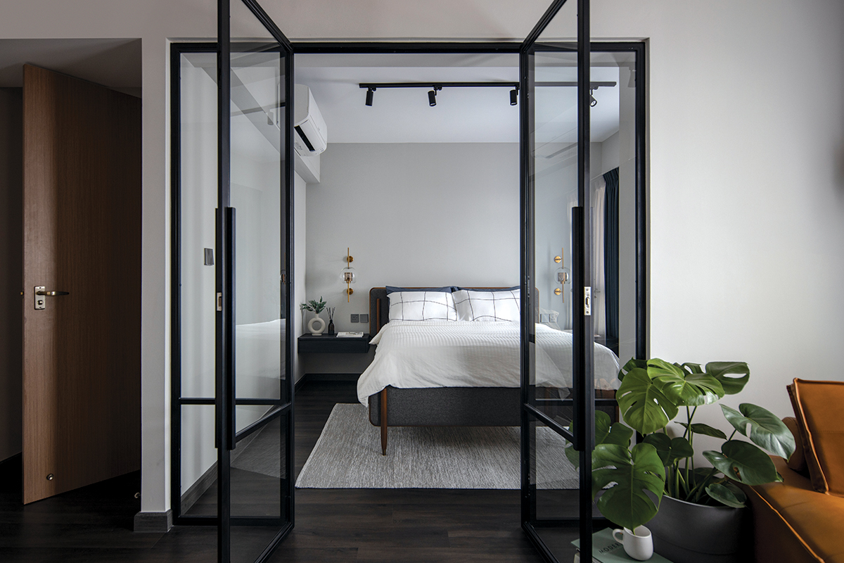
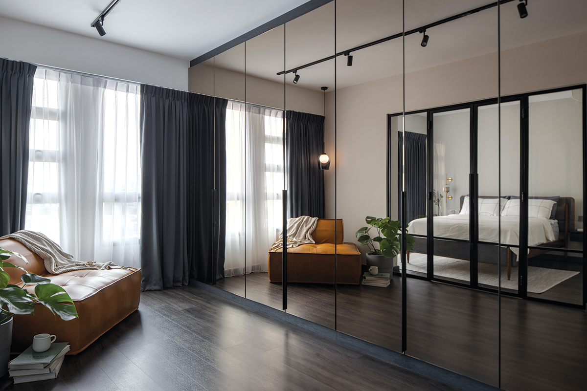
For the owners’ personal sanctuary, two bedrooms were combined to create an expanded master suite that comprises a sleeping area and a walk-in wardrobe. Despite now sharing the same floor area, the bedroom and wardrobe are divided by mild-steel glass doors. By doing so, the bedroom is afforded some separation without blocking out any natural light, making for a spacious and welcoming spot. As for the design, the trio looked towards the rooms of Hard Rock Hotel for inspiration. Boasting elements like dark walnut vinyl flooring, track lights and gold-accented accessories, the bedroom’s aesthetic is industrial yet posh-looking.

On the opposite end of the bedroom, the adjoining en-suite bathroom comes into view. Tayllen shares, “We wanted the bathrooms to match the closest space it is linked to, which is why the master bath has a design similar to that of the master bedroom.” For instance, the musky green square tiles and concrete-like tiles help inject an industrial touch into the shower zone, while the wood-effect laminates on the drawers draw a link to the vinyl flooring outside.
For Tayllen, this renovation didn’t come without its fair share of challenges, but it was ultimately a highly fulfilling one for the designer. “Even though the circuit breaker period delayed a bulk of the schedule, I am grateful for the trust my clients had in me, and I feel very proud to be able to design a home for them that truly speaks to their needs.”
This post was adapted from an article originally published in the April 2021 issue of SquareRooms.


