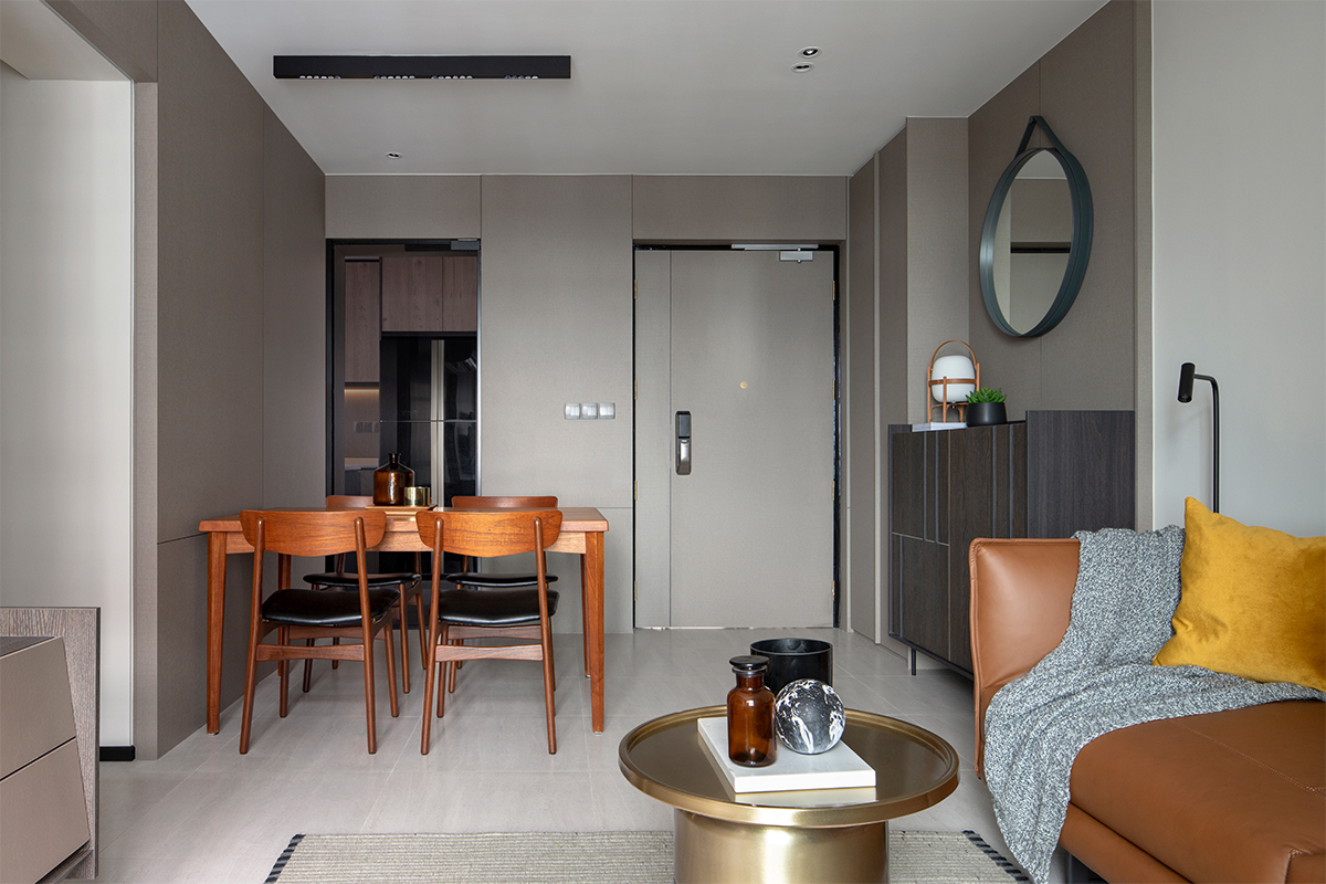
As far as simple sophistication goes, this 4-room HDB flat unit designed by the Joey Khu design team exudes a quiet air of confidence. The designers mixed an understated colour palette with streamlined design accents to fulfil the homeowners’ brief: an inviting boutique hotel-style living space. Says the team on the conceptualisation of the space: “The flat unit may not have the luxury of space, but we wanted to introduce the concept of hotel luxury into the home through sleek design accents.”
Residing in the home is a bachelor and his parents. This professional in the education industry enjoys hosting family and friends at home. Therefore, the designers had to be smart with the space planning in order to eke out sufficient walking room to accommodate guests. They remark, “It was understood that the living and dining zones are supposed to be heavy traffic areas with the number of entrances here.”

In order to draw out a spacious expression in this communal zone, the designers turned to toning down the number of visual distractions. They used a uniformed ensemble of laminate coverings to fill the walls with a soothing sense of symmetry. Behind the front door, the DB outlet box has been well concealed behind these laminates through the application of custom carpentry. A custom-built cabinet is then worked into the picture to fill up the recessed wall and to balance the visual proportions of the space.
Keeping to the neutral colour palette of white and warm grey tones, the dining space is anchored by laminate wall coverings bearing a cross stroke for a streamlined appeal. “We didn’t want anything too elaborate to define or overwhelm the look of this area,” says the team of the clean-lined style.
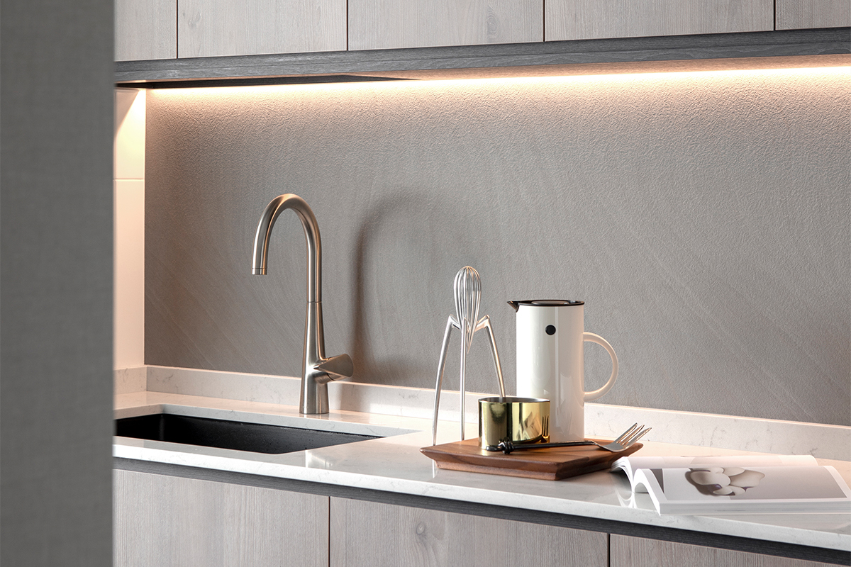
Moving to the kitchen of this 4-room HDB flat, which is enclosed by a dark tinted glass door, the simple galley setup is enhanced by the tactile feel of the backsplash. It is embellished by EDL Compact panels and with its textured details; it brings a dimensional touch to the clean-cut setup of the Silestone countertops in white.

For the bachelor’s bedroom, he specified for storage to house his collection of books, and a workstation. Since space is tight in the master bedroom, the team maximised the floor area with a full-height ensemble of custom carpentry. They aligned the bedhead with the floor-to-ceiling storage fixtures bearing the wardrobe and open showcase cabinets along the same wall. Integrated with the cabinetry is a compact 1.1-metre long desk and this L-shaped arrangement of custom carpentry makes full use of the limited space footage.

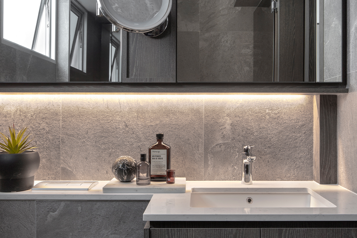
In the en suite bathroom, a spacious and sophisticated aesthetic is achieved with the use of material consistency and wide format wall tiles. The team decked the sink counter with Silestone surfaces which extend towards the wall-hung WC for an elongated tabletop. “Besides maximising the amount of countertop space in the bathroom, this extended counter draws the eye to believe that space is much more expansive,” explains the team.

This post was adapted from an article originally published in the January 2020 issue of SquareRooms.


