Kicking off the design of this 5-room HDB flat was a clear and concise brief from the homeowners. The two residents wanted their home to be airy and spacious, steering clear of any features that make rooms feel dark and claustrophobic. The designers at Cozyspace fulfilled this requirement through the use of an open layout, white walls, optically elevated ceilings and space-savvy storage solutions.
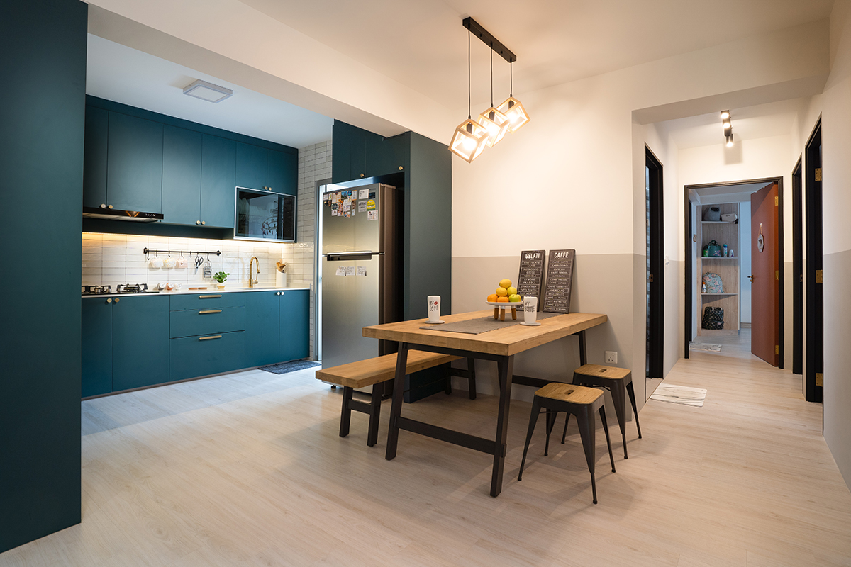
On a structural level, the wall separating the kitchen from the home’s living areas had to go. After all, an open-space layout is crucial for better flow of movement in any home, and it can do wonders for a space that feels crammed and stifling. The renovated area is now a combination of kitchen and dining room, the two spaces visually separated by a deep, luxurious shade of blue that covers most of the kitchen. The dining area, on the other hand, is split horizontally, the lower half painted grey while the top half is coated in a bright white that sweeps all the way up to the ceiling. A striking pendant lamp further helps to draw the eye upwards, its three light bulbs arranged in a stair-like formation.

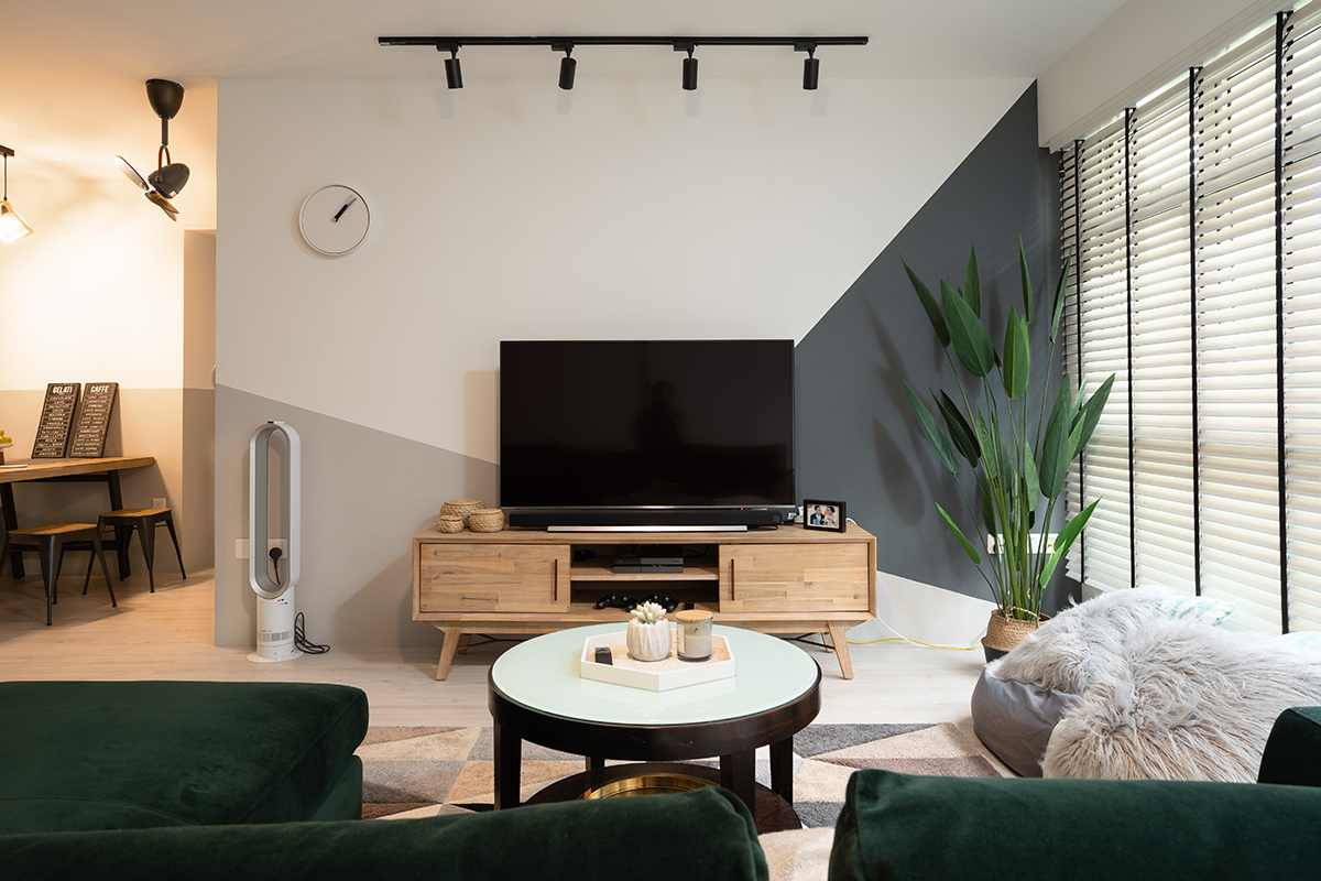
The grey hue from the dining area is carried over into the living room, where it angles down into an arrangement of two geometric shapes, culminating behind the TV console to actively make it the focal point of the room. The shape closest to the window is cleverly painted darker, softening the glare of the light that streams into the space in order to even out the room’s brightness. A cosy rug repeats the geometric pattern, laid out underneath a velvety green couch that mimics the bold edge of the kitchen cabinets.

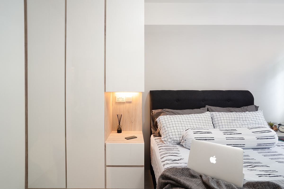
But the visual continuity in this home is not limited to the living areas. In fact, we can find the same subtle grey tone in this HDB flat’s study and even the master bedroom, repeating its stroke across the lower walls in order to optically raise the ceiling. Both the study and the bedroom follow the same minimalist aesthetic we encounter in the living room, prioritising space over ornamentation. The study in particular was kept almost bare, transformed into a distraction-free space that encourages productivity and concentration. The bedroom is similarly airy, with the addition of a floor-to-ceiling wardrobe and a space-saving, built-in nightstand.

The two bathrooms equally reflect the home’s overarching aesthetic. The more prominent of the two boasts a display of geometric tiles in a mix of neutral tones, arranged into a striking feature wall that recalls that pattern in the living room. The same washed-out grey that sweeps from one end of the home to the other can be spotted within this tile arrangement as well, forming a bridge between the dark, earthy shades and the milky white tiles. The second bathroom sports a more toned-down look, breaking up the white walls and fittings with a rounded cabinet that recalls the wooden TV console and the built-in storage from the master bedroom.
This post was adapted from an article originally published in the August 2020 issue of SquareRooms.


