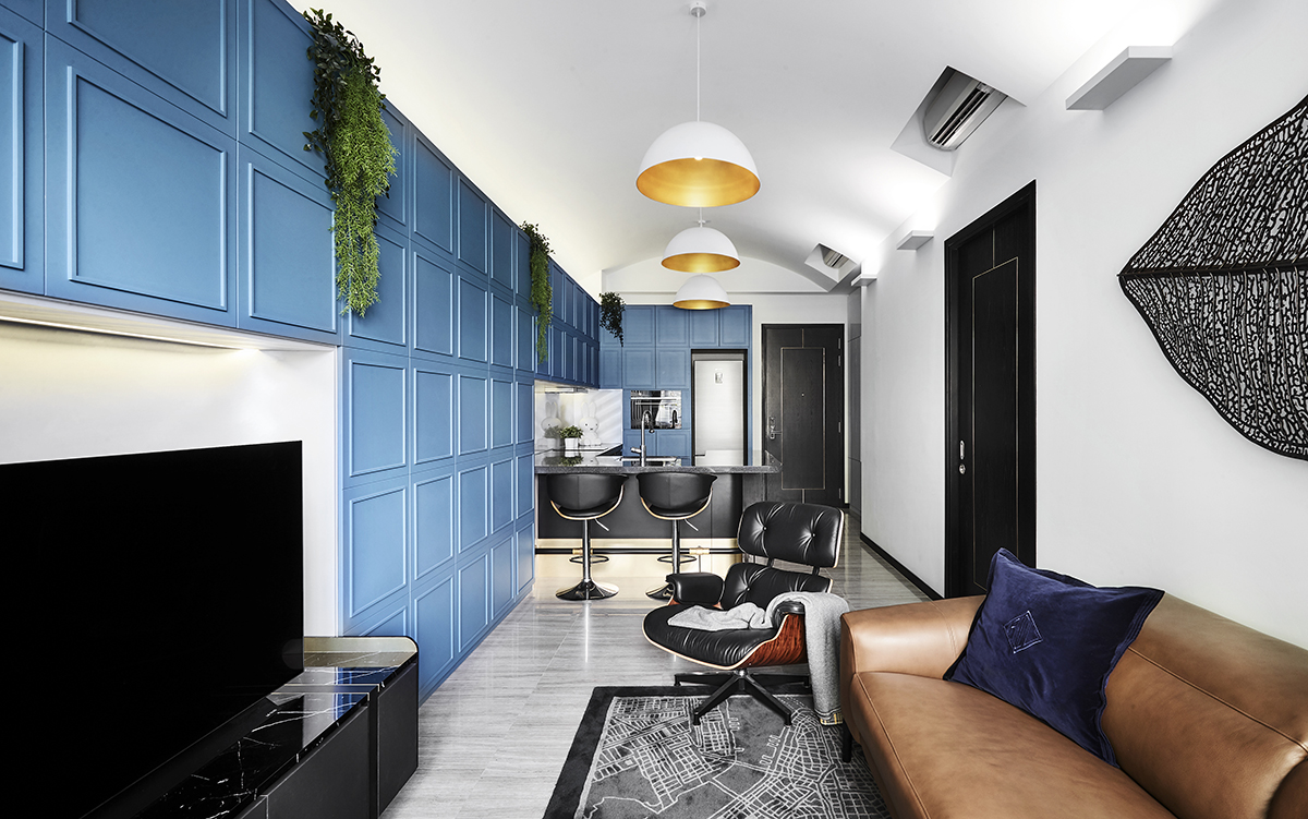
Staying in New York left an indelible impression on the homeowners of this condominium unit, and it was only natural that the experience became a source of inspiration for their new home here in Singapore. Design director Lawrence Puah from akiHAUS, who helmed the home’s overhaul along with his senior designer Ash Ashiqin, reveals: “The homeowners pulled out many visuals of New York lofts when we asked them for their design input.” From there, the akiHAUS team decided to marry the modern style with old world glamour—a look synonymous with the understated loft-inspired style.

The Manhattan loft-inspired aesthetic worked out well for this petite home as it benefited from that airy and expansive boost of space. Lawrence adds, “The home was also very much lacking in functional space as it did not come with a storeroom and has limited room to spare for storage.” The team had to apply their ingenuity to carve out more storage space while refraining from adding visual bulk to the already space-starved home. This led them to conceptualise a full ensemble of hidden storage walls that span the open layout of the communal zones.
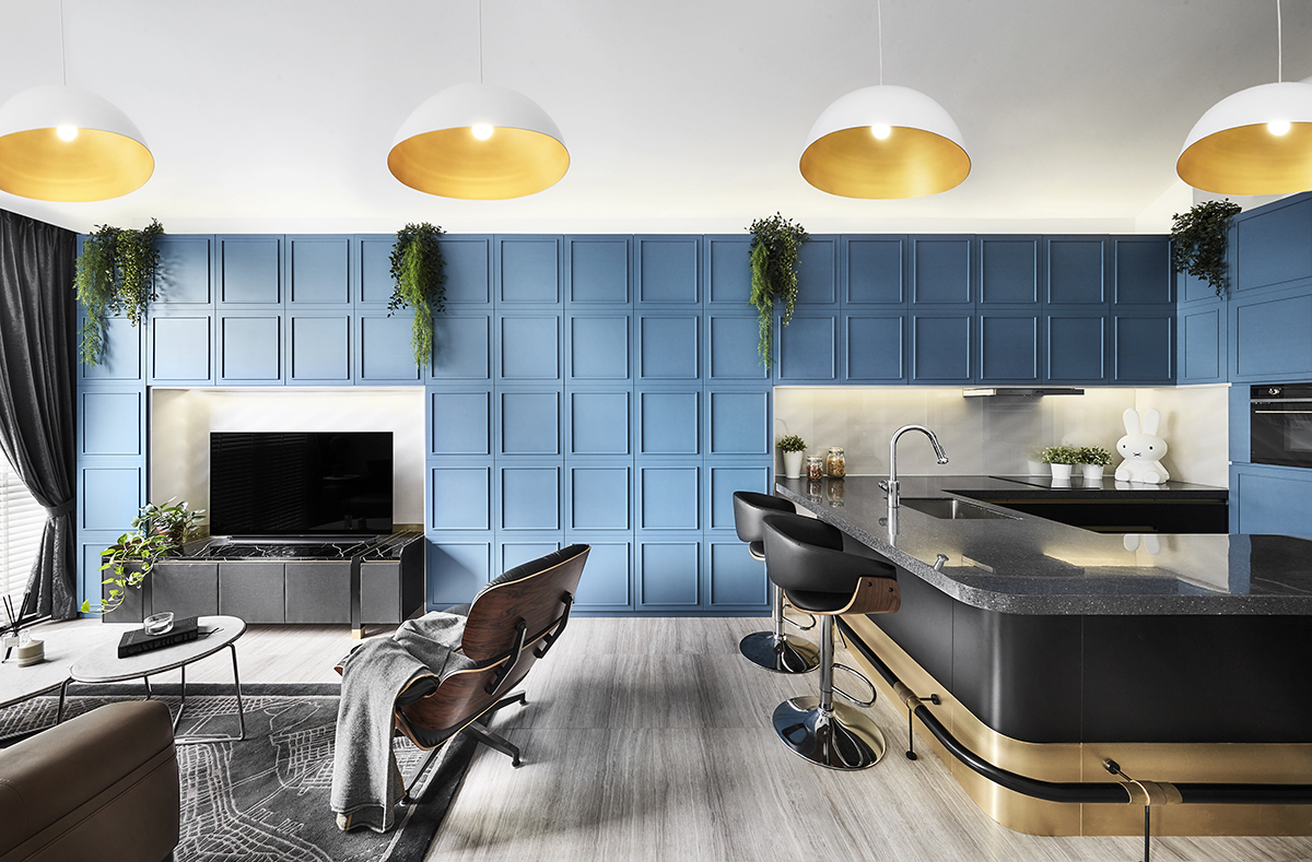
Coining these storage walls ‘blue chocolate bars’ because of the moulding details, a modern contrast was crafted with sleek linear forms. This further establishes a fresh departure from the classic bevelled edges. “We wanted it simple and not overly ornate,” says Lawrence as he describes the distinctness of the walls and their bold aquamarine tone. The streamlined details also mask the joints of the cabinet doors and this seamless touch bestows a discreet profile to the hideaway storage.
The ‘chocolate bar’ design motif lines the walls but does not extend to the ceiling. This was a conscious decision to leave some vertical breathing room and encourage the illusion of height. “Filling up the entire wall would just overwhelm the entire setting, and so projecting this illusion of space beyond is important in enhancing the visual scale,” explains Lawrence. A concave false ceiling feature was then introduced to accentuate the spacious expanse of the communal areas, all while helping to balance out the boxy forms of the blue feature walls.

Soft contours can also be seen in the different design details of the communal zones. They are especially prominent within the C-shaped kitchen counters. The solid surface countertop sports curvy edges and ends off with a waterfall design effect at the peninsular extension. These gentle contours highlight the classic style and pair well with the bronze-finished inlays of the custom carpentry.
Other than maximising form and function through thoughtfully planned bespoke touches, the designers had to take into account the existing electrical fixtures outfitted by the developer. That meant working in these brand new kitchen appliances into the modern classic-styled home to good effect. A skilled design eye was necessary on their part to make sure that the aesthetics and proportions are seamlessly integrated. This well considered sense of design continuity is applied onto the existing front door as well. Since the outer frame does not allow for modifications, the designers altered the inner frame with a customised linear design of bronze inlays to better match the overall modern classic theme.
As exemplified by Lawrence and Ash of akiHAUS, good design is a thoughtful combination of smart space planning with tasteful design accents, all of which culminate in this condominium unit. He shares with a laugh: “The homeowners are definitely settling down for good here and last we heard, their guests find it hard to leave as well!
This post was adapted from an article originally published in the January 2020 issue of SquareRooms.


