Not all homes are built equal but for this resale HDB flat unit nestled at the outskirts of town, its layout was a complete departure from the usual floor plans. While the commissioned designers from Artistroom mulled over the unconventional layout, their main objective was to make the space liveable for the homeowner, a bachelor in his thirties. A major reshuffle in the layout soon ensued in creating appropriate areas for the homeowner to work, rest and play in.
The main areas that underwent drastic overhauls are the kitchen and bedrooms. Since space was limited in the designated dining area, the design team made the executive decision to hack away the boundary wall enclosing the kitchen. Now transformed into an open-concept area, it frees up more space to accommodate a four-seater dining set comfortably.
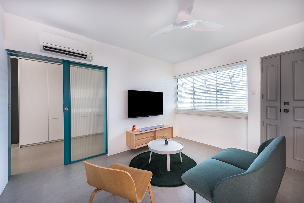
Dominated by white tones, the communal zones are enlivened by pops of teal accents which appear on the metal sliding door frame. A marble slab has been engaged as an outstanding feature for the shared kitchen and dining area. Seeing that the homeowner is not big on cooking, the team decided that his light cooking habits would sit in well with the marble backsplash. The dramatic veining on the backsplash ushers in modern opulence and elongates the visual scale of the wall area.
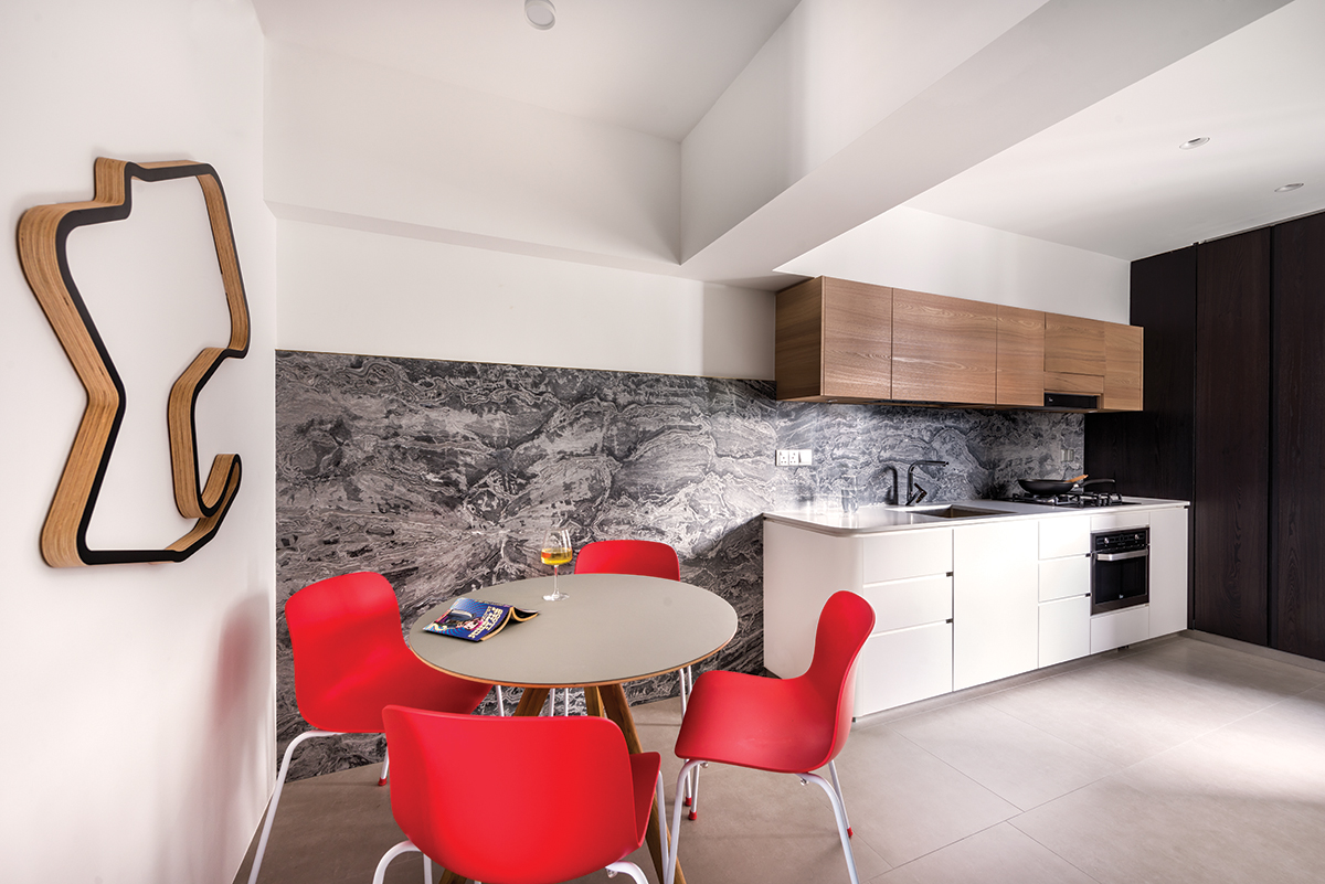
As to not let the heavy marble textures close the space in, the team put together a material palette of white quartz, matte white laminates and veneer for the one-wall kitchen setup. The results show off a lightweight design profile which is accentuated by its contoured edges.
Inside the private areas which have been cordoned off with the metal sliding doors, the application of ribbed glass panels affords the space with privacy. Still bathed in light, the private zones comprise the integration of two bedrooms into one expansive area. Now used as the study, wardrobe and sleeping quarters, the designers also factored in shelving to showcase the homeowner’s comics collection.
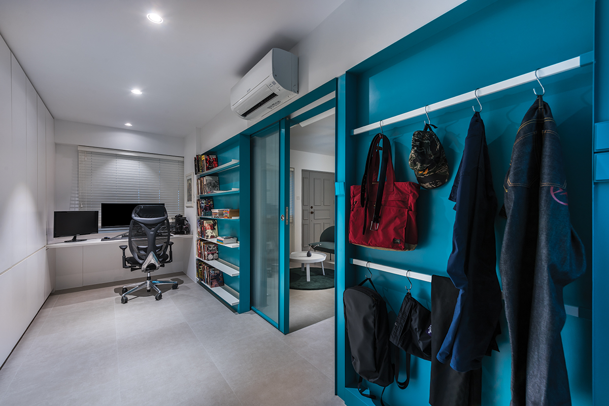
Embellished by metal fixtures in a matching, eye-catching shade of teal, the wall in the study is furnished with space-saving storage solutions. One side hosts white metal shelving and a recess to tuck away the pocket sliding door neatly. The other side of the doorway has been turned into a utility area with its application of white metal rods to hang up clothing, bags and other items in order.
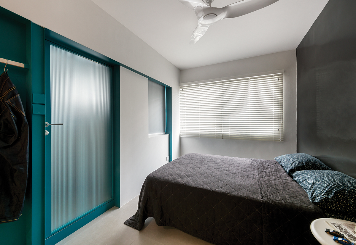
The other side of the expanded room houses the sleeping quarters and to emit a cosy yet characterful aesthetic, black epoxy paint has been applied for the main wall. The smooth finish reflects light into the space and amplifies the visual expanse of the sleeping area. Facing another metal sliding door frame in teal, this leads into the ensuite bathroom.
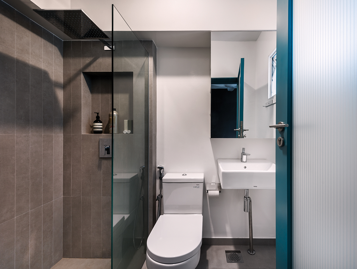
To maintain a visual connection with the rest of the home, this bathroom is outlined with a similar treatment of homogeneous tiles for both the flooring and walls. The only exception lies in the refreshed format of the wall tiles in the shower stall, which have been specially cut into linear strips from the main lot of 600 by 600mm homogeneous tiles. With that, the entire setup appears uniformed but with a dimensional and visually striking appeal.
This post was adapted from an article originally published in the March 2020 issue of SquareRooms.


