When all that you have is limited square footage for a kitchen, the best plan is to make the most of what’s given. Take on tiny with these nifty renovation strategies designed to stretch the diminutive kitchen to its limit – metaphorically speaking, of course. Let’s get cooking.
A gallery layout optimises small spaces
Roadblocks in this part of the home may cause accidental bumps that not only hinder productivity and workflow they can be downright dangerous as well. Make way for more room by first working with a layout that works best for your pocket-sized space.
One that’s a fan with owners of tiny homes is the galley. Formed by two parallel runs of units that form a central aisle for traffic, this layout fully optimises the available floor area for both storage and prep work. Another variation is to install cabinetry at only one side of the wall – this frees up space, which means no more elbow-rubbing when two’s in the kitchen.
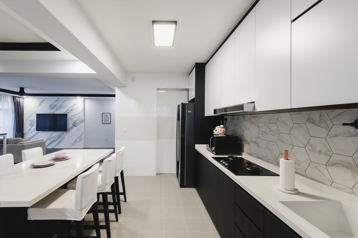
Image credit: Crescendo Interior & Lifestyle
U-shaped layouts are great for boxy kitchens
With boxy layouts, consider going for an L- or U-shaped arrangement. These layouts will afford you with more counter space for food prep as well as give you additional space for storage compartments. You can bring an island in the middle if you have the square footage to spare. But don’t compromise practicality – ensure there’s enough leeway to open your cabinet doors with ease as well as sufficient walking and maneuvering space all around the island.
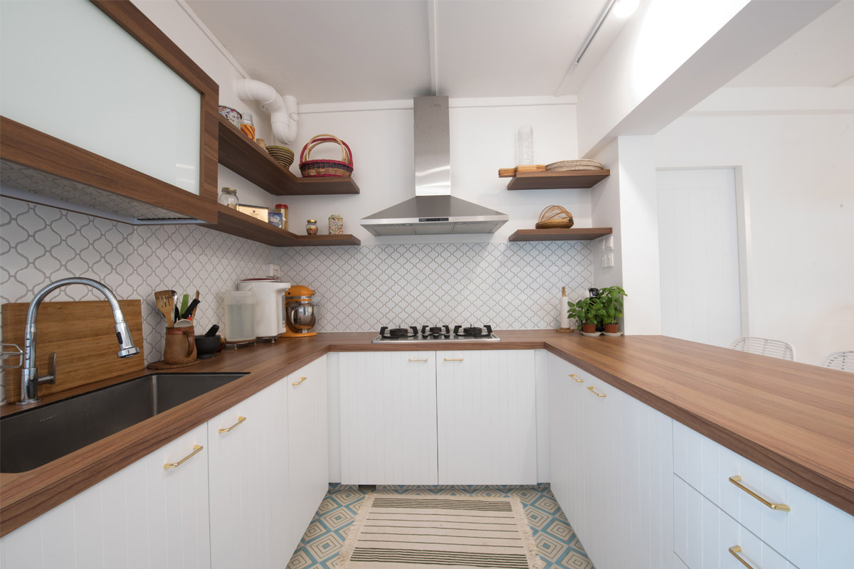
Image credit: Free Space Intent
White can visually enhance space
It’s of small wonder that white’s a favourite neutral with owners of pint-sized spaces. It reflects light, conjures up the illusion of added sunshine, and has the amazing ability to breathe a sense of spaciousness into rooms. To prevent a too-sterile look, go beyond white and include into your go-to palette variations like ivory, cream and beige as well as clean tones such as misty grey and pastels.
Even Vincent Neo, managing director with Versaform, emphasizes the importance of utilising different shades of pale in cramped quarters. “As the ceiling is usually painted in stark white, try going for an off-white or light grey on walls, and pastel for cabinet fronts,” he suggests. “This serves to create depth in the area.”
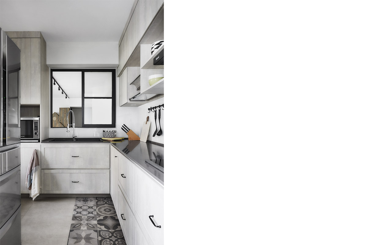
Image credit: Dan’s Workshop
Make full use of cabinets
As the cabinet takes up the largest expanse of a kitchen’s real estate, how it looks determines your space’s overall aesthetic. In terms of hue, white wins hands down for its ability to optically expand interiors. Besides, pale toned fronts work with a diversity of styles, from contemporary and modern minimal to classic country or the ever-popular Scandinavian style. High gloss laminates with smooth clean lines exude modernity and also augment the illusion of spaciousness. Shaker style cabinets, on the other hand, are a classic favourite. Its recessed panelled woodwork creates shadows and thus, depth and interest in an all-white environment. If you’d like to take it a step further, outfit your storage compartments with minimalist pulls, hidden openings or even touch-activated latches to reduce visual clutter and reinforce the clean lines of your kitchen.
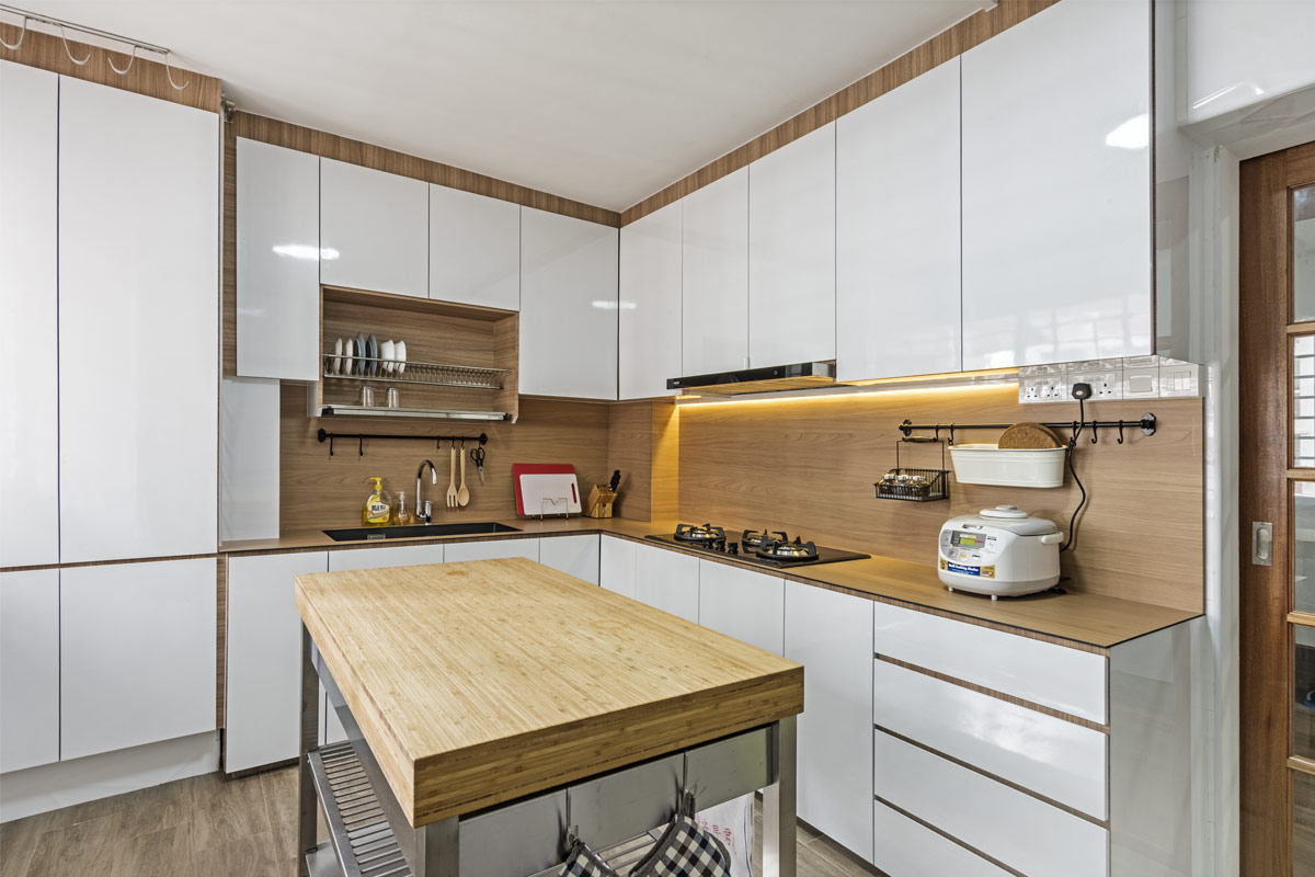
Image credit: DB Studio
See-through cabinet fronts can create the illusion of space
Replace one or some of the solid fronts with glass doors. This leads the eye to see beyond the frames and into the depths of the cabinet, making the walls feel further away. It’s important that you keep the contents neat and colour-coordinated though – else, the visual chaos will simply thwart all of your efforts.
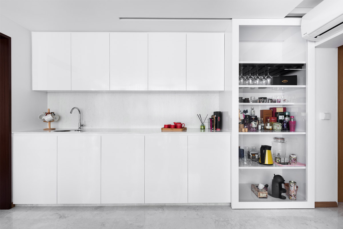
Image credit: Mesh Werk Studio
Reflective surfaces can brighten up a space
Most of us come into contact with the countertop more often than other parts of the kitchen. But it does more than merely serve as a surface that bears the brunt of everyday living. As the worktop runs the span of the lower cabinet units, it’s a key ingredient in crafting a kitchen’s aesthetic. What’s more, it offers cramped quarters much-needed uniformity – an element that space-crunched areas thrive on in order to open up optically.
Set the tone with marble for a luxurious take on the lightweight look, or brighten up with reflective surfaces such as stainless steel that subtly amplify the effects of both natural and artificial lighting. Pale wood tone worktops are great for adding warmth without weighing the airy ambience down, while engineered stone surfaces give you the liberty of choice as they come in many hues and patterns. Pick the one with a cleaner, less busy design to complement a small kitchen style.
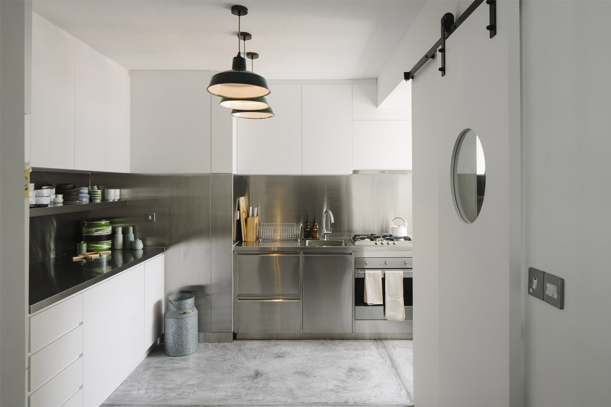
Image credit: The Monocot Studio
Dark or patterned floors can increase floor-to-ceiling height in tiny kitchens
The layman might think you have to go all out with all white to make a constrained kitchen appear bigger. On the contrary. Vincent Neo of Versaform explains that dark floors help to enhance the floor-to-ceiling height in a tiny space. To stir up interest underfoot, consider patterned tiles in monochrome such as black-and-white checkboard, chevron or mosaic patterns. Think of it as a beautiful distraction – a way to divert the attention away from a room’s lack of floor area. Size-wise, larger tiles tend to create an airier appearance because of the lesser grout lines. With fewer lines to contend with, less cleaning is needed.
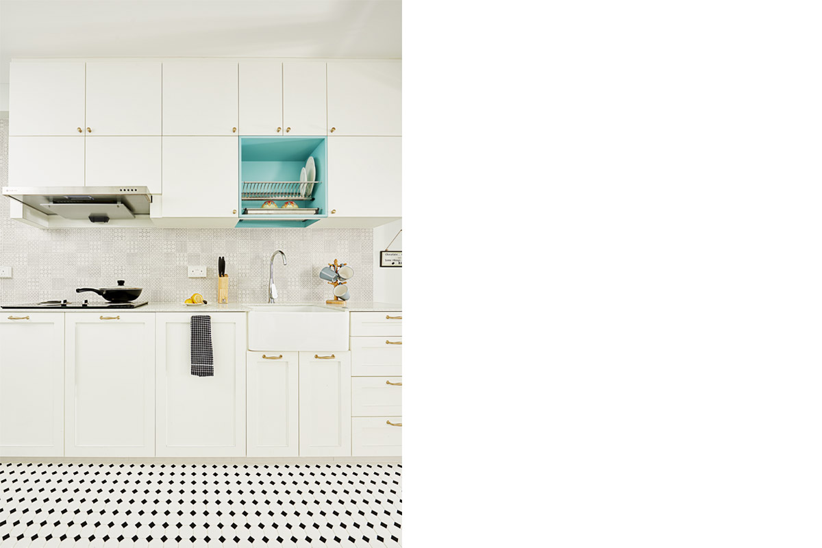
Image credit: Versaform
Don’t be afraid to add some colour
On the walls or the backsplash – that’s the canvas between the upper cabinetry and countertop – can afford a dose of low-key drama because of its diminutive dimensions. This may come in the form of patterned or coloured tiles. But if you prefer it even more understated, choose a unique design in a low-contrast colour or a classic subway tile that sparks just the right amount of interest without overwhelming your light toned space. We also love how a tinted glass backsplash provides a reflective surface that amplifies the bounce of light – but in a subtle manner.
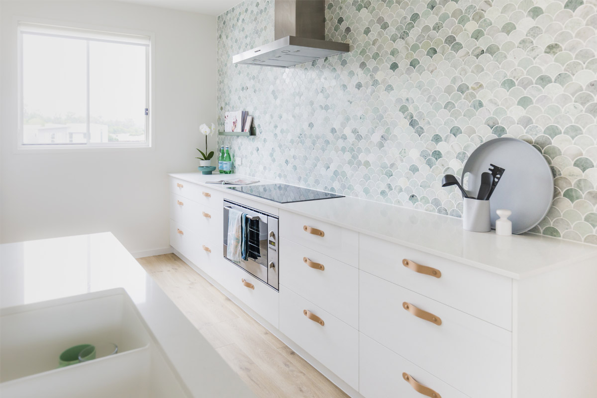
Image credit: H and G Designs
Let the light in
Not getting sufficient sunshine in your Polly Pocket-sized kitchen? A row of powerful track lights, under-cabinet fixtures, or a pendant over your little breakfast nook will brighten things up.
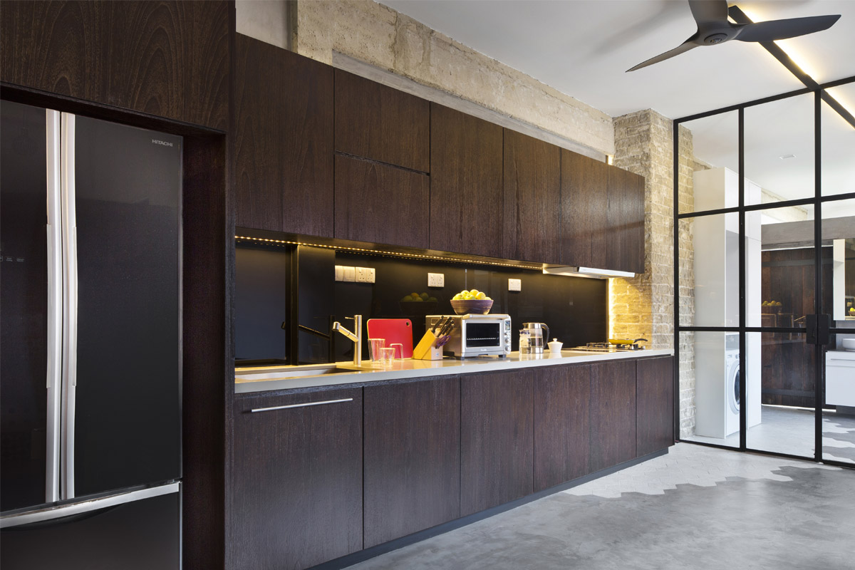
Image credit: Prozfile
This was adapted from an article originally written by Fidz Azmin published in the May 2018 issue of SquareRooms.


