Ever wondered how a renovation is planned and executed? SquareRooms collaborated with Gain City for the Big Renovation Project, where we are giving you an inside look at three home renovations from start to finish. The first home featured is a four-room resale BTO unit in Punggol Drive that is occupied by a bachelor. Under the purview of local interior design firm Rezt & Relax, the new home is underlined by a modern-industrial design theme and is further punctuated with natural wood tones, culminating in a timeless and elegant home.
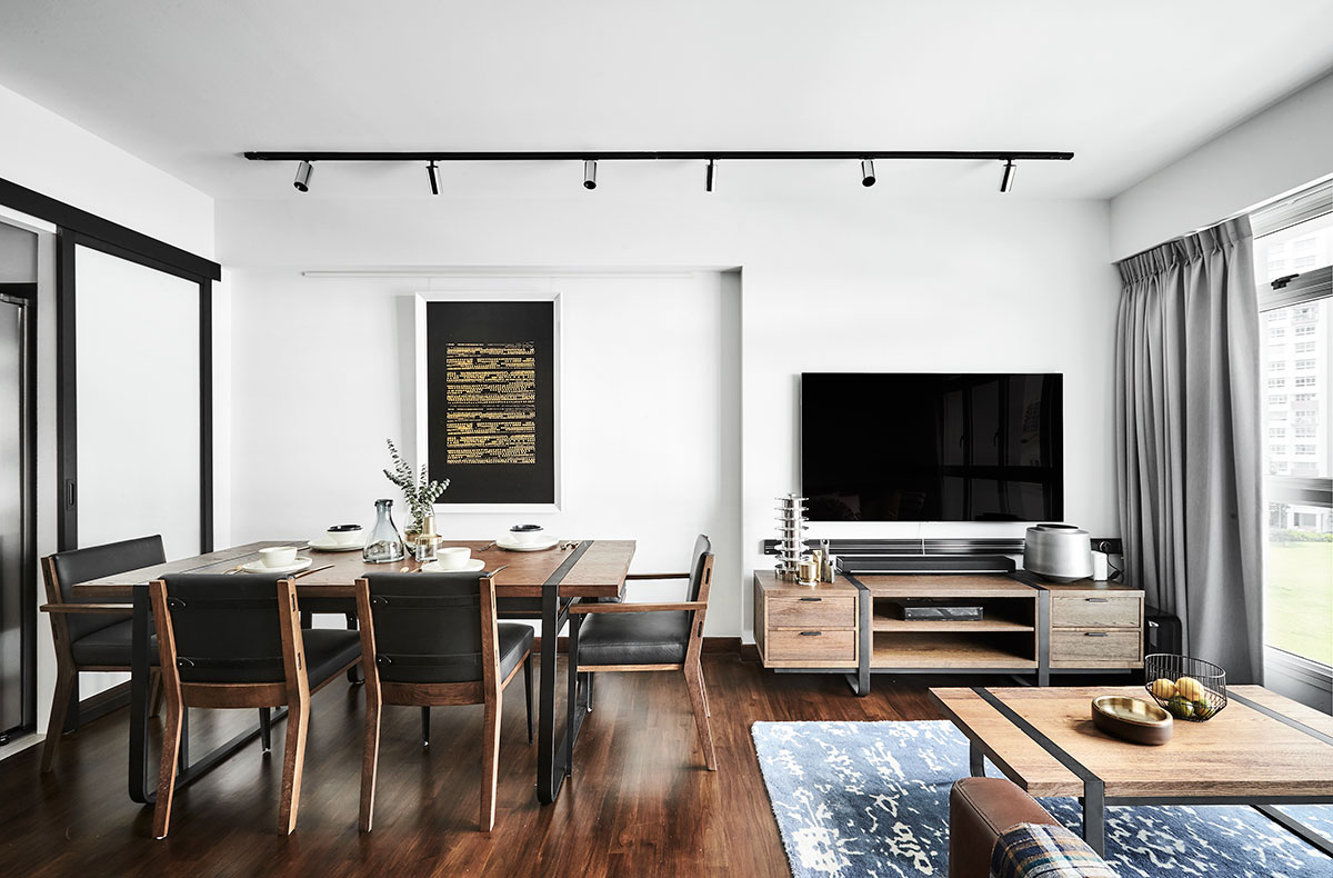
As a big lover of the look and feel of natural wood, the homeowner wanted to incorporate plenty of these elements into the home, which can be seen through the timber wood flooring and the wood-accented furniture.
When we choose to renovate a home, we do it because we want to reconfigure the pre-existing layout and design of the home into a carefully curated space that will be able to cater to all of our needs and wants. Things were no different for the owner of this four-room resale BTO in Punggol, who wanted his new home to accommodate his love for cooking.
With the renovation project helmed by designer Cherlyn Tan from local firm Rezt & Relax Interior, a modern-industrial theme set the tone for the design of the home. This is evident right from the home’s main door, which was designed to reflect a scissor gate that is commonly used within the industrial sectors. Meanwhile, another distinct modern-industrial feature of the home is its monochrome and wood colour palette, which is echoed throughout all the rooms.
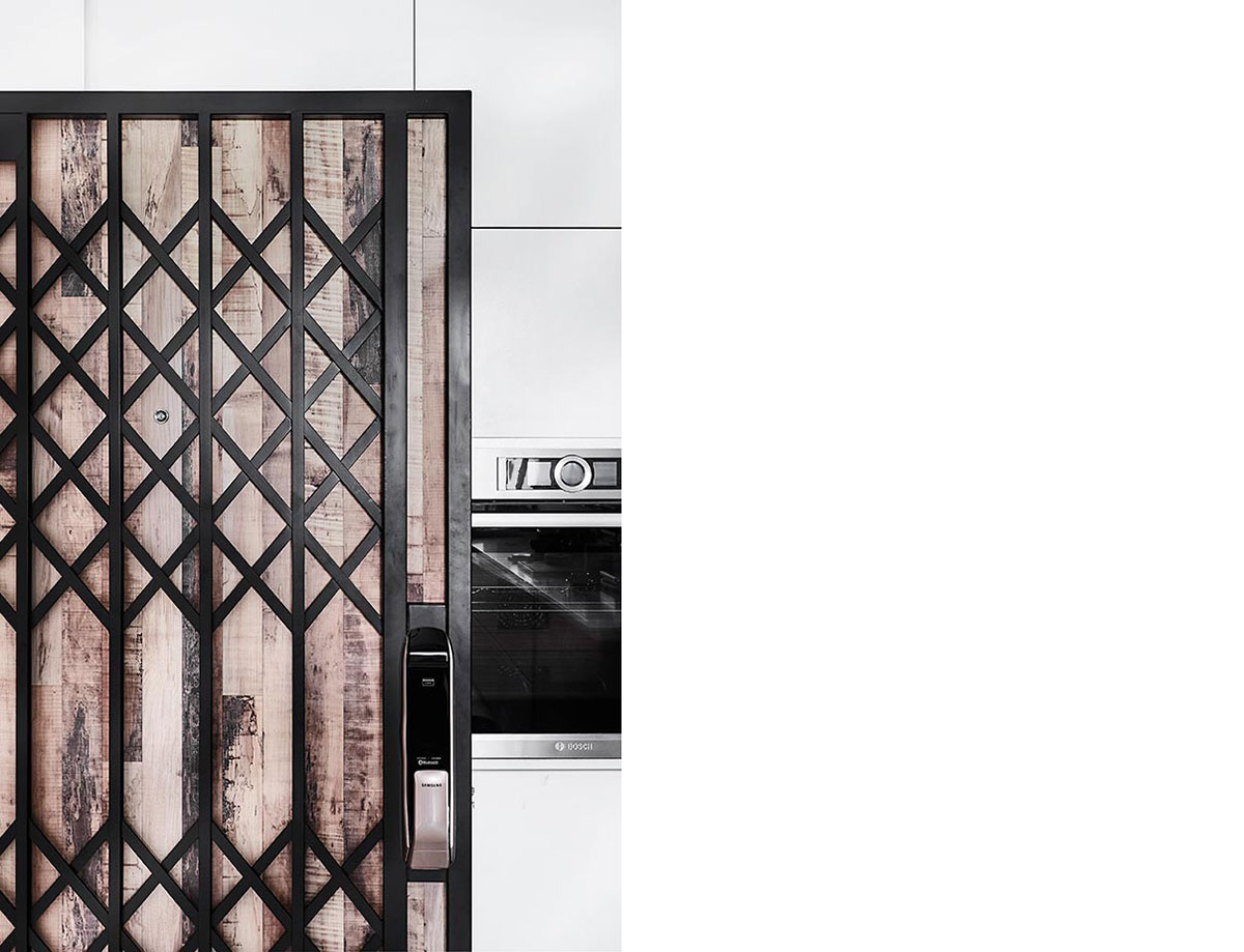
Traditionally seen in the industrial sectors, the main door features a custom-made scissor gate design, which reflects the modern industrial theme of the home.
On the inside, the layout is fairly unconventional, with the kitchen being the first space one would come across when stepping into the home. But this actually boded well for the homeowner, who being an avid cook, wanted a huge kitchen that could offer up plenty of countertop space for food and meal prep. To achieve this, the original partition wall that separated the kitchen from the entryway was hacked away and extended to the opposite wall, effectively expanding the square footage of the kitchen. Meanwhile, against the black- and wood-laminated cabinetry, white Caesarstone slabs take up the backsplash and countertop, further enhancing the durability of the regularly used space.
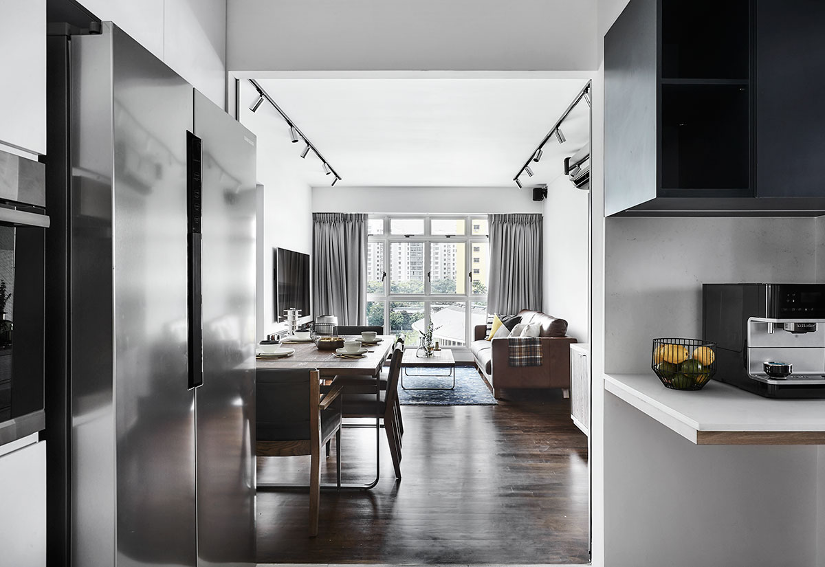
A glass sliding door allows the homeowner to maintain visual contact with his guests even when he is preparing meals in
the kitchen.
Further back in the kitchen is the yard, which employs a full white colour palette, creating a contrast to the darker toned kitchen. Cherlyn explains, “As the space in the yard is quite small, having it in full white can help to make it feel much bigger. Additionally, it also parallels the white-laminated storage units on the opposite end, in turn making the space feel much more cohesive.”
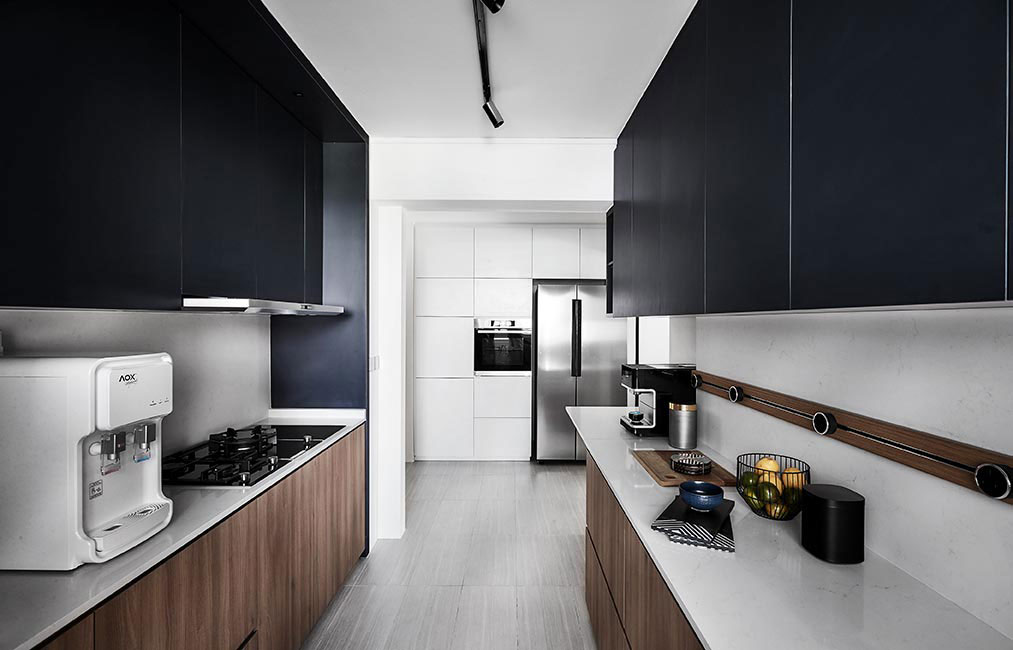
In contrast to the white laminated storage units that line the home’s entryway, the cabinets in the kitchen were clad in a combination of black and wood tones, which makes the overall space look interesting.
Moving on into the communal living spaces – separated from the kitchen by a glass sliding door – one can easily discern the lack of any built-in cabinets and fixtures. “Since the homeowner lives alone, he didn’t need to have a lot of built-in storage solutions throughout the home, which would have otherwise made the home feel bulky and small,” Cherlyn elaborates. The vertical and horizontal surfaces were also given a new lease on life, with the original ceramic floor tiles being hacked away to make way for a new cosy timber wood flooring, and the walls being given a fresh coat of white paint.
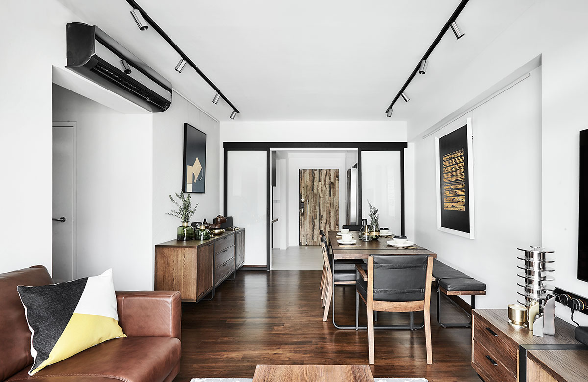
As a big lover of the look and feel of natural wood, the homeowner wanted to incorporate plenty of these elements into the home, which can be seen through the timber wood flooring and the wood-accented furniture.
However, in contrast to the plain whitewashed walls, one of the walls that flank the passageway was clad in a stucco wall finish, which injects a unique design element into the home. And as this wall plays host to a low side cabinet and a framed artwork, the stucco texture serves as a unique backdrop to those furnishings. On the ceiling, track lights were used instead of traditional downlights, which further enhances the industrial theme of the home.
When it came to the owner’s private chambers, Cherlyn employed a similar design treatment as the outer communal zones, in that the space was kept pared down in design and free from any built-ins. The original parquet flooring was also repolished to give it a new sheen. By doing so, the owner is offered a tranquil and cosy oasis to rest and recuperate from the daily grind.
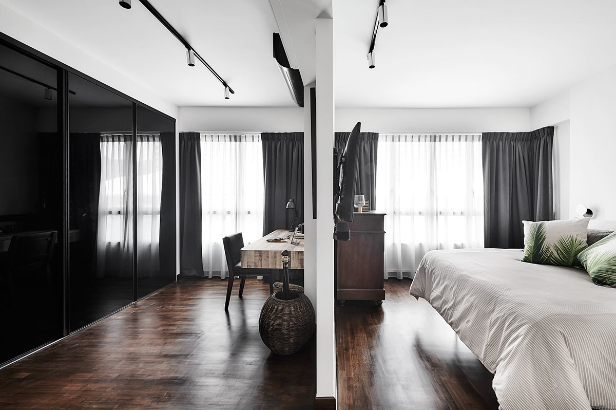
Against its monochromatic backdrop, and free from any built-in fixtures, the master boudoir presents the homeowner with a sea of calm that’s perfect for retreating into after a long day at work.
Sharing the same space as the sleeping area, but separated by a partition wall is the generous walk-in wardrobe and study area. Constructed out of black tinted glass, the full-height wardrobe units are a striking feature against its white surroundings.
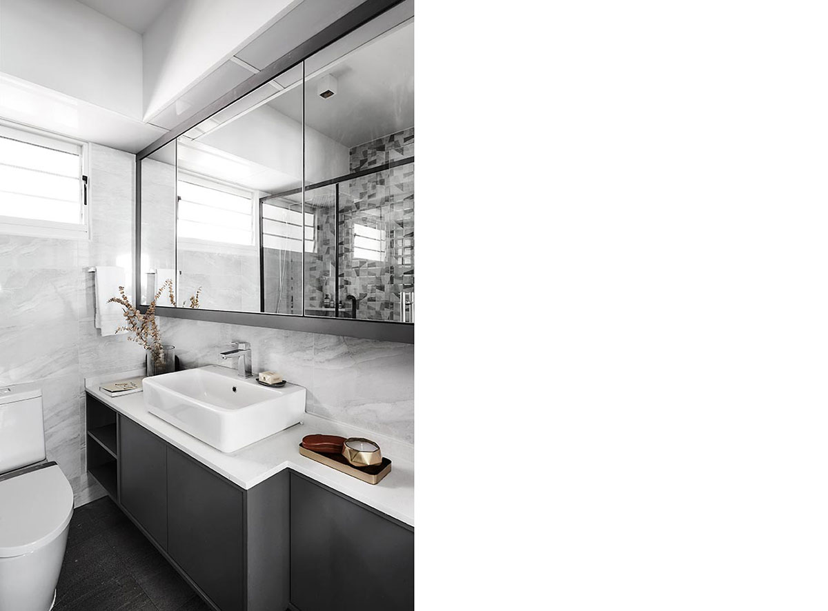
Equipped with natural stone-lookalike tiles and premium fittings like an American Standard sink and WC, the master bathroom was given a classy and elegant makeover akin to those found in high-end hotels.
When all’s said and done, the collaborative effort between the homeowner and interior designer during this one-month renovation project has undoubtedly resulted in a home that is a true reflection of the unique tastes and distinct personality of the homeowner.
Get the look
Do you like the modern-industrial theme seen in this Punggol home? Consider incorporating these neutral-toned textures and smart accessories into your interiors.

Clockwise from left: Grammy T1-36P1004H ceramic tile, POA at Hafary; Grammy T1-36P1001 ceramic tile, POA at Hafary; Samsung 65-inch QLED Smart TV, $5,099 at Gain City; LG Artcool Mirror air-conditioner, POA at Gain City; Samsung push pull digital lock, $880 at Gain City; Dark walnut timber flooring, POA at Goh Hang Meng Parquet; Frosty Carrina countertop, POA at Caesarstone; Sonos multi room speaker, $260 at Gain City; Fisher & Paykel front load washer, $1,339 at Gain City; Power rail and adaptor, POA at Line8; Samsung side by side fridge, $1,659 at Gain City
This post was brought to you by Gain City. For more home renovation ideas, visit the Gain City Megastore @ Sungei Kadut to view fully-furnished mock-ups of 3-, 4- and 5-bedroom BTO flats at the new Gain City Experiential Centre. The Gain City Homes Larger Than Life event will be taking place on 15 – 16 December and 22 – 23 December, so be sure to make your way down to Gain City Megastore @ Sungei Kadut to enjoy exclusive discounts on home appliances and more.


