This comforting BTO design was inspired by the gorgeous tiles and architecture of the Mediterranean.
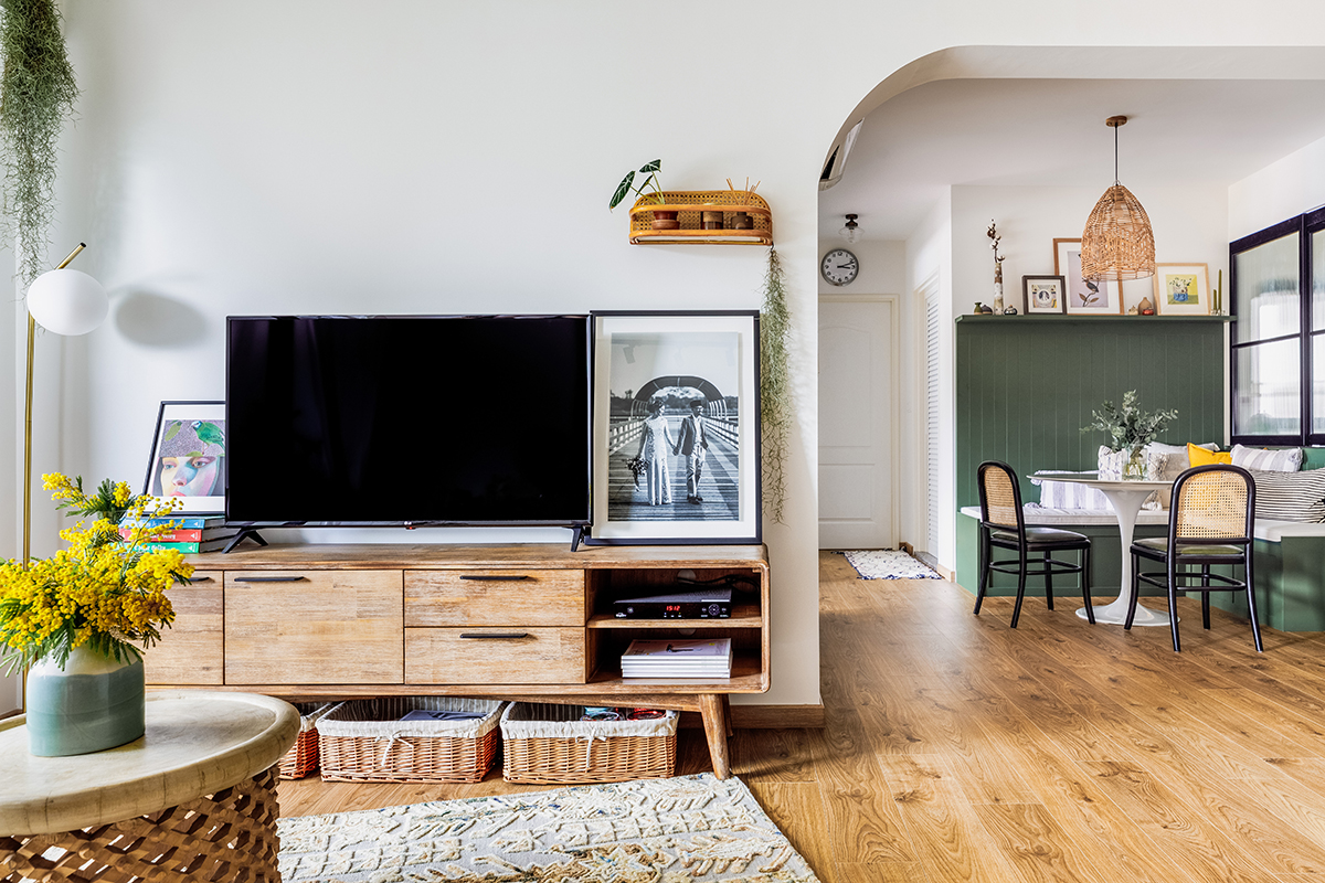
Everything fell into place for Fazlie and Corinne (@cnbrr.hm) when they stumbled across a couple of eye-catching Spanish tiles. Looking for the perfect surfaces for their home, they hadn’t thought to pull inspiration from their travels overseas, yet these tiles brought back one of their favourite memories: visiting the ancient architecture of the Baths of Caracalla, which they had fallen in love with on a trip to Rome.
This serendipitous find essentially kickstarted their home design journey, leading them to their flat’s signature Mediterranean look. They then turned to the entire region for inspiration, appreciating the warm tones, relaxed vibes and unique designs of southern Europe and northern Africa. The Moroccan riads became a particular favourite.
The tricky part was meeting in the middle, Fazlie being much more of a minimalist at heart, while the colourful, maximalist approach is more to Corinne’s taste. Creating a moodboard together helped the couple articulate their preferences and reach a compromise that made both of them happy. Ever supportive of her taste and vision, Fazlie even agreed to the cafe-style dining nook—and he certainly can’t deny that it’s a cosy addition to the home.
While the couple considered tackling the project with just a contractor, they quickly realised they needed the technical expertise and project coordination that only a designer could provide. Looking back now, they can’t imagine having done it without one; leaving things to the professionals from The Local INN.terior saved them plenty of time and angst, allowing them to achieve the design of their dreams with peace of mind.
We had a chat with Fazlie and Corinne to discover more about their dreamy home design and top renovation tips.
After considering going with just a contractor, you opted for an interior designer instead. How did you settle on the right ID?
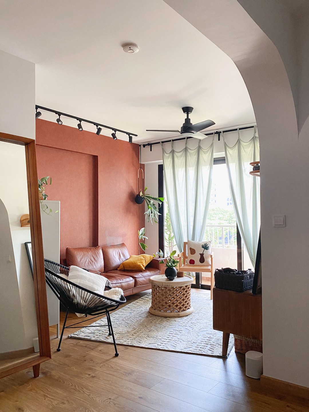
Sofa from Grey & Sanders, wallpaper from Honpo and rug from Living DNA.
We felt comfortable trading ideas from the start. He offered fresh, helpful perspectives that we would not have thought of otherwise. He is also proactive when it comes to dealing with the minutiae of the renovation process, so we trusted him completely and did not need to stress over the details.
Working with a designer who shares a common design sensibility also means that his choices for the smallest details aligned with ours, without him even having to consult us.
It’s not about going to as many designers as possible and pitting them against each other. Do your homework and shortlist only those whose style speaks to you and who you are happy to work with, then determine which designer has the most synergy with you at each consultation.
You love the Mediterranean aesthetic, but how did you know it was the right look for your home?
Italy is one of the places we felt the most relaxed in and most inspired by. We broke the feel of it down to the key elements, figuring out if it was the colours, textures, shapes or even smells that enticed us. You can’t always incorporate all of those things into your home, but it ultimately comes down to how a space makes you feel.
Besides your travels, what else did you draw inspiration from?
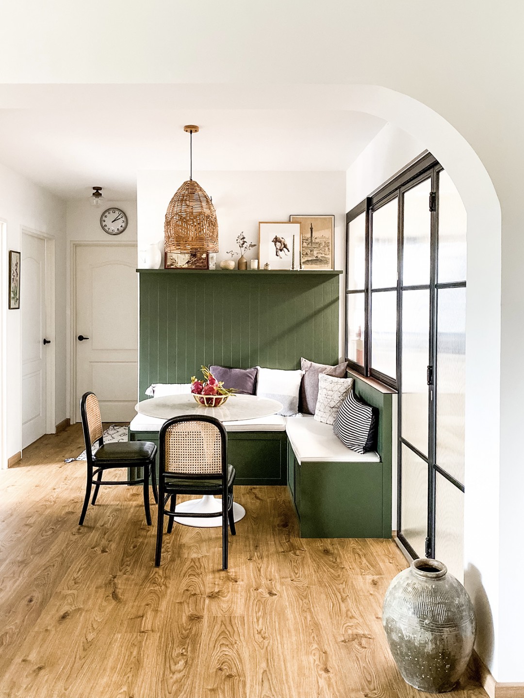
Dining chairs from Hock Siong and green laminates from Lamitak.
We subconsciously drew inspiration from the landscapes in films such as Call Me by Your Name and At Eternity’s Gate, about the painter Vincent van Gogh. We also closely followed Riad Jardin Secret (@riadjardinsecret) and Korakia Pensione (@korakia) on Instagram.
What’s your favourite spot in the house?
We wanted a comfortable and cosy dining area, so the breakfast nook is our favourite. It was carved out by building a banquette that can seat up to eight, which serves as an excellent spot to dine, work and entertain. The banquette seating even lifts up for extra storage space.
We also love our balcony. It’s generally viewed as being too small and even a waste of space, but it’s a pleasure to be able to look out at the setting sun and water the plants outside every morning.
Any favourite features or finds you’d like to share?
The earthenware pot I saved from my late grandparents’ house is special to me as much for its rustic charm as for its evocation of simple domesticity.
The dining chairs that we got second-hand from Hock Siong are meaningful to us for the sheer serendipity of their appearance at a point when we were convinced we would not be able to find affordable ones we actually liked. The mad dash Fazlie had to make to secure them just minutes after we saw them on our Instagram feed was probably also quite memorable for him.
Are there any features you weren’t a fan of initially but eventually came to appreciate?
Our designer convinced us of the importance of task lights in the kitchen, even though we told him then that cove lighting reminded us too much of ‘zhng’ cars and KTV lounges. Now we are grateful for those gentle strips of illumination in the early morning and when sneaking in a supper snack without alerting everyone else.
What were the biggest challenges during your renovation?
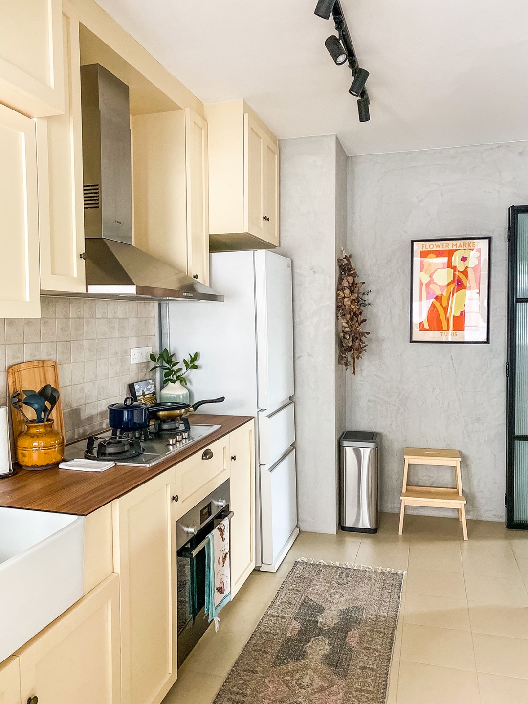
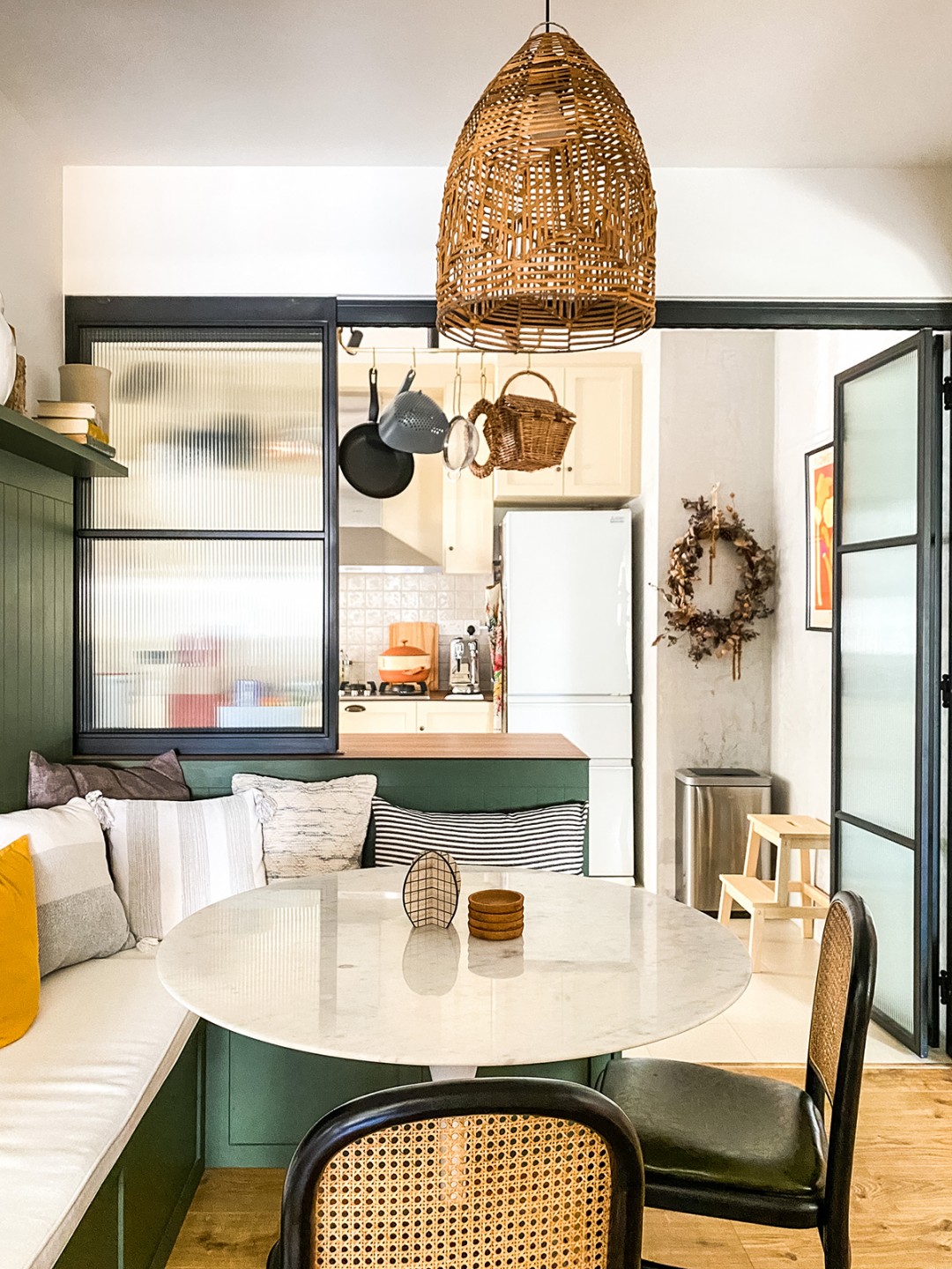
Cooker hood from Bosch and cream laminates from EDL.
Trying to stick to our budget when faced with a myriad of premium options if we could just top up a little. Resisting the temptation to do so was very hard but we tried to be resourceful and find creative solutions or alternatives that we could be just as happy with.
Speaking of budgeting, what’s your advice for saving during a renovation?
If you’re trying to keep to a tighter budget, choose to only have the necessary built-ins because custom cabinetry takes up a chunk of reno costs. Whatever else you need can be added on as modular furniture when the need arises or when the budget allows in the future.
You take great care to be sustainable at home. How did you weave this into the renovation process?
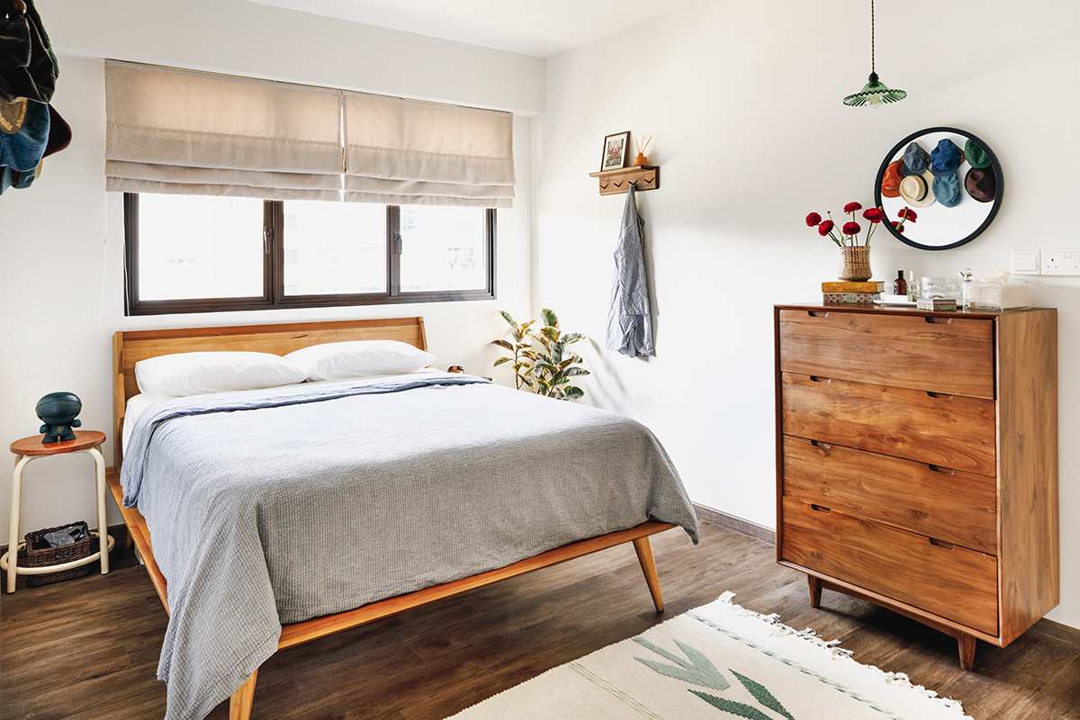
Dresser from Wihardja.
We make it a point to make considered and timeless choices when it comes to our purchases. Hence, our home was not completely furnished when we moved in as we had to space out some of the bigger-ticket items and also because we were waiting to find the ‘perfect’ pieces instead of settling for something we might tire of or regret in the short term.
Recycling is also something we practise. I remember going to the flat during the renovation to sort the waste and make sure all the cardboard boxes were properly flattened and disposed of. We then lugged them to a recycling bin in the adjacent neighbourhood because the recycling facilities in ours were not available yet.
Are there any features you would have loved to incorporate but couldn’t? Anything you’d do differently looking back now?
I would have loved an antique carved front door but that was out of the question with the fire-rated entrance door required under the Fire Code. We’d have done an overlay of the original kitchen and service yard floor tiles if we had known they were so porous and prone to staining.
We also would have spent more doing custom cabinetry in the other bedroom because the quality is truly much better than the average store-bought wardrobe. Having lived in our flat for quite some time now, we definitely need more wardrobe space than a three-door cupboard can provide!
And last but certainly not least, what advice would you give to homeowners renovating for the first time?
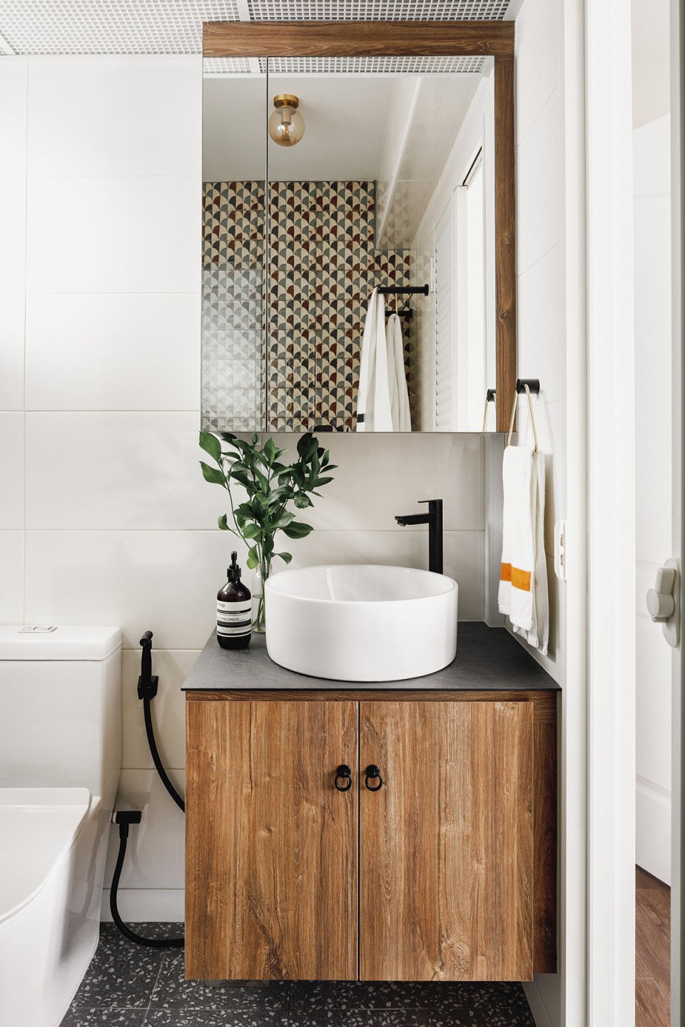
Vanity top from KompacPlus and wood-look laminate from Lamitak.
Perhaps we were lucky, but we found that trusting and respecting the work of the designer and tradespeople led to less stress for everyone involved and, most importantly, a better result.
This post was adapted from an article originally published in IdealHomes 2022.


