Japan has a way of staying with people. For this family, who spent part of their younger years studying there, it was less about the aesthetics and more about how certain spaces made them feel, unhurried, settled, at ease. Years later, that memory became the starting point for their 1,200sqft executive condo.
“It was not about literally recreating a Japanese aesthetic, but capturing a similar sense of quietness and ease,” said Kai and Jack, co-founders and designers from Resistance, who oversaw their executive condo’s renovation. “They also described wanting a mood, a space that allows them to slow down, unwind after long hours of work, and feel settled the moment they return home.”
Light as a material
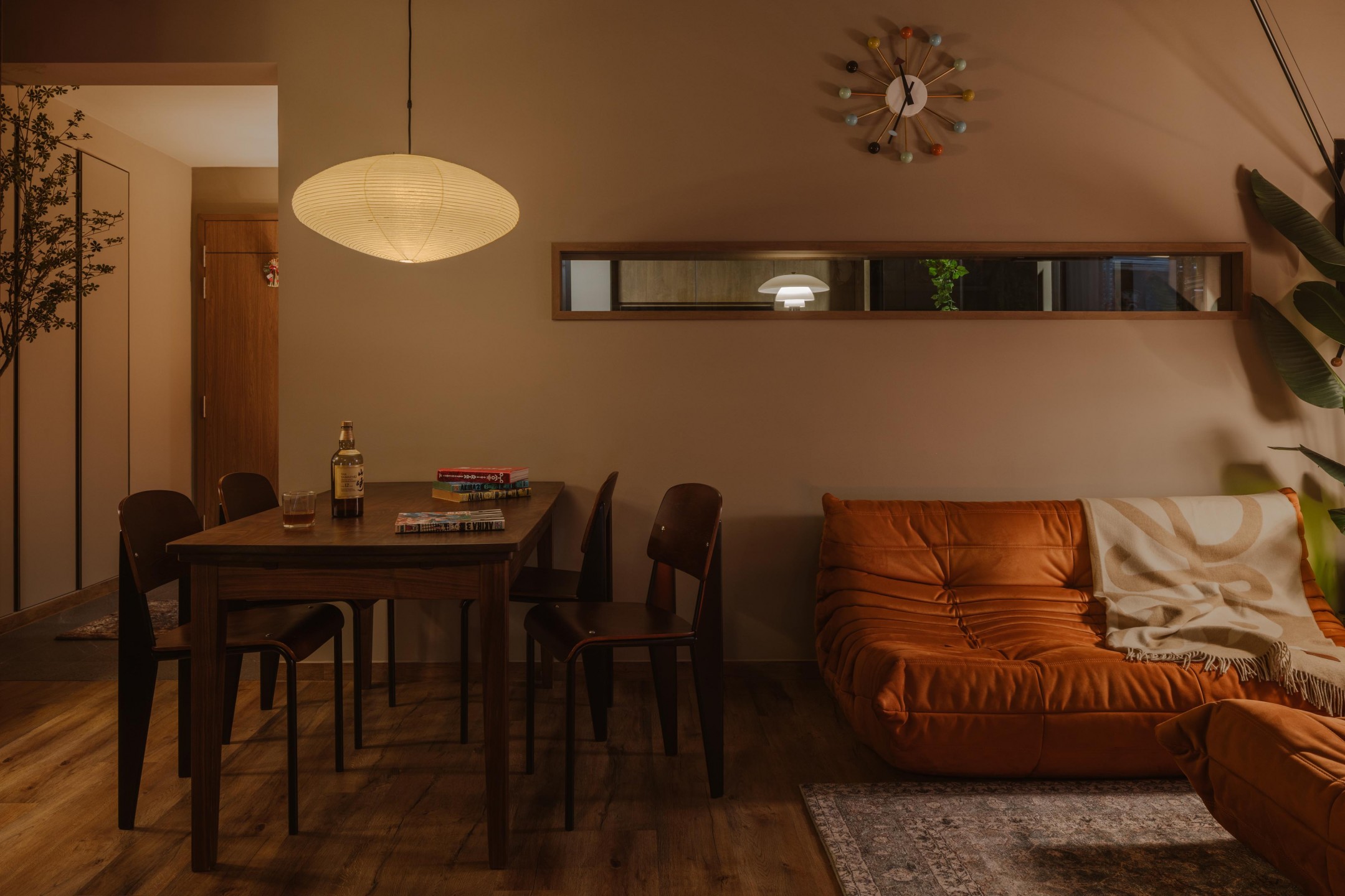
One of the defining decisions in the renovation was treating light not as an afterthought but as a design element in its own right. Natural light, artificial lighting, and shadow were considered alongside the physical finishes from the very beginning, allowing colour and texture to shift and deepen depending on the time of day.
“We wanted the space to feel warm, grounded, and slightly dim without becoming visually heavy,” they said. “Wood naturally became an important material language within the home, as it brings a sense of softness, familiarity, and warmth to the everyday living experience.”
Warm from the ground up
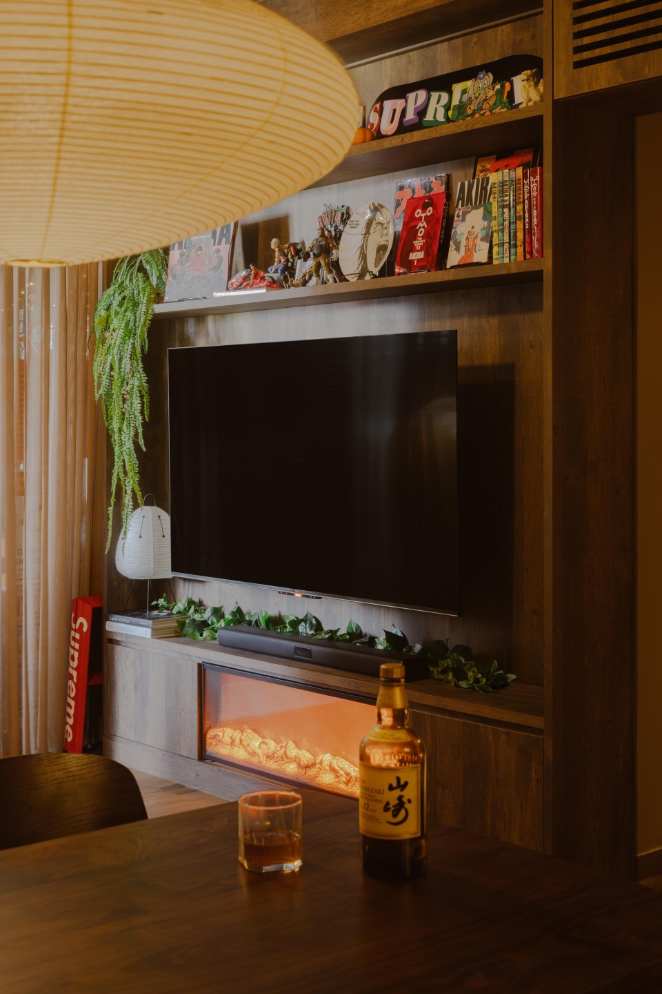
With that, the TV console and feature wall are finished mainly in wood-look laminates, their warm grain lending the living area a familiar, settled quality. Contrasting materials are introduced in measured doses to add depth without disrupting the overall tone. The faux fireplace, requested by the homeowners, adds an atmospheric rather than functional quality to the living area, its glow contributing to the calmer, slightly dim mood they were after, especially at night.
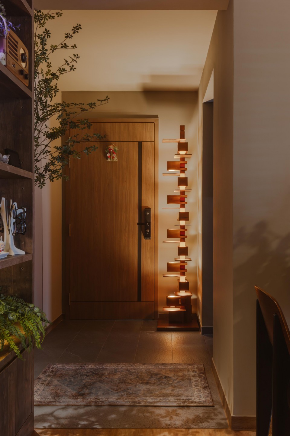
At the entrance, a sculptural tower lamp sets the tone before anything else, its stacked form casting a warm amber glow along the foyer wall. “As the entrance is the first spatial moment when returning home, the lamp helps establish a warmer and more intimate mood immediately upon entry,” they said. The shoe storage nearby was designed to read as part of the architecture rather than a standalone cabinet, keeping the material palette consistent throughout.
Refining the layout
Rather than overhauling the original layout, Kai and Jack refined it around how the family actually lives, reworking the dining zone for better flow. As the home was brand new, much of the existing framework was retained and built upon rather than replaced, including the flooring, which had new material overlaid on top. The walls were finished in a rich, clay-inspired earthy tone that grounds the room without weighing it down, drawing out the warmth of the wood tones around it.
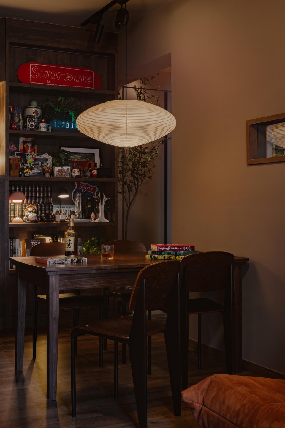
The horizontal window opening cut into the wall above the sofa is one of the more understated moves in the home. It connects the living and kitchen areas, letting light and sightlines pass through without fully opening the spaces up. “Although the opening is only a small slit, it allows visual connectivity between the spaces,” they explained. “It was carefully positioned to frame the homeowners’ displays, while concealing the messier aspects of daily cooking from the main living space.”
A collector’s haven
The homeowners enjoy picking up objects, souvenirs and travel finds, and the design makes room for all of it. Custom display shelving in the living area, finished in wood-look laminates, was planned from the start for exactly this purpose. “The shelving allows their everyday objects, books, and travel finds to slowly personalise the space over time, making the home feel more layered and lived in,” they said.
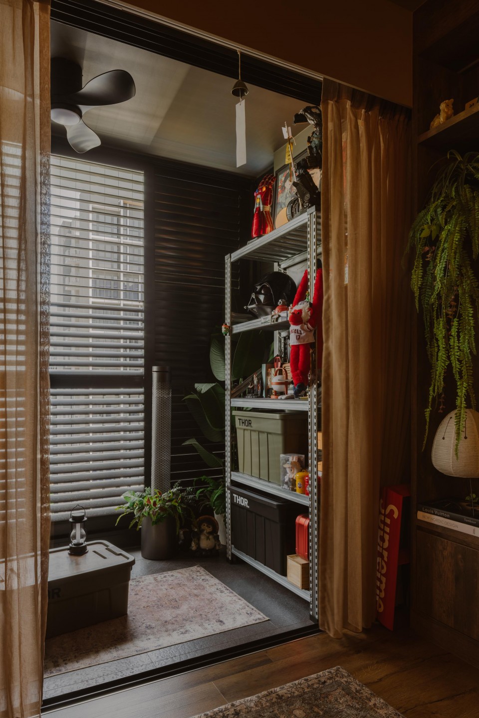
The balcony doubles as a display zone for the homeowners’ collectibles, shelved on a metal sistem system, with aluminium louvred doors set against soft linen curtains creating one of the more striking textural contrasts in the home. “We liked the harder and more industrial quality of the aluminium, contrasted against the softness of the louvres,” the pair said. “That juxtaposition creates a slightly more dramatic atmosphere while still feeling warm and liveable.”
A room of one’s own
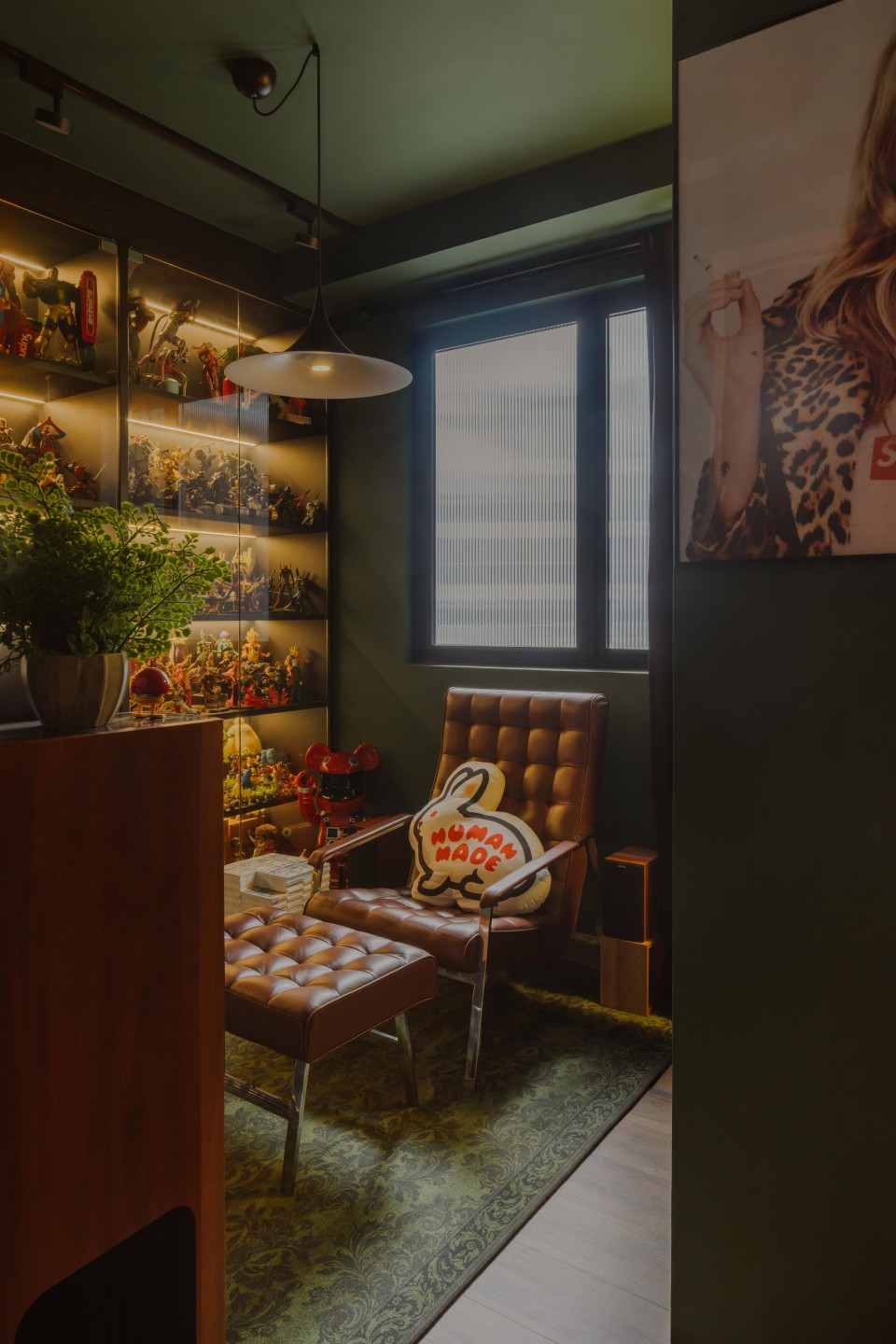
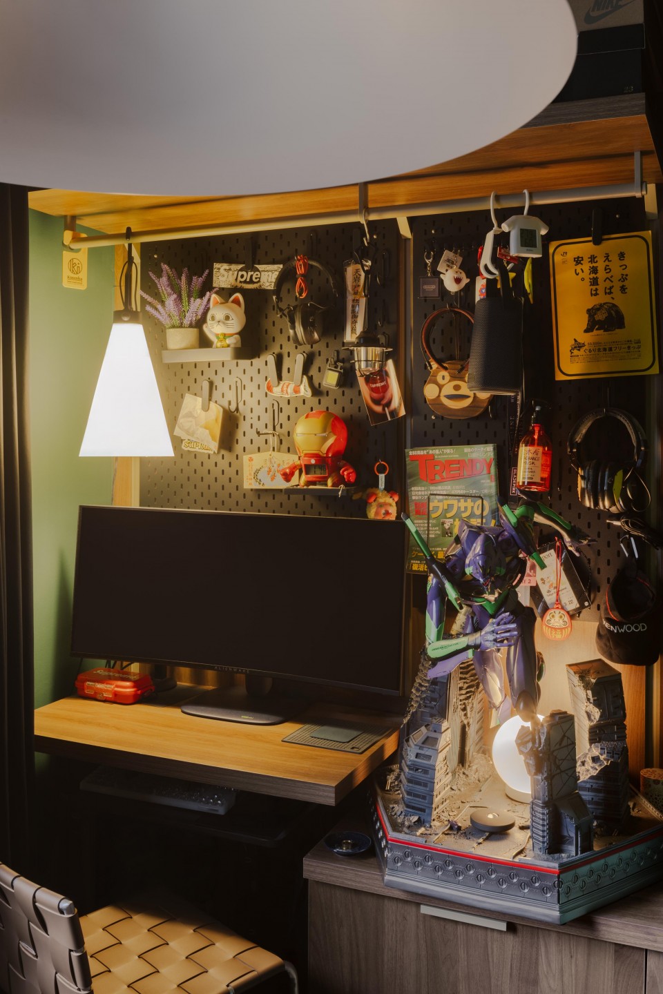
One of the common rooms has been given over almost entirely to personality. Part mancave, part study, it functions as a quieter retreat for reading, listening to music, and unwinding. Custom full-height display units line the walls to house a growing collection of figurines, their contents adding pops of colour against the darker, more moody backdrop of the room. A compact workstation was carved out of the existing wardrobe, keeping the space from feeling cluttered while still serving practical needs.
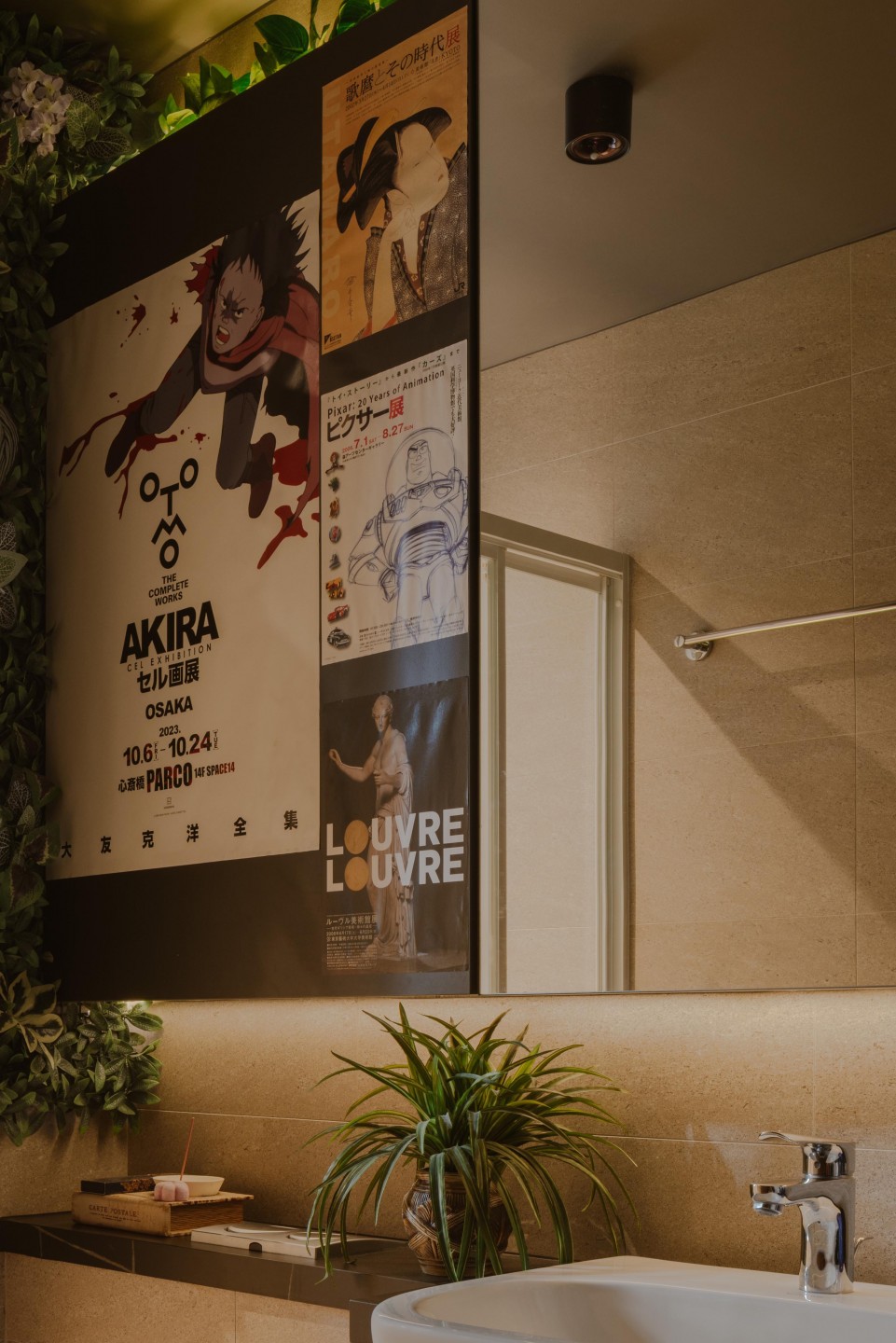
Even the common bathroom tells a story. The tiled finishes and fixtures were left largely unchanged, but the walls have been gradually covered with posters and flyers collected from travels over the years. It was not something the designers planned.
“The display wall was not something we intentionally designed,” they said. “We felt it became a nice reflection of how styling and personal objects can make a significant difference to an interior. Even without major renovation works, a space can still feel layered, lived in, and deeply personal.”


